
Scroll, Pause, Click: Designing Liinks Pages That Stop the Doomscroll and Start Conversations

People don’t “visit” your profile anymore.
They whiz past it.
They’re half-watching Netflix, half-checking texts, and half-doomscrolling (yes, that’s three halves; that’s what it feels like). Your content gets a split second. Your bio link gets even less.
So if someone actually taps that tiny URL? That’s a miracle.
What happens next decides everything: do they pause, feel understood, and click deeper… or bounce in 1.7 seconds because your page looks like a random list of homework links?
That’s where a well-designed Liinks page quietly becomes your secret weapon.
This guide is all about turning your link in bio from “meh menu” into a mini experience that:
- Stops the scroll long enough for someone to care
- Makes it stupidly obvious what to do next
- Sparks replies, DMs, signups, and sales—not just empty traffic
Let’s build a page that earns the pause and the click.
Why Your Liinks Page Needs to Be a Scroll Break, Not a Speed Bump
Most creators treat their link in bio like a junk drawer:
- Freebie from 2022
- Old brand collab
- Podcast you might revive someday
- Newsletter, shop, booking link, random blog post
Then they wonder why people don’t click.
Here’s what’s really happening:
- Attention is fragile. Studies consistently show people decide whether to stay on a page in just a few seconds. One classic stat from web usability research puts it around 10 seconds or less before they bail if they don’t see value.
- Mobile is unforgiving. Your Liinks page is being viewed on a tiny screen, often one-handed. If it’s cluttered or confusing, they’re gone.
- Your audience is already tired. They’ve been scrolling through hot takes, bad news, and five different creators selling them something. Your page has to feel like a relief, not more noise.
A good Liinks page doesn’t just list links. It does three things extremely well:
- Signals what kind of space this is (shop, learn, book, binge content, etc.)
- Guides attention to one or two obvious next steps
- Feels like you—visually and verbally—so people trust it enough to click
If you want a deeper dive into that “mini homepage” concept, bookmark this for later: Mini Homepages, Major Results: Liinks Layouts That Replace a Full Website (Without Looking Cheap).
Step 1: Decide What You Want People to Do (Yes, Just One Thing)
If your Liinks page tries to be everything, it becomes nothing.
Before you touch colors, fonts, or buttons, answer this question:
If someone only did one thing on my Liinks page this month, what would I want it to be?
Common answers:
- Join your email list
- Buy your main offer / product
- Book a discovery call
- Apply to work with you
- Download your lead magnet
That primary goal becomes your “hero action.” Everything else is supporting cast.
How to translate that into your page:
- Put the hero action in the top 1–2 buttons.
- Use your strongest, clearest CTA there (we’ll talk copy in a minute).
- De-prioritize anything that doesn’t directly support that goal.
If you want help mapping your offers and links into an actual revenue path instead of a random pile, read: “Link in Bio” Is Not a Strategy: How to Turn Random Links into a Real Revenue Plan with Liinks.
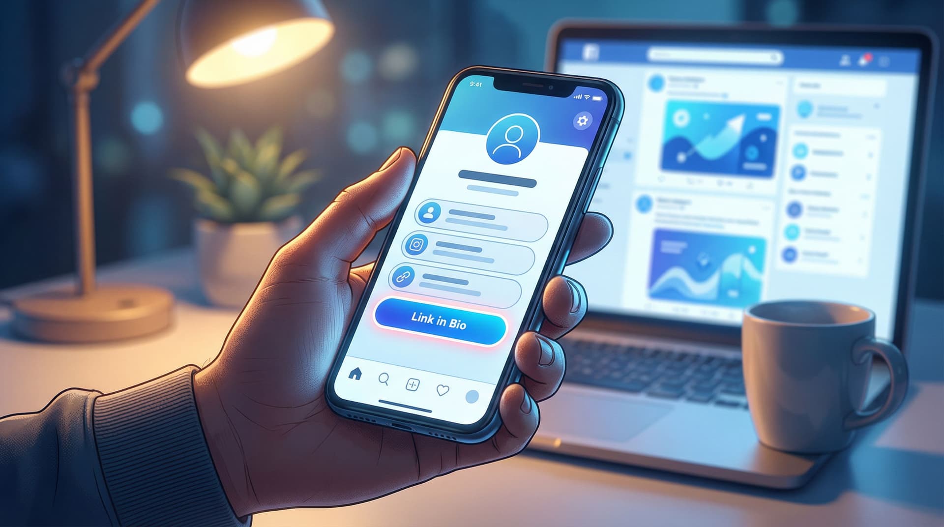
Step 2: Design for the Thumb, Not the Portfolio
Your Liinks page is not a Dribbble shot. It’s a tool.
You’re designing for:
- One thumb
- One small screen
- One distracted brain
So your design job is not “make it fancy.” It’s “make it obvious and pleasant.”
Keep the layout stupidly simple
Aim for:
- One clear header: who you are + what this page is for
- 3–7 key actions: not 23
- Logical grouping: offers together, content together, socials together
If you’re tempted to add a 12th button, you probably need a second page or a smarter structure (routes, categories, or a mini funnel). One Liinks Page, Many Personalities is a great next read for that.
Use hierarchy like a pro (without being a designer)
On Liinks, you can:
- Make some buttons bigger or more prominent
- Use sections or dividers
- Play with color contrast
Use that to create a visual “path” down the page:
- Hero button (primary action): largest, boldest, most contrasting color
- Secondary actions (2–3 max): standard buttons, still above the fold
- Nice-to-haves: smaller, lower on the page, or grouped under a label like “More from me”
If everything is loud, nothing is loud. Give your hero action VIP treatment.
Color and typography that actually help
You don’t need a brand book. You do need consistency.
- Pick 1 background color (or a subtle gradient) and stick to it.
- Use 1–2 accent colors max—for your primary button and maybe section headers.
- Match your content vibe. Cozy educator? Softer neutrals or pastels. Bold strategist? Strong contrast and clean lines. Maximalist creative? Bright, but still readable.
And please:
- Don’t put light text on a neon background.
- Don’t use five different fonts.
- Don’t make your buttons all-caps and tiny.
If you want more help turning a default template into something that actually feels like you, check out: Template to Signature Look: How to Design a Liinks Page That Feels Uniquely ‘You’ in Under an Hour.
Step 3: Write Micro-Copy That Makes People Curious, Not Confused
Doomscrolling stops when something feels specifically relevant.
Your button copy is where that happens.
Compare these:
-
Vague: “Newsletter”
-
Specific: “Get my weekly 5-minute creator income breakdown”
-
Vague: “Shop”
-
Specific: “Shop the exact tools I use in my videos”
-
Vague: “Work with me”
-
Specific: “Apply for 1:1 strategy intensives (2 spots / month)”
Notice what the better ones do:
- Hint at what you’ll get
- Hint at who it’s for
- Sometimes hint at urgency or format
A simple formula for scroll-stopping button text
Use this plug-and-play pattern:
[Verb] + [specific outcome] + [for who / in how long]
Examples:
- “Steal my content calendar (for solo creators)”
- “Book your 20-minute fit call (free)”
- “Download the client onboarding checklist (copy-paste ready)”
If you want more real-world button copy examples to swipe, you’ll love: Steal These High-Converting CTAs: Real-World Liinks Button Copy That Gets the Click.
Use your top section to set the scene
Above your buttons, add 1–2 short lines that answer:
- Who you are
- What this page is for
For example:
Creator & UGC strategist helping small brands stop posting into the void.
Start here if you’re ready for content that actually converts.
Or:
Fitness coach for busy parents who hate the gym.
Pick your next step below—quick workouts, simple meal plans, or 1:1 coaching.
That tiny bit of context is often what turns a random tap into a thoughtful click.
Step 4: Use Visual Cues to Guide the Eye (Without Overdoing It)
You’ve got a few milliseconds to direct someone’s attention. Use every tool you’ve got—subtly.
On Liinks, that can look like:
- Icons or emojis at the start of key buttons
- 💌 for your newsletter
- 🛒 for your storefront
- 🎧 for your podcast
- Spacing between sections to give the eye a break
- Section titles like:
- “Start here if you’re new”
- “My best free resources”
- “Work with me”
Think of your page like a conversation:
- “Hey, here’s who I am.”
- “If you’re new, start here.”
- “If you’re ready to go deeper, here’s how.”
If you want to go deeper on using story and layout to nudge people along without feeling pushy, read: Story-First Liinks: How to Use Micro-Copy, Emojis, and Layout to Guide Clicks Without Being Pushy.
Step 5: Make Your Page Feel Like a Safe Place to Click
Doomscrolling is fueled by low trust and low attention.
Your job is to raise both.
Build trust in 3 seconds or less
Sprinkle in tiny trust signals:
- Short social proof under a key button:
- “Trusted by 500+ newsletter subscribers”
- “Used by 200+ creators this year”
- Mini credentials in your header:
- “Ex-agency strategist turned creator coach”
- “7+ years as a registered dietitian”
- Clarity about what happens next:
- “No spam, unsubscribe anytime”
- “Takes 2 minutes to apply”
Remove friction everywhere you can
Ask yourself:
- Is every link current? (No dead freebies or expired launches.)
- Does every button lead to a mobile-friendly page?
- Are you asking people to click through four steps when it could be two?
One of the big perks of using Liinks is that it’s fast to update. Use that. Audit your page once a month and retire anything that isn’t serving your main goal.
For a deeper dive into keeping your page effective without constantly babysitting it, read: Evergreen, Not Exhausting: How to Build a Liinks Page You Barely Touch but Always Converts.
Step 6: Turn Clicks into Conversations (On Purpose)
You don’t just want clicks.
You want conversations:
- DMs from people who already understand what you do
- Replies to your newsletter from readers who feel like they know you
- Brand managers reaching out because your page made you look like a pro
Here’s how to make that happen by design.
Add conversation-friendly CTAs
Instead of:
- “Contact” → try “DM me ‘READY’ on Instagram and I’ll send details”
- “Newsletter” → try “Hit reply to the welcome email and tell me your #1 struggle”
- “Work with me” → try “Apply here—if it’s not a fit, I’ll point you to a better resource”
You’re not just asking for a click; you’re setting the tone of the interaction.
If you specifically want better client inquiries (not just more of them), check out: DMs on Autopilot: Using Liinks to Pre-Qualify Clients Before They Ever Message You.
Use your Liinks page as a conversation filter
Your page can quietly:
- Explain who you’re not for
- Share your process in 3–4 bullet points
- Answer basic questions before someone ever reaches out
For example, under a “Work with me” button, you might add:
- “Best for creators making $3k+/month who want to scale offers”
- “We meet weekly for 8 weeks; you’ll have homework”
- “If you’re brand new, start with my free course instead”
Now when someone does DM or apply, you’re already on the same page.
Step 7: Test Tiny Tweaks Instead of Rebuilding From Scratch
You don’t need to redesign your Liinks page every time you have a new idea.
Instead, run small experiments:
- Swap the hero button copy for a week
- Move your email signup higher and your shop lower
- Test a more specific CTA vs. a more playful one
Watch what happens to:
- Click-through rate on your top buttons
- Email signups or bookings
- Replies and DMs that mention your page
If you want a simple, non-overwhelming way to experiment without turning into a data goblin, read: A/B Test Your Link in Bio (Without Losing Your Mind): Simple Experiments That Actually Move the Needle.
Over time, a handful of small, thoughtful tweaks will do more for your results than one giant redesign you never quite finish.
Quick Recap: How to Turn Doomscrolls into Clicks and Conversations
Let’s bring it all together.
To design a Liinks page that makes people pause and act:
- Pick one hero action. Decide the single most important thing you want people to do.
- Design for the thumb. Simple layout, clear hierarchy, readable colors, minimal clutter.
- Upgrade your micro-copy. Use specific, curiosity-sparking button text and a clear intro.
- Guide the eye. Use icons, spacing, and section titles to create a natural path.
- Build trust fast. Add tiny proof, clarity, and low-friction experiences.
- Invite conversations. Use CTAs that encourage replies, DMs, and real interaction.
- Test small changes. Tweak one thing at a time and let the data tell you what works.
Do that, and your Liinks page stops being a static list and starts acting like a living, breathing part of your business.
Your Next Move (Yes, Right After You Finish This Scroll)
You don’t need a full rebrand, a long weekend, or a new personality.
You need 30–45 focused minutes.
Here’s a simple way to use them:
- Open your current Liinks page.
- Decide your hero action for the next 30 days.
- Rewrite your top 3 buttons using the formula:
- Verb + specific outcome + for who / in how long
- Clean out one outdated or irrelevant link.
- Add one small trust signal (social proof, clarity, or expectation-setting).
That’s it.
Those tiny changes alone can be enough to turn random doomscroll taps into intentional clicks—and the start of real conversations.
If you don’t have a page yet, or your current one looks like it was built in a hurry (because it was), you can set up a clean, on-brand hub with Liinks in under an hour.
Your content is already doing the hard work of getting attention.
Now it’s time for your bio link to actually do something with it.


