
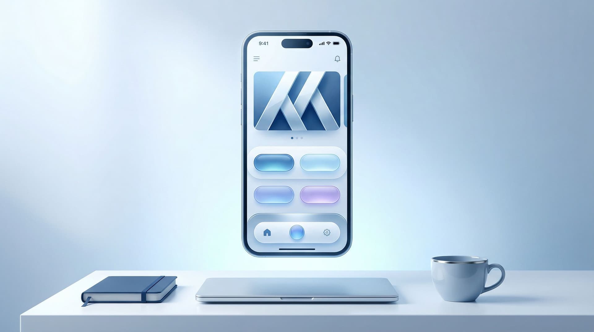
Mini Homepages, Major Results: Liinks Layouts That Replace a Full Website (Without Looking Cheap)

You do not need a five-page WordPress site, a $3k designer, and a weekend lost to template tweaking to look legit online.
You do need one thing:
A clean, on-brand, mini homepage that answers three questions in under five seconds:
- Who are you?
- What can I get from you?
- Where do I click next?
That’s exactly what a well-designed Liinks page can do—and it lives behind the same tiny “link in bio” you’re already using.
This isn’t about slapping more buttons on a generic list. We’re talking about layouts that quietly replace a full website for a lot of creators, without giving “I made this in 2012 on my lunch break.”
Let’s build you a mini homepage that:
- Looks like a real brand, not a template graveyard
- Guides people to buy, book, or subscribe without confusion
- Is fast to set up, easy to update, and doesn’t require a dev on speed dial
Why a Mini Homepage Beats a Full Site (More Often Than You Think)
Before we talk layouts, let’s be honest about why this matters.
Most creators and small businesses don’t actually need a sprawling site. They need:
- A place to send traffic from social that doesn’t make people work to find the good stuff.
- A way to collect leads and make sales without duct-taping 10 tools together.
- A page that looks professional enough for sponsors, clients, and customers to trust.
A mini homepage built on Liinks checks all three boxes:
- Speed: You can set up a polished, on-brand page in under an hour. Updating it takes minutes, not a full redesign. If you like that vibe, you’ll also love the approach in Evergreen, Not Exhausting: How to Build a Liinks Page You Barely Touch but Always Converts.
- Focus: Instead of scattering attention across 10 pages, you concentrate your best offers, content, and CTAs in one scroll.
- Conversion: A single, well-structured page often converts better than a full site because there are fewer distractions and decisions.
Is a full website ever necessary? Sure—if you’re running a complex blog, ecommerce catalog, or have lots of sub-pages. But for many creators, coaches, and service providers, a strong mini homepage is not just “good enough.” It’s smarter.
The Core Ingredients of a High-Performing Mini Homepage
No matter what layout you choose, your page needs five core elements:
-
Instant identity
A clear header that says who you are and what you do in one line. Think: “Brand photographer helping creators look expensive online,” not “Welcome to my page.” -
One primary action
The main thing you want most visitors to do: book a call, shop a collection, join your list, stream your new single. This should be visually obvious. -
Social proof
Logos, testimonials, metrics, or recognizable names that whisper, “Yes, you can trust me.” -
Clear paths for different people
New followers, warm leads, and superfans are not here for the same thing. Your layout should give each of them a path. (If you want to go deeper on that, read One Liinks Page, Many Personalities: How to Create Custom Experiences for Different Audiences.) -
Strong visual hierarchy
Bigger, bolder, higher = more important. Your design should make it painfully obvious what matters most.
Once those are in place, you can choose a layout that fits how you actually work.
Layout #1: The “Hero + Two Roads” Mini Homepage
Best for: Creators with one main offer and a strong content ecosystem (newsletter, YouTube, podcast, etc.).
Goal: Make it extremely easy to either (1) buy/book, or (2) go deeper into your world.
Structure:
-
Hero section (top of page)
- Your name or brand
- One-line positioning statement
- A single bold primary button (e.g., “Book a Brand Shoot”, “Join the Membership”, “Shop My Presets”)
-
Two clear paths underneath
- Path A: For people ready to take action
- Path B: For people who need more context
On Liinks, that might look like:
- A hero block with your cover image, name, and short description
- A large, styled button for your main offer
- Two grouped sections:
- “Work with me” – links to services, pricing, application, or booking
- “Get to know me” – links to your best intro content (YouTube playlist, “start here” newsletter, top performing posts)
Why it works:
- People who are already sold don’t have to scroll through your life story.
- People who are curious but not ready get a curated path instead of a dumping ground of links.
- It mirrors the “smart routing” idea we talk about in Stop Sending Everyone to the Same Page: Smart Liinks Routes for New vs. Super-Fans without needing multiple pages.
How to build it step-by-step:
-
Write your hero line.
Use this fill-in-the-blank:
I help [who] get [result] through [what you do].
Example: “I help busy founders turn chaotic content into clean, high-converting funnels.” -
Choose your primary CTA.
Ask: if someone only clicked one thing on this page, what would you want it to be? That’s your hero button. -
Curate 3–5 “Work with me” links.
- Services overview or sales page
- “Start here” offer (entry-level product, discovery call, or main package)
- Application or calendar link
-
Curate 3–5 “Get to know me” links.
- Best-performing YouTube video or playlist
- Intro episode of your podcast
- “New here?” blog or newsletter opt-in
- A “Start here” content bundle
-
Style with intention.
- Use one accent color for your primary CTA.
- Use a softer color or outline style for secondary links.
- Keep fonts consistent with your social content so the transition feels seamless.
Layout #2: The “Service Studio” That Replaces a Portfolio Site
Best for: Designers, photographers, strategists, coaches, and other service pros who want to book clients without a full-blown site.
Goal: Make it ridiculously easy for someone to understand what you offer, see proof, and book.
Structure:
-
Hero with positioning + primary CTA
Example: “Brand + web designer for bold, personality-driven businesses.”
Button: “View Packages & Pricing” or “Apply to Work Together”. -
Snapshot services menu
Use Liinks blocks to create a clean “menu”:- Brand Identity – from $X
- VIP Design Day – from $X
- Website Glow-Up – from $X
-
Mini portfolio section
- 3–6 featured projects with short captions and links to case studies, Google Drive portfolios, or Instagram carousels.
-
Social proof strip
- Client logos, a short testimonial, or quick stats (“Over 120+ brands designed since 2020”).
-
Booking & FAQ
- Button to your intake form or scheduler
- A short FAQ block addressing timelines, pricing ranges, and process
Why it works:
- Feels like a simple, modern portfolio site—but you built it on Liinks, not Webflow.
- Perfect for clients who clicked from Instagram or TikTok and want to decide fast.
- You can update offers, pricing ranges, or featured work in minutes.
How to build it step-by-step:
-
Map your client journey.
Ask: what does a cold lead need to see before they’ll book a call? Usually it’s:- What you do
- Who you do it for
- Rough investment
- Examples of results
- How to get started
-
Turn that into sections.
In Liinks, use headings to label sections and order them like this:- About / positioning
- Services snapshot
- Featured work
- Social proof
- Book / Apply
-
Create “expandable” links for depth.
Not everything has to live on this page. Use links to: -
Add friction where you want better leads.
For higher-ticket offers, don’t just drop your email. Link to an application form with questions that pre-qualify people. If you want to go deeper on pre-qualifying, read DMs on Autopilot: Using Liinks to Pre-Qualify Clients Before They Ever Message You.
Layout #3: The “Pop-Up Shop” Storefront
Best for: Product creators, influencers with affiliate income, and anyone who wants to turn content into sales without a full ecommerce build.
Goal: Turn your Liinks page into a lightweight storefront that feels intentional, not like a chaotic list of product URLs.
Structure:
-
Hero with clear promise
Example: “Curated tools, templates, and products I actually use.”
Button: “Shop All Favorites”. -
Category rows
Group products into 3–5 sections:- My Products (courses, templates, presets, digital downloads)
- Daily Tools (apps, software, subscriptions – affiliate links welcome)
- Creator Gear (camera, lighting, mics)
- Beauty / Lifestyle (if relevant to your brand)
-
Featured collection
A spotlight row at the top for:- A new product launch
- A seasonal collection
- A best-sellers bundle
-
Social proof & urgency
- “Trusted by 3,000+ students”
- “Used to create 500+ client campaigns”
- “Limited drop – closes Sunday”
-
Email or SMS capture
- A single block that says: “Want first dibs on drops and discounts? Join the list.”
How to build it step-by-step:
-
Audit your offers and links.
Gather all product links, affiliate URLs, and discount codes in one doc. -
Decide your top 1–2 outcomes.
- More sales of your products? Put those first.
- More affiliate revenue? Feature those in prime spots, but still label clearly.
-
Design your category sections.
Use headings and consistent button styles. For example:- Solid buttons for your own products
- Outline or secondary color buttons for affiliate items
-
Add context, not clutter.
Under each item, use a short line of copy:- “The exact mic I use for all my Reels.”
- “My go-to template for client onboarding.”
- “The planner that finally made me stick to a content schedule.”
-
Test and refine.
Track which buttons get the most clicks and move them higher. If you’re into simple experiments, you’ll like A/B Test Your Link in Bio (Without Losing Your Mind): Simple Experiments That Actually Move the Needle.
Design Moves That Keep Your Mini Homepage From Looking Cheap
A layout can be perfect on paper and still feel off if the design screams “default template.” A few small choices make a big difference.
1. Commit to a color story
- Pick one primary color, one neutral, and one accent. That’s it.
- Match them to the colors you already use in your content (profile pic, thumbnails, Reels covers).
- Use the primary color only for your most important CTAs.
2. Use hierarchy like a pro
Ask yourself: if someone only glanced for 2 seconds, what would they notice?
- Make your main CTA button larger and more saturated.
- Use headings to break up sections every 2–4 links.
- Add subtle spacing between sections so the page can “breathe.”
If you want a deeper design walkthrough, bookmark Design-First Link in Bio: How to Build a Stunning Liinks Page That Actually Converts.
3. Keep copy tight and specific
Each button should answer: What happens if I tap this?
Bad:
- “Learn more”
- “Click here”
- “New link”
Better:
- “Book a 30-min strategy call”
- “Download the Notion content planner”
- “Watch my YouTube starter playlist”
4. Use visuals intentionally
- Add a single, strong profile image or brand mark at the top.
- Avoid cluttering the page with random emojis and graphics unless they’re part of your brand.
- If you use backgrounds, keep them subtle so text stays readable.
5. Make it mobile-first (for real)
Most people hit your Liinks page from a phone.
- Preview your page on mobile as you build.
- Keep important CTAs above the first scroll.
- Avoid long paragraphs—break text into lines and bullets.
What to Put Above vs. Below the Fold
You don’t control screen sizes, but you can control what people see first.
Above the fold (no scrolling yet):
- Your name / brand
- One-line positioning
- Primary CTA button
- Optional: one secondary CTA (max)
First scroll:
- Clear paths for different visitor types (Work with me / Start here / Shop favorites)
- Short explanation or context where needed
Lower on the page:
- Deeper resources (full resource library, old freebies, secondary offers)
- Long-form about section
- Detailed FAQs
If something is mission-critical and it’s currently living near the bottom? Move it up.
Common Mini Homepage Mistakes (and Easy Fixes)
Mistake #1: Treating it like a link dump
Fix: Curate 5–9 core links. Archive or hide the rest. You can always rotate seasonal or campaign-specific items in and out.
Mistake #2: No clear “main thing”
Fix: Decide your primary outcome for the next 30–90 days (book clients, grow email list, sell a product) and make that the hero CTA.
Mistake #3: Same experience for everyone
Fix: Add at least two labeled paths like “New here?” and “Already a fan?” so people can self-select.
Mistake #4: Inconsistent branding
Fix: Match colors, fonts, and tone to your social content. Your Liinks page should feel like stepping into the same universe, not a different planet.
Mistake #5: Never updating anything
Fix: Set a 15-minute monthly check-in to:
- Swap in your current main offer
- Retire expired promos
- Move top performers higher
Quick Start: Build Your Mini Homepage in 30 Minutes
If you’re itching to start but don’t want to overthink it, here’s a simple sprint plan:
Minute 0–5: Clarify your goal
Pick one:
- Get more client inquiries
- Sell more of a specific product
- Grow your email list
Minute 5–10: Draft your hero
- One-line identity statement
- One primary button that supports your goal
Minute 10–20: Curate your sections
Create 2–3 sections like:
- Work with me
- Start here
- Shop my favorites
- For brands & collabs
Add 2–4 links per section, max.
Minute 20–30: Polish the design
- Choose your colors and fonts
- Adjust spacing and order (most important things first)
- Preview on mobile and remove anything that feels extra
Hit publish. You can refine later.
Wrapping It Up
A mini homepage built on Liinks can:
- Replace a full website for many creators and service providers
- Make you look polished and professional to brands, clients, and customers
- Turn casual profile taps into real actions—bookings, sales, signups
You don’t need more pages. You need one intentional page that:
- Tells people who you are and what you do in a sentence
- Gives different types of visitors a clear next step
- Looks like you actually thought about design (because you did)
Your Next Move
If your current bio link is a list of random URLs, you’re leaving clicks—and money—on the table.
Here’s your simple next step:
- Sign into Liinks (or create a free account).
- Pick one of the layouts from this post—“Hero + Two Roads,” “Service Studio,” or “Pop-Up Shop.”
- Spend 30 minutes turning it into your mini homepage.
Your followers are already tapping your bio link. Time to give them a page that looks and behaves like the homepage your brand deserves—without the headache of a full website build.


