Story-First Liinks: How to Use Micro-Copy, Emojis, and Layout to Guide Clicks Without Being Pushy

Your link in bio is not a menu.
It’s a tiny, scroll-sized story.
People tap it with one thumb, give you a couple seconds of attention, and silently ask:
- Who are you, really?
- What’s actually here for me?
- Where should I go next?
If your page answers those questions clearly and quickly, they click. If it doesn’t, they bounce.
This is where story-first thinking comes in.
Instead of treating your Liinks page like a list of random URLs, you treat it like a mini narrative that gently guides people from curiosity → clarity → action.
And you do it with three underrated tools:
- Micro-copy (the tiny bits of text around your buttons)
- Emojis (visual cues that act like neon arrows for the brain)
- Layout (the order, grouping, and spacing of everything on the page)
Let’s turn your link in bio into a story people want to follow—without you ever sounding pushy, salesy, or like you’re yelling at them in all caps.
Why Story-First Beats “Here’s Everything I Do”
Most creators and small businesses accidentally build junk drawer Liinks pages:
- 14+ links
- No clear priority
- Buttons named “Blog” and “Shop” and “Freebie” (helpful…ish?)
- Zero sense of what to click first
The problem isn’t that you have too many things. It’s that there’s no story.
A story-first page does three things really well:
-
Sets the scene
A clear headline and short intro tell visitors who you are and what this page is for. -
Guides the eye
Layout, emojis, and section labels show people where to start and what’s most important. -
Removes friction
Micro-copy answers objections and questions before someone hesitates.
If you’ve already built a more evergreen setup, this will feel familiar. Think of this as the “narrative layer” on top of your always-on hub. (If you haven’t yet, bookmark Evergreen, Not Exhausting: How to Build a Liinks Page You Barely Touch but Always Converts for later.)
Step 1: Decide the Story Your Liinks Page Should Tell
You don’t need a 3-act screenplay. You just need to answer:
What’s the one main outcome I want most visitors to reach?
Examples:
- “Join my newsletter so I can nurture them long-term.”
- “Get them to my primary offer (course, shop, service).”
- “Help new followers binge my best content and become fans.”
Then add two supporting outcomes max:
- Secondary: “Show my portfolio / case studies.”
- Tertiary: “Give them a low-friction free resource.”
Everything else? Nice-to-have, not the main storyline.
Quick exercise (2 minutes):
- Open your current Liinks page.
- Write down every link you have.
- Label each one as:
- Main story (direct path to your #1 outcome)
- Supporting (helps nurture, educate, or qualify)
- Background (nice-to-have, but not essential)
- Commit: Only main + supporting get prime real estate.
You can always tuck background links lower on the page or group them in a “More from me” section.
Step 2: Use Micro-Copy to Answer Questions Before People Ask
Micro-copy is the tiny text that lives:
- Above your buttons
- Under your headline
- As 1-line descriptions below links
- In small labels like “Start here” or “Most popular”
These small phrases do a lot of heavy lifting:
- Lower anxiety: “No spam, unsubscribe anytime.”
- Clarify value: “Free 15-page guide for new creators.”
- Add urgency (without yelling): “New cohort starts January 15.”
Where to Add Micro-Copy on Your Liinks Page
-
Headline + subheading
- Headline: Who you are / what you do in plain language.
- Subheading: What this page helps them do.
Examples:
- Headline: Helping creators turn content into clients
Subheading: Start with the free roadmap or jump straight to my 1:1 services. - Headline: Illustrator & merch designer for indie brands
Subheading: Browse my latest drops or hire me for your next launch.
-
Section labels Use tiny headers above groups of links to orient people:
- “👋 New here? Start with these”
- “🔥 Most-loved resources”
- “💼 Ready to work together?”
-
1-line link descriptions Under each key link, add a short line that answers: What is this, and who is it for?
- “Free 3-part email series for beginner coaches.”
- “30-minute strategy call to clarify your offer and next steps.”
- “My weekly newsletter with behind-the-scenes breakdowns and templates.”
-
Tiny trust builders Drop these near high-commitment actions (booking, buying, subscribing):
- “Takes 30 seconds to sign up.”
- “No credit card required.”
- “You’ll see available times in your own time zone.”
On Liinks, this is as simple as editing your button labels and descriptions and adding short text blocks between sections.
Step 3: Let Emojis Do the Visual Heavy Lifting
Emojis aren’t just “fun.” They’re fast.
Our brains process visuals quicker than text, so a well-placed emoji:
- Makes scanning easier
- Signals priority
- Sets tone (playful, professional, cozy, bold)
Used well, they guide attention. Used poorly, they look like a confetti cannon went off in your buttons.
Simple Emoji Rules for a Story-First Page
1. Assign one emoji per pillar
If your page is built around 3–4 content or offer pillars, give each pillar a visual anchor:
- Education / tutorials: 🎓 or 📚
- Services / booking: 💼 or 📅
- Shop / products: 🛒 or 🛍️
- Newsletter / community: ✉️ or 🌱
- Free resources: 🎁 or ⭐
Then keep those consistent across:
- Section headers
- Button labels
- Link descriptions (sparingly)
This ties in nicely with building around content pillars; if you haven’t structured your page that way yet, check out Content Pillars to Clicks: Structuring Your Liinks Page Around What Your Audience Actually Wants.
2. Use emojis as signposts, not decoration
Good:
- “🎁 Free Notion template for content planning”
- “💼 Apply for 1:1 coaching”
- “📅 Book a 20-minute intro call”
Messy:
- “🔥🎉💥 My course is LIVE 😍✨”
Aim for 1 emoji per line, max 2 if it’s really intentional.
3. Match emoji energy to your brand
If your content is calm, strategic, or luxury-leaning, go subtle:
- ✨, 📌, 📈, 🕯️, 🖋️
If your brand is loud, playful, or chaotic-good:
- 💥, 😈, 🌈, 🤸, 🪩
The goal is consistency. Your Liinks page should feel like your Reels, posts, or videos.
4. Use emojis to hint at action
- Arrows for primary actions: 👉, ➡️, ⬇️
- Time-sensitive items: ⏰, 📆
- “Best choice” cues: ⭐, 🔥, 💎
Example:
- “⭐ Start here: Free 5-day email challenge”
- “⏰ Limited spots: Q1 strategy intensive”
Step 4: Design a Layout That Feels Like a Guided Path
Layout is where story-first thinking really shows up.
Instead of stacking links randomly, you’re building a path:
- Who you are
- Where new people should start
- Where ready-to-buy people should go
- What else they can explore if they’re curious
On Liinks, you can do this with:
- Section headings
- Spacing and dividers
- Button styles (primary vs secondary)
- Background and accent colors
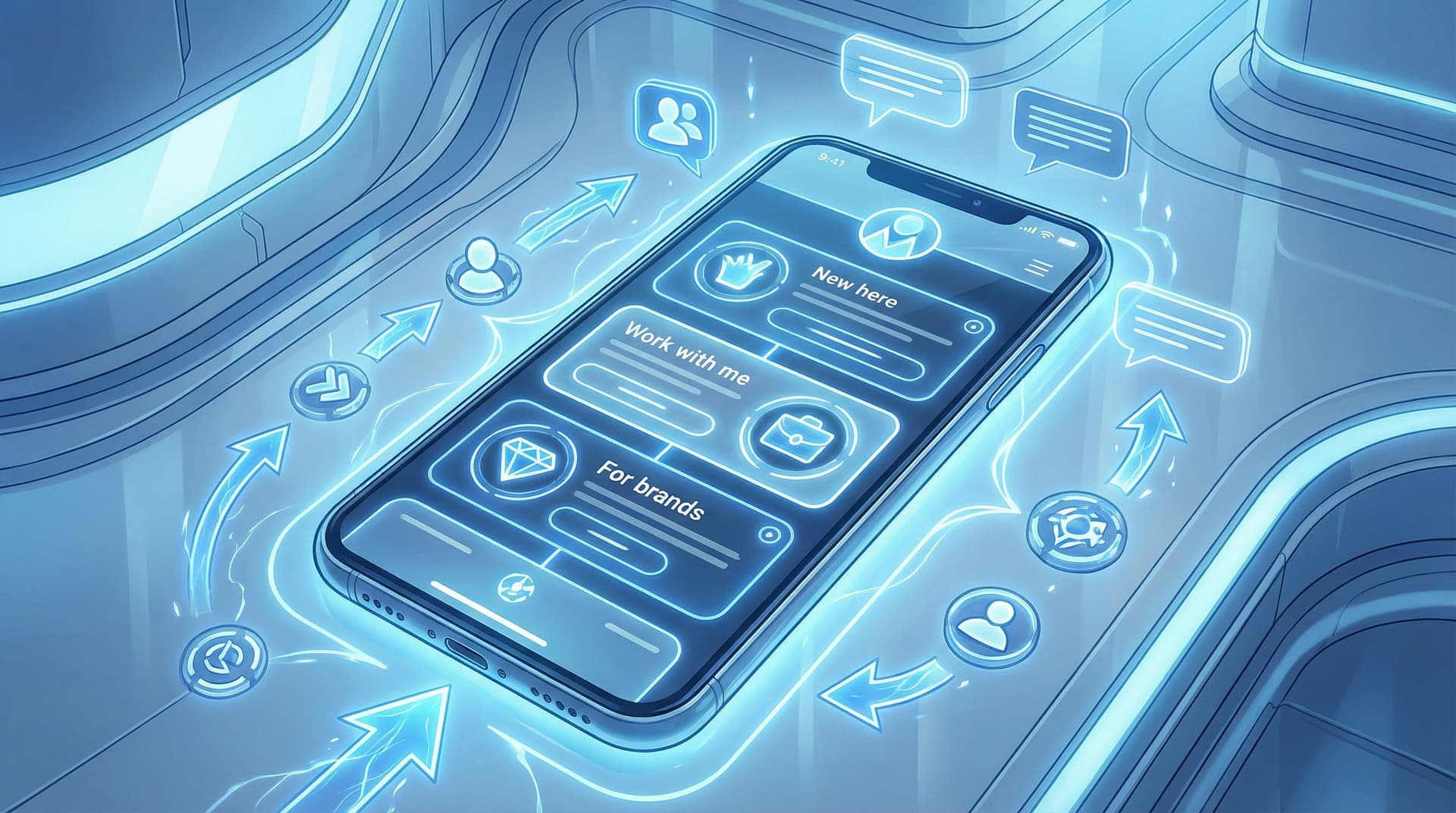
A Simple, High-Converting Layout You Can Steal
Top section: Identity + promise (0–1 scrolls)
- Profile image or logo
- Headline: clear, benefit-focused
- Subheading: what this page helps them do
Section 1: “Start here” for new people
Label: “👋 New here? Start with these”
Include 2–3 links max:
- “⭐ Start here: Free workshop / guide / playlist”
Short description: ‘Perfect if you’re new to [your niche].’ - “🎧 Binge my most popular content”
Link to a playlist, blog category, or YouTube series. - Optional: “✉️ Join the weekly newsletter”
Short description: ‘1 email per week, no fluff.’
Section 2: Main offer / primary action
Label: “💼 Work with me” or “🛍️ Shop my favorites”
- 1–3 links that directly support your main outcome.
- Use micro-copy like “Perfect if…” or “Best for…” under each.
Example for a service provider:
- “💼 Apply for 1:1 coaching”
For creators ready to turn content into consistent clients. - “📅 Book a single strategy session”
One-time call to fix your offer, pricing, or messaging.
Section 3: Social proof & depth
Label: “📌 Proof & receipts” or “✨ Client results”
- Case studies, testimonials, media features, or portfolio.
- This is where story-first layout quietly builds trust without you saying, “Trust me.”
Section 4: Everything else (aka the library)
Label: “📚 More from me”
- Podcast, blog, secondary socials, affiliate links, etc.
- Smaller buttons, lighter styling, or grouped links.
This structure works especially well if you’re using your Liinks page as a mini website or portfolio. If that’s your goal, you’ll love From Feed to Portfolio: Turning Your Liinks Page into a Mini Website That Actually Books Clients.
Step 5: Make Your CTAs Conversational, Not Bossy
You can guide people strongly without sounding like a pushy pop-up.
The trick: write your calls to action like you’re talking to one person who already likes you.
Swap These Common CTAs for Story-First Ones
Instead of:
- “Subscribe” → “Get the weekly breakdowns”
- “Learn more” → “See what’s inside the course”
- “Shop now” → “Browse the new collection”
- “Book call” → “Save your spot for a strategy session”
- “Download” → “Grab the free checklist”
Notice how the second version:
- Feels like a natural next step in a story
- Describes what happens after the click
- Sounds like a human, not a button robot
Add Context in the Line Below
For high-commitment actions, use that 1-line description to lower the stakes:
- “Takes 2 minutes, no hard pitch on the call.”
- “Instant access, watch on your own time.”
- “Free guide, no email required.”
You’re not just saying what to do—you’re explaining why it’s safe, useful, and worth their thumb tap.
If you want more word-for-word inspiration, pair this article with Steal These High-Converting CTAs: Real-World Liinks Button Copy That Gets the Click.
Step 6: Test Tiny Tweaks, Not Total Overhauls
You don’t need to redesign your Liinks page every week. But you should treat your story like a living thing.
Instead of blowing it up every time you launch something new, try:
-
One headline tweak at a time
Change your main headline and watch what happens to overall clicks. -
One CTA experiment per month
Swap “Join the newsletter” for “Get the weekly breakdowns” and compare signups. -
One layout shift per quarter
Move your main offer above or below your freebie and see which order converts better.
Inside Liinks, your analytics make this easy to track without needing a PhD in dashboards. If numbers usually make you want to close your laptop, bookmark Analytics Without the Headache: The Only Liinks Metrics Creators Actually Need to Track for a simple breakdown.
What to watch:
- Top clicked link: Is it the thing you want people to click most?
- Click-through rate on key buttons: Are your primary CTAs pulling their weight?
- Drop-off on long scrolls: Are people actually reaching the stuff you buried at the bottom?
If the data doesn’t match the story you thought you were telling, adjust the story—not your entire business.
Quick Checklist: Your Story-First Liinks Tune-Up
Open your Liinks page and run through this list:
- [ ] Clear main outcome: I know the #1 thing I want most visitors to do.
- [ ] Headline with a promise: My top text says who I am and how I help.
- [ ] New here? path: There’s a small section just for new followers.
- [ ] Primary offer path: My main offer or action is above the fold or close.
- [ ] Micro-copy everywhere it matters: Key links have 1-line descriptions.
- [ ] Emoji consistency: 1 emoji per pillar, used as signposts, not confetti.
- [ ] Visual hierarchy: Primary actions are more prominent than background links.
- [ ] Conversational CTAs: Buttons sound like me, not like default UI text.
- [ ] No clutter at the top: The first screen isn’t a wall of fifteen buttons.
If you can tick most of these, your page is already doing more guided storytelling than 90% of bios out there.
Bringing It All Together
A story-first Liinks page doesn’t shout.
It:
- Greets people like a host, not a hallway of doors
- Uses tiny phrases and emojis to quietly steer attention
- Makes your most important action feel obvious, not forced
- Gives new followers a clear “start here” moment
You’re not manipulating people into clicking. You’re simply making the right click the easiest, clearest, and most natural next step.
Your Next Step (Because of Course There Is One)
You don’t need a weekend. You need 20 focused minutes.
Here’s your mini sprint:
- Open your existing Liinks page (or create one if you haven’t yet).
- Rewrite your headline + subheading to reflect the story you want to tell.
- Add a “New here? Start with these” section with 2–3 links.
- Highlight one primary offer and give it:
- A strong, conversational CTA
- A 1-line description that says who it’s for
- Clean up the rest: group background links under a “More from me” section.
Hit save. That’s it.
You can refine the details over time, but once your page tells a clear story, every “link in bio” mention you post is pointing to a place that’s actually ready for the traffic.
And if you want a link in bio that not only looks good but makes this kind of storytelling ridiculously easy to update, go spin up or refresh your page on Liinks. Your future self (and your click-through rate) will be very into it.


