
From Feed to Portfolio: Turning Your Liinks Page into a Mini Website That Actually Books Clients

You’ve done the hard part: you’re creating content, showing up on social, and getting profile visits.
But if you offer services or done-for-you work, there’s a big question hanging in the air:
Can someone go from “I like this creator” to “I’m ready to hire them” using nothing but your bio link?
They can—if your link in bio isn’t just a menu of links, but a mini website-level portfolio that makes it easy to trust you, understand your offers, and take the next step.
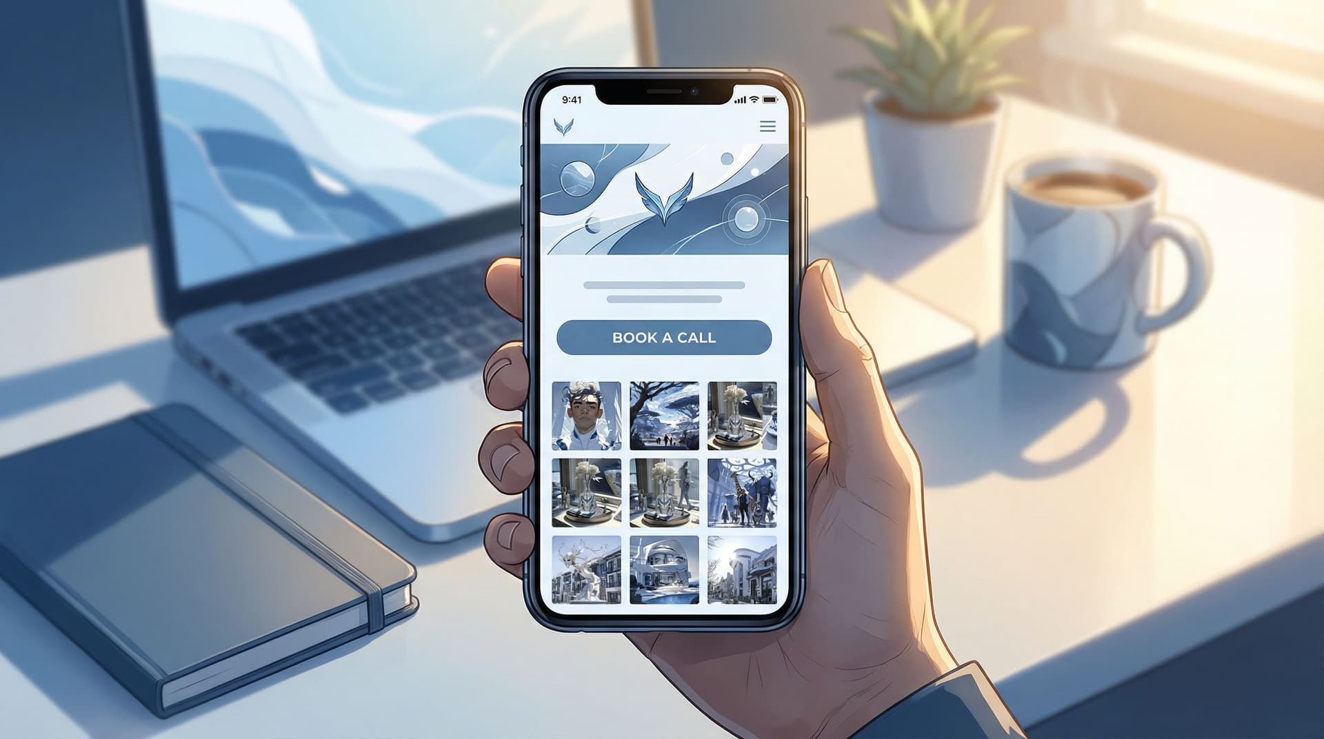
That’s exactly what you can build with Liinks: a flexible, fully customizable link in bio tool built for creators who want their page to actually look good and work like a lean, focused website.
In this guide, we’ll walk through how to transform your Liinks page from “link holder” into a client-booking micro site—no developer, no full website redesign, no 40-tab tech stack.
Why Turning Your Bio Link into a Mini Website Matters for Client Work
If you offer services—coaching, design, photography, consulting, editing, UGC, you name it—your social content is doing three things:
- Attracting attention (views, likes, saves)
- Building interest (follows, profile visits)
- Creating intent (clicks on your bio link)
But that last step is where many creators lose people.
Instead of landing on a clear, focused portfolio-style experience, visitors often see:
- A cluttered list of random links
- Outdated offers mixed with current ones
- No obvious “work with me” path
- Confusing navigation back to social
When that happens, people bounce—not because they don’t like you, but because you made them think too hard.
A mini website-style Liinks page fixes that by:
- Acting like a homepage for your services, even if you don’t have a full site yet
- Showing proof (portfolio, testimonials, case studies) right where people already are
- Shortening the path from social feed → portfolio → inquiry or booking
- Letting you iterate quickly—you can update copy, offers, and layout in minutes
If you’ve already laid the groundwork with content strategy, you’re halfway there. Posts like Content Pillars to Clicks: Structuring Your Liinks Page Around What Your Audience Actually Wants can help you clarify what belongs on the page. This post is about how to arrange it so it behaves like a portfolio that quietly sells for you.
Step 1: Decide the One Job Your Page Should Do
A mini website that books clients is single-minded.
Before you touch design or copy, answer this:
If someone clicks your bio link ready to take action, what’s the one outcome you want?
For service-based creators, that’s usually one of these:
- Book a discovery call
- Submit a project inquiry form
- Purchase a service package directly (e.g., VIP day, audit, template setup)
Everything else on your Liinks page should support that primary outcome.
To clarify the job of your page, write a simple sentence:
- “This page exists to turn interested followers into [discovery calls / project inquiries / booked packages].”
Keep this sentence visible while you build. If a section, link, or button doesn’t support that goal, it’s either:
- Removed
- Moved lower on the page
- Combined into something more focused
If you want to go deeper on creating a conversion-focused flow from content to clicks, pair this with From One Link to a Full Funnel: Turning Your Liinks Page into a 24/7 Sales Machine.
Step 2: Treat the Top of Your Page Like a Homepage Hero
The first screen of your Liinks page should answer three questions instantly:
- Who are you?
- What do you do?
- What should I do next?
Think of this like a homepage hero section—just compressed for mobile.
What to include above the fold
- Brand photo or logo – A clean headshot, brand mark, or on-brand image
- Clear headline – One line that says who you are and who you help
- “Brand designer for wellness founders ready to look premium.”
- “Short-form video editor helping coaches repurpose content into clients.”
- Short subheading – One sentence that hints at your value or method
- “Done-for-you design, simple packages, and a process that respects your time.”
- Primary CTA button – This is critical. Examples:
- “Apply to work with me”
- “Book a free consult”
- “View service packages”
If someone never scrolls, they should still know what you offer and how to move forward.
Step 3: Curate a Portfolio That Loads Fast and Feels Real
Your audience doesn’t need every project you’ve ever done. They need the right few examples that prove you can deliver the result they care about.
Choose 3–6 strong portfolio highlights
For each offer, pick pieces that:
- Match the type of client you want more of
- Show a clear “before and after” or transformation
- Are visually scannable on mobile
Depending on your niche, this might look like:
- Designers: carousel of brand boards, logos, or mockups
- Photographers: a few standout images per niche (brands, portraits, weddings)
- Coaches/consultants: client milestones, screenshots, or brief case studies
- Editors/UGC creators: embedded video clips or links to live posts
Structure portfolio sections on your Liinks page
Use blocks or sections to create a rhythm:
- Section title – e.g., “Client Work” or “Recent Projects”
- Short intro – 1–2 lines explaining what you specialize in
- Individual project cards that include:
- Project name or client type
- 1–2 screenshots or images
- One-sentence result (ideally with a metric)
- Optional link to a deeper case study or live example
Example project blurb:
“Rebrand for a nutrition coach: new visual identity, social templates, and sales page design. Result: 2.3x launch revenue vs. previous cohort.”
Make it easy to skim
- Use consistent formatting for every project
- Lead with outcomes, not just aesthetics
- Keep text tight—people are on their phone, likely between tasks
If you’re already using content like carousels or Reels to show your work, you can connect those directly. For more on turning social proof into sales, check out Carousel to Checkout: Turning Instagram Posts into Sales with a High-Converting Liinks Page.
Step 4: Turn Your Services into Simple, Shoppable Packages
Clients don’t want to decode a vague “DM me for rates” situation.
Your mini website should present your services like clear, easy-to-understand packages—even if you still customize behind the scenes.
Build 2–4 core offers
Aim for a small, focused menu. For each offer, include:
- Offer name – Something descriptive, not clever
- “Brand Essentials Package”
- “Monthly Short-Form Video Editing”
- Who it’s for – A single sentence
- “Perfect for coaches launching a new group program.”
- What’s included – 3–6 bullet points
- Timeline – How long it usually takes
- Starting price or price range – Even a range filters and qualifies leads
- Primary CTA – e.g., “Apply for this package” or “Book a consult about this offer”
Connect packages to frictionless next steps
Your Liinks page can link directly to:
- A booking tool like Calendly or Acuity Scheduling
- A short, embedded or linked intake form (e.g., Tally, Typeform, Google Forms)
- A checkout page for fixed-price services (e.g., Stripe Payment Links, ThriveCart, Lemon Squeezy)
The goal: no one should have to guess how to hire you. Every service block ends with a clear button that leads to a concrete action.
Step 5: Add Proof: Testimonials, Logos, and Quick Wins
People book when they feel safe.
Social content builds familiarity; your mini website builds confidence.
Layer in different types of proof
On your Liinks page, mix and match:
- Short testimonials (1–3 sentences)
- Client logos or brand names (if allowed)
- Screenshots of DMs, emails, or comments
- Mini case studies (2–3 bullet points summarizing the situation and result)
Keep it scannable:
- Use bolded phrases to highlight key outcomes
- Group testimonials under a heading like “Results Clients See”
Example testimonial block:
“Working with Taylor was the best investment we made this year. Our launch felt organized, our visuals finally match our prices, and we booked out our program in 10 days.”
– Jordan, business coach
Place your strongest proof near your CTAs—right above or below your “Book a Call” or “Apply to Work With Me” buttons.
Step 6: Remove Friction with Smart FAQs
A good FAQ section can quietly answer objections and reduce back-and-forth DMs.
Think about what people usually ask before they’re ready to book:
- “What are your prices?”
- “What’s your turnaround time?”
- “How does payment work?”
- “What if I’m not sure which package I need?”
Turn those into 4–6 concise Q&As.
Example:
Q: I’m not sure which package is right for me. Where should I start?
A: Book a free 15-minute fit check call and we’ll walk through your goals together. If I’m not the right fit, I’ll point you to a better option—no pressure.
You can link directly from an FAQ answer to your primary CTA button or booking link.
Step 7: Design It Like a Real Site (Without Overcomplicating It)
You don’t need a full-blown web design process, but you do need your Liinks page to feel cohesive and intentional.
A few design principles go a long way:
- One or two brand colors – Use them for buttons and section headers
- Readable fonts – Prioritize legibility over flair
- Consistent spacing – Give each section breathing room
- Visual hierarchy – Bigger text for headlines, medium for subheads, small for body
If you want a deeper dive into layout and visual decisions, bookmark Design-First Link in Bio: How to Build a Stunning Liinks Page That Actually Converts.
Mobile-first checks
Most people will view your mini website on their phone. Before you call it done, test:
- Thumb reach – Are your main buttons easy to tap?
- Scroll fatigue – Does it feel endless, or does each section earn its space?
- Load time – Are your images optimized and not slowing things down?
If you have a friend or peer in your niche, ask them to:
- Open your Liinks page on their phone
- Narrate what they think you do
- Try to book a call or submit an inquiry
Anywhere they hesitate is a spot to simplify.
Step 8: Connect Your Content to Specific Sections
Your mini website isn’t just a static portfolio—it should be tightly woven into your content.
Whenever you post:
-
Tutorial or educational content?
Link to a relevant package or case study section. -
Before/after transformation?
Link to the portfolio block that shows that exact type of work. -
Launch or promo?
Temporarily move that offer higher on your Liinks page or spotlight it with a banner.
You can:
- Use section titles that match phrases you use in your content (e.g., “Rebrand in a Week VIP Day”)
- Update button text to mirror your CTAs in Stories and captions
If you run seasonal offers—holiday shoots, end-of-year audits, limited-time retainers—pair this strategy with the ideas in Seasonal Campaigns with Liinks: Simple Link-in-Bio Swaps that Drive Holiday Revenue.
Step 9: Add a Soft Next Step for “Not Yet” Visitors
Not everyone who lands on your mini website is ready to book today. That doesn’t mean they’re a lost cause.
Give them a low-commitment next step so they stay in your world:
- Email newsletter signup
- Free resource or mini guide
- Template, checklist, or training
Place this below your primary service and portfolio sections, framed as:
“Not ready to book yet? Start here.”
This way, your page serves two types of visitors:
- Ready now → book, inquire, or buy
- Soon → join your list or grab a resource
Pair this with a simple nurture sequence, and your Liinks page becomes both a portfolio and a quiet lead engine.
Step 10: Review Your Page Like a Potential Client
Finally, zoom out.
Open your Liinks page and walk through it as if you were your ideal client who just discovered you on Instagram, TikTok, or YouTube.
Ask yourself:
- Do I know within 3 seconds what this person does and who they help?
- Can I see real proof they’ve done this before?
- Is there one obvious button that tells me what to do next?
- Does anything feel confusing, repetitive, or unnecessary?
If you want a quick checklist, here’s a simple one:
Your mini website is ready to book clients when:
- The top of the page clearly states who you are and what you do
- There’s one primary CTA above the fold
- You showcase 3–6 relevant portfolio pieces
- Services are packaged with clear bullets and starting prices
- There’s visible social proof (testimonials, logos, results)
- FAQs handle the most common objections
- There’s a soft next step for “not yet” visitors
- The design feels cohesive and easy to skim on mobile
Quick Recap
Turning your Liinks page into a mini website that actually books clients isn’t about adding more stuff—it’s about being intentional with what’s already working.
You learned how to:
- Give your page a single clear job (book calls, collect inquiries, or sell packages)
- Design the top of your page like a homepage hero with a strong headline and CTA
- Curate a tight, relevant portfolio instead of a giant gallery
- Turn your services into simple, shoppable packages with direct next steps
- Layer in proof and FAQs to reduce hesitation
- Use clean, consistent design so your page feels like a real site
- Connect your content directly to specific sections of your page
- Offer a low-commitment next step for visitors who aren’t ready yet
When you put all of this together, your bio link stops being “just a link” and starts behaving like a lean, focused website that works quietly in the background every time someone clicks.
Your Next Step
You don’t need a full rebrand or a massive website build to start booking more clients.
You just need one focused, well-designed page.
Here’s your simple starting plan:
- Log into Liinks or create your account.
- Rewrite your headline and add a single primary CTA at the top of your page.
- Add 3 portfolio pieces and 2 core service packages—even if they’re rough drafts.
- Link your main CTA button to a booking tool or inquiry form.
You can refine, polish, and optimize over time. What matters most is that someone who clicks your bio link today can see what you do, trust that you’re good at it, and know exactly how to hire you.
Turn your feed into a funnel, your Liinks page into a mini website, and your profile visitors into booked-out weeks.


