
Carousel to Checkout: Turning Instagram Posts into Sales with a High-Converting Liinks Page

You’ve got the content part down.
Your carousels are getting saves, your Reels are pulling views, and your Stories are full of replies. But when it comes to actual sales? The numbers don’t always match the engagement.
The missing piece usually isn’t your product or your content—it’s the path between the two.
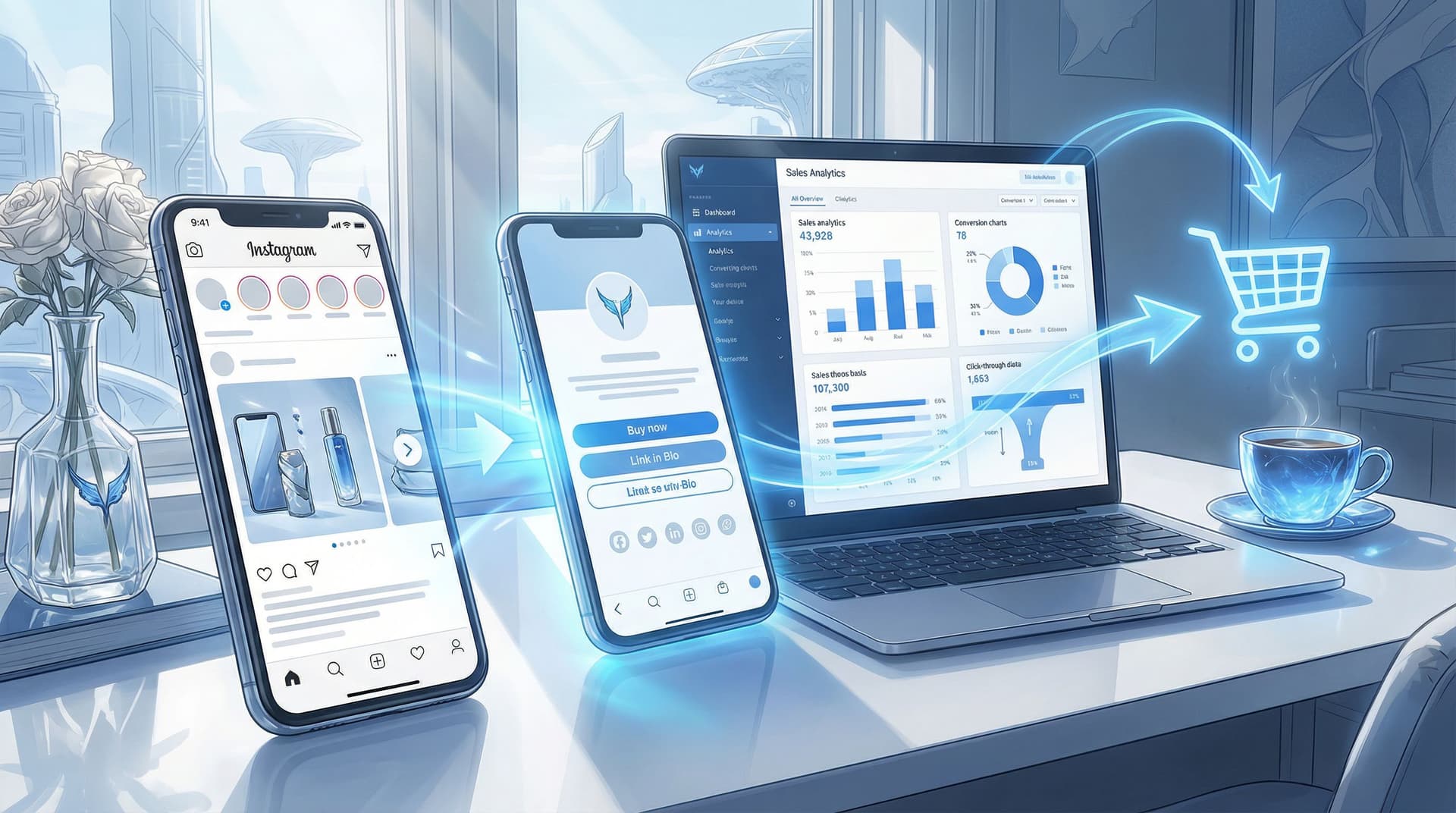
That’s where a high-converting Liinks page becomes the quiet MVP of your Instagram strategy. It turns that single bio link into a clean, guided path from carousel → profile → bio link → checkout.
In this guide, we’ll walk through how to:
- Map your content to clear buying journeys
- Design a Liinks page that feels like a natural extension of your Instagram
- Use link structure, copy, and visuals to reduce friction and boost conversion
- Track what’s actually working so you can double down on it
Why Your Carousel-to-Checkout Flow Matters
Instagram is built to keep people scrolling, not leaving. Every extra tap between a post and a purchase is a chance to lose someone.
A strong carousel-to-checkout system does three things:
-
Captures intent at the moment of curiosity
When someone saves a carousel like “5 Must-Have Tools for Beginner Creators,” they’re already interested. If your bio link and landing experience don’t match that intent, they’ll bounce. -
Reduces decision fatigue
A cluttered link page with 15+ random links is overwhelming. A focused Liinks page that highlights exactly what your content teases keeps people moving forward. -
Turns Instagram into a predictable revenue channel
When your content and link structure are aligned, you can plan campaigns, forecast sales, and repeat what works—rather than hoping a viral post magically converts.
If you want more ideas on turning that single bio link into a revenue engine, you might like From One Link to a Full Funnel: Turning Your Liinks Page into a 24/7 Sales Machine as a companion read.
Step 1: Start with the Journey, Not the Link
Before you touch your bio or your Liinks design, zoom out.
Ask: “What exact journey do I want someone to take after they see this carousel?”
For each key content type, define:
- The post type: Carousel, Reel, Story, Live replay
- The main promise: What you’re helping them do (e.g., “Plan a capsule wardrobe,” “Launch a mini-course,” “Book a strategy session”)
- The next step: What one thing you want them to do (buy, apply, book, download, join)
- The destination: The best page on your Liinks bio to send them to
Example Journeys
-
Carousel: “3 Lightroom Presets That Make Your Feed Pop”
→ CTA in caption: “Tap the link in my bio to grab the preset pack”
→ Liinks destination: Featured button “Shop Lightroom Presets – Instant Download” -
Carousel: “Before & After: Client Brand Makeover”
→ CTA: “Want results like this? Link in bio to apply”
→ Destination: Application form link highlighted at the top of your Liinks page -
Carousel: “How I Grew My Newsletter to 10K in a Year”
→ CTA: “Get my free welcome sequence template via the link in bio”
→ Destination: Lead magnet opt-in, with a secondary link to your full email course
When each core content theme is mapped to a specific action and destination, your Liinks page stops being a random menu and starts acting like a guided funnel.
Step 2: Design a Liinks Page That Feels Like Instagram’s “Next Slide”
When someone taps your bio link, the experience should feel like they just swiped to the next part of your carousel, not like they landed on a totally different brand.
Keep the Visuals Consistent
Use your Liinks customization options to:
- Match your brand colors from your feed and Stories
- Use the same profile photo or logo as your Instagram
- Carry over fonts and styling (bold, minimal, playful—whatever your look is)
- Add a simple header that restates what you do in one line (e.g., “Tools & templates to help you launch faster”)
If you want help nailing the look and performance of that page, check out Design-First Link in Bio: How to Build a Stunning Liinks Page That Actually Converts.
Make the Top of the Page Do the Heavy Lifting
Above the fold is where most of the selling happens. Use it wisely.
Consider structuring your Liinks page like this:
-
Primary CTA button (hero link)
- Example: “Shop the Latest Drop,” “Book a 1:1 Strategy Call,” or “Start the Course for $49”
-
Secondary CTA or campaign link
- Example: “Holiday Gift Bundles – Limited Time” or “Apply for Coaching (Spots Open)”
- If you run time-bound campaigns, you can rotate this link seasonally. For ideas, see Seasonal Campaigns with Liinks: Simple Link-in-Bio Swaps that Drive Holiday Revenue.
-
Content-aligned quick links
- “Resources from This Week’s Posts”
- “Products Featured on Instagram”
- “Start Here if You’re New”
-
Deeper navigation
- Your full site, blog, social channels, etc., can sit lower on the page. They’re nice to have—but not the main event.
Use Visual Hierarchy
- Make your main revenue driver visually larger or more colorful.
- Use icons or emojis sparingly to draw the eye to key links.
- Group related links (e.g., “Courses,” “Templates,” “Services”) so visitors don’t have to hunt.
Your goal: someone coming from a product-focused carousel should immediately see where to click next without reading every line.
Step 3: Turn Carousels into Click Magnets with Clear CTAs
Even the best Liinks page can’t fix a vague caption.
Your carousel should set up the problem, tease the solution, and then hand off to your bio link.
Strong Carousel Structures That Lead to Sales
Try these frameworks:
-
Problem → Proof → Product
- Slide 1: Call out the problem (e.g., “Struggling to turn followers into customers?”)
- Middle slides: Show quick tips or before/after transformations
- Final slide: Introduce your offer and direct them: “Tap my bio link to get the full system.”
-
Mini Tutorial → Shortcut Offer
- Slides: Teach a simplified version of your method
- Final slide: “Want the plug-and-play version? Grab the template via the link in my bio.”
-
Myth-Busting → Premium Solution
- Slides: Bust 3–5 common misconceptions
- Final slide: “If you’re ready to do this the right way, my course walks you through step by step. Details at the link in my bio.”
Caption & CTA Best Practices
- Use one main CTA. Don’t ask them to save, share, comment, and buy. Prioritize the sale when that’s the goal.
- Name the destination clearly. Instead of “link in bio,” say:
“Tap the link in my bio and hit the ‘Shop Presets’ button at the top.” - Create urgency or specificity.
- “Only 20 spots available.”
- “Founders’ price ends Friday at midnight.”
- Mirror your Liinks copy. Use the same wording for buttons so people instantly recognize the right link.
Step 4: Build Dedicated Paths for Your Top Offers
If everything on your Liinks page is treated equally, nothing stands out.
Instead, create dedicated, streamlined paths for your top 1–3 offers.
For Physical Products or Merch
- Add a “Shop Featured on Instagram” section at the top of your Liinks page.
- Link directly to:
- Product collections related to current posts
- Individual product pages for your most promoted items
- Use short labels like:
- “Shop: Capsule Wardrobe Starter Kit”
- “Shop: Creator Desk Setup Essentials”
If your shop is on platforms like Shopify, Etsy, or Squarespace, make sure links go straight to the relevant listing—not just your storefront.
For Digital Products or Courses
- Make one “Start Here” link for new buyers (e.g., your best low-ticket or flagship product).
- Add supporting links like:
- “See the Curriculum”
- “Watch a Free Lesson”
- “Student Results & Testimonials”
These can live just below your primary CTA and give people at different stages the info they need without overwhelming them.
For Services or Coaching
- Feature a “Work With Me” link at the top of your Liinks page.
- Send people to:
- A simple application form (via Typeform, Tally, or a form on your site)
- A calendar booking tool like Calendly or Acuity Scheduling
- Use benefit-driven labels such as:
- “Apply for Brand Strategy Intensive”
- “Book a 30-Minute Audit Call”
The key is to remove any extra steps between curiosity and commitment.
Step 5: Reduce Friction from Bio to Checkout
Once someone taps through to your Liinks page, your job is to make purchase friction almost nonexistent.
Here’s how:
Keep It Fast and Mobile-First
Most Instagram traffic is on mobile, so:
- Keep your Liinks design clean and lightweight.
- Avoid long walls of text; use short, scannable labels.
- Test how your page loads on different phones and connections.
Use Trust Builders Near Conversion Links
Right before a key link, consider adding:
- A short line of social proof: “Trusted by 2,000+ creators”
- A quick guarantee: “30-day money-back guarantee”
- A micro-benefit: “Instant access after checkout”
You don’t need full sales copy here—that belongs on your product page—but a small nudge can increase click-through.
Minimize Clicks to Checkout
For your main offer, ask:
- How many taps does it take from carousel to checkout confirmation?
Aim to keep this as low as possible.
Typical ideal path:
- Tap on carousel CTA → profile
- Tap bio link → Liinks page
- Tap primary product link → product page
- Add to cart / buy now → checkout
Anywhere you can remove a step (e.g., using direct “Buy Now” links for repeat buyers) is worth testing.
For more ideas on optimizing the full journey from curiosity to conversion, you may also enjoy Stop Losing Clicks: Common Link-in-Bio Mistakes (and How to Fix Them with Liinks).
Step 6: Align Campaigns, Launches, and Limited Offers
Your carousel-to-checkout system gets even more powerful when it supports campaigns and launches, not just evergreen offers.
For Launches & Drops
During a launch window:
- Make your launch offer the absolute first link on your Liinks page.
- Temporarily move evergreen links lower.
- Add a short line above your links like:
“⚡ Now live: Creator Systems Course – Founders’ Price Ends Sunday.”
Pair this with multiple carousels leading to the same destination:
- “What’s Inside the Course” carousel
- “Student Results” carousel
- “Behind the Build” or “Why I Created This” carousel
If you’re planning a big drop, The Ultimate Launch Checklist: Using Liinks to Maximize Hype on Drop Day walks through how to coordinate your content and your bio link for maximum impact.
For Seasonal or Time-Bound Promos
- Create a temporary top section on your Liinks page just for seasonal offers (e.g., “Holiday Bundles,” “Back-to-School Sale,” “Black Friday Deals”).
- Update your carousels to match the exact language of that section.
- Once the season ends, archive or move those links down and restore your evergreen structure.
This keeps your page relevant without needing a full rebuild every time.
Step 7: Measure, Learn, and Iterate
A high-converting Liinks page is never really “done.” It’s something you refine based on what people actually click.
Track What Matters
Use your Liinks analytics (and your shop or payment platform analytics) to watch:
- Click-through rates on each link
- Top referrers (Instagram vs. other platforms)
- Conversion rates on key offers after people land on the product page
Look for:
- Links with high clicks but low sales → maybe your product page needs work, or expectations from the carousel don’t match the offer.
- Links with lower clicks but high conversion → consider moving these higher on your Liinks page or featuring them more often in content.
Run Simple Experiments
Try testing:
- Different button copy (e.g., “Shop the Presets” vs. “Get the Presets I Use”)
- Order of links (moving your main offer above or below a free resource)
- Adding or removing small bits of social proof
Make one change at a time, give it a week or two, and compare the numbers.
Over time, you’ll build a page that doesn’t just look good—it quietly sells for you around the clock.
Quick Recap
To turn Instagram carousels into real revenue:
- Map each content theme to a single, clear next step. Know exactly where you’re sending people before you post.
- Design your Liinks page as the “next slide” of your content. Match visuals, tone, and messaging.
- Feature your top offers prominently. Don’t bury your best revenue drivers under a pile of generic links.
- Reduce friction from tap to checkout. Fewer steps, clearer labels, faster load times.
- Align your bio link with launches and campaigns. Let your Liinks page shift with your priorities.
- Use analytics to refine. Keep what works, improve or remove what doesn’t.
When all of this is working together, your carousels stop being “nice content” and start becoming predictable sales drivers.
Your Next Move
You don’t need to overhaul everything at once. Start with one simple improvement:
- Choose your #1 offer you want more people to buy.
- Update your Liinks page so that offer is clearly the star.
- Create one carousel this week that points directly to it, with a specific CTA that matches your top link.
If you’re ready to build a bio link that actually looks good and turns those Instagram taps into checkouts, set up or refresh your page with Liinks.
One small tweak to that single link can change how every future carousel performs.


