
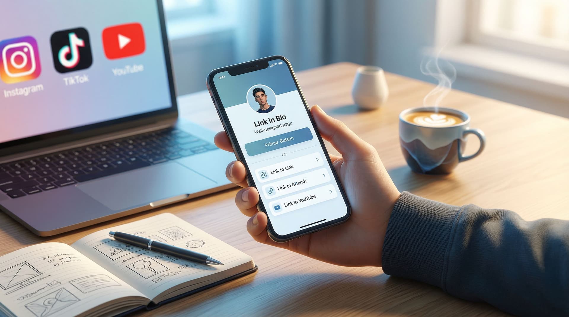
Stop Losing Clicks: Common Link-in-Bio Mistakes (and How to Fix Them with Liinks)

Your bio link is your one tiny piece of real estate that everyone who discovers you can actually click.
Whether you’re a creator, entrepreneur, or small business owner, that single link is often the bridge between:
- A curious scroller… and a new subscriber
- A casual viewer… and a paying customer
- A one-time visitor… and a long-term fan
When that bridge is confusing, cluttered, or off-brand, people drop off. You don’t just “lose a click” — you lose potential revenue, relationships, and momentum.
The good news: most link‑in‑bio problems are fixable in minutes, especially with a flexible, fully customizable tool like Liinks.
This guide walks through the most common mistakes that quietly kill your clicks — and how to turn your link-in-bio into a polished, high-converting hub that actually looks like you.
Why Your Link-in-Bio Might Be Costing You Clicks
People don’t abandon your bio link because they’re lazy. They abandon it because:
- They don’t immediately see what’s in it for them
- The page feels messy, slow, or untrustworthy
- The next step isn’t obvious
Attention is short. If someone has to think too hard, you’ve already lost them.
A strong link-in-bio page should:
- Make your #1 action painfully obvious (buy, book, subscribe, watch, join)
- Match your brand visually, so it feels cohesive and trustworthy
- Load quickly and work flawlessly on mobile
- Adapt over time based on what’s actually getting clicked
That’s exactly the kind of experience you can build with Liinks — but only if you avoid the pitfalls below.
Mistake #1: No Clear “Main Thing”
If your bio link looks like a junk drawer — 20+ buttons, all the same size, all screaming for attention — people freeze.
The problem:
- Everything feels equally important
- Visitors have to guess what matters
- Your highest-value action gets buried
What to do instead
-
Decide on your primary goal for the next 30–90 days. Examples:
- Grow your email list
- Sell a new product or service
- Drive traffic to YouTube or a podcast
- Book more discovery calls or sessions
-
Make that goal the star of your page. With Liinks, you can:
- Pin your primary CTA at the top
- Use a larger or highlighted button
- Add a short line of copy under it (e.g., “Start here — free 5‑day email course”)
-
Demote or remove anything that doesn’t support that goal.
- Move low-priority links lower on the page
- Group related links into sections
- Delete links that no longer serve your current strategy
Want to go deeper on turning that “main thing” into a revenue engine? Check out From One Link to a Full Funnel: Turning Your Liinks Page into a 24/7 Sales Machine.
Mistake #2: Overwhelming Visitors with Too Many Choices
A long scroll of buttons might feel helpful — “I’m giving them options!” — but it often has the opposite effect.
Why this kills clicks:
- Choice overload makes people bail instead of explore
- Important links get lost below the fold
- It feels like work to find the right next step
Fix it with a simple hierarchy
Use a three-tier structure:
-
Top priority (1–3 links)
- Your main CTA (e.g., “Shop the new drop”)
- One secondary action (e.g., “Join my newsletter”)
- Optional: your most popular piece of content
-
Supportive links (3–6 links)
- About / Start Here
- Key platforms (YouTube, podcast, community)
- Portfolio, services, or featured product categories
-
Deep cuts (optional)
- Press, interviews, older campaigns
- Long resource lists
With Liinks, you can reorder links with drag-and-drop, so it’s easy to keep your most important actions at the top and demote or hide the rest.
Pro tip: If you routinely promote a lot of different things, create themed sections instead of a long flat list:
- “Start Here”
- “For Creators”
- “For Clients”
- “Free Resources”
This keeps your page skimmable while still giving depth.
Mistake #3: Bland, Vague, or Missing CTAs
“New video.” “Website.” “Shop.”
These are labels, not invitations.
The problem:
- Visitors don’t know why they should click
- Every button feels generic and low-stakes
- You miss the chance to guide behavior
We’ve talked on the blog about how powerful clear, specific CTAs can be for creators — if you want to go deeper, bookmark Crafting Revolutionary CTA Strategies in the Creator Economy.
How to upgrade your link-in-bio CTAs
Use a simple formula:
Verb + Benefit + (Optional) Timeframe or Specificity
Examples you can plug in today:
- Instead of “Newsletter” → “Get weekly creator growth tips in your inbox”
- Instead of “Shop” → “Shop the new winter drop (limited stock)”
- Instead of “YouTube” → “Watch my 10‑minute guide to landing brand deals”
- Instead of “Freebie” → “Download the free content planning template”
Inside Liinks, you can:
- Add short descriptions under each button
- Use emojis or icons sparingly to draw attention
- Test different CTA texts over a week and see which gets more clicks
Quick exercise (5 minutes):
- List your current link titles.
- Rewrite each using the Verb + Benefit formula.
- Update them in your Liinks page and watch how clicks change over the next 7–14 days.
Mistake #4: Off-Brand or Unpolished Design
Your content might be high quality, but if your link-in-bio page looks generic or messy, it creates friction.
Common design red flags:
- Colors don’t match your brand or social feed
- Tiny or low-quality avatar/cover image
- Inconsistent button styles and fonts
- Hard-to-read text (low contrast, tiny size)
People make snap judgments based on visual cues. If your page looks thrown together, they subconsciously assume the same about your offers.
Design a page that actually looks like you
With Liinks, you can:
- Match your brand colors: Use your exact hex codes for backgrounds, buttons, and text
- Customize fonts to align with your website or logo
- Add imagery: headers, profile photos, and section dividers
- Use spacing intentionally: give your top CTA room to breathe
A simple visual checklist:
- 1–2 primary colors, 1 neutral background
- High contrast between button text and button color
- Consistent font sizes for button labels
- Plenty of white space — no wall of text
Mistake #5: Ignoring Mobile Experience and Speed
Most people tap your bio link from their phone, not a laptop.
If your page:
- Loads slowly
- Requires pinch‑zooming
- Has tiny tap targets
…you’re losing people before the page even has a chance to work.
How to optimize for mobile clicks
-
Test on multiple devices. Open your link on:
- Your own phone
- A friend’s phone with a different screen size
- Both iOS and Android, if possible
-
Check for these basics:
- Buttons are large enough to tap with a thumb
- No horizontal scrolling
- Text is readable without zooming
-
Keep it lightweight.
- Avoid heavy background images that slow load times
- Limit auto-playing embeds
- Use concise copy — most people are skimming
Liinks is built mobile-first, so your page is responsive out of the box. But your content choices — images, video embeds, text length — still matter. Aim for a page that feels light, fast, and easy.
Mistake #6: Treating Your Bio Link as “Set It and Forget It”
Your content, offers, and priorities change. If your link-in-bio doesn’t change with them, it quickly goes stale.
Symptoms of a neglected bio link:
- Old launches or expired offers still featured
- Outdated branding or profile photo
- Broken links (nothing kills trust faster)
Shift to a “living asset” mindset
Use a simple cadence:
-
Weekly (5 minutes):
- Check analytics in Liinks
- Move top-performing links higher
- Remove or hide links with near-zero clicks
-
Monthly (15–20 minutes):
- Refresh copy on your main CTA
- Rotate in your best new content or offers
- Test a new layout or section order
-
Quarterly (30 minutes):
- Reassess your primary goal
- Update visuals to match any brand evolutions
- Archive old campaigns and simplify
If you’re using your bio link to grow an email list (highly recommended), you’ll find more tactical ideas in Newsletter Growth on Autopilot: Using Liinks to Turn Social Traffic into Email Subscribers.
Mistake #7: No Strategy Behind What You Feature
A lot of creators simply throw every important link onto the page and hope something sticks.
But your bio link performs best when it’s part of a bigger journey.
Think in terms of “micro-funnels”
Ask yourself:
- Where is most of my social traffic coming from right now?
- What do those people most want when they tap my link?
- What is the logical next step for them?
Examples:
-
If most traffic comes from short-form videos, lead with:
- “Binge the full tutorials playlist”
- “Download the checklist from this video”
-
If most traffic comes from product content, lead with:
- “Shop the products featured on my TikTok”
- “Grab the bundle everyone’s asking about”
-
If you focus on education or coaching, lead with:
- “Take the free 3‑minute quiz to find your best next step”
- “Book a free 15‑minute audit call”
Then, structure the rest of your Liinks page to support that journey:
- Primary CTA (aligned with the traffic source)
- Nurture content (YouTube, podcast, resources)
- Conversion offers (products, services, programs)
For more ideas on turning casual engagement into actual sales, you may also like From Engagement to E-commerce: Transforming Customer Journeys with Bio Links.
Mistake #8: No Data-Driven Decisions
If you’re guessing which links matter, you’re probably wrong.
Analytics turn your bio link from a static page into a feedback loop.
What to watch inside your link-in-bio analytics
In Liinks, pay attention to:
- Total clicks: Is your bio link actually getting used?
- Click-through rate (CTR) per link: Which buttons earn attention?
- Top traffic days and times: When are people most likely to take action?
Use those insights to:
- Move high-CTR links higher on the page
- Rewrite or replace low-CTR links
- Align your social posting schedule with peak click times
Simple testing ideas:
- Week 1: “Join my newsletter for weekly growth tips”
- Week 2: “Get my free creator growth playbook (sent by email)”
Compare clicks. Keep the winner.
Over time, this turns your link-in-bio from a guess into an optimized asset that works harder with every tweak.
Putting It All Together: A Quick Before-and-After Blueprint
If your current link-in-bio page feels messy or underwhelming, here’s a simple transformation you can implement in under an hour using Liinks:
Before:
- 15+ random links in no particular order
- Generic labels like “YouTube,” “Website,” “Shop”
- Default colors and fonts
- Old promo still at the top
- No idea what people are actually clicking
After:
- Clarify your main goal for the next 60 days.
- Create a standout top CTA with specific, benefit-driven copy.
- Limit the top section to 3–5 key links, grouped logically.
- Customize your design to match your brand colors, fonts, and imagery.
- Test the page on your phone and a friend’s phone.
- Check analytics weekly and adjust based on real clicks.
This isn’t about perfection. It’s about creating a clean, confident path from curiosity to action — and then iterating.
Summary
Your link-in-bio is more than a convenience; it’s a powerful lever for growth.
You stop losing clicks when you:
- Lead with one clear primary action
- Cut the clutter and organize your links with intention
- Use specific, benefit-driven CTAs
- Present a visually cohesive, on-brand page
- Prioritize mobile experience and fast load times
- Treat your bio link as a living asset, not a one-time setup
- Align your links with real audience journeys and goals
- Let analytics guide your decisions instead of guessing
With a tool like Liinks, you don’t need to be a designer or developer to make this happen. You just need clarity on what you want people to do — and the willingness to refine over time.
Your Next Step
If you’ve read this far, your bio link is probably underperforming — or at least not living up to what your content deserves.
Here’s a simple challenge:
- Open your current link-in-bio page on your phone.
- Ask yourself: If I were a brand‑new follower, would I know exactly what to do next — and why it matters?
- If the answer is anything less than a confident “yes,” spend the next 30 minutes rebuilding your page with Liinks:
- Choose your primary goal
- Rewrite your top 3–5 CTAs
- Clean up your design and link order
Your content is already working hard to get people to your profile.
Make sure that when they tap your bio link, you’re ready to meet them with clarity, intention, and a page that actually looks and feels like you.
Start refining your link-in-bio with Liinks today — and stop leaving clicks (and revenue) on the table.


