
Design-First Link in Bio: How to Build a Stunning Liinks Page That Actually Converts

Your bio link is often the first place someone decides whether they’ll stay in your world or drift away.
They’ve just watched your TikTok, tapped through your Instagram Stories, or finished a YouTube video. They’re curious enough to click once. What happens next is up to the page you send them to.
A design-first link-in-bio isn’t just about looking pretty. It’s about:
- Making your brand feel instantly recognizable and trustworthy
- Guiding visitors toward the one or two actions that matter most
- Reducing friction so people don’t have to think hard about what to do next
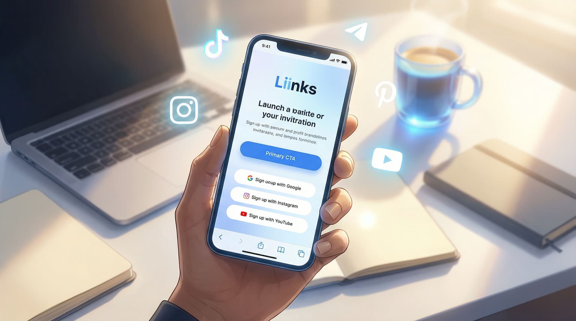
That’s exactly what you can create with Liinks—a flexible link-in-bio tool built for creators who want their page to actually look good and perform.
In this guide, we’ll walk through how to design a Liinks page that feels like a mini-website for your brand: clean, intentional, and built to convert.
Why Design-First Matters for Conversion
You’ve probably seen link-in-bio pages that look like this:
- A long, endless list of random links
- Clashing colors and too many fonts
- No clear focus or call to action
- Generic buttons that all feel equally important
Those pages don’t just look messy—they cost you clicks and revenue.
A design-first approach changes that by treating your Liinks page like a high-impact landing page rather than a dumping ground for links.
A well-designed Liinks page can help you:
- Build trust in seconds – Consistent colors, typography, and imagery make you feel more established and professional.
- Reduce decision fatigue – Clear hierarchy and layout make it obvious what to tap first.
- Increase conversions – When your primary offer is visually prioritized, more people take that action (join, buy, book, subscribe).
- Support your broader strategy – Whether you’re focused on email growth, sales, or discovery, your design can nudge people in that direction.
If your current bio link feels more like a directory than a funnel, you’ll also want to bookmark From One Link to a Full Funnel: Turning Your Liinks Page into a 24/7 Sales Machine for next.
Step 1: Get Crystal Clear on Your Primary Goal
Before you touch colors or fonts, answer one question:
If a new visitor lands on your Liinks page and only clicks one thing, what do you want it to be?
Common goals:
- Grow your email list
- Sell a product or offer
- Book discovery calls or sessions
- Drive traffic to a specific platform (podcast, YouTube, blog)
- Promote a current launch or campaign
Pick one primary goal and one secondary goal at most.
Example setups:
-
Creator focused on email growth
- Primary: “Join my weekly newsletter”
- Secondary: “Check out my latest YouTube video”
-
Service provider
- Primary: “Book a discovery call”
- Secondary: “View my services page”
-
E-commerce brand
- Primary: “Shop latest collection”
- Secondary: “Join SMS/email for exclusive drops”
Once you know your goals, everything else—layout, colors, button order—should support them.
If your main priority is list growth, you’ll find deeper tactics in Newsletter Growth on Autopilot: Using Liinks to Turn Social Traffic into Email Subscribers.
Step 2: Build a Cohesive Visual Identity on Your Liinks Page
Your Liinks page should feel like a natural extension of your brand. That doesn’t mean you need a full brand book—it just means making a few consistent visual choices.
Choose a Color System That Guides the Eye
Instead of using every color you like, build a simple palette:
- 1 primary brand color – Used for your main CTA button and key highlights.
- 1 neutral background color – White, off-white, or a very soft tone.
- 1 accent color – Used sparingly for secondary buttons or small details.
How to use color for conversion:
- Make your primary CTA button (e.g., “Join the newsletter” or “Shop now”) the boldest color on the page.
- Use muted or outline styles for secondary links so they don’t compete visually.
- Avoid high-saturation backgrounds with bright text; they’re hard to read and feel less professional.
Pick Typography That’s Readable and On-Brand
Fonts do a lot of heavy lifting for how your brand feels.
- Use one font for headings and one for body text. That’s it.
- Prioritize legibility on mobile: medium to large sizes, strong contrast, and enough spacing.
- If your brand is playful, you can use a more expressive heading font—but keep body text clean and simple.
Inside Liinks, you can quickly experiment with font and color combinations until your page feels like “you,” without needing a designer.
Use Imagery to Humanize Your Page
Even a single strong image can:
- Make your brand feel more real and trustworthy
- Communicate your niche instantly (fitness, design, coaching, beauty, etc.)
- Break up a wall of buttons and text
Ideas:
- A clean, high-quality headshot
- A product mockup or flat lay
- A screenshot of your newsletter, podcast, or course dashboard
Place your image near the top of the page so visitors immediately see who or what they’re engaging with.
Step 3: Structure Your Page Like a Mini Landing Page
Think of your Liinks page as a short story, not a list. You’re guiding someone from curiosity to action.
Start With a Clear, Benefit-Focused Header
Right under your name or brand, add a one-line statement that answers: Why should I care?
Examples:
- “Helping beginner creators land their first brand deals.”
- “Weekly recipes and meal plans for busy parents.”
- “Templates and systems for six-figure service providers.”
This instantly orients your visitor and sets context for every link that follows.
Put Your Primary CTA Above the Fold
On mobile, people should see your main CTA without scrolling.
That usually means:
- One bold button right under your header
- Short, clear copy like:
- “Join 3,500+ creators on my weekly list”
- “Start the free mini-course”
- “Shop the new collection”
This is where design and strategy meet: color, size, and placement all work together to say, “Tap here first.”
Group and Prioritize the Rest of Your Links
Once your main CTA is set, organize everything else so it’s easy to scan.
You might group links into:
- Content – Latest YouTube, podcast, or blog
- Offers – Services, shop, programs
- Community – Discord, Facebook group, Patreon
- About – Portfolio, media kit, press
Tips:
- Put high-intent links (offers, email opt-ins, booking) higher than low-intent links (social profiles you’re sending people back to).
- Limit yourself to 5–8 visible links. More than that, and people start to stall.
- Use short, descriptive labels (e.g., “Apply for 1:1 coaching” vs. “Coaching”).
If you’re sending traffic from different platforms, you’ll love TikTok, Instagram, YouTube: How to Customize One Liinks Page for Every Social Platform, which dives into tailoring this structure for each audience.
Step 4: Write Button Copy That Sells the Click
Design gets attention. Copy earns the tap.
Instead of generic labels like “Newsletter” or “Shop,” use language that communicates value.
Strong button copy usually includes:
- A clear action: Join, Watch, Download, Shop, Book
- A specific outcome: new recipes, content ideas, templates, workouts
- A hint of social proof or urgency where appropriate
Examples:
- “Join 2,000+ creators getting weekly content prompts”
- “Download the free Notion content planner”
- “Watch the latest YouTube tutorial”
- “Book your 20-minute strategy call”
- “Shop the new fall collection”
Keep it short, specific, and benefit-driven.
For advanced CTA strategy, bookmark Crafting Revolutionary CTA Strategies in the Creator Economy to refine your wording even further.
Step 5: Use Visual Hierarchy to Lead Visitors Where You Want Them
Visual hierarchy is how you tell someone, “Look here first, then here, then here.” On a Liinks page, that comes down to:
- Size – Bigger elements feel more important.
- Color – High-contrast or bold colors draw attention.
- Spacing – More space around an element makes it stand out.
- Order – Top-to-bottom and left-to-right reading patterns.
Practical ways to apply this on your Liinks page:
- Make your primary CTA:
- A solid, bold color
- Slightly larger than other buttons
- Placed near the top
- Use outlined or muted buttons for secondary links.
- Add section headings (e.g., “Start Here,” “Work With Me,” “Free Resources”) to break the page into logical chunks.
- Use subtext under key buttons (if you like) to add clarity, such as:
“Free, no spam. New issues every Sunday.”
When your hierarchy is clear, visitors don’t have to think hard—they can just follow the path you’ve laid out.
Step 6: Align Your Liinks Design With Traffic Sources
A beautiful Liinks page that ignores where traffic comes from is leaving conversions on the table.
Ask yourself:
- Are most visitors coming from TikTok, Instagram, or YouTube?
- Are they usually cold (first touch) or warm (already familiar with you)?
- What did they just see before they clicked your bio link?
Then adjust your design and content accordingly:
-
From TikTok:
- Keep it punchy and visual.
- Feature the offer or freebie you mentioned in your latest viral video.
- Use bold colors and short, clear labels.
-
From Instagram:
- Lean into aesthetics and brand cohesion.
- Match your Liinks colors to your grid or Stories.
- Highlight the offer you talk about most in your Stories or Reels.
-
From YouTube:
- Expect visitors to have higher intent and more context.
- Feature deeper resources: full programs, detailed guides, or your best-performing videos.
When your Liinks page “remembers” where someone came from, it feels seamless—and that seamlessness increases trust and clicks.
Step 7: Add Subtle Conversion Boosters (Without Clutter)
Once your core design is in place, you can layer in a few small details that quietly lift conversions.
Microcopy That Reduces Friction
- Under a newsletter CTA:
“No spam. Unsubscribe anytime.” - Under a booking link:
“Free 15-minute intro call. No pressure to commit.” - Under a digital product:
“Instant access. Lifetime updates included.”
These tiny lines answer objections before someone even has them.
Social Proof Without Overwhelming the Page
You don’t need full testimonials here, but you can weave social proof into your design and copy:
- “Trusted by 500+ small business owners”
- “As seen on [Podcast Name] & [Brand]”
- “4.9★ average rating from students”
You can place this as a small line under your name, near your main CTA, or in a short section near the bottom.
Smart Link Order During Launches
When you’re in launch mode:
- Move your launch-related CTA to the very top.
- Temporarily push low-priority links down or hide them.
- Use on-brand but high-contrast colors for the launch button so it stands out even more.
Remember: design-first doesn’t mean design-only. Every visual choice should support your current business priorities.
Step 8: Test, Measure, Refine
A stunning Liinks page is never truly “done.” Small tweaks can create meaningful lifts in conversions over time.
Start by tracking:
- Total clicks vs. profile visits – Is your page compelling enough to earn that first tap?
- Click distribution – Which buttons get the most taps? Are they the right ones?
- Performance by campaign or season – Does your main CTA need to change during launches, holidays, or new content pushes?
Experiment with:
- Rewriting your primary CTA copy
- Swapping button colors (while keeping brand consistency)
- Reordering your top 3–5 links
- Updating imagery to better match your current content or offers
Over time, you’ll build a Liinks page that doesn’t just look good—it behaves like a smart, evolving asset in your business.
For more ideas on using your page strategically, check out Stop Losing Clicks: Common Link-in-Bio Mistakes (and How to Fix Them with Liinks).
Quick Recap
Here’s how to build a design-first Liinks page that actually converts:
- Define your primary and secondary goals so your design has a clear job.
- Create a cohesive visual identity with intentional colors, fonts, and imagery.
- Structure your page like a mini landing page, not a random list of links.
- Write benefit-driven button copy that sells the click, not just labels it.
- Use visual hierarchy (size, color, spacing, order) to spotlight your main CTA.
- Align your page with traffic sources from TikTok, Instagram, YouTube, and beyond.
- Layer in subtle conversion boosters like microcopy and light social proof.
- Test and refine regularly so your page keeps working harder for you.
When you treat your link-in-bio like a thoughtfully designed landing page, it stops being an afterthought and starts becoming one of the most powerful assets in your online presence.
Your Next Step
You don’t need a full website redesign or a brand strategist to make a big difference. You just need one well-designed hub that feels like you and points people where you want them to go.
Open your current bio link and ask:
- Does this page look like my brand?
- Is it obvious what I want people to do first?
- Would a new visitor understand who I am and how I can help—within 5 seconds?
If not, this is your sign to give your page a refresh.
Start by setting up or redesigning your page with Liinks. Play with colors, fonts, and layout. Rewrite your top three buttons. Move your main CTA to the top and give it the visual weight it deserves.
One hour of focused design on your Liinks page can pay off in more subscribers, more sales, and more people actually taking action after they click your bio.
Your content is already doing the hard work of getting people curious. Now it’s time to give them a beautiful, conversion-ready place to land.


