
One Liinks Page, Many Personalities: How to Create Custom Experiences for Different Audiences

Your audience is not one person.
You’ve got:
- The lurkers who just found you on TikTok and aren’t sure if you’re a genius or unhinged.
- The loyal crew who’ve bought three of your offers and would probably join your cult if you started one.
- The brand manager who clicked your bio link between meetings to decide if you’re “professional enough.”
And they all hit the same link in bio.
If that link leads to one generic page, you’re basically shoving everyone into the same room and yelling, “Figure it out!”
Let’s not.
With a flexible, fully customizable tool like Liinks, you can use one main page as your home base—and still create different experiences for different people, depending on who they are, what they need, and where they’re coming from.
This isn’t about building 47 landing pages or needing a degree in funnel strategy. It’s about using design, structure, and a few clever tricks to make your page feel almost… psychic.
Why tailoring your Liinks page to different audiences actually matters
You don’t create the same content for TikTok, Instagram, and YouTube. So why would you send everyone to the exact same, one-size-fits-nobody link list?
When you customize your Liinks experience around different audience types, a few powerful things happen:
1. People see what’s relevant first
If a cold follower lands on a page full of advanced offers, they bounce. If a ready-to-buy client lands on a page full of freebies, they get distracted. Customizing the experience lets you:
- Put low-friction, low-commitment options in front of new people
- Put high-intent, revenue-driving actions in front of warm leads
2. You quietly qualify people before they ever DM or email you
If you liked that idea, you’ll love how it plays out in real life. We break this down more in DMs on Autopilot: Using Liinks to Pre-Qualify Clients Before They Ever Message You, but the short version: a smart page layout can filter out tire-kickers and surface your best-fit people.
3. You stop losing clicks to decision fatigue
A random list of 15 buttons is not a strategy; it’s a to-do list. By shaping your page around who’s visiting and what they’re likely to want, you:
- Reduce the number of choices
- Increase the clarity of each option
- Make the next step painfully obvious (in a good way)
4. You make more money without more content
You’re already creating enough. Custom experiences help you:
- Reuse the same offers and content, just presented differently
- Turn your Liinks page into a mini funnel for each type of follower (for a deeper dive on that, check out One Link, Many Offers: How to Turn Your Liinks Page into a Mini Funnel for Every Type of Follower).
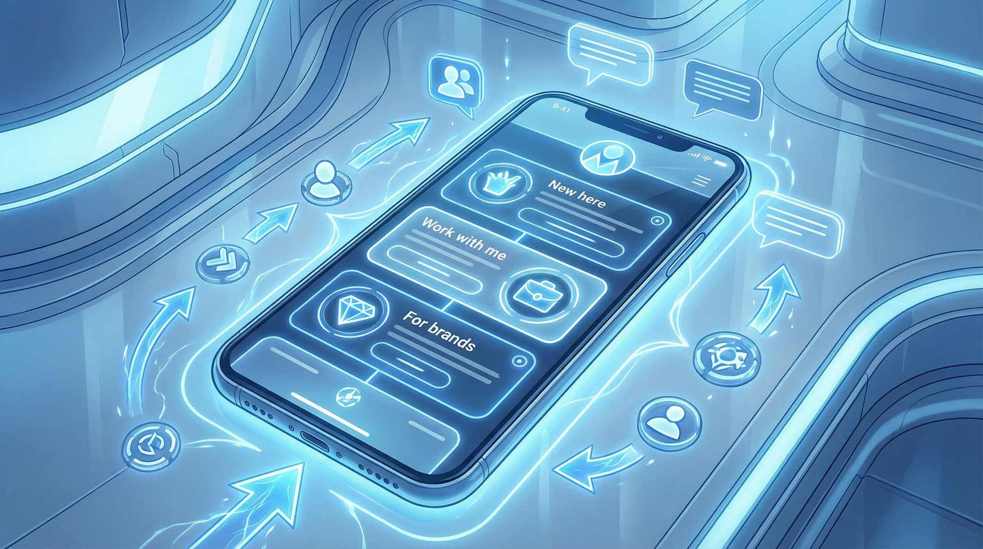
Step 1: Define your “personality groups” (aka who you’re actually building for)
Before you start dragging buttons around your Liinks page, you need to know who you’re designing for. Think in audience segments, not demographics.
Here are four simple groups most creators can start with:
-
New & curious
- Just discovered you from a Reel, TikTok, or shoutout
- Don’t fully know what you do yet
- Need context, clarity, and a low-commitment next step
-
Warm & exploring
- Have seen your content a few times
- Know your niche and vibe
- Are open to subscribing, downloading, or saving something
-
Ready to buy / book
- Already convinced you’re the person for them
- Want packages, pricing, or a clear “work with me” path
-
Brands & collaborators
- PR teams, agencies, or founders checking you out
- Care about your numbers, content quality, and professionalism
You might have more (students, local clients, wholesale buyers), but start here. Your goal is not to build a separate page for each group. It’s to:
- Decide which group is your priority
- Make sure every other group still has a clear path
Ask yourself:
- “If I could only design this page for one group, who would it be?”
- “What’s the #1 action I want that group to take?”
That group and that action become your north star for your page layout.
Step 2: Map one core page to multiple journeys
Think of your Liinks page as a train station, not the final destination. Everyone arrives in the same place, but the signs and tracks guide them to different platforms.
Here’s how to map that out without overcomplicating things.
A. Choose your primary “hero” action
This is the big, obvious thing your page is built around.
Examples:
- “Book a 1:1 strategy call”
- “Shop the new collection”
- “Join the free email list”
- “Download the starter guide”
Make this:
- The first button on the page
- The most visually prominent (color, size, or styling)
- Supported by 1–2 lines of microcopy like:
“New here? Start with this free guide—it’ll get you up to speed in 10 minutes.”
B. Build “tracks” for different audience types
Under your hero action, group your links into clusters that speak to different groups.
Example layout:
-
Start here if you’re new
- “Watch my 3 most popular videos”
- “Read what I actually do in under 60 seconds”
- “Grab the free starter kit”
-
Work with me / shop
- “Services & pricing”
- “Apply to work 1:1”
- “Shop my digital products”
- “View client results & case studies”
-
For brands & collabs
- “Media kit & stats”
- “Past brand partnerships”
- “Email my manager”
-
Deep-dive content
- “Binge my YouTube channel”
- “Read the blog”
- “Listen to the podcast”
You’re not hiding anything. You’re signposting.
Someone new will naturally gravitate toward “Start here.” A brand manager will laser in on “For brands & collabs.” A warm follower will head straight to “Work with me.”
Step 3: Use design to signal different “personalities” on one page
You don’t need multiple pages to create different vibes. You can do a lot with visual hierarchy and microcopy on a single Liinks layout.
1. Play with visual hierarchy
Use design to say, “This is for you” without literally saying it.
- Button size: Make your primary action slightly larger or bolder than the rest
- Color coding: Use one accent color for “Work with me” links and another for “Free resources”
- Spacing: Group related links closer together with a bit more white space between clusters
This helps:
- New visitors feel like the page is organized and friendly
- Busy visitors quickly find “their” section
For more on designing a page that still feels like you while doing all this, you might like Template to Signature Look: How to Design a Liinks Page That Feels Uniquely ‘You’ in Under an Hour.
2. Match tone to intent
Same page, slightly different voice in different areas.
-
For new & curious:
Light, welcoming, a bit playful.- “New here? Start with this 3-minute crash course.”
- “Not sure what I actually do? This will help.”
-
For ready-to-buy:
Clear, confident, specific.- “See packages & pricing”
- “Apply for 1:1 coaching (limited spots)”
-
For brands:
Professional, results-focused.- “View media kit & audience stats”
- “See past campaigns & performance”
Same brand voice, slightly different outfits.
3. Use subtle social proof where it counts
You don’t need a wall of testimonials—just a few well-placed signals.
- Under your main offer:
“Trusted by 200+ creators and small businesses.” - Next to your email list:
“Join 3,500+ subscribers getting weekly content tips.” - For brands:
“Featured by [Brand A], [Brand B], [Brand C].”
These tiny lines help warm up skeptical visitors without cluttering the page.
Step 4: Create “micro-experiences” for different entry points
Here’s where things get fun.
Even if you’re using one main Liinks page, you can still create tailored experiences based on where people came from or what you’re promoting.
A. Anchor links & scroll targets
If your page is long enough to scroll, you can:
- Use specific buttons at the top that jump people down to relevant sections (e.g., “Skip to: Work with me”)
- Link directly to a section in your content, so someone who taps from a specific post lands right where they need to be
This makes your page feel like multiple mini-landing pages wrapped into one.
B. Campaign-specific entry paths
Running a launch, sale, or seasonal promo? Instead of rebuilding everything from scratch, you can:
- Move a campaign section to the top of the page temporarily (e.g., “Holiday Gift Guide” or “Enrollment Open This Week Only”)
- Use bold styling or a different background color for that section
- Then drop people into their usual “tracks” below once the campaign is over
If you’re doing holiday or seasonal pushes, you’ll love the deeper breakdown in Seasonal Campaigns with Liinks: Simple Link-in-Bio Swaps that Drive Holiday Revenue.
C. Platform-aware tweaks (without 3 different pages)
You might not want separate links for TikTok, Instagram, and YouTube—but you can:
- Adjust your hero copy to reference where most of your traffic comes from (e.g., “Saw me on TikTok? Start here.”)
- Add a small note under certain buttons:
“As seen in my latest YouTube video.”
“Mentioned in this week’s Stories.”
Tiny details like this make people feel like the page was built for them, not just generically slapped together.
Step 5: Customize for intent—freebie hunters vs buyers vs brands
Let’s put this into real scenarios.
1. The new follower who just saw your viral Reel
What they’re thinking:
“Who is this? Are they legit? Do they have more of this?”
What they should see first:
- A short line at the top:
“Hey, I’m Alex. I help creators turn social traffic into sales (without working 24/7).” - A big, clear button:
“New here? Start with my free 10-minute crash course.” - A “Start here if you’re new” cluster with:
- “Watch my 3 most popular videos”
- “Grab the free starter guide”
- “What I actually do (in under 60 seconds)”
Goal: Turn curiosity into connection (follows, email subs, saves).
2. The warm follower who’s finally ready to hire you
What they’re thinking:
“I’ve been watching for months. I just need to know what it costs and how to get started.”
What they should see quickly:
- A clearly labeled section: “Work with me”
- Buttons like:
- “Services & pricing”
- “Apply for 1:1 coaching”
- “Done-for-you packages”
- “Client results & case studies”
You can even add a tiny line above that cluster:
“Already know you want to work together? Start here.”
Goal: Turn interest into inquiries, applications, or bookings.
3. The brand manager scouting you for a campaign
What they’re thinking:
“Do they have reach, is their content on-brand for us, and can they deliver?”
What they should find instantly:
- A section labeled “For brands & collabs” with:
- “Media kit & audience stats”
- “Past campaigns & results”
- “Email my manager / partnership inquiries”
Goal: Turn curiosity into professional conversations and deals.
Step 6: Let your analytics tell you which “personality” needs more love
You don’t have to guess whether your custom experiences are working. The data on your Liinks page will happily snitch.
Watch for:
-
Top-clicked buttons: Are people ignoring your main offer and flocking to your freebies? You might need to:
- Change your hero action
- Make your paid offers more visible
- Rework your copy so it’s clearer who each link is for
-
Low-click sections: If nobody touches “For brands & collabs,” maybe it needs:
- A more compelling label (e.g., “For sponsors & partnerships”)
- A higher position on the page
- A shoutout in your content so people know it exists
-
Surprise winners: Sometimes a “just in case” link becomes your star. If a specific free resource or mini guide is getting a ton of clicks, that’s a sign to:
- Feature it more prominently
- Build a follow-up offer behind it
If analytics make you want to lie down, we’ve got you: Analytics Without the Headache: The Only Liinks Metrics Creators Actually Need to Track walks through exactly which numbers to care about (and which to ignore).
Step 7: Keep the skeleton, swap the outfits
The beauty of building one well-structured Liinks page is that you don’t have to reinvent it every week.
Think of your page like a wardrobe staple:
- The structure stays the same: hero action, clusters for new folks, buyers, brands, and deep dives
- The contents rotate: featured offers, current freebie, latest video, seasonal promo
Every time you:
- Launch something new
- Run a sale
- Shift focus to a different offer
…you can:
- Swap in a new hero button
- Move one cluster higher for a season
- Temporarily highlight a specific path (e.g., “Holiday gift guide,” “New course now open,” “Waitlist for 2026 clients”)
Same page. Many personalities. Minimal effort.
Quick recap
You don’t need multiple websites to create custom experiences. You need one intentional, flexible Liinks page that:
- Starts with a clear primary action for your most important audience
- Groups links into obvious paths for new followers, warm leads, and brands
- Uses design, copy, and subtle social proof to signal who each section is for
- Adapts to campaigns, platforms, and seasons without you rebuilding everything
- Uses analytics to show which “personality” is actually doing the work
When you do this well, your bio link stops being a random menu and starts behaving like a smart host—greeting each visitor with exactly what they need next.
Your next move (yes, right now)
If your current link in bio feels like a junk drawer with a nice background, it’s time to give it a personality (or three).
Here’s a simple 30-minute plan:
- Pick your primary audience (new followers, buyers, or brands).
- Choose one hero action you want them to take.
- Log into Liinks and:
- Move that hero action to the top
- Create 2–3 labeled clusters for different groups
- Clean out any links that don’t serve someone specific
- Add one tiny line of copy above each cluster that says who it’s for.
- Check your analytics in a week and see what people actually clicked.
That’s it. One page, many personalities—no funnel agency required.
Go give your Liinks page a main-character moment.


