
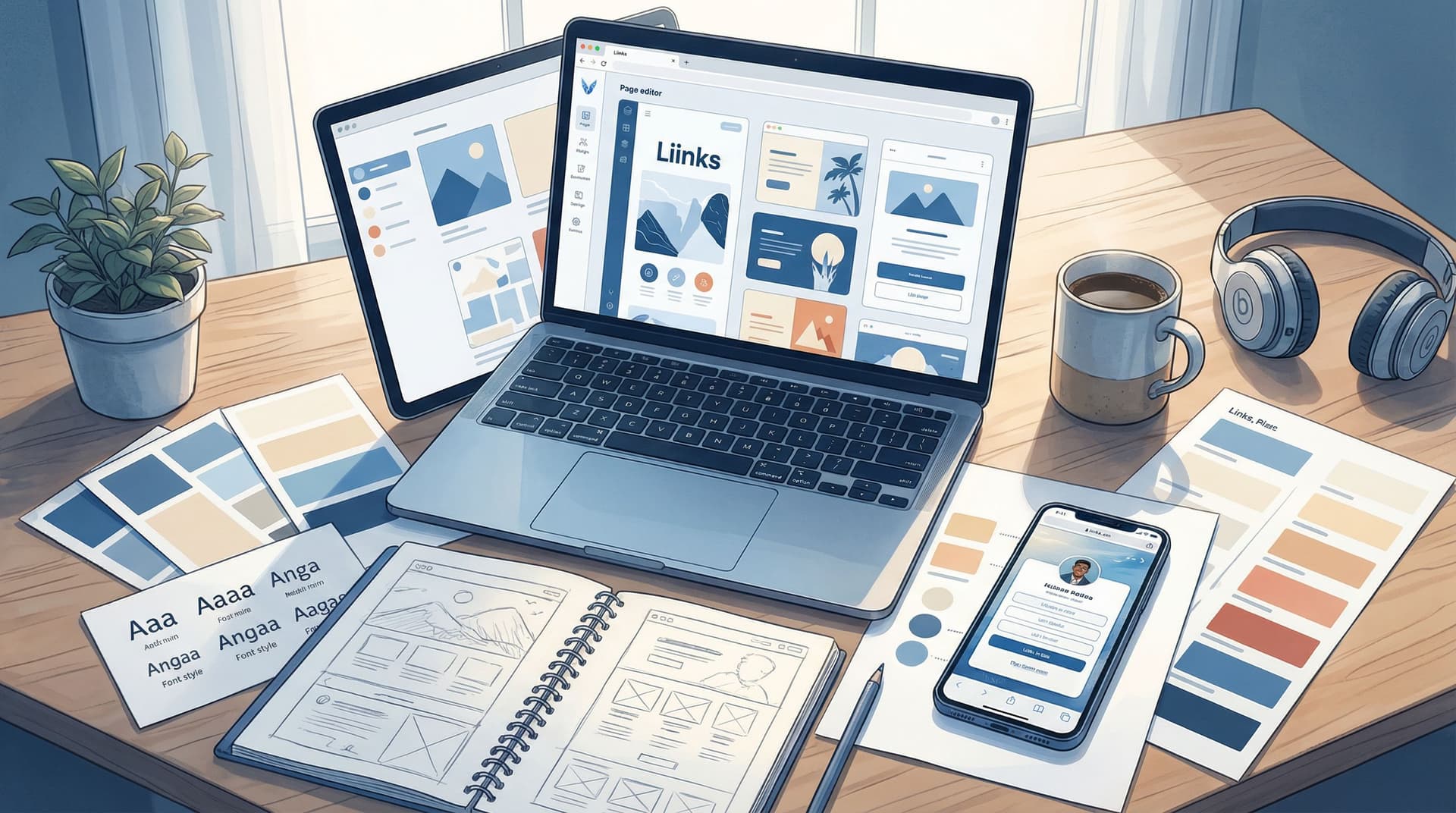
Template to Signature Look: How to Design a Liinks Page That Feels Uniquely ‘You’ in Under an Hour

Your link in bio is often the first place someone decides whether they want to stay in your world or click away.
They’ve just watched your Reel, saved your carousel, or finished your YouTube video. They tap your bio link, and in a split second they’re asking:
- Does this feel like the same person I just saw in my content?
- Is it clear what I should click next?
- Do I trust this enough to buy, subscribe, or follow deeper?
That’s why moving from a generic template to a signature look matters so much. A well-designed page on Liinks doesn’t just look pretty—it makes you recognizable, memorable, and easier to buy from.
And you don’t need a design degree or a free weekend to get there. With a bit of intention, you can go from starter template to a page that feels exactly like you in under an hour.
Why Your Liinks Design Is Worth the Hour
Spending 45–60 minutes dialing in your design has a ripple effect across everything you do online.
Here’s what a signature look quietly does for you:
- Builds instant trust. When your page matches your content, people feel like they’re in the right place. That consistency is a shortcut to credibility.
- Makes decisions easier. Clean, intentional design guides visitors toward your most important links instead of overwhelming them with options.
- Boosts conversions. A page that looks professional and aligned with your brand makes people more comfortable buying, opting in, or booking.
- Saves time later. Once your visual foundation is set, you can swap links and campaigns without rebuilding your page from scratch.
If you want to go deeper on how design connects to performance, you might like our post on building a design-first Liinks page that actually converts.
The Under-an-Hour Game Plan (Overview)
We’ll walk through a simple, time-boxed process you can follow:
- Clarify your vibe and priorities (5–10 minutes)
- Choose the right starting template (5 minutes)
- Lock in your colors, type, and imagery (15–20 minutes)
- Structure your links so they tell a story (15–20 minutes)
- Do a quick polish and mobile check (5–10 minutes)
Set a 60-minute timer if that helps. The goal is not perfection. The goal is to get to a page that’s recognizably you—and ready to ship.
Step 1: Define What “You” Looks and Feels Like (5–10 Minutes)
Before you touch any settings in Liinks, zoom out. Your page should feel like a natural extension of:
- The content you post most often
- The offers you actually want people to take
- The personality you’re known for (or want to be)
Ask yourself three quick questions
Grab a notes app and answer these in a few bullet points:
-
If my brand were a person at a party, how would people describe them?
Examples: "chill and minimalist", "bold and high-energy", "soft and cozy", "edgy and experimental". -
What are the top 1–2 actions I want people to take from my bio link?
Examples:- Book a discovery call
- Join my newsletter
- Shop my latest drop
- Watch my newest video or series
-
What visual cues do I already use elsewhere?
Think about:- Colors in your thumbnails, Reels covers, or logo
- Fonts you use in carousels or YouTube titles
- Any recurring motifs (stars, doodles, gradients, polaroid frames, etc.)
These answers will guide every design decision you make, and they’ll keep you from getting lost in endless customization.
Step 2: Pick the Right Template—Then Commit (5 Minutes)
Liinks gives you flexible layouts that can be dressed up a thousand different ways. The trick is choosing a starting point that matches how your brain (and your audience) works.
Choose based on your primary goal
-
If you sell products or digital offers…
Start with a layout that lets you feature a few hero links or buttons at the top, plus supporting links below. Think: "Shop the drop" or "Start here" links in bold, then secondary items. -
If you’re a service provider or freelancer…
Look for a layout that gives space for a short intro and a few high-intent links like "Work with me", "Portfolio", and "Book a call". Our post on turning your page into a mini website that actually books clients can help you decide what those should be. -
If you’re a creator focused on content growth…
Choose a layout that makes it easy to highlight your latest or most bingeable pieces: playlists, series, or lead magnets.
Once you’ve picked a template, commit for at least a month. You can always tweak styling and content, but constantly hopping templates makes it hard to build a recognizable look.
Step 3: Lock In Your Visual Identity (15–20 Minutes)
This is where your page starts to look like more than a template.
You’ll focus on three things:
- Color palette
- Typography (fonts)
- Imagery and accents
1. Choose a simple, memorable color palette
You don’t need 10 colors. You need 3–4 max:
- Primary color: The main brand color used for buttons or key accents.
- Secondary color: A softer or complementary color used for backgrounds or secondary buttons.
- Neutral(s): White, off-white, or a dark gray/near-black for text and contrast.
Quick ways to find your colors:
- Pull colors from your existing logo, thumbnails, or Instagram grid.
- Use a tool like Coolors or Adobe Color to generate combinations based on your main brand color.
Design tips:
- Prioritize contrast. Make sure buttons and text are easy to read on mobile. Dark text on light backgrounds (or vice versa) almost always wins.
- Use color with intention. Reserve your boldest color for your most important buttons so they naturally stand out.
2. Pick 1–2 fonts and stick to them
Fonts do a lot of heavy lifting for your vibe.
- Sans-serif fonts (clean, modern) work well for tech, education, productivity, fitness.
- Serif fonts (with little "feet" on the letters) can feel more editorial, luxe, or classic.
- Script or display fonts are best used sparingly—maybe for your name or a single heading.
Keep it simple:
- Heading font: Something with personality but still readable.
- Body font: Clean, legible, and not too condensed.
Try to mirror what you already use in your content graphics or website for instant cohesion. If you’re not sure, go with a friendly, modern sans-serif for everything—you can’t go wrong with clarity.
3. Add imagery that feels like your world
Your profile photo and any header image or background pattern do a lot of work before anyone reads a word.
- Profile photo: Choose a clear, high-resolution image where your face or logo is easily recognizable even at small sizes.
- Header or background: This could be a subtle gradient, a brand pattern, or a soft photo that doesn’t compete with your buttons.
Good imagery is:
- On-brand with your content (same color grading, similar mood)
- Not so busy that it makes buttons hard to read
- Consistent—avoid mixing 10 different styles of photos or illustrations
If you want a deeper dive into matching your visuals across platforms, check out our guide to designing a brand-safe, on-brand Liinks page.
Step 4: Make Your Links Tell a Clear Story (15–20 Minutes)
Once your page looks like you, it needs to behave like you—direct, helpful, and focused.
Start with your “North Star” action
Remember the 1–2 actions you identified earlier? Those should sit at the very top of your page.
Examples:
-
Creator selling a course:
- "Start here: My signature course"
- "Free training: 3 steps to your first client"
-
Service provider:
- "Work with me: Done-for-you TikTok strategy"
- "Book a free 15-minute consult"
-
Ecommerce brand:
- "Shop the latest drop"
- "Best-sellers: Start here"
Put these links in visually prominent buttons and consider using your primary brand color here.
Then group everything else into simple sections
Your page shouldn’t feel like a junk drawer. Think in pillars instead of random links. For example:
- Learn: Tutorials, blog posts, YouTube playlists
- Work with me: Services, booking links, applications
- Shop: Products, bundles, affiliate links
- Community: Newsletter, Discord, Patreon, membership
Our post on structuring your page around what your audience actually wants—Content Pillars to Clicks—can help you map these out.
Within each pillar, limit yourself to 3–5 links. If you have more, ask:
- Is this actively relevant right now?
- Does this support my main goals?
- Has this gotten meaningful clicks or results in the last 60–90 days?
If not, archive or hide it for now. You can always bring it back for specific campaigns.
Write link labels that sound like you (and are clear)
Your link text is part of your design. It should:
- Be human and specific, not vague or corporate
- Match the tone of your content
- Make the benefit obvious
Compare these:
- "Newsletter" → "Get my weekly creator playbook"
- "Course" → "Learn how to land 3 clients/month"
- "Shop" → "Shop my presets + templates"
You don’t have many words—make each one work.
Step 5: Add Micro-Touches That Make It Feel Custom (10–15 Minutes)
This is where your page goes from “nice” to “oh, this is them.”
Use spacing and hierarchy intentionally
- Give your hero links a bit more breathing room.
- Group related links closer together.
- Avoid long, unbroken lists—use section headings or visual breaks.
A little whitespace instantly makes your page feel higher-end and easier to skim.
Add subtle personality cues
Without overdoing it, sprinkle in details that feel like your brand:
- Small icons next to certain links (a camera for “Portfolio”, a heart for “Favorites”)
- Short, friendly microcopy like:
- "New here? Start with these" above your intro links
- "For clients" above your service links
- A one-line intro that sounds like you, for example:
- "Helping creators turn content into clients."
- "Cozy book recs, mindful productivity, and slow business."
Make sure it’s mobile-first
Most visitors will see your Liinks page on their phone, not a desktop.
Do a quick check:
- Open your page on your own phone.
- Test tap each button—is there enough spacing so you’re not accidentally hitting the wrong link?
- Check readability in different lighting (bright daylight vs. dim room). If it’s hard to read, increase contrast or font size.
Give yourself a 30-second “stranger test”
Look at your page as if you just discovered yourself five minutes ago.
Ask:
- Can I tell what this person does in under 3 seconds?
- Is it obvious what I should click first?
- Does this look like the same creator I just saw on Instagram/TikTok/YouTube?
If the answer to any of these is “not really,” tweak your intro line, hero links, or colors until it clicks.
Step 6: Set Yourself Up for Easy Updates (5–10 Minutes)
Your page shouldn’t be a one-and-done project. The best link in bio pages evolve without losing their core look.
Create a simple update ritual
Pick a recurring reminder—maybe every two weeks or once a month—to:
- Swap in your latest offer, video, or lead magnet as a top link
- Retire time-sensitive campaigns you’re done promoting
- Reorder links based on what matters most this week or month
If you want a deeper, data-backed approach, our SEO and analytics checklist—Optimize Once, Grow for Months—shows you how to use click data to decide what stays and what goes.
Keep your design consistent even as content changes
When you update links, resist the urge to overhaul your colors and layout every time.
Instead:
- Keep your colors, fonts, and imagery steady for at least a quarter.
- Make changes mainly in copy, order, and which links are featured.
This is how your page becomes recognizable—like seeing your favorite creator’s thumbnail style from across the feed.
Example 45-Minute Workflow You Can Steal
If you like structure, here’s a sample schedule you can follow right now:
-
Minutes 0–10:
Answer the three questions about your vibe, priorities, and existing visual cues. -
Minutes 10–15:
Choose a template in Liinks that matches your primary goal. -
Minutes 15–30:
- Set your primary + secondary colors and neutrals.
- Choose your heading + body fonts.
- Upload your profile image and any header/background.
-
Minutes 30–40:
- Add your top 1–2 hero links.
- Group remaining links into 2–4 simple sections.
- Rewrite link labels to be clear and personality-driven.
-
Minutes 40–45:
- Check everything on mobile.
- Adjust spacing, contrast, and order.
- Add a one-line intro and any small icons or microcopy.
Set a timer, move quickly, and ship it. You can always refine later—but you can’t optimize a page that doesn’t exist.
Bringing It All Together
Designing a link in bio that feels uniquely you isn’t about being a designer. It’s about:
- Knowing the vibe you want to give off
- Choosing a template that supports your goals
- Locking in a simple, recognizable visual identity
- Structuring your links around what your audience actually wants
- Adding small touches that make your page feel like a natural extension of your content
Give yourself one focused hour and you’ll walk away with a Liinks page that doesn’t just list links—it introduces you, guides your audience, and supports everything else you’re building.
Your Next Step
Don’t bookmark this and walk away.
- Open Liinks in a new tab.
- Set a 45–60 minute timer.
- Follow the workflow above step by step.
By the time your timer goes off, you’ll have moved from a generic template to a signature look—a page that feels unmistakably you and quietly does the heavy lifting every time someone taps your bio link.
Your audience is already clicking. Now it’s time to give them a page that’s worth landing on.


