
Brand-Safe but Still You: Designing an On-Brand Liinks Page That Matches Your Entire Online Presence

Brand-Safe but Still You: Designing an On-Brand Liinks Page That Matches Your Entire Online Presence
Your audience doesn’t just see you in one place.
They might catch a Reel on Instagram, a how‑to on YouTube, a spicy take on X, and a newsletter in their inbox—all before they ever buy from you.
The common thread they’re looking for across all of that? A brand that feels consistent, trustworthy, and unmistakably you.
Your link‑in‑bio is one of the easiest places to either reinforce that feeling… or accidentally break it.
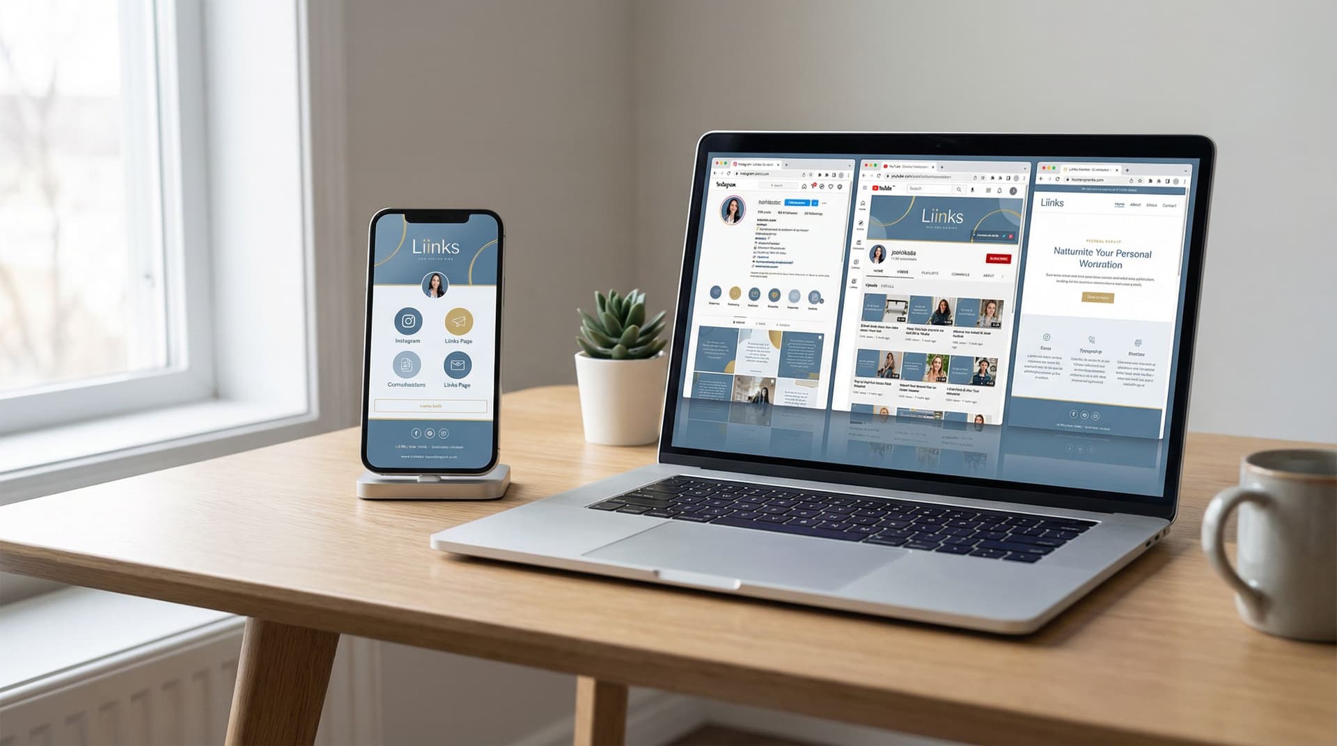
This guide will walk you through how to design a brand-safe, on-brand page with Liinks that looks and feels like your entire online presence—without turning into a generic corporate landing page.
Why “Brand-Safe but Still You” Matters
A lot of creators and small brands fall into one of two traps:
-
Too safe, not enough personality
Their link‑in‑bio page looks like a default template: bland colors, generic fonts, no point of view. It’s technically “on-brand” but not memorable. -
Too chaotic, not enough structure
Every color, font, and emoji under the sun fights for attention. It feels fun—but also a little untrustworthy or confusing.
A brand-safe but still-you Liinks page hits the middle:
- Consistent with your visual identity (logos, colors, type, imagery)
- Aligned with your voice and positioning (how you talk, what you prioritize)
- Clear about what to click next (no decision fatigue)
- Flexible enough to support campaigns, launches, and experiments
When your Liinks page matches the rest of your presence:
- People instantly recognize they’re in the right place.
- You build trust without needing a huge website.
- Your launches, offers, and content feel cohesive instead of scattered.
- You can treat your page like a mini home base (or even a mini website-level portfolio—more on that in this post).
Step 1: Audit Your Current Brand Signals
Before you design anything, you need to understand what your brand already looks and feels like.
Do a quick 20-minute audit of your:
- Instagram grid & Stories highlights
- TikTok profile & thumbnails
- YouTube channel art & video thumbnails
- Website or landing pages (if you have them)
- Newsletter header, footer, and sign-up forms
Write down recurring elements you see:
- Colors – What shades show up most often? Are you more muted, bright, dark, or pastel?
- Fonts – Do you lean serif, sans-serif, handwritten, or bold block type?
- Imagery style – Polished studio shots, candid lifestyle photos, screenshots, illustrations, memes?
- Tone of voice – Playful, straight-to-the-point, nurturing, edgy, analytical?
- Key phrases – Taglines, value props, or recurring phrases your audience already associates with you.
You’re building your Liinks page from these ingredients—not from a random template.
Quick check: If someone only saw your profile photo, your top 9 grid posts, and your Liinks page, would they feel like they’re looking at the same person or brand? If not, that’s the gap you’re about to close.
Step 2: Choose a Clear Role for Your Liinks Page
Your page can’t be everything to everyone. It needs a job.
Ask yourself: What is the main outcome I want from my link‑in‑bio right now?
Common roles:
-
Book more clients – Highlight portfolio, services, and booking links.
(If that’s you, you’ll love the deeper dive in this guide.) -
Grow your email list – Push one primary lead magnet or newsletter sign-up.
(You can layer on more list-specific tactics with the strategies in Newsletter Growth on Autopilot.) -
Drive sales – Focus on product collections, featured offers, and checkout links.
-
Show your best content – Surface your strongest posts, series, or resources so new followers can binge.
Once you choose the main role, your design decisions become easier:
- What should be above the fold
- Which buttons get the boldest styling
- Which links get demoted or removed
Your Liinks page can still support multiple goals—but it should have one clear priority.
Step 3: Translate Your Visual Identity to Liinks
Now that you know your brand ingredients and your page’s job, it’s time to bring it into Liinks.
Lock in Your Core Colors
Aim for:
- 1 primary color – Used for your main buttons, key headings, and accents.
- 1–2 neutrals – For background and text (e.g., off-white + dark charcoal).
- 1 accent (optional) – For subtle highlights, badges, or limited-time promos.
Tips:
- Pull hex codes directly from your logo, website, or social templates for consistency.
- Make sure your primary button color has enough contrast with the background so text is legible.
- Avoid using every brand color at once; keep it focused.
Choose Fonts That Match Your Personality
Inside Liinks, pick fonts that mirror what you already use elsewhere:
- Headings – Can carry more personality (serif, bold, quirky) as long as they’re readable.
- Body text – Keep it clean and simple; this is where clarity matters most.
Ask:
- Does this font combo feel like my existing posts and website?
- Is it easy to skim on a small phone screen?
Use Imagery Intentionally
You don’t need a gallery of photos, but a few visual anchors can make your page feel like a real brand, not just a list of links:
- A clean header image or profile image that matches your social avatars
- A hero section image or background that reflects your niche (e.g., workspace, lifestyle, product flat lay)
- Occasional section dividers or icons that echo your style (line art, doodles, minimalist shapes)
Keep imagery on-theme: if your Instagram is warm, cozy, and soft, don’t suddenly go neon and hyper-tech on your Liinks page.
Step 4: Align Your Page Structure with Your Brand Story
Brand-safe design isn’t just about visuals—it’s about how your page flows.
Think of your Liinks page as a short story about who you are and what you help people do.
Start with a Clear Identity Block
Right at the top, include:
- Your name or brand name
- A one-line positioning statement (who you help + how)
- Optional: social proof nugget (clients served, niche, or signature offer)
Examples:
- Helping freelance designers land better clients with better portfolios.
- Short-form video coach turning your 30-second clips into full-time income.
- Nutritionist making healthy eating realistic for busy parents.
This instantly orients visitors and makes every link that follows make more sense.
Group Links into Intentional Sections
Instead of a random stack of links, group them by purpose:
- Start here – For new followers or cold traffic
- Work with me / Shop – Services, products, offers
- Free resources – Lead magnets, guides, checklists
- Content hubs – YouTube playlist, blog, podcast
- Community & social – Discord, Patreon, secondary channels
This approach mirrors the content-pillar thinking from Content Pillars to Clicks: you’re turning your brand themes into clear, clickable paths.
Within each group, order links from most important to least important.
Use Copy That Sounds Like You
Your link labels and microcopy are a huge part of feeling on-brand.
Instead of plain labels like:
- “Newsletter”
- “Shop”
- “Book a call”
Try:
- “Get my weekly creator playbook”
- “Shop my go-to gear + templates”
- “Apply for 1:1 strategy session”
Keep it:
- Consistent with how you talk in captions and emails
- Specific about what happens when they click
- Short enough to scan quickly on mobile
Step 5: Make It Brand-Safe for Partnerships & Sponsorships
If you work with brands, your link‑in‑bio is part of your professional footprint. It needs to feel safe for:
- Potential sponsors reviewing your profiles
- Affiliate partners clicking through your links
- PR teams and journalists checking you out
To keep things brand-safe without losing personality:
Maintain a Professional Baseline
- Avoid NSFW imagery or language on your Liinks page—even if some platforms are a bit spicier.
- Keep your primary sections focused on value, offers, and content—not drama or hot takes.
- Make sure your top links work, load quickly, and lead to pages you’re proud of.
Create a Dedicated “Partners” or “Brands” Section
This can include:
- A link to a media kit or press page
- A short “Work with me” overview
- Case studies, testimonials, or past collaborations
This shows you take your brand seriously and gives partners a clear path to learn more.
Use Campaign-Specific Styling Thoughtfully
When you’re running a launch, sale, or brand collaboration, you can:
- Temporarily feature a branded color block or hero section
- Add a limited-time banner (e.g., “Holiday Gift Guide” or “New Drop Live”)
- Pin campaign-specific links above your usual layout
Just make sure the core of your design—fonts, base colors, tone—still feels like you.
For seasonal promos, you can borrow ideas from Seasonal Campaigns with Liinks and adapt them to your brand palette.
Step 6: Keep It Consistent Across Platforms (Without Extra Work)
Your audience might come to your Liinks page from:
- TikTok
- YouTube
- X (Twitter)
- Your newsletter
You don’t need a different page for each platform, but you do want the experience to feel seamless.
Here’s how:
Match the Entry Point
If most visitors are coming from Instagram Stories where you’re promoting a specific thing (like a workshop), make sure that offer is:
- At or near the top of your Liinks page
- Styled as a primary button
- Labeled in a way that matches your Story text
If you’re driving from YouTube, consider pinning:
- Your latest video
- A playlist relevant to your niche
- A “Start here” guide that mirrors your channel trailer
Keep Your Visual Identity Stable
Even if you tweak sections for different campaigns, keep these consistent:
- Logo or profile image
- Core background color
- Font choices
- Overall tone of your headings and button labels
That way, no matter where someone discovers you, your Liinks page feels like the same creator they just watched.
If you want to go deeper on cross-platform alignment, check out TikTok, Instagram, YouTube: How to Customize One Liinks Page for Every Social Platform.
Step 7: Test, Tweak, and Stay Recognizable Over Time
A brand-safe, on-brand page isn’t something you set once and forget. But you also don’t want to reinvent it every week.
Use this rhythm instead:
Monthly or Campaign-Based Tweaks
Once a month—or whenever you launch something new—review:
- Top 3–5 links – Do they reflect your current priorities?
- Hero section – Does it highlight your most important offer or content?
- Any outdated promos – Remove or archive old sales, launches, or freebies.
This is where the “living hub” mindset from Repurpose, Don’t Burn Out really shines: you can rotate in your best evergreen content and offers without changing the core brand design.
Protect Your Brand Foundations
Even as you tweak links and campaigns, keep these stable for at least 3–6 months at a time:
- Primary and neutral colors
- Font pairings
- General layout structure (e.g., identity → main CTA → sections)
This repetition is what trains your audience to recognize you instantly.
Pay Attention to What People Actually Click
Look at your analytics to see:
- Which links get the most taps
- Which sections people ignore
- Whether your primary CTA is actually performing like a primary CTA
If a “fun” section never gets clicks, it might be time to simplify.
If a specific free resource outperforms everything else, consider:
- Moving it higher on the page
- Giving it a more prominent button style
- Aligning your content more closely with that topic
Quick Checklist: Does Your Liinks Page Actually Feel On-Brand?
Run through this list and be brutally honest:
- My Liinks colors match (or intentionally complement) my existing brand colors.
- My fonts feel like my other content and are easy to read on mobile.
- My header clearly states who I am and who I help.
- My top 1–3 links reflect my current priority (clients, list growth, sales, etc.).
- My link labels sound like my captions and emails—not generic button copy.
- My page would feel safe and professional to a potential brand partner.
- My layout would still be recognizable if someone saw it again in 3 months.
If you can’t check at least 5 of these, you’ve got some easy wins waiting.
Bringing It All Together
A brand-safe but still-you Liinks page isn’t about perfection. It’s about alignment.
When your visuals, voice, and structure all tell the same story, your audience feels:
- More confident clicking your links
- More clear about what you offer
- More connected to you as a creator or brand
And you get a page that doesn’t just “hold links,” but quietly does the work of:
- Introducing you to new followers
- Guiding people to the right next step
- Supporting launches, campaigns, and evergreen offers
—all while looking like you on your very best day.
Your Next Step
You don’t need to overhaul everything at once.
Here’s a simple way to start today:
- Spend 10 minutes auditing your current brand signals across your main platforms.
- Open Liinks and:
- Set your background, primary, and text colors to match your existing brand.
- Choose fonts that mirror what you already use.
- Rewrite your top 3 link labels so they’re specific, clear, and in your voice.
- Add a short one-line positioning statement at the top of your page.
That alone will put you ahead of most creators who are still using default templates and vague buttons.
Then, when you’re ready, come back to this guide and layer in:
- Section groupings
- Campaign highlights
- Partner-friendly touches
- Regular “living hub” updates
Your brand deserves a link‑in‑bio that pulls its weight. With a thoughtfully designed, on-brand Liinks page, that one tiny URL can finally look—and work—like the rest of your presence.


