
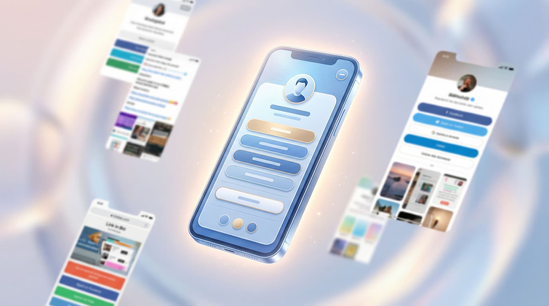
The “Link in Bio” Glow-Up: Tiny Visual Tweaks That Make People Actually Want to Click

Your “link in bio” is the one place people voluntarily go when they want more from you.
They’re already interested. They’ve already paused the scroll. They’ve already tapped.
And then… they land on a page that looks like a group project from 2013.
The good news: you don’t need a full rebrand to fix this. You need a glow-up—specifically, a handful of tiny visual tweaks that quietly make people think:
“Oh, this looks good. I trust this. I’ll click.”
If you’re using a flexible tool like Liinks (built for creators who actually care what their page looks like), these tweaks are ridiculously easy to pull off.
Let’s turn that random list of buttons into a tiny, on-brand, click-magnet.
Why Your Link in Bio Design Matters More Than You Think
People decide whether to stay or bounce from a page in a few seconds. Multiple UX studies show that first impressions are formed in under 50 milliseconds—yes, your page is being judged faster than you can say “link in bio.”
On a link page, that snap judgment affects whether they:
- Join your email list
- Buy your product
- Book a call
- Watch your video
- Or just close the tab and go back to scrolling
Your content got the attention. Your link in bio decides what that attention turns into.
If you want a deeper dive into how design affects conversion, bookmark our post on why good design on your link in bio quietly boosts your conversion rate for later.
For now, here’s the big idea:
Tiny visual changes → big trust boost → more clicks on the links that matter.
You don’t need 27 new features. You need:
- Cleaner hierarchy
- Better contrast
- Clearer emphasis
- A page that feels intentional, not accidental
That’s where the glow-up begins.
Step 1: Pick One Visual Story (and Commit to It)
The fastest way to look unprofessional? A link page that feels like five different creators fighting for custody.
Neon buttons, serif headings, three different pinks, and a random teal background… your audience doesn’t consciously clock each detail, but they do feel the chaos.
Instead, pick one simple visual story.
Decide on three things:
- A base color – usually pulled from your logo, your favorite outfit, or your feed aesthetic.
- A neutral – white, off-white, charcoal, or deep navy.
- An accent – used sparingly for your most important CTAs.
On Liinks, you can set a background color, button colors, and text colors in a few clicks. Use that power responsibly:
- Background: keep it light or dark and solid (or a very soft gradient). Avoid busy photos unless you’re keeping buttons super minimal.
- Buttons: one main color, one secondary style (outlined or muted) for less important links.
- Text: high contrast. If you need to squint, it’s a no.
Rule of thumb: If your link page and your main platform (Instagram, TikTok, YouTube) stood next to each other at a party, they should look like they arrived together.
If you’re still figuring out your overall vibe, our post on turning your Liinks page into a mini style guide walks you through using your link page as a branding lab.
Step 2: Make the First Screen Do the Heavy Lifting
Most people will never scroll your entire page. Harsh, but true.
That means the first screen (what someone sees without scrolling) has one job: make the next click obvious.
Clean up your above-the-fold area
Here’s what that first view should include:
- A recognizable profile photo or logo – same as your main platform, or a strong variation.
- A short, specific tagline – not “Helping you live your best life,” but:
- “Templates & tools for ADHD-friendly productivity”
- “Wedding photographer & educator for candid, unposed lovers”
- “Cozy home decor finds + small space styling tips”
- 1–2 priority buttons – the things you want 80% of people to click.
Then, everything else can live below.
Use visual hierarchy like a pro (without being a designer)
A few tiny tweaks that make a huge difference:
- Make your primary button bigger or bolder than the rest.
- Use a different style for secondary links (outlined, muted color, or smaller font).
- Group related links with small headings like “For new here” or “Work with me.”
On Liinks, you can:
- Pin your main offer or latest launch to the top.
- Use sections to visually group content.
- Adjust button styles so your “main thing” doesn’t visually compete with your “nice to have” links.
If you want to go even deeper on simplifying what shows up first, check out the “One Offer” Liinks makeover for a full breakdown.
Step 3: Upgrade Your Buttons from “Homework Links” to “Tap-Worthy”
Let’s talk about the actual buttons.
If your page looks like:
- 12 identical rectangles
- All the same color, same size, same text style
- With vague labels like “New video” or “Click here”
…you’re making people work way too hard.
Give each button a clear job
Rename your links so each one answers: “What happens if I tap this?”
Instead of:
- “Newsletter” → “Get my weekly email with X, Y, Z”
- “Shop” → “Shop my presets & templates”
- “YouTube” → “Watch my latest long-form tutorials”
Microcopy tweaks that help:
- Add benefit language: “Book a 1:1 call” → “Book a 1:1 call to plan your Q2 content.”
- Use time clues: “5-min tutorial: Edit Reels faster.”
- Use social proof: “Join 3,000+ creators on my list.”
Use visual cues to guide the eye
Small design moves that nudge people toward your main CTA:
- Primary button color for your #1 action (e.g., email list or main offer).
- Secondary, softer color for everything else.
- Icons (if your tool supports it) on a few key links: play icon for videos, envelope for email, cart for shop.
On Liinks, experiment with:
- A single standout color for your primary CTA button.
- Slightly larger text or bolder weight for that one button.
- Putting supporting links in a separate section so they don’t compete.
Tiny tweak challenge: Change just your button labels to be more specific and benefit-driven. Don’t touch anything else. Watch your click data for a week.
Step 4: Use Spacing Like a Designer (Without Knowing What Kerning Is)
One of the most underrated visual tweaks? Whitespace.
Crowded pages feel stressful. Stressful pages get closed.
Give your links room to breathe
Quick spacing rules:
- Add a bit more vertical space between sections than between individual links.
- Avoid more than 7–8 primary links in one unbroken stack. If you have more, group them.
- Add section headers like:
- “Start here”
- “For clients”
- “Free resources”
This creates visual “rest stops” so the page feels scannable, not like a wall of homework.
Trim what doesn’t need to be there
You don’t have to delete everything, but you should demote or hide links that:
- You haven’t promoted in months
- Lead to dead or irrelevant offers
- Confuse your main goal (e.g., five different freebies when you only care about your paid offer right now)
If you’re drowning in old content, the post on turning your content dump into a curated Liinks resource hub will help you decide what stays, what goes, and what gets archived.
Step 5: Match the Vibe of Your Content (Not Someone Else’s)
Your link in bio doesn’t need to look like a generic SaaS homepage. It needs to look like you.
Ask yourself:
- Are my Reels chaotic and funny, but my link page is stiff and corporate?
- Is my YouTube channel calm and educational, but my link page is neon chaos?
- Does my audience expect cozy, minimal, maximalist, playful, or luxury—and does my page match that?
Tiny visual tweaks that align your page with your content:
- Photography style: If you use warm, grainy photos on your feed, avoid cold, hyper-sharp stock-style images on your page.
- Typography: If your brand is soft and friendly, pick rounded, simple fonts over sharp, ultra-corporate ones.
- Color temperature: Match your background and button colors to the temperature of your content (warm neutrals vs. cool tones).
On Liinks, you can:
- Upload a custom background image (just keep it subtle and not too busy).
- Use your own brand colors instead of default palettes.
- Add a short intro line that sounds like you—not like a resume.
The goal isn’t to look like a “professional brand.” The goal is to look like the same person they just watched for 30 seconds.
Step 6: Add One Tiny Motion Moment (and Stop There)
A little movement can draw attention. A lot of movement can make people seasick.
Smart ways to use motion:
- A subtle hover effect on buttons (slight color shift or shadow).
- A gentle highlight on your primary CTA (e.g., a soft glow or border).
- A micro animation on one element, like a “New” tag next to your latest offer.
Avoid:
- Multiple bouncing, pulsing, flashing elements.
- Auto-playing videos with sound.
- Anything that feels like a pop-up ad from 2009.
If your tool doesn’t support motion, you can fake it visually:
- Add a tiny “✨ New” or “🔥 Popular” label next to a key link.
- Use contrast and spacing to make one link feel more “alive” than the rest.
Step 7: Make It Skim-Friendly for Goldfish-Brain Browsers
Your visitors are:
- Half-watching something
- Half-tapping through Stories
- Half-thinking about lunch
So your page needs to be skimmable at a glance.
Speed-friendly tweaks:
- Use short link titles (1–2 lines max). Put extra context in a small sub-label if needed.
- Add tiny labels like “Free,” “New,” or “Best for beginners.”
- Order links by intent:
- For new people (start here, free guide, intro video)
- For warm audience (main offer, services, shop)
- For superfans (podcast, YouTube, deep dives)
If you’re a multi-passionate creator with a lot going on, pair these tweaks with the structure ideas in The Multi-Passionate Creator’s Map so your page still feels calm, not chaotic.
Step 8: Let Data Tell You What to Glow Up Next
Visual tweaks are fun. But the goal isn’t just “pretty”—it’s pretty and profitable.
Once you’ve made a few changes, check your link analytics:
- Which buttons get the most clicks?
- Which important links are underperforming?
- Do people scroll, or mostly tap from the first screen?
Experiment with:
- Swapping the order of your top 3 links.
- Testing two different button labels for the same offer.
- Trying a different color for your primary CTA.
On Liinks, you can quickly reorder links, duplicate pages for A/B-style experiments, and watch how behavior changes over a week or two.
Design tweak formula: Change one thing → watch data → keep what works.
No need to overhaul your entire page every time you get a new idea.
Quick Visual Glow-Up Checklist
Ready to give your page a 20-minute makeover? Run through this list:
Brand & vibe
- Do my colors, fonts, and photo match what people see on my main platform?
- Do I have one main color, one neutral, and one accent (not seven)?
Above the fold
- Is there a clear profile image and short, specific tagline?
- Are there 1–2 obvious primary actions, not 10 equal buttons?
Buttons & text
- Do my button labels clearly say what happens when you click?
- Is my main CTA visually different (color, size, weight) from the rest?
Layout & spacing
- Are my links grouped into logical sections with small headers?
- Is there enough whitespace so the page feels calm, not crowded?
Skimmability
- Can a new visitor understand where to start in under 3 seconds?
- Are my most important links in the top 3–5 positions?
If you can check most of these boxes, your link in bio is already ahead of the pack.
Bringing It All Together
Your “link in bio” glow-up isn’t about doing more. It’s about doing smaller things more intentionally:
- One clear visual story instead of random colors.
- One obvious next step instead of twelve equal options.
- Buttons that feel like invitations, not chores.
- Spacing and structure that make your page feel calm, not chaotic.
Those tiny visual tweaks add up to something big: people actually clicking the links that matter.
If you want a deeper structural reset (not just visual tweaks), pair this guide with:
- Creator Starter Pack: The Essential Links Every New Liinks Page Should Have (and What to Skip)
- The Lazy Creator’s Guide to a High-Converting Liinks Page (Built in One Weekend)
Together, they’ll help you decide what to feature while this post helps you decide how it should look.
Your Next Tiny Step (Yes, Just One)
You don’t need to block off a whole weekend or rebuild everything from scratch.
Pick one of these to do right now:
- Rewrite your top 3 button labels to be clearer and more benefit-driven.
- Reorder your links so your #1 goal is in the first position.
- Choose a simple color palette (base, neutral, accent) and update your Liinks page to match.
Log into Liinks, make that one tweak, and then watch how it changes the way you feel about sending people to your link in bio.
If you feel more confident dropping “link in bio” at the end of your content, your audience will feel it too.
Glow-up started. Keep going.


