
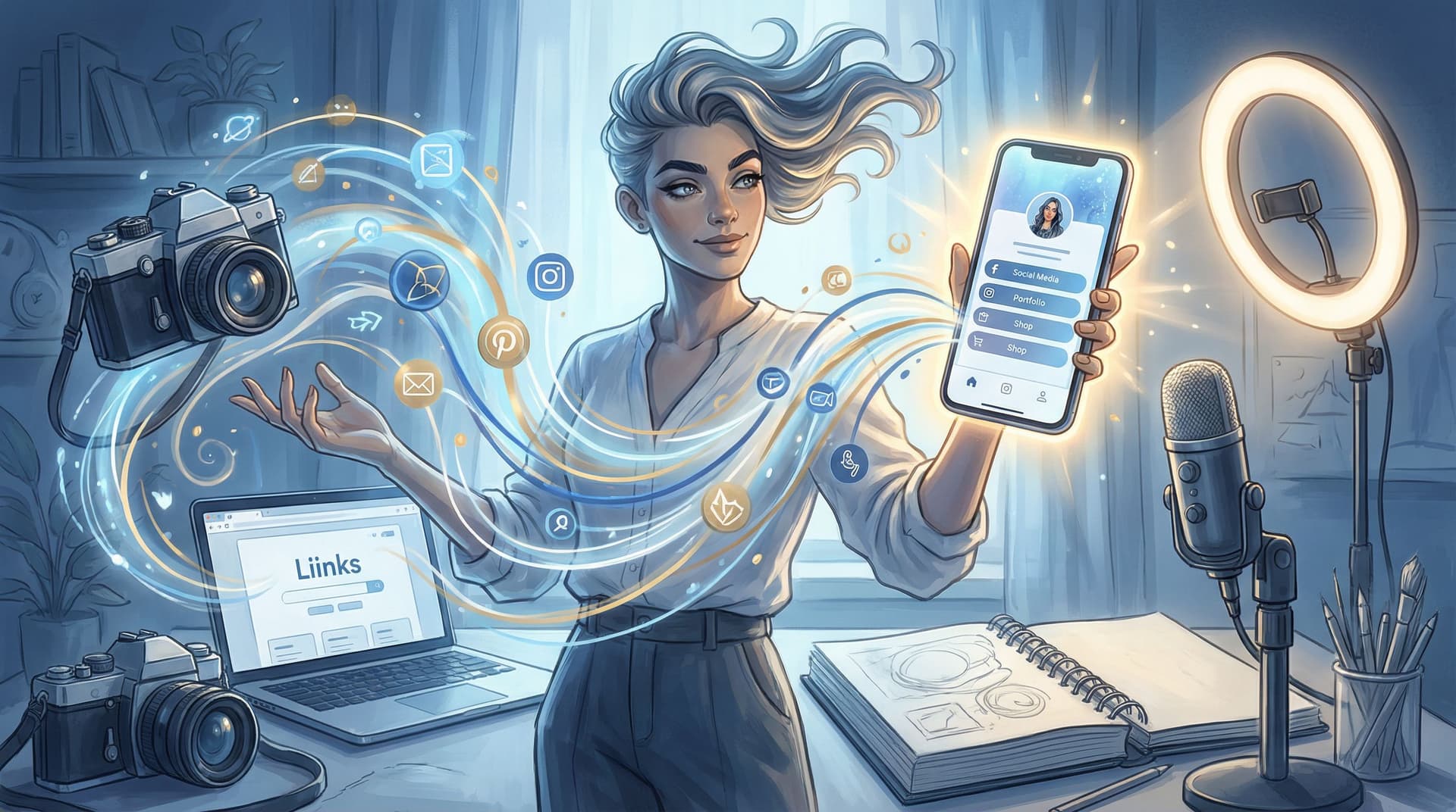
The Multi-Passionate Creator’s Map: Structuring One Liinks Page When You Do… Everything

You’re a podcaster and a photographer and a coach who occasionally sells crochet patterns and templates on the side.
Your interests? Abundant. Your offers? Plentiful. Your current link in bio? A mild cry for help.
If you’ve ever stared at your bio link builder thinking, “Where do I even start when I do all of it?” — this is your map.
We’re going to turn your one Liinks page into a clear, calm, strategic hub that can hold all your passions without feeling like a clearance rack.
Why Being Multi-Passionate Breaks Most Link Pages
Most link pages are built for people who have:
- One main offer
- One main platform
- One main niche
You, unfortunately (fortunately), are not that person.
When you try to cram everything you do into a basic list of buttons, a few things happen:
- Decision fatigue kicks in. Too many options = people freeze and tap out. Studies on choice overload show that when people are given too many options, they’re less likely to choose anything at all.
- Your priorities get fuzzy. If your email list, podcast, shop, coaching, and free guide all look equally important, nothing actually gets focus.
- Your brand feels fragmented. Even if your content is great, a scattered link page quietly says, “I haven’t thought this through.”
A well-structured link hub, on the other hand, can increase engagement and conversions because it makes it stupidly easy for people to find the right next step and take action — especially when it’s clean, branded, and focused.(pushbio.io)
So no, the problem isn’t that you do too much. The problem is that your page isn’t organized to show off that range.
Step 1: Decide What Your Page Is For (Right Now)
Before you drag a single button around, answer this:
If someone taps your bio link today, what is the best thing they could do next?
Not in theory. Not in October. This week.
Maybe it’s:
- Join your newsletter before a launch
- Book a discovery call
- Buy your new digital product
- Binge your best content so they actually get to know you
Whatever it is, that becomes your north star action. Everything else on your Liinks page should either:
- Directly support that action, or
- Be clearly secondary.
If you’re feeling stuck here, you might like the “one clear money move” thinking in The ‘One Offer’ Liinks Makeover: How Simplifying Your Page Can Actually Boost Sales.
Quick exercise (2 minutes):
- Write one sentence: “When someone taps my link, I want them to ______.”
- Circle the verb. That’s your primary CTA.
- Everything else you add to your page has to answer: “Does this help more people do that?”
Step 2: Pick Your Multi-Passionate “Map Type”
You don’t need a custom UX degree to structure your page. You just need to pick a layout that matches how your brain — and your audience — naturally sort things.
Here are three patterns that work especially well for “I do everything” creators.
1. The Role-Based Map
Perfect if you wear distinct hats that attract different people.
Example roles:
- Designer (brand + web clients)
- Educator (courses + templates)
- Influencer (brand collabs, affiliate picks)
Layout idea on Liinks:
- Short headline: “Design, teach, and create for multi-hyphenates.”
- Three featured blocks or sections:
- For Clients – portfolio, booking link, services
- For Students – flagship course, starter resources
- For Brands – media kit, past partnerships, contact
Each section gets 2–3 links max. You’re saying, “Pick the version of me you’re here for,” then giving them a short, curated path.
2. The Journey Map
Great if your content naturally moves people through stages (discover → learn → buy).
Layout idea:
- Start Here – intro video, best-of content, your story
- Go Deeper – newsletter, podcast, YouTube playlist, resources
- Work With Me / Shop – offers, services, products
This is especially powerful if you hate “funnels” but still want structure. (Also see Creator Funnels for People Who Hate Funnels: A No-Jargon Guide Using Liinks for more on this style.)
3. The Theme Map
Ideal if your interests look random on paper but actually connect through a few big themes.
Example themes:
- Creativity – art, photography, design
- Systems – Notion templates, productivity content
- Lifestyle – vlogs, recommendations, affiliate links
Each theme gets a mini section with:
- 1 “hero” link (the main thing)
- 1–2 supporting links (related content or offers)
Pick one map type and commit. You can always tweak later, but choosing a pattern now keeps you from building a Franken-page of vibes.
Step 3: Ruthlessly Prioritize (Yes, Even You)
Let’s talk numbers.
Best-practice guidance across link-in-bio platforms consistently lands around 5–7 main links for a clear, high-converting page.(modnet.io) Too many buttons and people bail.
For multi-passionate creators, the trick is:
Fewer main links, more smart grouping.
Instead of 14 individual links, you’ll:
- Group related things under one “pillar” link (e.g., “All Templates,” “Photography Portfolio,” “Start Here Library”).
- Use that pillar link to route to a more detailed page (your site, a collection, or even another focused Liinks page if you want to go advanced).
A simple prioritization ladder:
- Tier 1 – The One Big Thing (1 link)
- Your primary CTA: “Book a strategy session”, “Shop the new collection”, “Join the newsletter.”
- Tier 2 – Core Support (2–3 links)
- Best-of content, portfolio, shop, or main program.
- Tier 3 – Everything Else (2–3 links, max)
- Socials, secondary offers, a general “More resources” hub.
If it doesn’t fit in those 5–7? It probably belongs inside a collection page, not as a front-and-center button.
For quick, low-lift ways to rotate what’s visible without rebuilding everything, check out The 5-Minute Content Refresh: Tiny Liinks Tweaks That Make Your Old Posts Feel Brand New.
Step 4: Design a Page That Can Hold Many Niches (Without Looking Chaotic)
When you do a lot, design isn’t “nice to have.” It’s the glue that makes your page feel like one person instead of seven side projects.
A few design rules that especially matter for multi-passionate creators:
1. Pick One Visual Story
- One color palette. Not “a new color for every niche.” Choose 2–3 brand colors and use them consistently.
- One typography vibe. Your “coach” hat and your “artist” hat should not have totally different fonts on the same page.
- One style of imagery. If you’re using photos or icons, keep the style cohesive.
This is exactly the kind of polish we break down in The Aesthetic Advantage: Why Good Design on Your Link in Bio Quietly Boosts Your Conversion Rate.
2. Use Visual Hierarchy Like a Highlighter
Your page should visually whisper, “Start here.”
On your Liinks page, you can:
- Make your primary CTA button bigger or bolder.
- Use a contrasting color for your top action.
- Add subtle dividers or headings between sections (e.g., “For Creators,” “For Brands”).
People’s attention naturally goes to what’s big, bright, and high on the page. Use that to your advantage.
3. Design for Thumb-Brains
Most visitors are on mobile, scrolling with one thumb. Best-practice guidelines recommend:
- Single-column layouts
- Large tap targets (around 44–48px high buttons)
- Clear spacing and high contrast
- Short, scannable labels(whoozit.in)
Translation: no tiny text, no cramped buttons, no walls of copy above your links.
Step 5: Label Links Like a Human, Not a Spreadsheet
If your buttons currently say things like “Blog,” “YouTube,” or “Shop,” you’re missing an easy win.
Specific, action-focused CTAs consistently outperform vague labels because they tell people why to click and what they’ll get.(whoozit.in)
Instead of this:
- Blog
- YouTube
- Coaching
- Shop
Try this:
- Binge my top 5 tutorials (blog or playlist)
- Watch weekly behind-the-scenes vlogs (YouTube)
- Apply for 1:1 coaching
- Shop my templates & presets
For multi-passionate creators, this is crucial because your offers might sound unrelated at first glance. Good labels connect the dots.
Formula to steal:
[Action verb] + [who/what it’s for] + [benefit]
Examples:
- Start your content system in 1 hour (Notion template)
- Learn my 3-step editing workflow (video tutorial)
- Book a brand shoot in NYC (service)
If you do multiple things for different people, add that into the label:
- Brands: View my media kit
- Creators: Grab the free hook bank
- Students: Join the study club
Step 6: Build for You, Not Just Your Audience
This part is underrated: your link hub should reduce your chaos too.
When you’re juggling multiple projects, offers, and platforms, a well-structured Liinks page becomes a control center:
- One place to update when your focus shifts
- One URL you can drop in newsletters, DMs, podcasts, and print
- One quick reference when someone asks, “Where can I find everything you do?”
Instead of rewriting your bio every time you pivot, you:
- Update your primary CTA and top section.
- Rotate in or out a few key links.
- Keep your URL the same everywhere.
If you’re feeling the “too many tabs, too many tools” version of burnout, pairing this map with the ideas in Creator Burnout Is a UX Problem: Simplifying Your Online Universe with One Well-Designed Liinks Page can be a game changer.
Step 7: Add a Simple Maintenance Ritual
Your interests evolve. Your offers change. Your link page should, too — without becoming a second job.
Borrow this low-effort rhythm:
Weekly (5–10 minutes)
- Check your analytics inside Liinks or your other tools.
- Ask: What are people actually clicking?
- Move top performers higher; demote or remove duds.
Analytics across link-in-bio platforms show that links near the top of the page consistently get more clicks, and that rotating in timely offers (launches, promos) boosts engagement.(creatorblog.direct.me)
Monthly (15–20 minutes)
- Re-evaluate your north star action. Does it still match your current focus?
- Retire anything outdated or off-brand.
- Refresh your “Start Here” or “Best Of” link with updated content.
Quarterly (30–45 minutes)
- Revisit your overall map type (Role / Journey / Theme).
- Ask: Does this still reflect who I am and how I work?
- Make any bigger structural changes you’ve been avoiding.
You don’t need a full rebrand every time you get a new idea. You need a page that’s built to flex.
Putting It All Together: A Sample Multi-Passionate Layout
Let’s say you’re a photographer, educator, and creator who also runs a small preset shop.
Here’s how your Liinks page might look:
Header:
- Photo of you
- Line: “Helping creators shoot, edit, and share better stories.”
Primary CTA (Tier 1):
- Book a brand shoot (limited spots monthly)
Section 1 – For Clients (Tier 2):
- See my portfolio (link to portfolio page)
- Brand shoot pricing & FAQs
Section 2 – For Creators (Tier 2):
- Grab the free “Shoot Better Reels” guide
- Binge my top 5 tutorials (YouTube playlist or blog)
Section 3 – Shop & Resources (Tier 3):
- Shop presets & editing tools
- Join the newsletter for weekly tips
- Brands: View my media kit
That’s 8-ish total links, but visually grouped into clear paths. Each type of visitor instantly knows where to go, and you still get to be your full multi-hyphenate self.
TL;DR: Your Map, in One Scroll
If you skimmed (no judgment), here’s the condensed version:
- Choose one primary action you want visitors to take this week — that’s your north star.
- Pick a map type that fits you: Role-based, Journey-based, or Theme-based.
- Limit front-and-center links to roughly 5–7, and group the rest under smart hubs.
- Make design do the heavy lifting so your many passions feel like one cohesive brand.
- Write human, action-focused labels that explain who each link is for and what they’ll get.
- Use your Liinks page as your control center, not just a random menu.
- Check in regularly with a tiny analytics + cleanup ritual instead of giant overhauls.
You don’t need fewer passions. You need a better map.
Your Next Move (Yes, This Is Your Nudge)
You already have the hard part: skills, ideas, and way too many projects.
Now:
- Open your current link in bio.
- Ask: “What do I most want people to do from here?” Write that down.
- Log into Liinks and:
- Move that action to the very top.
- Group everything else into 2–3 clear sections.
- Rename your buttons using the action-focused formula.
Give yourself 30 minutes. Not a weekend, not a life overhaul. Just one focused session to turn your “I do everything” energy into a page that actually makes sense.
Your multi-passionate brain isn’t the problem. Your layout is.
Let’s fix that — one very good Liinks page at a time.


