The Aesthetic Advantage: Why Good Design on Your Link in Bio Quietly Boosts Your Conversion Rate

Your link in bio is doing more sales work than most of your captions.
Every time someone taps that tiny URL, they’re raising their hand and saying, “I’m interested enough to see more.” What happens next decides whether they:
- Join your list
- Buy your thing
- Book a call
- Or… close the tab and go back to scrolling
That decision happens in seconds—and design is doing a lot of the talking.
This is where a tool like Liinks shines: it’s built for creators who want their page to actually look good and convert, not just exist as a sad list of default buttons.
Let’s break down why aesthetics quietly move your numbers—and how to design a link in bio that looks incredible and behaves like a tiny conversion machine.
Why Design Quietly Changes Your Conversion Rate
You’ve probably heard some version of: people form an impression of a site in about 50 milliseconds. That’s 0.05 seconds for your brain to decide: “This feels legit” or “Nope.”
On a link-in-bio page, that snap judgment is even harsher because:
- People arrive from a tiny screen
- They’re half-distracted
- They’re used to seeing generic, template-y link pages
So when your page looks clean, intentional, and on-brand, a few invisible things happen:
-
Perceived trust goes up
Polished design signals, “I care about details. You can trust me with your time, inbox, or money.” -
Cognitive load goes down
Good layout, clear hierarchy, and consistent styling make it easy for the brain to understand, “Oh, this is what I’m supposed to click.” -
Your best action stands out
Instead of every button screaming at the same volume, design lets you spotlight your primary goal—like in the “One Offer” makeover approach. -
You look like a brand, not a hobby
When your link page visually matches your content, you stop feeling like “random creator online” and start feeling like a cohesive brand. (If that idea excites you, you’ll love this deep dive on turning your page into a mini style guide.)
In short: aesthetics don’t just “look nice.” They reduce friction, increase trust, and guide behavior. That’s conversion math, not just vibes.
The Invisible Design Mistakes That Cost You Clicks
Before we talk about what to do, let’s call out what’s quietly hurting you right now.
1. Template Face
If your page looks exactly like every other generic link list—same colors, same button style, same everything—people subconsciously assume:
- This was thrown together in 3 minutes
- There might not be anything important here
- This is “just links,” not a curated experience
A tool like Liinks gives you enough customization to escape template jail without needing a design degree.
2. Color Chaos
Random colors pulled from different apps, screenshots, and “that one Canva template you liked once” create:
- Low trust (feels messy)
- Low clarity (nothing stands out)
- Low recall (people don’t remember you visually)
3. Button Soup
Every link is the same size, same weight, same importance. Your freebie has the same visual priority as your “Book a $2,000 package” button.
When everything is loud, nothing is clear.
4. Text That Tries to Do Too Much
Tiny buttons stuffed with:
“Free 3-Day Challenge – Start Here to Finally Fix Your Content Strategy”
…are hard to skim. People bounce instead of reading.
5. No Visual Hierarchy
If your eye doesn’t know where to go first, your brain checks out.
- No clear headline
- No section breaks
- No spacing between “types” of links (offers vs free content vs social)
Good news: all of this is fixable with small, intentional design tweaks.
The Core Design Principles That Make Your Link in Bio Convert
You don’t need to become a designer. You just need a few rules you actually follow.
1. One Clear Visual Goal
Ask yourself:
“If someone only clicked one thing on this page, what would I want it to be?”
That becomes your primary call-to-action (CTA)—and your design should revolve around it.
How to make that CTA visually dominant:
- Use a bigger button than everything else
- Give it a stronger color (your boldest brand color)
- Add a short, direct label, like:
- “Join the Newsletter”
- “Shop My Presets”
- “Book a Strategy Call”
- Place it above the fold (visible without scrolling)
Then, use secondary styling (smaller, lighter buttons) for everything else.
If you want help choosing that one central action, pair this with the strategy in The ‘One Offer’ Liinks Makeover.
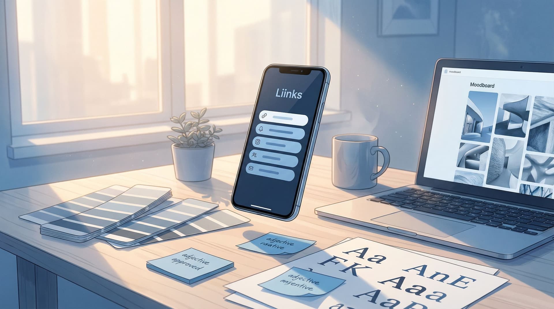
2. A Simple, Repeatable Color System
Instead of “whatever looks good,” try this:
- 1 background color
- Light neutral for most people (off-white, soft beige, light gray)
- 1 primary accent color
- For your main CTA button and key highlights
- 1 secondary accent color
- For less important buttons or badges
- 1 text color
- Usually dark gray or near-black for readability
Bonus move: pull colors from your existing content (like your Instagram feed) so the click from profile → Liinks page feels seamless.
3. Typography That Doesn’t Fight You
Fonts carry personality and affect legibility.
Quick rules:
- Use one font for headings, one for body text (or even just one font with different weights)
- Avoid long blocks of ALL CAPS (hard to read)
- Keep button labels short enough to skim at a glance
Button text framework:
- Verb + Outcome
- “Get the Content Planner”
- “Watch the Free Training”
- “Apply for Coaching”
4. Layout That Guides the Eye
Think of your page like a mini homepage, not a random list.
A simple high-converting layout:
-
Brand moment at the top
- Profile photo or logo
- Short, clear line about who you are / what you do
-
Primary CTA block
- One bold button for your main goal
-
Secondary actions
- 2–4 supporting links (freebie, shop, most popular content)
-
Deeper cuts
- Resource library, playlists, archives, etc.
If you want to go deeper on turning your link page into a true “hub,” bookmark this guide on making your Liinks page the center of your strategy.
5. Spacing (The Secret Weapon)
White space is not “empty.” It’s breathing room.
Use it to:
- Separate sections (offers vs. free content vs. socials)
- Create visual “groups” so the brain sees patterns
- Make your primary CTA feel important (space around it = emphasis)
On Liinks, that might look like:
- Adding section titles (“Start Here,” “Work With Me,” “Free Resources”)
- Leaving small gaps between categories
- Avoiding 12 buttons with no breaks
A Step-by-Step Mini Redesign You Can Do in an Hour
Let’s turn this into something you can actually execute—today, in about 60 minutes.
Step 1: Choose Your One Primary Goal (10 minutes)
Decide what matters most this month:
- Growing your email list?
- Selling a specific offer?
- Booking discovery calls?
- Pushing people to your YouTube channel?
Write it down. That’s the star of your page.
Step 2: Audit Your Existing Links (10–15 minutes)
Open your current link page and:
- Delete anything outdated or irrelevant
- Demote low-priority links (they can live further down)
- Highlight 3–5 links that support your main goal
If you’re drowning in content and don’t know what to keep, you’ll get a lot from this post on turning your content dump into a curated resource hub.
Step 3: Set a Simple Visual System (15 minutes)
Inside Liinks:
- Pick a light, clean background
- Choose one bold accent color for your primary CTA
- Use a muted version of that color (or a neutral) for secondary buttons
- Set consistent fonts for headings and body text
Ask yourself: does this look like the same person I just saw on social? If yes, you’re on the right track.
Step 4: Rewrite Your Button Labels (10–15 minutes)
Go through every link and:
- Start with a verb
- Make the outcome obvious
- Keep it short enough to skim
Examples:
- Bad: “My Podcast” → Better: “Listen to the Podcast”
- Bad: “Freebie” → Better: “Download the Free Notion Template”
- Bad: “Coaching” → Better: “Apply for 1:1 Coaching”
Your primary CTA should be the clearest, most benefit-driven label on the page.
Step 5: Add Microcopy That Sells (5–10 minutes)
Microcopy = tiny bits of text that reassure and motivate.
Places to use it:
- Under your name:
- “Helping creators turn followers into clients.”
- Above your primary CTA:
- “Start here if you’re new ↓”
- “Ready to grow your list?”
- Next to social proof:
- “Trusted by 1,200+ newsletter subscribers.”
These tiny lines do a lot of heavy lifting for conversions, especially when the page itself is visually clean.
Design Tweaks That Make Your Page Feel Premium (Without a Designer)
You don’t need luxury-brand money to look high-end. You just need to avoid looking like a default template.
Here are quick wins that instantly upgrade the vibe:
1. Use Real Photos, Not Random Stock
- Add a clear, well-lit profile photo or brand mark
- Use a header image that reflects your actual work (your desk, your product, your face)
2. Create Visual “Sections”
Instead of a wall of buttons, break things up:
- Start Here – for new people
- Work With Me – offers, services, shop
- Free Resources – lead magnets, guides, playlists
This not only looks better, it also lets new vs. existing fans self-select—something we go deeper into in this post about routing different audiences smartly.
3. Add Tiny Visual Details
If your tool allows it (and Liinks does), play with:
- Rounded vs. sharp corners on buttons
- Subtle drop shadows (very light!)
- Icons next to certain links (🎧 for podcast, 📩 for newsletter)
Small touches add personality without clutter.
4. Keep It Short Enough to Scroll Once
If someone has to scroll and scroll and scroll… they won’t.
Try this rule:
- If you can’t see the primary CTA + 2–3 supporting links without scrolling, tighten it up.
Remember: your link page is not your entire website. It’s a curated menu.
Why This Matters More Than “Just Looking Nice”
Design isn’t a vanity project. On a link in bio, it directly affects:
- Click-through rate – Do people actually tap anything?
- Time on page – Do they explore more than one thing?
- Perceived value – Do they feel like your offers are worth paying for?
- Brand recall – Do they remember you next time you pop up?
When your design is clean, cohesive, and intentional, you’re not just “prettier.” You’re easier to trust, easier to understand, and easier to buy from.
That’s the aesthetic advantage.
Quick Recap
If you skimmed (no judgment), here’s the TL;DR:
- Good design = higher conversions. It boosts trust, reduces friction, and spotlights your main goal.
- Avoid template face, color chaos, and button soup. They quietly tank your clicks.
- Choose one primary goal for your page and make that CTA visually dominant.
- Use a simple color + font system so everything feels cohesive with your existing content.
- Write clear, action-based button labels that are easy to skim.
- Add spacing, sections, and microcopy to guide different types of visitors.
- You can do a powerful mini-redesign in about an hour using a flexible tool like Liinks.
Your Next Move (Do This Before You Post Again)
Before your next “link in bio” mention, give that page a quick aesthetic upgrade:
- Log into Liinks (or create your account if you haven’t yet).
- Pick one primary goal for the next 30 days.
- Redesign your page around that goal using the simple rules above.
- Tap your own bio link from your phone and ask:
- Does this look like someone I’d trust?
- Can I tell what to click in under 3 seconds?
If the answer is yes, you’ve just given yourself a quiet conversion boost—no extra content, no new offer, just better design doing its job.
Your link in bio is already getting traffic.
Now it’s time to make sure it looks good enough to turn that traffic into results.
