
From Chaos to Clicks: How to Turn Your Content Dump into a Curated Liinks Resource Hub

You know that feeling when you go to grab a single link and end up spelunking through:
- Old freebies
- Seven versions of your media kit
- A webinar you forgot you hosted
- Three “final” sales pages (none of which are actually final)
That’s not a “system.” That’s a content junk drawer.
The good news: your mess is secretly an asset. You don’t need more content—you need a better way to curate, package, and route what you already have.
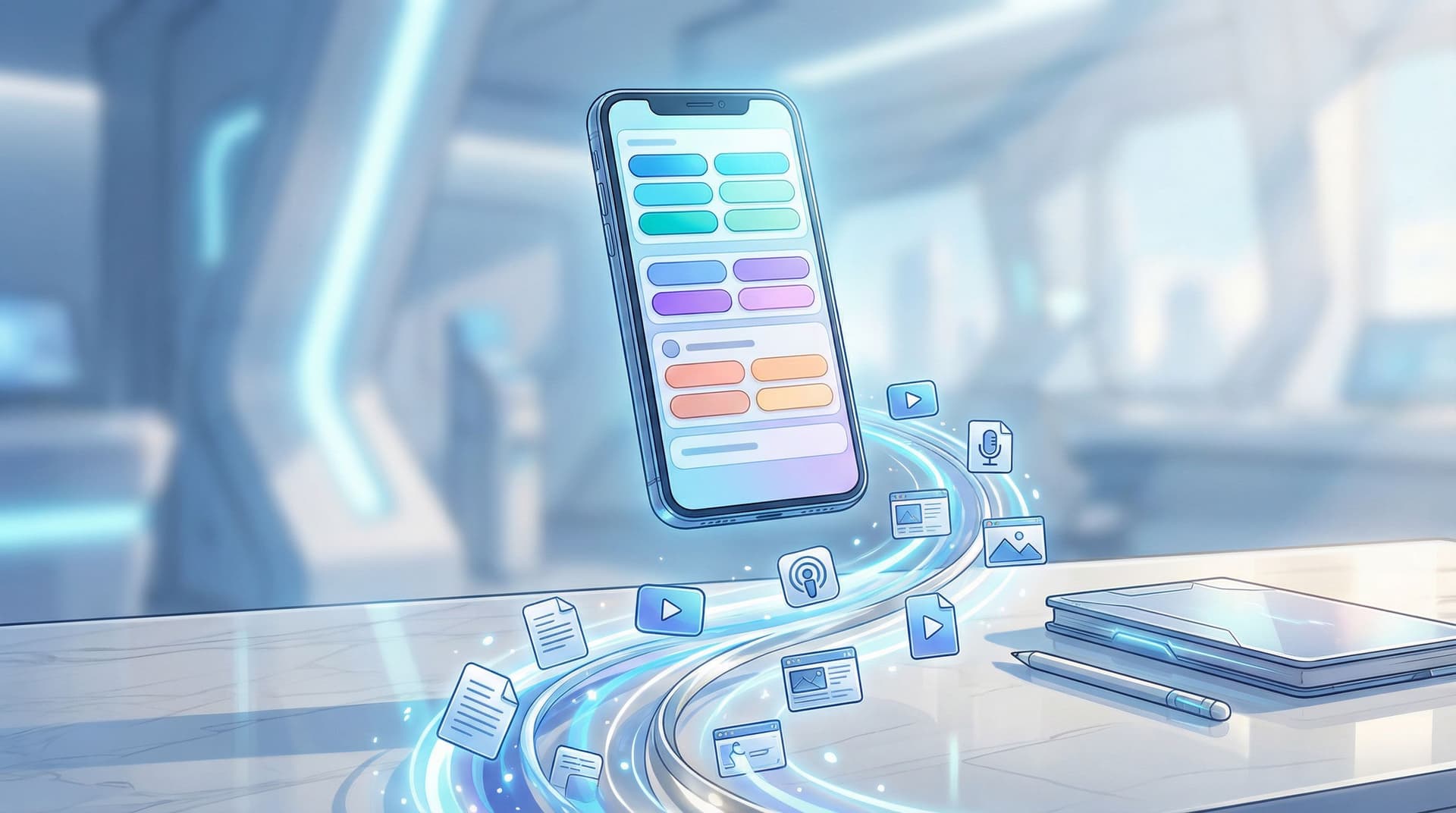
That’s where turning your content dump into a curated resource hub—powered by Liinks—comes in.
Instead of a random list of buttons, your link in bio becomes:
- A bingeable library for new followers
- A shortcut menu for superfans
- A soft-selling machine for your offers, services, and products
Let’s turn the chaos into clicks.
Why Your “Content Dump” Is Costing You Clicks (and Cash)
If your bio link currently leads to a page that looks like a brain dump, here’s what’s happening behind the scenes:
- Decision fatigue kicks in. More options = slower decisions. Studies on choice overload show that too many options can reduce conversions and satisfaction because people freeze instead of choosing.
- Your best stuff is buried. That podcast episode that converts listeners into email subscribers? Lost between “My 2019 ebook” and “Random affiliate link #7.”
- You look less trustworthy. A cluttered, out-of-date page feels like no one’s driving the bus. People hesitate to buy, book, or opt in when things look neglected.
Compare that to a curated resource hub where:
- Every section has a clear purpose
- Your top priorities are front and center
- Visitors feel guided, not dumped into a pile of URLs
If you’ve already worked on making your page look polished, you’ve seen how much design alone can change the vibe. If you haven’t yet, bookmark our guide on making your page look high-end without a designer: Broke but Branded: A No-Designer Guide to Making Your Liinks Page Look Shockingly High-End.
Now we’re going to layer structure on top of that pretty page.
Step 1: Decide What Your Hub Is For (No, It’s Not “Everything”)
You can’t curate if you don’t know the point.
Ask yourself: What’s the #1 outcome I want from people who tap my bio link?
Examples:
- “Join my email list so I can nurture them.”
- “Book discovery calls for my 1:1 service.”
- “Make it easy to shop my products.”
- “Show brands I’m worth working with.”
Then pick one primary goal and one secondary goal. That’s it.
Primary goal examples:
- Grow list
- Book calls
- Sell products
Secondary goal examples:
- Showcase credibility (press, testimonials, case studies)
- Deepen relationship (podcast, YouTube, long-form content)
- Support brand deals (media kit, past collabs)
Your Liinks resource hub will be built around these two goals. Everything else is either supporting content or clutter.
If you’re a “funnels make my eyes glaze over” person, read this next: Creator Funnels for People Who Hate Funnels: A No-Jargon Guide Using Liinks. It’ll help you pick smart goals without needing a marketing degree.
Step 2: Audit Your Chaos (Without Crying)
Time to face the pile. Block 30–45 minutes and gather:
- Your current Liinks page
- Your main platforms: Instagram, TikTok, YouTube, podcast, newsletter
- Any existing landing pages, freebies, or product links
Create a simple table in Notion, Google Sheets, or a doc. For each piece of content, jot down:
- Title – “How I grew to 50k on TikTok without posting daily”
- Type – Reel, YouTube video, blog post, podcast, freebie, product, service
- URL – where it lives
- Topic – e.g., “audience growth,” “content batching,” “pricing,” “mindset”
- Goal – nurture, sell, grow list, build authority
Then, ask three ruthless questions of every item:
- Is this still relevant? If it’s outdated, archive it.
- Does it support my primary or secondary goal? If not, it’s optional, not core.
- Would I be proud if a brand or new follower saw this first? If the answer is “eh,” it doesn’t belong in the prime real estate.
You’ll end up with three buckets:
- Core content – directly supports your main goals
- Nice-to-have content – good for deeper dives
- Retired content – archive, don’t delete; you might repurpose it later
Step 3: Group Content into “Resource Collections”
People don’t think in URLs. They think in problems and desires.
Instead of listing 20 individual links, turn your content into collections that answer a specific question or outcome.
Example collection themes
-
“Start Here: New to My World?”
- Your best intro video
- A short “about” page or highlight
- One free resource that shows your value fast
-
“Grow Your Audience”
- Your top 3 growth-focused videos or posts
- A free checklist or lead magnet
-
“Work With Me”
- Services or offers
- Application or booking link
- Case studies or testimonials
-
“Shop My Favorites”
- Product collections
- Affiliate recommendations
For each collection, limit yourself to 3–5 key pieces. You can always rotate items in and out.
This is where Liinks shines: you can visually separate sections, use headers, and reorder blocks quickly. Your hub starts to feel like a mini homepage instead of a link graveyard. If you want layout inspiration, check out: Mini Homepages, Major Results: Liinks Layouts That Replace a Full Website (Without Looking Cheap).
Step 4: Build the Hub on Liinks (Structure That Actually Makes Sense)
Now that you have collections, let’s translate them into a clean, click-friendly Liinks page.
1. Create clear sections
Use section headers like:
- Start Here
- Free Resources
- Deep Dives
- Work With Me
- Shop / Offers
Avoid vague labels like “Links” or “Stuff.” Each header should answer: “What’s in this for me?”
2. Give every button a job
Each link should:
- Start with a verb: “Watch,” “Download,” “Book,” “Shop,” “Listen,” “Read”
- Hint at the outcome: “Grow to 10k followers,” “Plan your content in 60 minutes,” “Book your strategy call.”
For example:
- “Watch: How I Plan a Month of Content in 90 Minutes”
- “Download: Client Onboarding Checklist (Free)”
- “Book: 1:1 Strategy Intensive – Limited Spots”
If you need help with this part, bookmark: Steal These High-Converting CTAs: Real-World Liinks Button Copy That Gets the Click.
3. Prioritize above-the-fold content
On mobile, people see only a handful of links before they have to scroll.
Make sure the first screen includes:
- Your #1 goal link (email list, main offer, etc.)
- A Start Here link for new people
- One trust-building link (like a best-performing piece of content)
Everything else can live lower on the page.
4. Use visual hierarchy
Inside Liinks, play with:
- Button size or emphasis for priority actions
- Section spacing so it doesn’t feel cramped
- Consistent colors and fonts so it feels like your brand, not a template
Remember: your hub should feel like a calm, organized version of your online presence—not a different person.
Step 5: Turn Old Content into High-Value “Guides”
You probably have:
- A YouTube video that pairs perfectly with a downloadable checklist
- A podcast episode that expands on a viral TikTok
- A blog post that answers the FAQ you get in your DMs every week
Instead of linking these separately, bundle them into mini guides inside your resource hub.
Example: “Launch Prep Starter Pack”
On your Liinks page, create a section:
Launch Prep Starter Pack
- Watch: “How I plan a 7-day launch without burnout” (YouTube)
- Download: Launch email outline (free Google Doc or PDF)
- Listen: “What I’d do differently in my first launch” (podcast)
Now your old content behaves like a cohesive resource, not random homework.
You can do the same for:
- “New Creator Starter Kit” – audience growth + content ideas
- “Client Systems Toolkit” – onboarding, pricing, boundaries
- “Brand Deal Fast-Track” – media kit, case studies, pitch templates
If brand partnerships are on your radar, you’ll love: Brand Partnerships 101: How to Use Your Liinks Page to Impress Sponsors and Land Collabs.
Step 6: Map Routes for Different Types of Visitors
Not everyone tapping your link wants the same thing. Some are:
- New and curious – “Who is this person?”
- Ready to buy – “Where’s the link to that thing you mentioned?”
- Brands or collaborators – “Are they legit and on-brand?”
Your resource hub should give each group a clear path.
For new followers
Place a Start Here section near the top with:
- A quick intro (video or short about page)
- Your best “this is what I do” piece of content
- One simple, low-friction next step (usually a freebie)
For ready-to-buy people
Make your Work With Me or Shop section impossible to miss:
- Use bold headers
- Limit to your current core offers
- Add micro-copy like: “New here? Start with the free workshop above.”
For brands and collaborators
Create a mini “press/collab” area:
- Media kit (hosted on Liinks or linked)
- Past collabs / case studies
- Contact or inquiry form
This way, your hub quietly does pre-qualification for you—before they ever DM or email.
If you want to go deeper on tailoring routes for different audience types, check out: Stop Sending Everyone to the Same Page: Smart Liinks Routes for New vs. Super-Fans.
Step 7: Keep It Evergreen (Without Constant Maintenance)
You do not need to rebuild your Liinks hub every week.
Aim for a setup that’s:
- Evergreen at the core – your main offer, best freebie, and top content stay stable
- Seasonal at the edges – you swap in launch-specific or timely content as needed
A simple maintenance rhythm
-
Once a month (15 minutes):
- Remove anything expired or irrelevant
- Promote any new “top tier” content into your collections
- Check that your primary goal link is still front and center
-
Before a launch:
- Add a dedicated section: “Current Launch: [Name]”
- Temporarily bump related content to the top
-
After a launch:
- Move launch content into a relevant collection (e.g., “Launch Prep Starter Pack”)
- Restore your evergreen layout
If the idea of maintenance stresses you out, you’ll appreciate: Evergreen, Not Exhausting: How to Build a Liinks Page You Barely Touch but Always Converts.
Step 8: Measure What’s Working (So You Don’t Guess)
Once your resource hub is live on Liinks, don’t just vibe-check it—track it.
Watch for:
- Top clicked links – Are they aligned with your primary goal?
- Low performers – Are they buried, badly named, or just not that useful?
- Traffic spikes – Which posts or platforms send the most people to your hub?
Then:
- Move high-performing links higher up the page
- Rewrite vague button copy
- Retire links that consistently underperform
You don’t need a full analytics degree for this—just a habit of checking your numbers and making one small tweak at a time.
Quick Recap: From Dump to Hub
Let’s zoom out.
To turn your chaos into a curated Liinks resource hub that actually earns its keep:
- Pick a primary and secondary goal for your hub.
- Audit your content and separate core, nice-to-have, and retired pieces.
- Group content into resource collections based on problems and outcomes.
- Build clear sections on Liinks with action-based, benefit-driven button copy.
- Bundle old content into mini guides that feel like complete resources.
- Design routes for different visitors (new, ready-to-buy, brands).
- Keep the core evergreen, tweak the edges for launches and seasons.
- Check your metrics and adjust instead of guessing.
Do this once and your link in bio stops being a random list of links… and starts behaving like a living, breathing resource library that quietly sells for you.
Your Next Move (Yes, Right After You Finish This Paragraph)
You don’t need a full rebrand or a new website.
You just need to:
- Open your current Liinks page (or create one if you haven’t yet).
- Decide your #1 goal for that page.
- Create one new section:
Start Herewith 2–3 links that genuinely help a new follower.
That’s it. That’s the first domino.
Once that’s in place, you can:
- Add collections
- Bundle guides
- Polish your CTAs
- Slowly clean out the junk drawer
But your audience doesn’t need perfection. They need clarity.
Open your Liinks tab, pick your goal, and turn that content dump into a hub people actually want to click through.
Your chaos has done its job. It’s time for curation.


