
Broke but Branded: A No-Designer Guide to Making Your Liinks Page Look Shockingly High-End

You do not need a $3,000 brand designer, a 40-page Notion mood board, and a personality crisis over fonts to look legit online.
You do need:
- A clear vibe
- A few smart design decisions
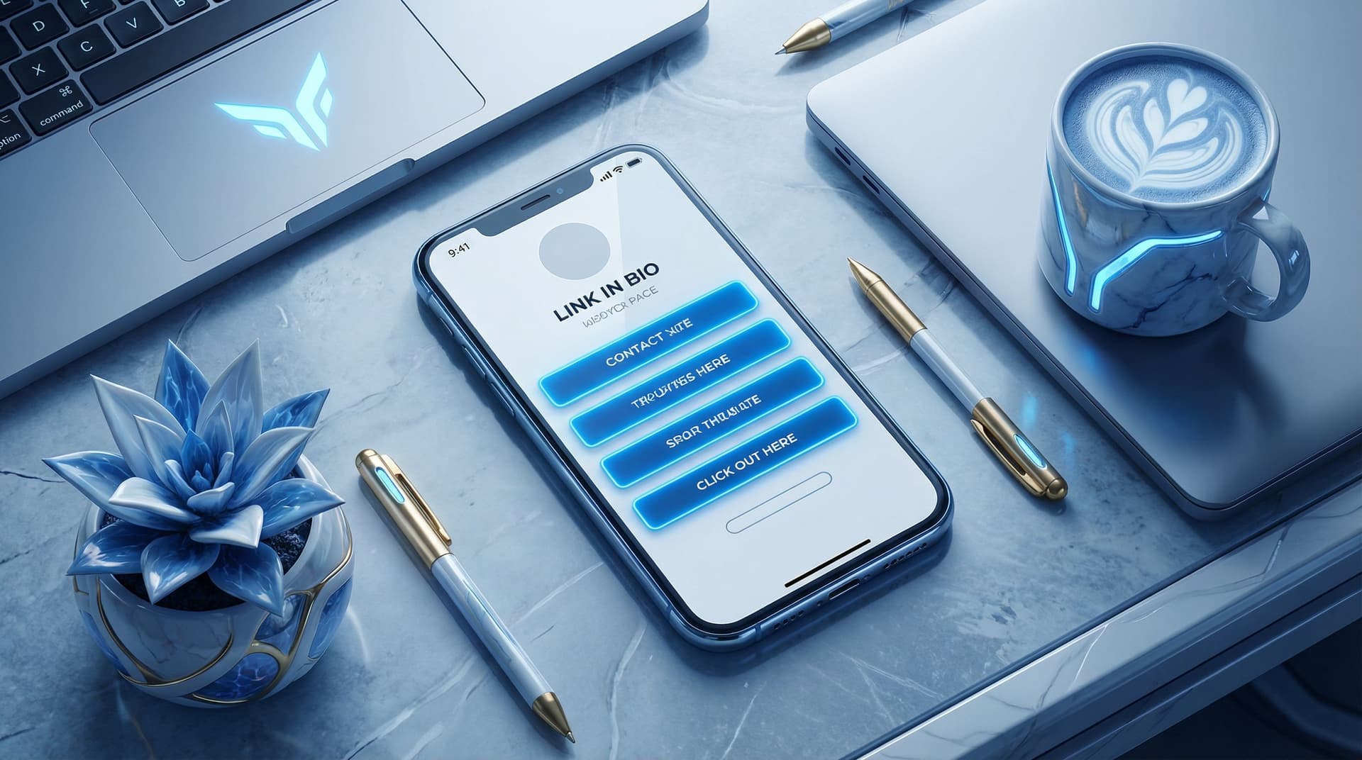
- A link-in-bio tool that doesn’t fight you on customization—like Liinks
If your current page feels like “college group project” instead of “booked-out creator,” this is your glow-up guide.
We’re going to walk through how to make your Liinks page look clean, expensive, and intentional—even if your current budget is “whatever’s left after iced coffee.”
Why Looking High-End Matters (Even If You’re Just Starting)
Let’s be clear: “high-end” doesn’t mean cold, corporate, or fake.
It means:
- Trustworthy – People don’t hesitate to click, buy, or sign up.
- Consistent – Your page feels like the same person they just saw in your content.
- Focused – No chaos, no scavenger hunt, no “wait, where’s your actual offer?”
When your Liinks page looks polished:
- Brands take you more seriously (which we get into deeply in Brand Partnerships 101: How to Use Your Liinks Page to Impress Sponsors and Land Collabs).
- Followers turn into true fans faster because they can actually find your best stuff.
- You make more money with the same traffic, just by reducing friction.
Good design is not decoration. It’s conversion.
Step 1: Pick a “Rich-But-Relatable” Visual Direction
High-end pages don’t happen by accident. They come from a few intentional choices you repeat everywhere.
Start with a three-word vibe
Before you touch a single color picker, define your brand in three adjectives:
- Cozy, clever, minimalist
- Bold, playful, expert
- Earthy, calm, thoughtful
- Sleek, energetic, modern
Write yours down. They’re now your design north star.
Choose a simple color palette (2–3 colors, max)
Overcomplicating color is the fastest way to make your page look cheap.
Aim for:
- 1 background color (or a very soft gradient)
- 1 main accent color (for buttons/links)
- 1 neutral (for text and subtle dividers)
A few budget-friendly ways to find colors:
- Use the eyedropper in tools like Coolors to pull colors from a favorite photo or your content.
- Search “color palette + your vibe” (e.g., “moody neutral palette”) on Pinterest and copy one.
- Make sure your accent color passes basic contrast checks using a free tool like WebAIM Contrast Checker.
On your Liinks page, keep it tight:
- Background: light, muted, or dark-but-readable
- Buttons: your accent color
- Text: near-black or off-white, depending on background
Limit fonts like your sanity depends on it
Because it does.
Use 1–2 fonts total:
- Heading font: Slightly more personality (rounded, bold, or serif)
- Body font: Simple, clean, very readable
If you’re not sure what to pick, these pairs almost always work:
- Sans-serif for both headings and body (change only weight/size)
- Serif for headings, sans-serif for body
Inside Liinks, choose one font family and use weight and size for variety instead of adding more fonts.
Rule of thumb: If your page looks like a group chat of fonts, start over.
Step 2: Design the Layout Like a Concierge, Not a Bulletin Board
Most creators treat their bio link like a junk drawer: everything goes in, nothing gets edited.
High-end pages feel like a hotel concierge: calm, curated, and guiding you to the next best step.
Decide your #1 goal for the page
Pick one primary outcome you want from most visitors:
- Email signups
- Product sales
- Booking calls
- Brand inquiries
- Content discovery (YouTube, podcast, etc.)
Everything else is a supporting character.
If you need help deciding what that main path should be, “Link in Bio” Is Not a Strategy: How to Turn Random Links into a Real Revenue Plan with Liinks walks you through turning your page into an actual plan, not a pile of links.
Use a clear visual hierarchy
On your Liinks page, think in layers:
- Top section (hero) – Who you are + what this page is for
- Primary action – The one thing you most want people to do
- Secondary actions – 2–4 other key links
- Deep cuts – Only if absolutely necessary
Concrete layout example:
- Profile photo or logo
- Short, benefit-driven line (e.g., Helping creators turn followers into clients without sleazy funnels)
- Big, standout button: “Start Here: Free Client-Booking Checklist”
- Then 3–4 smaller buttons:
- Work with me
- Shop templates
- Watch on YouTube
- Join email list
Ruthlessly cut link clutter
Ask this about every button:
“Does this help a new visitor understand me or take a step closer to working with me?”
If not, it goes.
Common things to delete or demote:
- Old freebies you don’t really promote
- Random one-off collab pages from last year
- Duplicate links to the same destination
High-end pages feel spacious. White space is not wasted space—it’s breathing room.
Step 3: Make Your Buttons Look Like Money
You can tell a “made-in-5-minutes” page from a “wow, who designed this?” page mostly by the buttons.
Keep button styles consistent
On Liinks, set one primary button style and stick to it:
- Same corner radius (all rounded or all sharp)
- Same padding (not one cramped, one huge)
- Same font size and weight
Then use variation with intention:
- Primary action: solid accent color button
- Secondary actions: outline or muted version
Use microcopy that sounds like you and sells
“Learn more” is fine. “Learn more” does not pay rent.
Instead, try:
- “Steal my content planner” instead of “Free guide”
- “Book your intro call” instead of “Contact”
- “Shop my exact filming setup” instead of “Amazon storefront”
If you want more real-world button copy examples, bookmark Steal These High-Converting CTAs: Real-World Liinks Button Copy That Gets the Click.
Add subtle visual cues
High-end doesn’t mean boring. You can add polish with tiny details:
- A small icon (→, ✨, 🎧, 🛒) at the end of button text
- Slight shadow or hover effect for tap feedback
- Grouping related buttons with a small label (e.g., “For brands,” “For creators,” “Start here”)
Just don’t turn every button into a circus. Pick one special treatment for your main CTA and keep the rest simple.
Step 4: Use Images and Icons Like a Pro (Without a Designer)
Nothing cheapens a page faster than random, low-res images slapped everywhere.
When to use a profile photo vs. logo
- Use your face if you are the brand (creator, coach, freelancer).
- Use a logo if you’re building a brand that’s bigger than you (studio, shop, publication).
Either way:
- Use a high-resolution image (no pixelated screenshots)
- Keep the background simple or blurred
- Match the vibe: if your content is fun and bright, don’t use a moody, dark headshot from 2017
Keep image styles consistent
If you add thumbnails or featured images for key links, make them feel like a set:
- Same aspect ratio (e.g., all square or all 16:9)
- Similar filters or color grading
- Similar text style if you add titles on top
You can create quick, consistent graphics using free tools like Canva by duplicating one template and just swapping text.
Use icons to clarify, not clutter
Icons are great for:
- Social links (YouTube, TikTok, podcast, etc.)
- Differentiating types of actions (shop vs. watch vs. read)
But:
- Don’t mix 12 different icon styles.
- Pick one icon set (outline or solid) and stick to it.
Step 5: Nail the Copy So Your Page Feels “Premium but Human”
Design gets attention. Words close the deal.
Rewrite your top line
Your top line (the sentence under your name) should answer:
Who are you and what do people get here?
Examples:
- Helping busy creators turn one link into a full client pipeline.
- Plant-based recipes & lazy-girl meal prep for people who hate cooking.
- Video editor for creators who want cinematic vibes without Hollywood prices.
Avoid vague lines like “Content creator | Dream chaser | Coffee lover.” Cute, but not helpful.
Add tiny context lines under key buttons
A single line of microcopy under a button can double clarity:
-
“Join the newsletter”
Weekly content prompts & launch ideas. -
“Brand collaboration hub”
Media kit, past work, and contact form. -
“Shop presets”
The exact color grades I use on Reels.
Short, specific, and benefit-focused.
Match your content voice
If your content is chaotic-funny and your page sounds like a corporate brochure, people get whiplash.
Let your voice show up in small ways:
- Button: “I’m new here, help” → links to a “Start Here” page
- Button: “Just gimme the shop” → storefront
- Microcopy: “No spam, only vibes and useful stuff.”
Professional doesn’t mean personality-free.
Step 6: Borrow “Luxury Brand” Tricks (On a Zero-Dollar Budget)
You can steal a lot of high-end feel from how luxury brands design online.
Embrace white space
High-end sites rarely cram everything above the fold. They:
- Use generous padding around sections
- Let each element breathe
- Avoid stacking 10 buttons with no spacing
On your Liinks page:
- Add space between groups of links
- Use section headings sparingly but clearly
- Don’t be afraid of a scroll—just make it intentional
Stick to a restrained color story
Luxury brands often:
- Use mostly neutrals
- Save color for key accents (like a CTA)
- Avoid neon rainbows unless that’s the core brand vibe
You can absolutely be colorful—just keep it cohesive, not chaotic.
Use fewer, stronger links
Nothing says “I know what I’m doing” like restraint.
Try this structure:
- 1 hero CTA
- 3–5 core links
- 1 small section at the bottom for “extras” (e.g., press, resources, or a link to a full link library if you must)
If you want to see how a polished page can replace a full website without feeling cheap, check out Mini Homepages, Major Results: Liinks Layouts That Replace a Full Website (Without Looking Cheap).
Step 7: Do a 10-Minute “Does This Look Expensive?” Audit
Once you’ve set everything up on Liinks, run through this quick checklist on your phone (not your laptop—most people will see it mobile-first):
Visual check
- Does anything look pixelated or blurry?
- Are there more than 3 colors in use? If yes, can you simplify?
- Are fonts consistent across all buttons and headings?
Clarity check
- Can a stranger tell what you do in 3 seconds?
- Is there one clear “start here” action?
- Are there any buttons you wouldn’t miss if they disappeared? (Delete them.)
Experience check
- Is it obvious what happens when you tap each button?
- Are any buttons sending people off to weird, half-finished pages?
- Does the page feel like your content… but cleaner?
Bonus: Ask a friend who is not in your niche to tap through and narrate what they think each button will do. If they’re confused, your audience will be too.
Quick Recap: Your Broke-But-Branded Blueprint
You don’t need a designer. You need decisions.
Here’s the simplified formula for a high-end Liinks page:
- Define your vibe in three words and let that guide colors and fonts.
- Choose a minimal palette (1 background, 1 accent, 1 neutral).
- Use 1–2 fonts and rely on size/weight for hierarchy.
- Design a clear layout: hero → main CTA → 3–5 core links.
- Make buttons consistent and upgrade copy from “learn more” to “here’s exactly what you’re getting.”
- Use images intentionally: one strong profile image, consistent thumbnails if needed.
- Polish your words so the page feels like your content, just more focused.
- Edit ruthlessly—fewer, better links almost always beats “everything I’ve ever made.”
Do these, and your page goes from “I threw this together” to “Wait, who designs your stuff?” very fast.
Your Next Move (Yes, Right After You Finish Reading)
You don’t have to rebuild your entire online presence. Just start with the one page every click passes through.
Here’s a simple, 30-minute sprint you can do today:
- Open your existing Liinks page.
- Write down your three-word vibe.
- Pick a simple color palette and update your background + button colors.
- Rewrite your top line and your main CTA button.
- Delete or demote at least three links that aren’t pulling their weight.
- Do the 10-minute “Does this look expensive?” audit on your phone.
That’s it. No designer, no 47-tab spiral, no rebrand announcement.
Your bio link is already doing the work—Liinks just makes it easier to make that work look good.
Give your page its glow-up. Your future brand deals, clients, and superfans will never know you did it on a coffee budget.

