
The ‘One Offer’ Liinks Makeover: How Simplifying Your Page Can Actually Boost Sales

You know that moment when you tap someone’s bio link and land on a page with 19 buttons, 4 freebies, 3 shops, and a mysterious “Start Here 👇” that is… not actually at the top?
That’s not a funnel. That’s a scavenger hunt.
If your own link page secretly looks like that, this is your intervention.
In this post, we’re going to talk about the “One Offer” makeover: stripping your page down so it’s centered around one clear, money-making action—without nuking everything else you care about.
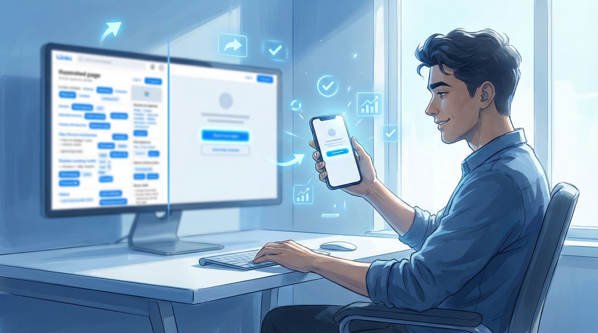
And yes, we’re going to use Liinks for examples, because it’s built for creators who want their page to look good and convert, not just sit there being vaguely blue and button-shaped.
Why “One Offer” Beats “Everything I’ve Ever Made”
Let’s start with the uncomfortable truth:
People are not confused because you don’t have enough to offer. They’re confused because you’re offering everything at once.
When someone taps your bio link, they’re asking one silent question: “What should I do next?”
If your page answers with:
- “Get my free guide!”
- “Join my membership!”
- “Book a call!”
- “Shop my presets!”
- “Watch my latest YouTube!”
- “Read my blog!”
- “Check out my podcast!”
…their brain picks the easiest option: close tab.
A “One Offer” Liinks makeover solves that by making one action the star of the show. Everything else becomes a supporting character instead of fighting for the spotlight.
What “One Offer” actually means
It does not mean:
- You can only have one link
- You must delete everything you’ve ever launched
- You have to pick one niche for the rest of your life (breathe)
It does mean:
- One primary goal per page (e.g., sell your signature offer, grow your email list, fill a workshop)
- One visually obvious next step for new visitors
- Everything else is secondary and visually quieter
If you’ve ever felt the burnout of juggling too many URLs, you’ve already felt the cost of doing it the old way. We talk a lot about that in Creator Burnout Is a UX Problem: Simplifying Your Online Universe with One Well-Designed Liinks Page — this is the “ok, now let’s actually fix it” sequel.
Step 1: Decide What You Actually Want People to Do
Yes, you want:
- More followers
- More sales
- More email subscribers
- More brand deals
- More everything
But your bio link can’t carry all of that on its tiny shoulders at the same time.
Pick one primary outcome for the next 30–90 days. Examples:
- “Sell my $97 mini-course”
- “Fill 10 spots in my 1:1 service”
- “Grow my newsletter by 500 subscribers”
- “Get people into my low-ticket membership trial”
Then translate that outcome into a single, specific CTA for your Liinks page, like:
- “Start the $97 Instagram Reels Bootcamp”
- “Apply for 1:1 Coaching”
- “Join the Weekly Creator Playbook (Free)”
- “Start Your $9 Trial Month”
Non-negotiable: if someone glances at your page for 2 seconds, they should know exactly what you want them to do.
Step 2: Turn Your Liinks Page into a Mini Sales Section
Once you’ve picked your One Thing, your page layout should behave like a tiny sales page, not a random list.
Here’s a simple “One Offer” structure you can build on Liinks in under an hour:
-
Hero section: One clear offer, one clear button
- Short headline: “Book Your Content Strategy Intensive”
- One sentence of context: “A 90-minute call to untangle your content, map your offers, and leave with a 30-day plan.”
- One primary button: “Book Your Intensive”
-
Three quick proof points
Use text blocks or small bullet sections under the hero:- “Trusted by 200+ creators and small brands”
- “Average 35% increase in content output within 30 days”
- “No long contracts, just one powerful session”
-
Social proof snapshot
- A short testimonial quote or two
- Or a link titled: “See results from past clients →” that goes to a highlight, case study, or PDF
-
Only then: your secondary links
Below a divider or a clear heading like “More from me,” you can add:- Your podcast
- Your YouTube
- Your free resources
- Your socials / contact
The key: your main offer lives above the fold and looks obviously more important than everything else.
Step 3: Visually Downgrade Everything That Isn’t the Offer
A lot of creators think the problem is “not enough traffic.” Often, it’s actually “too many equally loud buttons.”
Use design to make one path obvious and everything else clearly optional. With a customizable tool like Liinks, you can do this without needing a designer.
Try these tweaks:
-
Size & placement
- Make your primary button larger and place it at the very top.
- Keep secondary links in a simple list below a heading like “Other links”.
-
Color hierarchy
- Use your bold brand color for the main CTA button.
- Use neutral or softer tones for secondary links.
-
Copy hierarchy
- Primary offer: specific, benefit-driven, urgent.
- “Start the 7-Day Reels Bootcamp (Spots limited)”
- Secondary links: descriptive, but chill.
- “Binge my YouTube tutorials”
- “Read my blog”
- Primary offer: specific, benefit-driven, urgent.
-
Spacing & grouping
- Add more white space around your main offer so it visually “floats.”
- Group secondary links into sections like “Free stuff” and “Work with me.”
If you want more ideas on making your page look premium and intentional without adding clutter, bookmark Beyond Blue Links: Unexpected Design Tweaks that Make Your Liinks Page Feel Premium (Not Template-y).
Step 4: Create a Simple Path for “Not Ready Yet” People
The fear behind going “One Offer” is usually: “But what about people who aren’t ready to buy?”
Good news: you can absolutely keep nurturing them—just don’t make them your main event.
Here’s a simple structure that works beautifully:
-
Primary CTA (buy / book / join)
- Big button, top of page.
-
Secondary CTA (nurture / list-build)
- Example: “Not ready yet? Get my free 3-part email series instead.”
- Slightly smaller button under the main one, or a highlighted text link.
-
Everything else (explore / stalk / binge)
- Links to content, socials, and other offers.
This way, you’re still:
- Giving hot leads a direct path to purchase
- Giving warm leads a way to stick around and build trust
- Giving casual lurkers somewhere to casually lurk
But only one of those paths is framed as The Main Thing.
Step 5: Rewrite Your Micro-Copy Like a Human, Not a Menu
If your buttons currently say things like:
- “Shop”
- “Services”
- “Newsletter”
…you’re making people do all the work.
Your One Offer makeover is the perfect time to upgrade your micro-copy so each link answers, “Why should I care?”
Try these swaps:
- Instead of “Shop” → “Shop Lightroom Presets for Moody Portraits”
- Instead of “Services” → “Done-for-You TikTok Editing (Limited Spots)”
- Instead of “Newsletter” → “Get Weekly Content Prompts in Your Inbox (Free)”
For your main offer, go one step further:
- Add a mini subheading under the button:
“Perfect for creators posting 3+ times/week who want content to actually convert.” - Use urgency without drama:
“Next cohort starts February 10 — join the waitlist.”
If you want to go deeper on using story and micro-copy to guide clicks, check out Story-First Liinks: How to Use Micro-Copy, Emojis, and Layout to Guide Clicks Without Being Pushy.
Step 6: Connect Your Content Directly to the One Offer
A “One Offer” page doesn’t work in isolation. You need your content to line up behind it like traffic cones guiding people to the same destination.
For the next 30 days, try this:
-
Choose one core topic that naturally leads to your offer.
- Selling a Notion content planner? → Talk about “posting consistently without burning out.”
- Selling a Reels bootcamp? → Talk about “getting over camera shyness” or “turning views into sales.”
-
End every piece of content with the same CTA.
- “Want help implementing this? Tap the link in my bio and join the Reels Bootcamp.”
-
Make your Liinks hero match your current content.
- Use the same language, colors, or even the same hook line you’re using in your posts.
-
Pin or highlight content that points to the offer.
- Pin 1–3 posts on Instagram or TikTok that explain the offer and direct people straight to your Liinks URL.
Your goal: whenever someone finally taps that link, the page they see should feel like the natural continuation of what they’ve been hearing from you all week—not a random buffet.
Step 7: Give It 2 Weeks, Then Check the Numbers
You don’t need a full analytics dashboard obsession to know if your “One Offer” makeover is working.
Track just a few simple things:
- Clicks on your main CTA vs. secondary links
- Email signups or sales tied to that offer
- DMs or replies that mention your page or offer
Ask yourself:
- Are more people taking the action I actually care about?
- Are fewer people getting lost in “explore mode” and never converting?
- Does my brain feel calmer when I send people to my link?
If the answer is yes to even two of those, you’re on the right track.
From there, you can start running tiny experiments — like testing two different headlines or button labels — similar to what we walk through in A/B Test Your Link in Bio (Without Losing Your Mind): Simple Experiments That Actually Move the Needle.
What This Looks Like in Real Life (A Before-and-After Sketch)
Before: “Kitchen Sink” Liinks Page
- Top button: “New video!”
- Second: “Free Notion template”
- Third: “My presets”
- Fourth: “1:1 coaching”
- Fifth: “Podcast”
- Sixth: “Newsletter”
- Seventh: “Brand collabs”
- All the buttons look the same
- You’re never quite sure what to promote, so you promote everything
After: “One Offer” Liinks Makeover
- Hero headline: “Turn Your Content into Clients in 30 Days”
- Subheading: “Join my 4-week live cohort and build a simple, repeatable content-to-client system.”
- Big primary button: “Apply for the 4-Week Cohort”
- Three bullets under it: who it’s for, what they get, when it starts
- Secondary button: “Not ready yet? Get my free Content to Client Checklist”
- Divider line
- Section: “More from me” with smaller links to podcast, YouTube, presets, etc.
Same creator, same offers, same audience. Different focus.
Quick Recap: The “One Offer” Makeover Formula
Here’s the whole thing condensed into something you can screenshot and build from:
- Pick one primary goal for the next 30–90 days (sales, signups, bookings).
- Turn that goal into a single, clear CTA at the top of your Liinks page.
- Design for hierarchy: big, bold primary button; quieter secondary links.
- Give “not ready yet” people one gentle next-best step (usually an email freebie).
- Rewrite your micro-copy so every link answers “what’s in it for me?”
- Align your content so it naturally leads into that one offer.
- Check your numbers after two weeks and tweak one thing at a time.
Do that, and your page stops being a junk drawer of “stuff I made once” and starts behaving like a tiny, focused revenue engine.
Ready to Try Your Own “One Offer” Makeover?
If your bio link currently feels like a choose-your-own-adventure novel with no ending, this is your sign to simplify.
Here’s your very first step:
- Log into your current link-in-bio setup (or finally claim your page on Liinks).
- Ask yourself: “If I could only promote one thing for the next 30 days, what would it be?”
- Make that the hero of your page — visually, verbally, and strategically.
You can always add the rest back in as supporting characters. But giving one offer the spotlight for a while? That’s how you actually find out what your audience is willing to click, join, and pay for.
Your content is already doing the hard work of getting people curious.
Let your Liinks page do the equally important work of giving them one, clear, irresistible next step.


