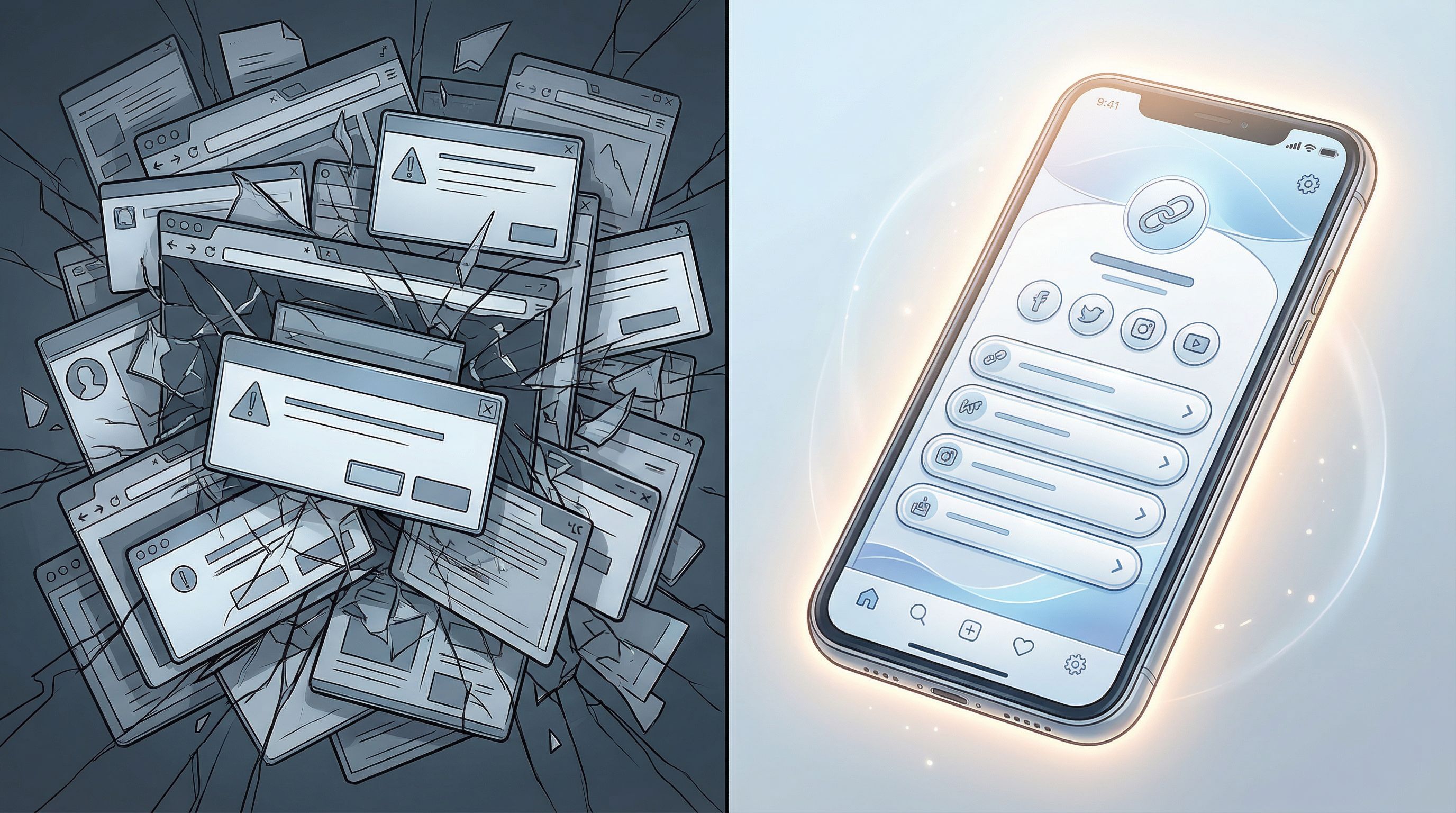
Creator Burnout Is a UX Problem: Simplifying Your Online Universe with One Well-Designed Liinks Page


Creator burnout doesn’t always look like a dramatic “I’m quitting social media” notes app screenshot.
Most of the time, it looks like:
- 37 open tabs
- 5 half-finished sales pages
- 3 different “link in bio” tools you tried and abandoned
- And you, at midnight, wondering why updating one tiny URL feels like a part-time job
Here’s the plot twist: a lot of what we call burnout is actually bad user experience.
Not just for your audience—for you.
Every time your online universe is scattered across platforms, random links, and mystery Notion docs, your brain is doing extra work just to answer basic questions:
- Where do I send people?
- Is this link still the right one?
- Which offer am I pushing this week?
That’s UX. Not just for your followers, but for the person who has to run the whole system: you.
A well-designed Liinks page can quietly fix a lot of this. Not because it’s “another tool,” but because it becomes the single, simple interface between your brain, your content, and your audience.
Let’s unpack how.
Burnout, But Make It UX
You’re probably used to thinking about UX as something that lives on apps and websites. Buttons, menus, layouts.
But you have a UX too:
- How easy is it for you to update your offers?
- How quickly can you find your own links?
- How many decisions do you have to make to promote one thing?
Every extra click, hunt, or micro-decision is cognitive load. Stack enough of that on top of content creation, and of course you’re exhausted.
Creator burnout isn’t just about working too much. It’s about working through friction all day long.
Some common red flags:
- You avoid launching things because you “don’t want to deal with all the links.”
- You’re never sure what’s behind your own bio link.
- You keep rewriting captions because you don’t have a clear, consistent place to send people.
That’s not a motivation problem. It’s an experience problem.
Why One Hub Changes Everything
A single, well-designed hub—like a thoughtfully set up Liinks page—does two big things for your brain:
- Reduces decisions (you always send people to the same place)
- Reduces chaos (that place is clean, organized, and easy to update)
Instead of:
“Okay, for this reel I’ll send them to my website. For that one, the Notion form. For this launch, the Gumroad page. For this collaboration, the Calendly link…”
You get to say:
“Everything lives behind my Liinks URL. I’ll just surface the right thing at the top.”
If you’ve ever wished your online presence felt more like a calm, curated homepage and less like a group project folder, you’ll love posts like From Chaos to Clicks: How to Turn Your Content Dump into a Curated Liinks Resource Hub. Think of this article as the zoomed-out, burnout-prevention version of that.
Step 1: Decide What Your Liinks Page Is For (So It Can Say No For You)
A messy link hub tries to be everything at once:
- Portfolio
- Media kit
- Offer menu
- Content library
- Newsletter signup
- Freebie buffet
That’s how you end up with 19 buttons and a quiet sense of dread.
Instead, give your page one primary job and one secondary job.
Examples:
-
Primary: Grow your email list
Secondary: Highlight 1–2 paid offers -
Primary: Book clients
Secondary: Showcase your best content -
Primary: Help brands understand you quickly
Secondary: Route them to a dedicated media kit page
Once you pick this, everything gets easier:
- You know what goes at the top
- You know what gets demoted or deleted
- You stop treating your page like a junk drawer
If you want more help choosing that focus, Stop Sending Traffic to Nowhere: How to Turn Your Liinks Page into the Hub of Your Entire Digital Strategy is a great next read.
Quick exercise (2 minutes):
Finish this sentence:
“If someone taps my bio link and only does one thing, I want them to ______.”
Whatever you just wrote? That’s your primary job.

Step 2: Design for Tired Brains (Theirs and Yours)
Good UX assumes people are:
- Distracted
- Rushed
- Slightly confused
That includes you, updating your page between meetings, and your audience, tapping your link while waiting for coffee.
So your Liinks page should feel obvious at a glance.
Make the First Screen Do All the Heavy Lifting
Most people will only see the first scroll.
On that first screen, they should instantly get:
- Who you are (short, clear intro)
- What’s here for them (1–3 key actions)
- What’s most important right now (your primary job)
Consider this layout:
- Profile block – Name, one-line descriptor, maybe a tiny photo
- #1 priority button – Big, clear, slightly different styling
- 2–3 supporting buttons – For the most common secondary actions
Everything else? Below the fold.
For more design inspiration, check out Beyond Blue Links: Unexpected Design Tweaks that Make Your Liinks Page Feel Premium (Not Template-y).
Write Buttons Like You’re Talking to a Human
“Newsletter” is a label.
“Get my weekly creator systems email” is a promise.
Make each button answer: What happens if I tap this?
Try these formats:
- “Start here: ___”
- “Get the free ___”
- “Work with me: ___”
- “Shop: ___”
- “Binge my best content”
This is classic UX: clear micro-copy reduces confusion and decision fatigue. Fewer confused people = fewer DMs = fewer fires for you to put out.
Use Visual Hierarchy to Calm the Chaos
You don’t need wild design skills; just a few smart choices:
- One background color (or gradient), not five
- One accent color for your primary button
- Consistent button shapes so nothing looks random
- Space between sections so the page can breathe
Remember: your goal is not to impress a designer on Pinterest. Your goal is to make a half-distracted stranger go, “Oh, I get it,” and click.
Step 3: Turn Your Liinks Page into Your Brain’s External Hard Drive
Every time you dig through old emails or DMs to find a link, a piece of your soul leaves your body.
Let your Liinks page be the place where links go to live, not hide.
Create a Simple Structure You Can Actually Maintain
Think in sections, not chaos:
- Start Here – For new people
- Work With Me – Services, offers, shop
- Free Stuff – Lead magnets, resources
- Deep Dives – Podcast, YouTube, long-form content
- For Brands – Media kit, case studies
You don’t need all of these. Pick 2–4 that match your actual life.
The goal is: when you create something new, you know exactly where it belongs.
Use Your Page as a Resource Library (Without Extra Work)
You don’t have to make new content to make your page more valuable.
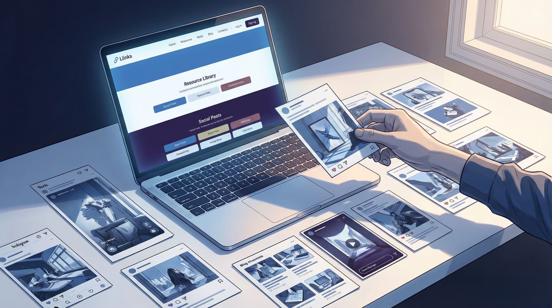
The ‘No New Content’ Strategy: How to Turn Your Existing Posts into a High-Converting Liinks Resource Library walks through this in detail, but here’s the short version:
- Go through your best-performing posts.
- Pull out anything people saved, shared, or asked questions about.
- Turn those into a “Best Of” section on your Liinks page.
Now, every time someone asks, “Do you have a post on X?” you don’t have to dig. You just send them to your hub.
That’s UX for you: fewer repetitive tasks, more time for the work that actually moves the needle.

Step 4: Build a Maintenance Ritual That Takes 10 Minutes, Not Your Weekend
Burnout loves a system that only works if you “have time.”
Your link hub should be the opposite: something you can update in 10 minutes or less, even on your worst week.
Set a Recurring “Link Check” on Your Calendar
Once a week (or every other week), spend 10 minutes on:
- One priority check
- Is the top button still the main thing I want people to do?
- One broken-link check
- Click through anything that looks suspicious or old.
- One tiny improvement
- Rewrite a button label for clarity
- Move a low-performing link lower
- Add one top-performing post to your “Best Of” section
That’s it. No full redesign. No “burn it all down and start over.”
If you want a bigger overhaul, The Lazy Creator’s Guide to a High-Converting Liinks Page (Built in One Weekend) is your blueprint. But your baseline maintenance should be boring and light.
Use Your Page Data Like a Sanity-Saving Feedback Loop
Instead of guessing what’s working, let clicks tell you.
- If a link at the top isn’t getting clicks, either:
- The label is unclear, or
- People don’t actually want that thing
- If a link buried at the bottom is secretly a star, move it up
Think of this as UX testing, but chill. You’re not running a lab; you’re just nudging your page closer to what people clearly want.
Step 5: Route Everything Through Your Liinks URL
The more entry points you have, the more work your brain has to do.
Your Liinks page becomes a burnout buffer when it’s the single front door to your online universe.
Use that same URL:
- In your social bios (obviously)
- In your email signature
- In your newsletter (“Tap here for everything mentioned in this issue”)
- On your podcast (“Show notes at myname dot link”)
- On slides for workshops or talks
The benefit isn’t just more traffic. It’s fewer decisions:
- You don’t have to remember 8 different URLs.
- You don’t have to rebuild your system every time you try a new platform.
- When something changes, you update it once.
This is exactly the kind of platform-agnostic thinking we dive into in Algorithms Change. Your Links Don’t: Future-Proofing Your Brand with a Platform-Agnostic Liinks Strategy—worth a read if you’re tired of rearranging your life every time a platform tweaks reach.
Step 6: Design for Future You (Who Is Tired, Busy, and Over It)
Future You is not going to:
- Remember where that random checkout link lives
- Have the energy to redesign your page for every launch
- Want to dig through Canva to update a media kit
So set things up now in a way that protects that version of you.
Create Stable “Homes” for Your Big Stuff
Instead of:
- A new landing page for every idea
- A new funnel for every offer
Try:
- One “Work With Me” area that you update as offers change
- One “Free Resources” area where all lead magnets live
- One “For Brands” area that acts as a living media kit
With Liinks, that might look like:
- A services section where you swap out 1–2 offers seasonally
- A static “Start Here” button that always goes to your current best intro resource
- A media kit section that links to screenshots, case studies, or a dedicated mini-page
Now, instead of building new infrastructure every time you have an idea, you just slot it into a system that already exists.
Quick Recap: How a Well-Designed Liinks Page Fights Burnout
Let’s connect the dots.
A thoughtful Liinks setup helps you:
- Make fewer decisions – One main URL, one main page, one primary goal
- Do less repetitive work – Your best links and resources live in one place
- Feel less scattered – Clear sections, clear labels, clear hierarchy
- Adapt faster – Easy to update without a full redesign
- Respect your own energy – Maintenance that fits into 10-minute windows
That’s UX. For you.
When your online universe is easier to run, you:
- Launch more often (because the logistics aren’t horrifying)
- Serve your audience better (because they can actually find things)
- Have more creative energy left for the stuff only you can do
Your Next Tiny Step (No Overhauls Required)
You don’t need a massive rebrand, a new content calendar, or a week off grid.
You need one small, concrete move that makes your online life easier today.
Here are three options—pick one and do it in the next 15 minutes:
-
Clarify your page’s primary job.
Finish the sentence: “If someone taps my bio link and only does one thing, I want them to ______.” Then update your top button on Liinks to reflect that. -
Clean up your first screen.
Log into Liinks and:- Move your #1 priority link to the very top
- Limit the first screen to 3–4 key buttons
- Rewrite at least one label to be clearer and more human
-
Create one stable section.
Add a section like “Start Here,” “Work With Me,” or “Best Free Resources,” and move the right links underneath it. Future You will be weirdly grateful.
If you don’t have a Liinks page yet, this is the perfect moment to start fresh—with UX and burnout prevention in mind from day one.
You’re not “too disorganized” or “bad at systems.” You’ve just been trying to run a serious creator business on top of a messy experience.
Fix the experience, and a lot of the burnout starts to untangle itself.
One page. One link. One calmer brain.
Go set it up.

