
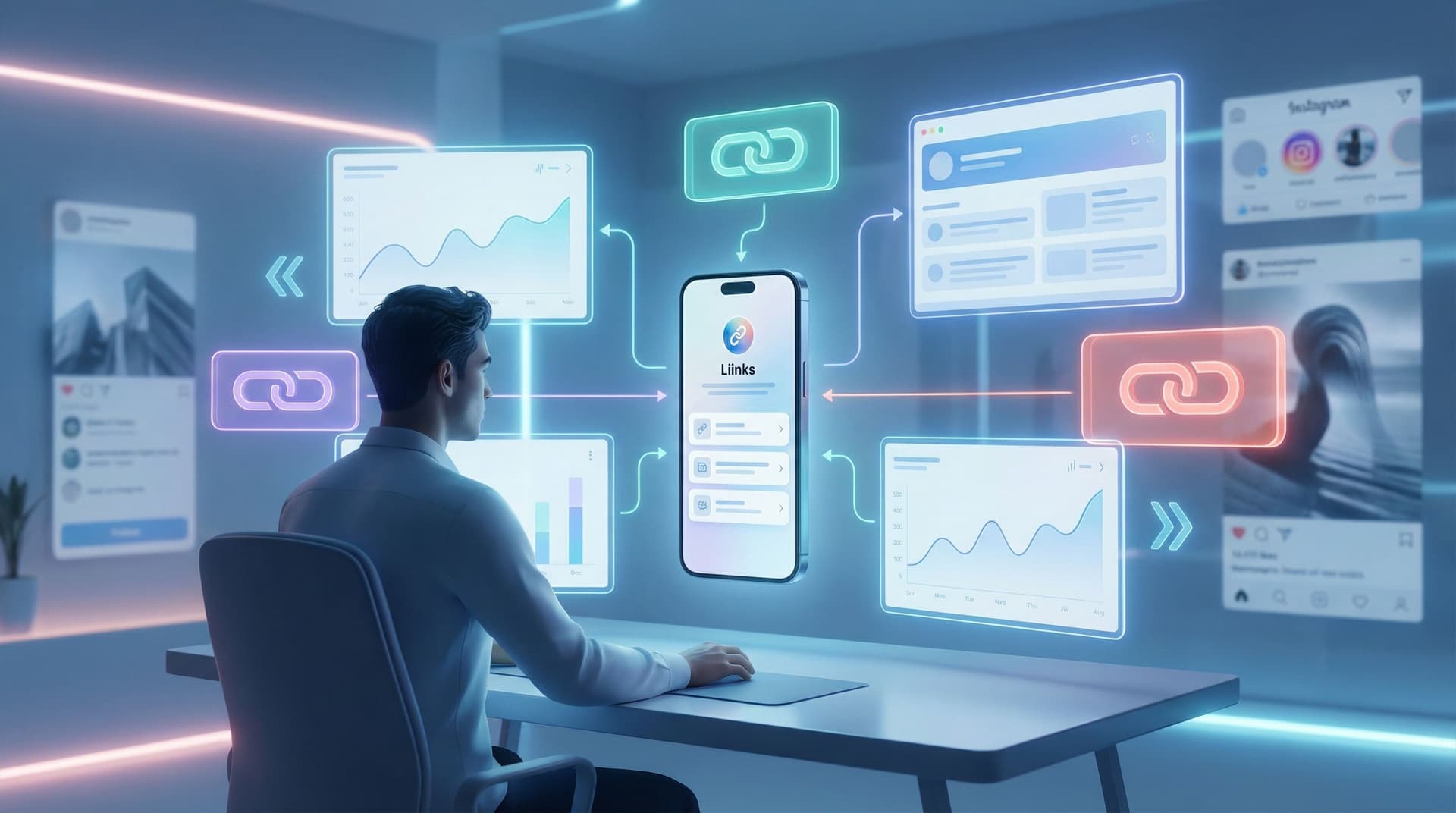
Stop Sending Traffic to Nowhere: How to Turn Your Liinks Page into the Hub of Your Entire Digital Strategy

You’re working hard for every click.
You post, you story, you short-form-video yourself into oblivion—then you toss a casual “link in bio” at the end and hope people figure it out.
Spoiler: a lot of that traffic is quietly going nowhere.
People tap your bio link, land on a random list of stuff, shrug, and leave. Not because your offers are bad, but because the page behind your link isn’t acting like what it should be: the central hub of everything you do online.
That’s what we’re fixing.
We’re going to turn your Liinks page into the home base of your entire strategy—the place every click passes through, every offer connects to, and every future fan remembers.
Why Your Link Hub Matters More Than Your Next Post
Let’s be honest: reach is unpredictable. One week you’re going viral, the next week you’re talking to 17 people and a bot.
What is consistent? The tiny URL in your bio.
When someone taps that link, they’re doing three things:
- Raising their hand — “I’m interested enough to see more.”
- Giving you a shot — “You have 5 seconds to show me something useful.”
- Looking for direction — “Where should I go next?”
If your Liinks page is just a chaotic list of links, you’re making them do all the work.
When you treat it like a hub, it becomes:
- Your default homepage (especially if you don’t have or don’t love your website)
- Your routing system for new vs. returning visitors, buyers vs. browsers
- Your traffic insurance policy when algorithms, platforms, or trends shift
If you want more depth (and receipts) on why this little URL is such a power move, pair this guide with “Algorithms Change. Your Links Don’t: Future-Proofing Your Brand with a Platform-Agnostic Liinks Strategy”.
Step 1: Decide What Your Hub Actually Does
Most people start with, “What links should I add?”
Better question: What job should this page do for you?
Pick one primary job and one or two secondary jobs. Examples:
- Primary: Grow your email list
Secondary: Showcase your best content + highlight 1–2 low-ticket offers - Primary: Book client calls
Secondary: Share portfolio + collect inquiries - Primary: Sell products
Secondary: Capture subscribers + feature new drops
If you try to do everything equally, nothing stands out.
Quick clarity exercise
Answer these in one sentence each:
- If someone only spends 10 seconds on my Liinks page, what’s the one thing I want them to do?
- What’s the second-best outcome if they’re not ready for #1 yet?
- What’s the most important proof or context they need before they’ll do #1?
Those three answers will drive your layout.
If you want help mapping this to a simple revenue plan, check out “‘Link in Bio’ Is Not a Strategy: How to Turn Random Links into a Real Revenue Plan with Liinks”.
Step 2: Turn Your Page into a Mini Homepage (Not a Link Dump)
Your hub should feel like a tiny, scroll-sized homepage—not a homework list.
Here’s a simple structure that works for almost every creator, coach, or small business:
-
Identity & promise (top section)
- A clear headline: who you are + what people get here.
- Example: “Helping creators turn followers into clients (without sleazy funnels).”
- Subhead: 1–2 lines of credibility or specificity.
-
Primary action (hero button or card)
- Make the main thing painfully obvious.
- Examples:
- “Start here: Free 3-part email series”
- “Book a strategy session”
- “Shop my presets + templates”
-
Shortcut paths for different visitor types
- New here? Start with…
- Ready to buy? Go here…
- Brand or collaborator? Click here…
-
Proof + depth (optional, but powerful)
- Testimonials
- Screenshots of results
- Logos of brands you’ve worked with
-
Nice-to-have extras
- Social links
- Featured content
- Community or newsletter links
Keep it short enough that someone can scroll through the entire thing in under 10 seconds.
If you need help making this look “expensive” without hiring a designer, you’ll love “Broke but Branded: A No-Designer Guide to Making Your Liinks Page Look Shockingly High-End”.
Step 3: Map Every Traffic Source to a Specific Destination
Here’s where your hub stops being “a list of links” and starts behaving like infrastructure.
Instead of sending everybody to the exact same generic page, you:
- Keep one core hub on Liinks
- Create specific routes for different audiences, campaigns, or platforms
Think in routes, not random clicks
Ask yourself for each traffic source:
“If someone came from here, what’s the most logical ‘next step’ for them?”
Examples:
- Instagram Reels about your services → Route to a version of your hub where the top section is “Work With Me” and a short explainer.
- Pinterest traffic from a tutorial → Route to a hub layout that leads with “Get the full guide” or “Grab the template.”
- Podcast listeners → Route to a version that highlights your newsletter, main offer, and a “mentioned in this episode” section.
You can keep the same core Liinks structure, but:
- Change the top headline to match context
- Reorder top 3–4 buttons
- Swap in campaign-specific links during launches
For a deeper dive on this idea, bookmark “Stop Sending Everyone to the Same Page: Smart Liinks Routes for New vs. Super-Fans”.
Step 4: Design Clear “Paths” for Different People
Your audience is not one person with one goal.
You’ve got:
- Curious new followers
- Warm leads who are “almost ready”
- Super-fans who buy everything
- Brand managers and collaborators
Your hub should give each of them an obvious path.
Example layout with clear paths
Above the fold:
- Headline: “Strategy, content, and systems for creators who want actual revenue.”
- Big primary button: “Start with the free email roadmap.”
Just below:
- “New here?” → Button: “Watch my 5-minute ‘who I am + what I do’ video.”
- “Ready to work together?” → Button: “See services + pricing.”
- “Brand or collab?” → Button: “View media kit + past campaigns.”
Lower down:
- “Binge-worthy content” → 3–5 top pieces
- “Tools I recommend” → Affiliate links, resources
Now your page is doing something magical:
- Newbies get context (and don’t feel overwhelmed)
- Warm leads get a direct line to working with you
- Brands get what they need without sliding into your DMs confused
If you want to go big on this concept, read “One Liinks Page, Many Personalities: How to Create Custom Experiences for Different Audiences”.
Step 5: Make Your Offers Ridiculously Easy to Buy
If someone has made it from:
Post → Profile → Bio link → Your hub → Offer link
…they are doing the absolute most. The least you can do is not make them hunt.
A few conversion upgrades for your Liinks hub:
1. Put money-making links above the fold
Your revenue-driving actions should be visible without scrolling:
- “Shop my presets”
- “Book a consult”
- “Join the membership”
Freebies and content are great, but don’t bury the thing that pays your rent.
2. Use benefit-first microcopy
Instead of:
- “Newsletter”
- “Course”
- “Shop”
Try:
- “Get 1 weekly strategy email (no fluff, just what to post)”
- “Learn my 4-step client booking system”
- “Shop the exact tools I use in my content”
3. Add lightweight social proof
Right on your hub, add:
- A line like: “Trusted by 500+ creators”
- A tiny testimonial under your main offer button
- A mini “as seen in” row if relevant
4. Build a lightweight storefront
If you sell multiple products, turn part of your hub into a mini store:
- Group offers by outcome (“Grow your audience,” “Book more clients,” “Save time”) instead of format.
- Use simple product cards with: title, 1-line benefit, price, and a clear button.
Want a full walkthrough of this? See “Make Every Post Shoppable: A Step-by-Step Guide to Building a Lightweight Storefront with Liinks”.
Step 6: Connect Your Hub to Everything (Not Just Social Bios)
If your Liinks URL only lives in your Instagram bio, it’s underemployed.
Your hub should be the default destination everywhere someone might want “more from you.”
Places to plug your hub:
- Email signature — “All my links in one place: [your Liinks URL]”
- Newsletters — “New here? Start with my resource hub.”
- Podcast show notes — “Everything mentioned in this episode lives here.”
- YouTube descriptions — “Work with me, freebies, and tools: [your Liinks URL]”
- Lead magnets & PDFs — Link the footer or final page to your hub
- Offline — QR code on business cards, flyers, packaging inserts
If you’re ready to get a little more advanced with this, read “Beyond ‘Link in Bio’: Smart Ways to Use Your Liinks URL in Newsletters, Podcasts, and Offline Marketing” and “Beyond Instagram: Unexpected Places to Drop Your Liinks URL (That Actually Drive Clicks)”.
The mindset shift: your hub is your default “learn more” link—not just your social accessory.
Step 7: Keep It Evergreen (So You’re Not Tweaking It Weekly)
Your hub should be stable enough that you don’t have to babysit it, but flexible enough to support launches and experiments.
Think of it in layers:
-
Evergreen core (rarely changes)
- Your positioning
- Your main free offer
- Your main paid offer(s)
-
Rotating highlights (monthly / quarterly)
- Current launch
- Latest podcast episode or feature
- Seasonal offers
-
Temporary promos (short-term)
- Flash sales
- Collaborations
- Time-limited bundles
When you build your Liinks page around a solid evergreen core, you can:
- Swap in launch links without breaking the whole layout
- Pause offers without leaving dead buttons
- Keep your page accurate even when life and business evolve
For a deeper, low-maintenance approach, pair this with “Evergreen, Not Exhausting: How to Build a Liinks Page You Barely Touch but Always Converts”.
Step 8: Use Simple Metrics to See What’s Actually Working
You don’t need a full analytics obsession. You just need enough data to stop guessing.
On your Liinks hub, keep an eye on:
- Total views — Are people actually reaching your hub from your profiles and content?
- Click-through on key buttons — Are they choosing the actions you want them to take?
- Top 3 clicked links — Is your page layout aligned with what people clearly care about?
A few easy experiments:
- Move your main CTA above the fold → check clicks after 1–2 weeks
- Rewrite button copy to be benefit-focused → compare old vs. new CTR
- Remove 2–3 low-performing links → see if your priority links get more action
If you want a non-nerdy guide to this, bookmark “Analytics Without the Headache: The Only Liinks Metrics Creators Actually Need to Track”.
Quick Recap: Turning Your Liinks Page into a True Hub
Let’s bring it all together.
To stop sending traffic to nowhere and start treating your Liinks page like the hub of your strategy:
- Give your hub a clear job — Pick a primary goal (email list, clients, sales) and design around it.
- Build a mini homepage, not a link graveyard — Headline, primary CTA, clear paths for different visitors.
- Map routes from every traffic source — Don’t send everyone to the same generic experience.
- Design for different types of visitors — New people, warm leads, super-fans, and brands all get obvious next steps.
- Make buying easy — Money-making links above the fold, benefit-first copy, light social proof.
- Use your hub everywhere — Bios, newsletters, podcasts, emails, offline materials.
- Keep an evergreen core — So you’re not rebuilding your page every time you launch.
- Check a few key metrics — Let data, not vibes, guide your tweaks.
Do this, and your link in bio stops being a random hallway and becomes the front door to your entire brand.
Your Next Move (Yes, Right After You Finish Reading This)
You don’t need a full rebrand or a lost weekend in Canva to start.
Here’s a simple, 30-minute game plan:
- Log into Liinks.
- Rewrite your headline and top button so they match your real #1 goal.
- Add 2–3 clear paths: “New here?”, “Work with me”, “Brands & collabs”.
- Move your main money-making link above the fold.
- Delete or demote 2–3 links that almost no one clicks.
If you want a day-by-day walkthrough to build this from scratch, pair this with “From Zero to ‘Link in Bio’ Hero: A 7-Day Liinks Setup Sprint for Busy Creators”.
Your content is already doing the hard part: getting people curious.
Now let your Liinks hub do its job—catch that curiosity, route it somewhere smart, and quietly turn traffic into subscribers, clients, and customers while you get back to making great stuff.


