
The ‘No New Content’ Strategy: How to Turn Your Existing Posts into a High-Converting Liinks Resource Library

You do not need another content calendar, another 30‑day challenge, or another “I’m coming back stronger this month!!” post.
You need to squeeze more out of what you’ve already made.
If you’ve been posting for more than six months, you’re probably sitting on:
- Tutorials buried in reels
- Rants that secretly read like mini sales pages
- Carousels people saved like crazy and then never saw again
- Old freebies, workshops, and PDFs you forgot you even made
That’s not a backlog. That’s an asset library.
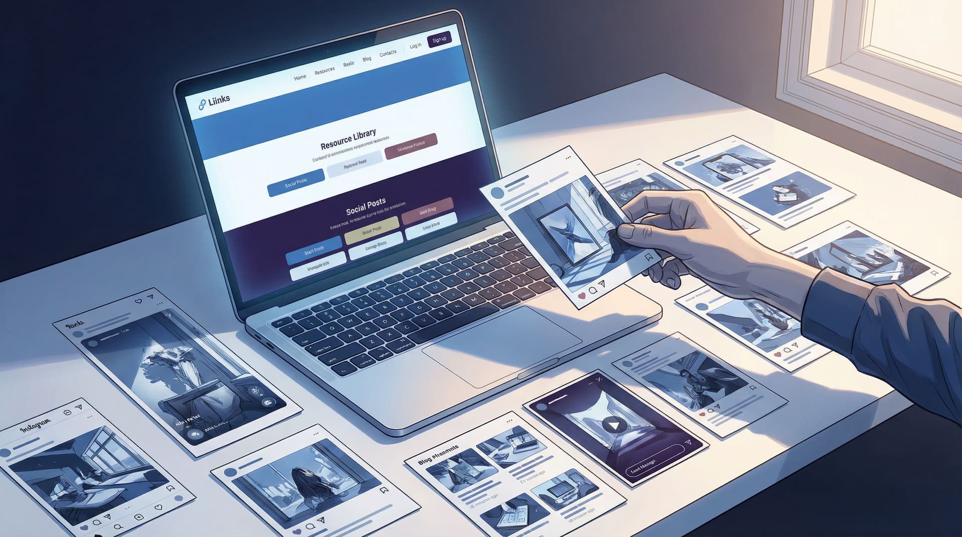
The “no new content” strategy is about pressing pause on creating and focusing on curating—using what already exists to build a high-converting resource library on Liinks that:
- Makes you look wildly organized and credible
- Guides new followers through your best work
- Sends traffic to your offers and email list on autopilot
Let’s turn your content graveyard into a resource library people actually bookmark.
Why This Strategy Works (Even If You Feel “Too Small” for a Library)
Before we get tactical, let’s talk about why a resource library on Liinks is secretly a growth engine, not just a cute idea.
1. Most of your audience has never seen your “best stuff”
Thanks to algorithms, only a slice of your followers see each post. Studies on social reach show that organic reach on platforms like Instagram and Facebook often hovers around 10% or less of your audience, sometimes far lower for accounts without constant engagement.
Translation: that post you poured your soul into? A lot of people never saw it. A resource library gives your greatest hits a second (and third, and fourth) life.
2. People trust librarians more than loudspeakers
Anyone can yell “new post!” every day.
The creator who calmly says, “Here’s a curated library of my best resources by topic—start here” instantly feels:
- More expert
- More organized
- More worth paying
That perception matters. If you want your Liinks page to feel premium, not template‑y, pairing this strategy with small visual upgrades (like the ones in Beyond Blue Links: Unexpected Design Tweaks that Make Your Liinks Page Feel Premium (Not Template‑y)) can dramatically increase how people respond to your links.
3. It’s the easiest path to “evergreen, not exhausting”
You do not have to be on the content hamster wheel forever. When you build a resource library, your link in bio becomes:
- A home for your best evergreen content
- A path from “free value” → “paid offers”
- Something you barely touch, but that keeps converting (very on‑brand for the vibe in Evergreen, Not Exhausting: How to Build a Liinks Page You Barely Touch but Always Converts)
If you’ve been craving a break from constant posting, this is how you take it without disappearing.
Step 1: Audit What You Already Have (Without Spiraling)
We’re not doing a full-on digital archaeology dig. You just need a 90‑minute “good enough” audit.
Make a simple tracking doc
Open a Google Sheet or Notion page and create columns for:
- Title / Topic – e.g., “How I plan my content in 60 minutes a week”
- Format – reel, carousel, YouTube, podcast, blog, freebie, etc.
- URL – direct link to the content
- Category – e.g., “Getting started,” “Advanced strategy,” “Mindset,” “Client work,” etc.
- CTA / Offer tie‑in – what offer, freebie, or list this could lead to
- Performance notes – saves, shares, comments, or “people keep DMing me about this”
Where to look
Set a timer for 15–20 minutes per platform and scan:
- Instagram / TikTok: Reels and carousels that got high saves or comments
- YouTube: Videos with higher‑than‑average watch time or views
- Podcast: Episodes people reference or binge
- Email: Campaigns with strong open and click‑through rates
- Old freebies: PDFs, Notion templates, checklists, mini‑courses
You’re looking for signal, not perfection. If something:
- Got strong engagement
- Still represents what you do now
- Leads naturally to something you sell or want to promote
…add it to the doc.
Aim for 15–30 solid pieces to start. That’s more than enough to build a powerful library.
Step 2: Group Your Content into “Shelves,” Not Chaos
A good resource library doesn’t feel like a content dump. It feels like:
“Oh, you’re here for this? Start with these three things.”
On Liinks, that translates into clear sections and short, themed clusters of links.
Pick 3–5 main themes
Look at your audit and ask: If someone hired me for one thing, what would it be? Your themes should reflect that.
Examples:
-
For a fitness coach:
- Start Your Fitness Journey
- Home Workouts & Routines
- Mindset & Motivation
- Nutrition Basics
- Work With Me
-
For a business coach:
- Start Here: My Core Framework
- Audience & Content
- Offers & Sales
- Systems & Automation
- Coaching & Programs
-
For a designer:
- Portfolio Highlights
- Design Tips & Tutorials
- Brand Strategy Deep Dives
- Templates & Resources
- Hire Me
Assign each piece of content to a “shelf”
From your tracking doc, tag each content item with one of your themes.
If something doesn’t fit any theme, ask:
- Is this still aligned with what I do?
- Does this attract the kind of audience I want now?
If not, it doesn’t make the library. Your resource library is a museum, not a storage unit.
Step 3: Design Your Liinks Page Like a Mini Library, Not a Link List
Now we’re moving into build mode.
You’re going to turn your themes and content into a clean, scannable Liinks layout that feels more like a curated homepage than a pile of buttons.
Start with a “Start Here” section
At the very top of your page, create a small intro block that answers:
- Who you are
- Who this library is for
- Where they should begin
Example micro‑copy:
New here? Start with these 3 resources
I help busy creators turn casual followers into paying clients. If you’re new, start with these three quick wins.
Under that, add 2–3 of your most foundational pieces—the ones that:
- Explain your core framework or philosophy
- Give people an “aha” moment
- Naturally point to your main offer or email list
Then build themed sections like “shelves”
For each theme, create a section with:
- A short, benefit‑driven heading
- 3–5 links max
- Optional: one “hero” link styled differently (e.g., accent color, emoji, or label like “Start here”)
Examples:
Section title ideas:
- “Build Your First Offer (Without a Website)”
- “Content That Attracts Clients, Not Just Likes”
- “Booked‑Out Designer Basics”
Link label ideas:
- “WATCH: My 10‑minute content planning routine”
- “THREAD: The 5 DMs that turn into clients”
- “FREEBIE: Client onboarding checklist”
If you want this to look extra polished, pair this structure with the subtle layout and color tweaks from Broke but Branded: A No‑Designer Guide to Making Your Liinks Page Look Shockingly High‑End.
Don’t forget your offers and email list
This is where a lot of creators fumble: they make a gorgeous free resource library… that never actually points to anything paid.
Inside your library:
- Add at least one link per section that gently points to:
- A low‑ticket product
- A service
- A lead magnet that leads into a nurture or sales sequence
- Make sure each free resource is one or two clicks away from something paid
Example:
- Free resource: “How I plan a week of content in 60 minutes” (YouTube)
- Right under it: “Want my plug‑and‑play content planner? Grab the template for $19.”
Your library should feel generous and directional.
Step 4: Add Tiny Bits of Copy That Do Heavy Lifting
A resource library is more than a list of titles. The micro‑copy around your links can quietly:
- Filter who each resource is for
- Set expectations
- Nudge people toward the next step
Add one‑line descriptions under your most important links
Instead of:
- “Content Planning Workshop Replay”
Try:
- “Content Planning Workshop Replay – 45 minutes, zero fluff. Walk away with a 30‑day plan.”
Or:
- “Client Inquiry Script – Copy‑paste DM script that turned 12 ‘just curious’ messages into paid clients.”
Use emojis and labels strategically
Emojis are seasoning, not the main dish. A few smart placements:
- ⭐ for “start here” pieces
- 🔥 for high‑value or time‑sensitive items
- 💌 for email‑list‑related links
- 💰 for paid offers
Labels you can add in your copy:
- “Best for beginners”
- “For advanced creators”
- “5‑minute read” / “10‑minute watch”
This helps people self‑select and reduces that “too many options, I’m out” feeling.
For more on using story and micro‑copy to guide clicks, you’ll love Story‑First Liinks: How to Use Micro‑Copy, Emojis, and Layout to Guide Clicks Without Being Pushy.
Step 5: Turn Your Library into a Conversion Engine (Without Being Gross)
You’re not building a museum of your past content for nostalgia. You’re building a pathway.
Here’s how to make sure your Liinks resource library quietly drives results.
1. Connect each theme to a specific goal
For each “shelf,” decide its main job:
- Start Here → Build trust + email subscribers
- Content & Audience → Nurture + low‑ticket sales
- Offers & Services → Book calls or sell higher‑ticket offers
Then, inside that section, make sure at least one link points directly to:
- A booking page
- A sales page
- A waitlist / application form
2. Use “content clusters” to warm people up
Instead of one random resource per topic, create mini content journeys:
Example for a social media manager:
- “Why your content isn’t converting (and what to fix first)” – educational post
- “Behind the scenes: How I plan a month of posts for clients” – authority / process post
- “Case study: How we turned 3 reels into $8k in sales” – proof post
- “Work with me: Done‑for‑you content management” – offer
Put those four links in order within one section. Now your library isn’t just helpful—it’s persuasive.
3. Add one clear “if you only click one thing, click this” link
Some people will skim everything and still feel overwhelmed.
For them, add a bold, standout link near the top or bottom of your page:
Not sure where to start? Take my 3‑minute quiz and I’ll tell you exactly what to watch/read next.
Or:
Just want help? Skip the library and apply to work with me here.
This gives the “I’m ready now” people a direct path.
Step 6: Put the “No New Content” Rule into Practice for 30 Days
You’ve built the library. Now let it work for you.
For the next 30 days, your job is not to create more. It’s to route attention to what already exists.
Update your “link in bio” mentions
Any time you mention “link in bio,” make it specific:
- “Grab the full client inquiry script in my resource library (link in bio → ‘Client Scripts & Templates’ section).”
- “Missed my content planning workshop? The replay’s in my library under ‘Start Here’—link in bio.”
Turn old posts into traffic drivers
Go back to older high‑performing posts and:
- Update the caption with: “P.S. I’ve added this to my resource library—grab it via the link in my bio under [section name].”
- Add a top comment with the same note so it’s more visible.
Use your library everywhere, not just social
Your Liinks URL can now be your default “learn more” link:
- In your email footer: “Browse my full resource library here.”
- On podcast interviews: “All the resources I mentioned are in my library at [your Liinks URL].”
- On PDFs / freebies: “Want more? Head to my resource library.”
If you want more ideas on using that URL beyond social, check out Beyond “Link in Bio”: Smart Ways to Use Your Liinks URL in Newsletters, Podcasts, and Offline Marketing.
Watch what people actually click
Over this 30‑day experiment, pay attention to:
- Which sections get the most clicks
- Which specific resources people keep coming back to
- Where people drop off (e.g., lots of clicks on a freebie, but no one moves to the related offer)
Use that data to:
- Promote certain resources more often
- Tighten the copy around your offers
- Remove or rearrange links that no one touches
You don’t need a full analytics obsession—just enough to make small, smart tweaks.
Quick Recap: Your No New Content Game Plan
Let’s rewind and simplify.
- Audit your existing content for 60–90 minutes and list 15–30 strong pieces.
- Group them into 3–5 themes that match what you want to be known and paid for.
- Build a Liinks page that looks like a mini library:
- “Start Here” section with 2–3 foundational pieces
- Themed sections with 3–5 links each
- Clear, benefit‑driven labels and micro‑copy
- Connect each section to a goal (trust, leads, sales) and add related offers or list‑building links.
- Run a 30‑day “no new content” experiment, sending all roads to your resource library and watching what people click.
By the end of those 30 days, you’ll know:
- Which topics your audience actually cares about
- Which pieces of content quietly sell for you
- How to keep growing without constantly cranking out new stuff
Your Next Move (Yes, This Is Your Gentle Nudge)
You don’t need a full rebrand or a content bootcamp. You need:
- One afternoon
- One Liinks page
- The content you already have
Here’s your very first step:
- Open a doc and list 10 pieces of content you’re proud of.
- Circle the 3 that best represent what you do now.
- Sign up for or log into Liinks, and create a simple “Start Here” section with just those three links.
That’s it. That’s your minimum viable resource library.
You can add shelves, offers, and fancy micro‑copy later. For now, move your best work from “lost in the feed” to “front and center.”
Your content has already done the hard part. Let your Liinks resource library do the rest.


