
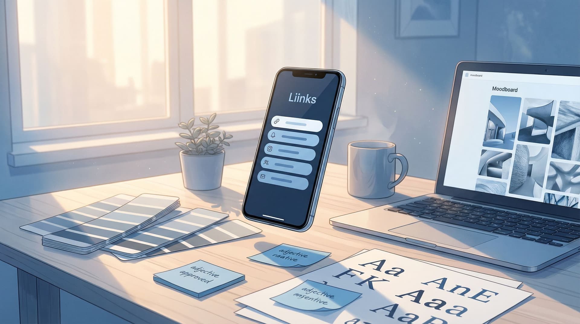
Link in Bio, But Make It a Brand: How to Turn Your Liinks Page into a Mini Style Guide

Your bio link is not just a utility. It’s not “that thing you slap under your username so people can find your stuff.”
It’s the front door of your brand.
When someone taps that tiny URL, they’re not just asking, “Where’s your shop?” They’re asking:
- Do you look legit?
- Do you feel consistent with what I just saw on your feed?
- Do I trust you enough to click, buy, or subscribe?
That’s why turning your Liinks page into a mini style guide is such a power move. You’re not just listing links—you’re showing people exactly who you are, visually and verbally, in one scroll.
Let’s turn your link in bio into the brand moment it deserves to be.
Why Your Link in Bio Should Act Like a Style Guide
A style guide is usually some dusty PDF that lives in a Google Drive folder and says things like “Never stretch the logo.” Useful? Sure. Fun? Not exactly.
But when you translate the idea of a style guide into your Liinks page, it becomes something much more alive:
- A visual handshake with new followers
- A consistency check for returning fans
- A trust signal for brands, clients, and collaborators
What a “Mini Style Guide” Page Actually Does
When your link page acts like a style guide, it:
- Looks instantly recognizable – Colors, fonts, and imagery match your content and other platforms.
- Sets expectations – People can tell what you do and what you care about in seconds.
- Makes decisions easier – Clear hierarchy and copy guide visitors to the right clicks.
- Supports everything else you do – Launches, collabs, newsletter pushes, mini shops… all feel cohesive instead of random.
If you’ve ever looked at someone’s link page and thought, “Oh, they’re on it,” that’s what we’re building here.
Step 1: Define Your Visual Vibe (Without a 40-Page Brand Deck)
You don’t need a full-blown brand bible to make your Liinks page feel like you. You just need to make a few decisions and actually stick to them.
Pick Your Core Color Story
Choose 1–2 primary colors and 1 neutral you’ll use everywhere:
- Primary: The main color you want people to associate with you (buttons, highlights).
- Secondary: A supporting color for accents (badges, subtle backgrounds).
- Neutral: White, off-white, or a soft gray/charcoal for backgrounds and text.
Keep it simple:
- If your content is bright and playful → think corals, lilacs, mint, sunny yellow.
- If your brand is calm and expert-y → think deep greens, navy, muted beige.
- If you’re edgy / bold → think high-contrast black & white, plus one standout accent.
On Liinks, this translates into:
- Background color or gradient
- Button colors and hover states
- Link divider or section colors
Rule of thumb: If your page looks like a Skittles bag, you have too many colors.
Choose 1–2 Fonts and Commit
Fonts carry vibe.
- Sans-serif (clean, modern): Great for creators, coaches, tech, lifestyle.
- Serif (editorial, classic): Great for writers, photographers, premium brands.
- Script / display (decorative): Use sparingly for headings only.
Pick:
- One font for headings (something with personality)
- One for body text (simple, readable)
Then: use those same choices on your Liinks page and in your graphics, covers, and thumbnails. If you need help making it look high-end without a designer, bookmark this for later: Broke but Branded: A No-Designer Guide to Making Your Liinks Page Look Shockingly High-End.
Decide on Your Imagery Style
Ask yourself: if someone screenshotted your page and your handle was blurred out, would they still know it’s you?
Define:
- Photo style: Bright + airy, moody + contrasty, colorful + candid?
- Graphic style: Minimal line icons, collage, bold shapes, or screenshots?
- Headshot rules: Same photo everywhere, or a consistent set (same background, outfit vibe, or framing)?
Use your profile image, header graphics, or section images on Liinks to mirror what people already see on your socials.
Step 2: Turn Your Layout into a Visual Hierarchy
A style guide isn’t just about how things look—it’s about what gets priority.
Your Liinks page layout should say, without words:
“Here’s what matters most. Start here.”
Make One Thing the Star
Choose your primary action for the season:
- Join your newsletter
- Book a call
- Shop your latest drop
- Watch your signature YouTube video
Then design around it:
- Put it above the fold (visible without scrolling).
- Use a bigger button or a standout color.
- Add a short line of copy that explains the benefit (not just the label).
If you want a deeper dive on centering your page around one money-making action, check out The ‘One Offer’ Liinks Makeover: How Simplifying Your Page Can Actually Boost Sales.
Group Links Like a Pro
Random lists feel chaotic. Organized sections feel intentional.
Consider grouping links into:
- Start Here – Best intro content, your main offer, or welcome video.
- Work With Me – Services, applications, booking links.
- Shop – Digital products, physical products, affiliate shops.
- Deep Dives – Blog posts, playlists, long-form videos.
- Community – Newsletter, Discord, Patreon, membership.
Use section headers and spacing on Liinks so each cluster feels like its own mini chapter of your brand.
Use Size, Color, and Spacing as Brand Signals
You’re not just decorating; you’re communicating.
- Size – Big buttons = important. Smaller links = optional extras.
- Color – Primary color for main CTA, neutral for secondary links.
- Spacing – More white space around key sections draws the eye.
Ask: if someone only skimmed your page for two seconds, what would they notice first? If it’s not your main CTA or core offer, tweak until it is.
Step 3: Write Micro-Copy That Sounds Like You (But Clearer)
Your visual style says, “Here’s who I am.” Your copy says, “Here’s what to do next.”
Style-guide thinking applies to words too.
Set Your Voice Rules
Pick 3–5 adjectives for your brand voice. For example:
- Warm, direct, witty, practical
- Bold, playful, high-energy, encouraging
- Calm, thoughtful, expert, grounded
Then run your button labels and descriptions through that filter:
- Instead of:
Newsletter- Try:
Get My Weekly Creator Playbook
- Try:
- Instead of:
Shop- Try:
Browse My Templates & Toolkits
- Try:
- Instead of:
Book a Call- Try:
Apply for 1:1 Strategy Session
- Try:
This is where a story-first approach shines. If you want help turning copy + layout into a tiny narrative that guides clicks, pair this post with Story-First Liinks: How to Use Micro-Copy, Emojis, and Layout to Guide Clicks Without Being Pushy.
Create a Consistent Label System
Decide once how you name things—and repeat it everywhere:
- If it’s a workshop, don’t call it a masterclass somewhere else.
- If your newsletter is called The Sunday Reset, use that name across your Liinks page and social posts.
Good style guides avoid chaos. Your link labels should too.
Add Tiny Bits of Context
One line of context under a link can massively increase clicks:
-
Join The Sunday Reset
A short weekly email to help you plan content in 10 minutes. -
Creator Systems Toolkit
My plug-and-play Notion + Airtable templates for managing content and clients. -
Brand Collab Portfolio
See the campaigns and results I’ve created for brands like yours.
Think of these as mini captions for your links—short, skimmable, benefit-first.
Step 4: Make Your Page a Brand Experience, Not Just a Menu
A style guide is about consistency, but your link in bio is about experience. Those two should meet.
Add a Short Brand Intro at the Top
Treat the top of your Liinks page like a mini “About” section.
Include:
- Who you are – “Content strategist for multi-passionate creators.”
- Who you serve – “Helping creators turn chaos into clear offers.”
- What they can get here – “Start with my free planning guide or book a 1:1 intensive.”
Make it 2–3 lines max. This is a style-guide-level summary of your brand in plain language.
Use Visual Anchors for Key Offers
If Liinks lets you add images, icons, or thumbnails, use them strategically:
- A consistent thumbnail style for all products (same background, same framing).
- Screenshots of your best-performing posts for a “Start Here” section.
- A photo of you near anything high-touch (like coaching or consulting).
This keeps your visual identity tight, even as you swap in new offers over time.
Align Your Page With Your Other Channels
Your Liinks page shouldn’t feel like a separate universe. It should feel like a natural extension of your content.
Check for consistency across:
- Profile photos
- Taglines / bios
- Color usage
- Tone of voice
If your page looks chill and minimal but your content is neon chaos (or vice versa), your brand story feels disjointed. Make them match.
Step 5: Bake Your Own Rules Into a Simple Checklist
You don’t need a formal brand manual—you need a repeatable checklist you can follow whenever you update your Liinks page.
Here’s a simple one you can steal and adapt:
Visuals
- Background color matches one of my brand neutrals
- Buttons use my primary color only
- Headings + body fonts match my usual choices
- Images / thumbnails follow a consistent style
Layout
- One clear primary CTA above the fold
- Links grouped into 3–5 logical sections
- Most important offer uses size/color to stand out
- No more than 8–10 total links (unless you’re building a resource hub on purpose)
Copy
- Top intro explains who I am + what this page is for
- Link labels are consistent with how I name things elsewhere
- Each key link has 1 line of benefit-focused context
- My brand voice adjectives show up in the wording
Experience
- Page feels like the same brand as my main platform
- New visitors know where to start in under 5 seconds
- Returning fans have shortcuts to the things they use most
If this feels like a lot to do from scratch, pair it with a build-in-a-weekend approach like The Lazy Creator’s Guide to a High-Converting Liinks Page (Built in One Weekend). Use that post for speed; use this one for style.
Step 6: Keep It Consistent Without Burning Out
A style guide isn’t a one-time makeover; it’s a maintenance habit.
But that doesn’t mean you need to obsess over every pixel.
Set a Recurring “Brand Check” Date
Once a month (or once a quarter), do a 15-minute audit:
- Does my main CTA still match my current priority?
- Do my colors, fonts, and images still match my content?
- Are there any outdated offers or dead links?
This is where a well-organized Liinks setup can quietly protect you from creator burnout. If your online universe feels chaotic, your brain feels chaotic. For more on that, read Creator Burnout Is a UX Problem: Simplifying Your Online Universe with One Well-Designed Liinks Page.
Treat Changes Like “Style Updates,” Not Total Rebrands
You don’t need a full overhaul every time your focus shifts.
Instead:
- Keep your core colors and fonts the same.
- Swap in new hero links and updated copy.
- Refresh thumbnails or section headers seasonally.
That way, followers feel continuity even as your offers evolve.
Quick Recap: What We Just Built
You’re not just “making your link in bio pretty.” You’re turning your Liinks page into a living, scroll-sized style guide that:
- Shows your visual identity through consistent colors, fonts, and imagery.
- Clarifies your priorities with a smart layout and a single main CTA.
- Speaks in your voice with intentional micro-copy and naming.
- Creates a brand experience that matches your content everywhere else.
- Stays maintainable with a simple checklist and light-touch updates.
This is how you go from “I have a link in bio” to “My link in bio is my brand, in one screen.”
Your Next Step (Yes, Right After Reading This)
Don’t turn this into a someday project.
Here’s your first 20-minute move:
- Open your current Liinks page.
- Choose one primary action you want people to take this month.
- Update your layout so that action is:
- At the top
- In your primary brand color
- Supported by one clear, benefit-focused line of copy
- Remove or demote anything that competes with it.
Then, over the next week, layer in the rest:
- Tighten your colors and fonts.
- Clean up your link labels.
- Add a short brand intro at the top.
- Group links into clear sections.
By this time next week, your link in bio won’t just be functional—it’ll be a tiny, powerful style guide that quietly tells everyone, “Yes, this is a real brand.”
And if you haven’t started with Liinks yet? This is your sign. Go set up (or glow up) your page and let it finally look as good as your content deserves.


