
The High-Intent Link in Bio: How to Attract People Who Are Ready to Buy (Not Just Browse)

Most creators treat their bio link like a junk drawer: everything you might want, someday, in one long scroll.
High-intent people take one look at that chaos, sigh, and go back to scrolling.
Let’s fix that.
This guide is all about turning your link in bio into a high-intent magnet—a tiny page that attracts people who are ready to buy, book, or sign up now, not “when they get around to it.” And yes, your tool choice matters, which is why a flexible, design-forward setup like Liinks makes this way easier than trying to hack it together with random buttons.
Why “High-Intent” Matters More Than “More Traffic”
You don’t get paid in views. You get paid when someone:
- Clicks your bio link
- Knows exactly what they want
- And actually follows through
That’s high intent.
A few reasons this matters:
- High-intent clicks are worth more. If your average ecommerce conversion rate sits around 2–3%, a visitor who’s already decided they want you or your offer is several times more likely to convert than a casual lurker.
- You can make more money with fewer followers. If your bio link converts 4% of clicks instead of 1%, you’ve 4x’d your revenue potential without going viral.
- Optimization compounds. Once your link in bio is built for intent, every new Reel, TikTok, or Story you post sends warmer traffic into a system that’s actually ready for them.
Most link-in-bio pages leak intent in three ways:
- Too many choices (aka “Here’s my entire life’s work, good luck!”)
- No obvious next step (people have to guess what you want them to do)
- Design that doesn’t match your content (so they’re not sure they’re in the right place)
A high-intent link in bio fixes all three.
Step 1: Decide Exactly What “High Intent” Means for You
Before you rearrange a single button, you need to answer one unsexy but crucial question:
If someone is ready to say yes to me today, what does “yes” actually look like?
For example, your primary high-intent action might be:
- Buying a digital product
- Booking a 1:1 call
- Purchasing from your TikTok Shop or Etsy
- Applying for a program or service
- Joining a paid membership or Patreon
Pick one primary high-intent goal for your link in bio.
You can absolutely have secondary actions (newsletter, freebies, socials), but if you want to attract buyers—not just browsers—you need one clear “this is the main thing” moment.
On Liinks, that usually looks like:
- One hero section at the top for your main offer
- Supporting links grouped under it (not competing with it)
If you’re juggling multiple offers and feeling overwhelmed, you’ll love the way we broke down stacking freebies, tripwires, and core offers in The Anti-Overwhelm Offer Stack.
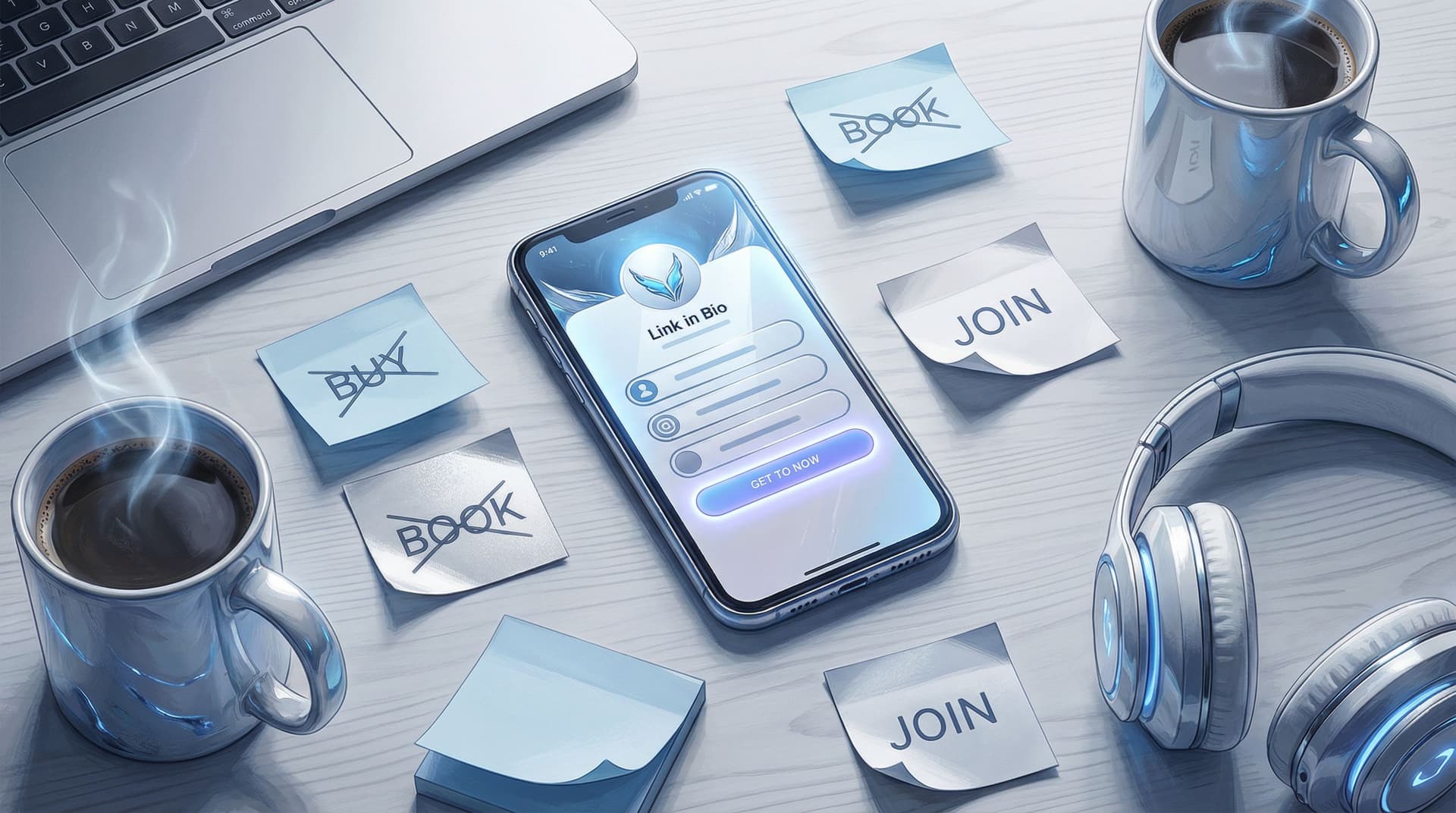
Step 2: Build a “Buyer-Ready” Above-the-Fold Section
High-intent visitors should be able to land on your page and, within three seconds, answer:
- Who is this?
- What do they help me do?
- Where do I click to get the thing?
That means your above-the-fold section (the part they see without scrolling) needs to work harder.
The 3-Second High-Intent Layout
Here’s a simple layout you can recreate in Liinks:
- On-brand header with your name or brand and a one-line promise
- Example: “Notion templates that make your freelance admin disappear.”
- One primary button that screams your main action
- Example: “Shop Templates” or “Book a Strategy Call”
- One trust-building subline
- Example: “Trusted by 3,000+ freelancers” or “Seen in Cosmopolitan & Later”
That’s it. Not eight buttons. Not three rows of social icons. One clear path.
If your current page looks like a settings menu from 2014, fix the vibe mismatch first. Your visuals should feel like a natural extension of your content—something we unpack in The ‘Link in Bio’ Style Guide.
Step 3: Ruthlessly Prioritize High-Intent Paths
High-intent visitors are not here to explore your entire personality. They’re here to:
- Grab the product you mentioned
- Book the thing you teased
- Get the resource you promised
So your job is to shorten the path from “I want this” to “I’ve got it.”
Use a “Two-Row” Mental Model
Think of your Liinks page as two rows:
- Row 1: High-intent actions (money, applications, bookings)
- Row 2: Warm-up actions (freebies, socials, content hubs)
If a link doesn’t clearly fit either row, it probably doesn’t need to be there.
Row 1 examples:
- “Shop My Presets”
- “Book a 1:1 Call”
- “Join the Membership”
- “Grab the Course”
Row 2 examples:
- “Start with the Free Guide”
- “Binge My Tutorials Library”
- “Join the Email List”
High-intent visitors should never have to scroll to find Row 1.
Step 4: Match Links to Intent (Not Just to You)
A common mistake: organizing your link in bio around what you think is important, not what your audience is actually trying to do.
Instead, design your layout around intent buckets:
- Ready to buy → product/shop/booking links
- Ready to test the waters → low-commitment freebies or mini-offers
- Ready to learn more → best-of content or playlists
You can even label sections by intent:
- “Work with me” (high intent)
- “Not ready yet? Start here” (medium/low intent)
If you want a deeper system for this, check out how we use content buckets in Stop Guessing, Start Grouping. It’s basically a decluttering intervention for chaotic link pages.
Step 5: Make Your Offers Obvious (Not Mysterious)
High-intent people are not in the mood to decode vague buttons.
Compare these:
-
Vague: “Click here”
-
High-intent friendly: “Book a 30-Min Strategy Call”
-
Vague: “My Store”
-
High-intent friendly: “Shop Lightroom Presets (Instant Download)”
A few copy rules for high-intent links:
- Say what it is (template, call, course, membership, shop)
- Say who it’s for (freelancers, busy moms, new creators, local clients)
- Say what happens next (instant download, book a time, apply now)
You’re not trying to be clever. You’re trying to be unmistakably clear.
If writing this kind of copy makes your brain melt, you can absolutely cheat by using AI as a tiny creative director—see AI as Your Tiny Creative Director for prompt ideas.
Step 6: Reduce Clicks Between “I Want It” and “I Have It”
Every extra step kills intent.
The classic funnel:
TikTok → Profile → Link in bio → Landing page → Product page → Checkout
By the time they hit checkout, half your buyers have wandered off to watch a raccoon eating grapes.
Use your link in bio to collapse the funnel:
- Deep link directly to checkout or product pages when appropriate
- Use payment links for simple offers (no full website needed)
- For services, link straight to a booking form, not your generic homepage
If you’re selling with just payment links and a link hub, you’re already doing what we break down in The No-Website E‑Commerce Stack.
On Liinks, that looks like:
- One hero button → directly to checkout or booking
- Optional secondary buttons → more context for people who aren’t quite ready
High-intent people will thank you for skipping the scenic route.
Step 7: Bake in Proof Right on the Page
High-intent doesn’t mean “no doubts.” It means “I’m close—don’t give me a reason to hesitate.”
This is where social proof saves the day.
You can:
- Add a short testimonial line under your main button
- “Over 1,200 students enrolled”
- “4.9★ average rating from 300+ reviews”
- Use micro-logos: “As seen in…”, “Trusted by…”, or client brand badges
- Link to a case study highlight or “Results” page if you sell services
If you’ve got screenshots, fan content, or UGC, don’t let it rot in your Stories. Turn it into a clickable, conversion-boosting section—UGC, But Make It Clickable walks through exactly how to do this on your Liinks page.
Step 8: Make “Warm Traffic” Feel Like VIPs
Not everyone hitting your bio is high-intent yet—but some are very close.
People who:
- Just watched a full tutorial
- Replied to your Story
- Saved three of your posts this week
Those folks are warm. Your link in bio should treat them like priority guests.
Tactics that work:
- Story-specific CTAs that match your layout
- “Missed the link? Tap my bio and hit the ‘Free Workout Plan’ button at the top.”
- Pinned videos that tell people exactly what to click in your bio
- Campaign-specific buttons at the top during launches (and then moved down later)
If you’re running experiments with offers, layout, or pricing for these warmer people, From ‘Link in Bio’ to Launchpad is your sandbox.
Step 9: Track What High-Intent People Actually Do
You can’t optimize what you don’t measure.
At minimum, keep an eye on:
- Profile views → bio link clicks (on the platform)
- Bio link clicks → high-intent actions (on your link-in-bio & checkout tools)
A simple way to think about it:
- If few people click your bio link → fix your profile CTA and how you talk about your link.
- If many people click but few buy → fix your link-in-bio layout and offer clarity.
Tiny experiments you can run:
- Swap your top two buttons for a week
- Test a more specific CTA on your hero button
- Move low-intent links (like “My YouTube”) below your money links
The goal is not perfection; it’s steady improvement. A 20–30% lift in conversions from the same traffic is very realistic once you stop treating your bio link like a bookmark pile and start treating it like a mini sales page.
Quick Recap: What Makes a Link in Bio “High Intent”?
Let’s boil it down:
A high-intent link in bio:
- Has one clear primary goal (buy, book, apply, join)
- Puts that action front and center above the fold
- Groups other links by intent, not by “random things I do”
- Uses specific, benefit-driven copy on buttons
- Collapses the funnel so there are fewer clicks between want and have
- Includes social proof right on the page
- Gets updated and tested instead of set-and-forgotten
And it’s much easier to pull off when your tool lets you control design, layout, and hierarchy—exactly what Liinks is built for.
Your Next Move (Because You Definitely Have High-Intent Readers Right Now)
Someone is going to tap your bio link this week genuinely ready to buy.
The question is: will your current page help them… or lose them?
Here’s a simple 20-minute upgrade plan:
- Pick your primary high-intent goal. One. Not three.
- Open your Liinks page (or create one if you’re still raw-linking it).
- Make a new top section with:
- A one-line promise
- One primary high-intent button
- One micro-proof line
- Move everything else down into clear sections: “Work with me,” “Start free,” “Binge content,” etc.
- Remove 2–3 links that don’t serve your high-intent goal.
Do that, and your next buyer won’t have to fight your layout to give you money.
If you want help styling it so it actually looks good while it converts, open up The ‘Link in Bio’ Style Guide next and give your new high-intent hub the glow-up it deserves.
Then, grab your analytics, make yourself a beverage, and enjoy watching what happens when your link in bio finally starts attracting people who are ready to say yes—not just people who are curious enough to click.


