
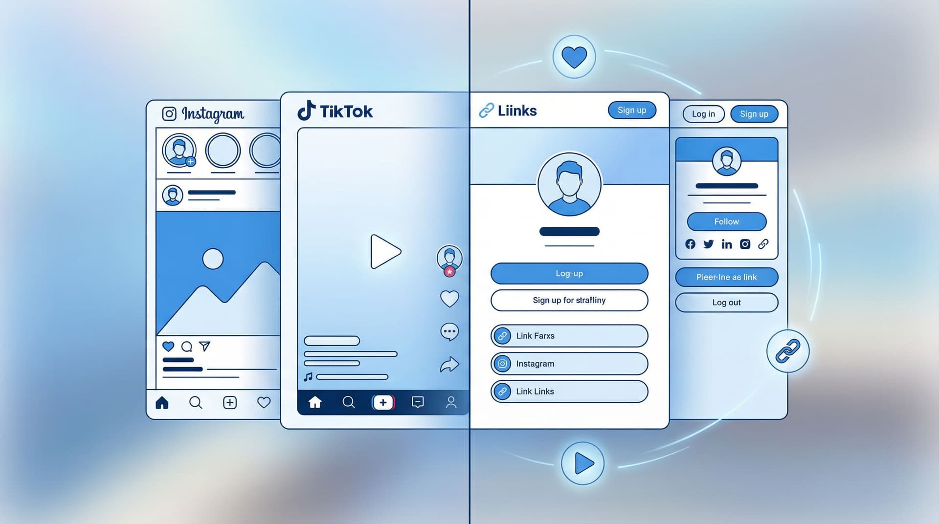
The ‘Link in Bio’ Style Guide: How to Make Your Liinks Page Look Like Your Instagram, TikTok, and Website Had a Baby

Your followers don’t experience you in separate compartments.
They see your TikToks, your Reels, your Stories, your site, your shop—and in their minds, it all blends into one thing: your brand.
So when they tap your bio link and land on a page that looks like a default settings screen from 2014? Instant vibe whiplash.
This is where a well-designed Liinks page quietly becomes the main character. When you treat it like the love child of your Instagram, TikTok, and website, you get a hub that:
- Feels instantly familiar ("Yep, I’m in the right place")
- Moves people smoothly from scrolling to clicking
- Looks way more polished than “random list of blue buttons”
Let’s build that.
Why Matching Your Liinks Page to Your Other Platforms Actually Matters
A quick reality check: most people will discover you on social first and everything else second.
That means your link in bio is often the first place they see your brand pulled together—or the first place it all falls apart.
When your Liinks page visually matches your Instagram, TikTok, and site:
- You feel more legit. Consistent visuals across platforms boost recognition and trust. People are far more likely to click, buy, or subscribe when everything feels cohesive instead of “Did I just click a spam link?”
- You reduce decision fatigue. If your colors, fonts, and language stay consistent, visitors don’t waste brainpower figuring out what’s going on. They go straight to choosing what to click.
- You make your content work harder. That Reel, TikTok, or Story that brought someone here? Your Liinks page should feel like the natural next frame—not a totally different movie.
If you’ve ever clicked someone’s bio link and thought, “Oh… this looks nothing like their content,” you’ve already felt the problem we’re fixing.
Step 1: Steal From Yourself (Your Visual Brand Basics)
Before you touch your Liinks layout, you’re going to raid your own brand closet.
Grab three things:
-
Color palette
- Pull 2–4 colors you use constantly on Instagram/TikTok/your site:
- 1 main brand color (your “signature”)
- 1 background color (usually light or dark neutral)
- 1 accent color (for buttons, highlights, or warnings)
- Pro tip: Screenshot your feed and use a color picker (e.g. Coolors or Adobe Color) to pull exact hex codes.
- Pull 2–4 colors you use constantly on Instagram/TikTok/your site:
-
Typography
- What kind of fonts do you use on:
- Reels/TikTok text overlays
- Your website headings
- Your logo or wordmark
- On your Liinks page, you’re mostly choosing one font for headings and one for body text. Aim for:
- Headings: the one that feels most “you” (bold, playful, elegant, etc.)
- Body: something super readable on mobile (no 0.5pt script fonts, please).
- What kind of fonts do you use on:
-
Imagery & vibe
- Are you:
- Clean + minimal
- Cozy + warm
- Maximalist + colorful
- Do you use:
- Product shots
- Selfies
- Screenshots
- Memes
- Are you:
Whatever the vibe is, your Liinks page should feel like it could be a screenshot from your feed, not a totally different brand.
If you want help turning this into a simple visual system, our post on what your link in bio says about you (before anyone ever clicks) is a great companion read.
Step 2: Design Your “Baby” Layout – How Instagram, TikTok, and Your Site Combine
Now we’re going to build a layout that feels like it belongs to your content.
Think of it like this:
- From Instagram → Aesthetic, color, and imagery
- From TikTok → Energy, hierarchy, and clear CTAs
- From Your Website → Structure, clarity, and navigation
1. Start with a Strong Above-the-Fold Section
When someone lands on your Liinks page, the first screen should:
- Confirm they’re in the right place
- Tell them what you’re about
- Offer 1–3 obvious next steps
You can do that with:
- Profile image that matches your social avatars
- Short, on-brand headline, e.g.:
- “Helping busy creatives make more money from fewer offers.”
- “BookTok recs, reading trackers, and cozy chaos.”
- “Local coffee, slow mornings, and events in [Your City].”
- Mini subheading clarifying what’s here:
- “Start with my latest video guides ↓”
- “Shop my presets, courses, and favorite tools.”
- “See today’s menu, events, and online ordering.”
Then add 1–3 primary buttons that are visually louder than everything else:
- “Start Here: New? Watch this first”
- “Join the Newsletter”
- “Shop My Favorites”
- “Book a Session”
If you’re driving a lot of story traffic, pair this layout with the conversion tips from From Swipe-Up to Sign-Up so your “link baby” doesn’t just look good—it quietly grows your list.
2. Group Links Like a Website Menu, Not a Link Dump
Your Liinks page should feel like a one-page homepage, not a filing cabinet.
Use 3–5 clear sections that mirror how you talk about your content elsewhere. For example:
-
For creators with offers:
- ⭐ Start Here
- 🎓 Courses & Resources
- 🛒 Shop / Products
- 🤝 Work With Me
- 💌 Community & Newsletter
-
For local businesses:
- Today’s Specials / What’s New
- Visit Us (map, hours, directions)
- Order / Book Online
- Events & Updates
-
For niche content creators (BookTok, fitness, etc.):
- Start Here / Most Popular
- By Category (e.g., Fantasy, Romance, Non-Fiction)
- Tools & Favorites
- Join the Community
If this is starting to sound like content buckets, that’s because it is. For a deeper dive on organizing chaos into categories, bookmark Stop Guessing, Start Grouping.
Step 3: Match the Aesthetic – Colors, Fonts, and Buttons That Feel Like “You”
This is where your Liinks page stops looking “templated” and starts looking custom.
Colors: Make It Feel Like a Feed Screenshot
Use your brand colors with restraint:
- Background: pick the same light/dark bias as your social content
- If your posts live on light backgrounds, use a soft off-white or very light neutral.
- If you love dark mode, try a deep charcoal or muted color instead of pure black.
- Buttons:
- Primary CTAs (the most important actions) = main brand color
- Secondary links = softer tones or outlined buttons
- Accents:
- Use your accent color for hover states, icons, section dividers, or tiny tags like “New” or “Popular.”
If you’re not sure it matches, literally hold your phone next to itself: open your Instagram profile on one tab and your Liinks page on another. Do they look like they’re from the same universe?
Typography: Don’t Get Too Clever
Pretty is good. Readable is non‑negotiable.
- Keep headlines big and bold, especially on mobile.
- Avoid long paragraphs in ALL CAPS (your audience will feel yelled at).
- Match the feeling of your social fonts, even if you can’t use the exact same typeface.
- Playful brand? Round, friendly sans‑serif.
- Luxury brand? Clean serif or high-contrast type.
- Techy/creator tools? Modern sans‑serif with good spacing.
Buttons & Cards: Borrow From Your Website
If you already have a site:
- Make your Liinks buttons look like your site buttons:
- Same corner radius (pill vs square)
- Similar shadows or outlines
- Similar hover/press states
If you don’t have a site, your Liinks page is your site. Treat each button or card like a mini landing page link:
- Short, specific labels (“Book 1:1 Strategy Call” vs “Consulting”)
- Optional subtext line (“60-minute Zoom, limited spots each month”)
- Tiny icons that match your general vibe (simple, not clip-art chaos)
Step 4: Bring Your Content Rhythm Onto Your Liinks Page
Your Liinks layout shouldn’t be static while your content is constantly evolving.
Think about how you post:
- Weekly drops?
- Seasonal launches?
- Local events?
- Evergreen content that’s always relevant?
Then build sections and slots that match that rhythm.
Add a “Now Playing” or “This Week” Block
Borrow from TikTok’s energy and keep one area that changes frequently:
- “This Week’s Video Guide”
- “Currently Obsessed”
- “Featured Offer”
- “New This Month”
This tells returning visitors: something is happening here, not “this page hasn’t moved since 2022.”
Mirror Your Highest-Traffic Content
Look at your analytics (Instagram, TikTok, YouTube, etc.) and ask:
- Which topics or videos consistently blow up?
- Which ones drive the most link clicks or DMs?
Then:
- Create a section dedicated to that theme on your Liinks page.
- Use titles that match how your audience thinks about it:
- “Viral Video Resources”
- “BookTok Starter Pack”
- “Beginner-Friendly Workouts”
If you’re already using Liinks as a search-friendly hub, pair this with the strategies in SEO, But Make It Short-Form so your “viral moment” content has a permanent home.
Step 5: Copy That Sounds Like Your Captions (Not Corporate You)
Visuals get people to stay. Words tell them where to go.
Your Liinks page copy should sound like your captions, hooks, and on-screen text, not your resume.
Keep Your Voice Consistent
If your content voice is:
- Sarcastic and fun → your buttons can be too.
- Soft and supportive → your microcopy should feel like a gentle nudge.
- Direct and tactical → your CTAs can be punchy and clear.
Examples of on-brand CTAs:
- “Binge the tutorials” instead of “Video library”
- “Get the reading tracker” instead of “Download template”
- “Book your caffeine-fueled consult” instead of “Schedule call”
Use Microcopy to Reduce Anxiety
Under important links, add a tiny line to answer the question in their head:
- “Free, takes 2 minutes”
- “No spam, just weekly recs”
- “Instant download, keep forever”
- “Local pickup available”
These tiny lines carry the same emotional tone as your Stories, making the whole experience feel like one continuous conversation.
Step 6: Make It Feel Like a Real Brand, Not Just a Collection of Links
This is where you add the finishing touches that make your Liinks page feel like a tiny, complete brand home.
Add Social Proof the Way You Do in Content
You probably already:
- Share screenshots of DMs
- Repost story mentions
- Highlight reviews
Bring that energy to your Liinks page:
- A “What People Say” section with 2–3 short quotes
- A “Featured in” row if you’ve been on podcasts, blogs, or local press
- A “Loved by” note for popular offers (“1,200+ downloads”)
For a deeper dive on weaving UGC into your hub, check out UGC, But Make It Clickable.
Make Navigation Brain-Dead Simple
Ask yourself:
- If someone only has 10 seconds, what’s the one thing I want them to do?
- If someone has 2 minutes, what are the top 3 places they should explore?
Then design around that:
- Your #1 action gets the biggest, brightest button near the top.
- Your next 2–3 actions get clear section headers and descriptive labels.
- Everything else? Smaller, lower, or grouped into “More Resources.”
Test It On a Real Human (Not Just Yourself)
Send your Liinks page to:
- A friend who follows you but isn’t deeply enmeshed in your world
- A regular viewer / customer (bonus points if they’re chatty)
Ask them:
- What do you think I want you to do first on this page?
- Is there anything you expected to see that’s missing?
- Does this feel like me, based on my socials?
If their answers match your intentions, you’re on the right track. If not, tweak.
Quick Checklist: Does Your Liinks Page Look Like Your Content’s Baby?
Run through this list with your page open:
- My profile photo, name, and handle match my social profiles.
- My colors, fonts, and overall vibe feel like a continuation of my feed.
- The first screen clearly tells people who I am and what to do next.
- I have 1–3 primary CTAs that stand out visually.
- My links are grouped into clear sections, not one long list.
- My link labels and microcopy sound like my captions, not corporate jargon.
- There’s at least one “Now” or “Featured” area that I update regularly.
- There’s some form of social proof (testimonials, numbers, logos, etc.).
- A friend or follower can explain what this page is for in one sentence.
If you’re missing a few, that’s fine. Style guides are living documents—not stone tablets.
Bringing It All Together
When your Liinks page looks and feels like the natural child of your Instagram, TikTok, and website, a few magic things happen:
- People trust you faster because everything feels aligned.
- Your content works harder, turning casual scrollers into clickers, subscribers, and buyers.
- You finally have a single, good-looking home base that doesn’t feel like a compromise.
And the best part? You don’t need a full rebrand or a 40-page brand book to do this. You just need:
- Your existing colors, fonts, and vibes
- A clear idea of what you want people to do
- A flexible tool (hi, Liinks) that lets you actually make it look the way your brain wants it to look
Your Next Tiny Step
Don’t put this on the “someday” list.
Here’s a simple, 20-minute challenge:
- Open your Instagram or TikTok profile and screenshot your feed.
- Open your current Liinks page in another tab.
- Ask: If someone didn’t know these were both mine, would they guess?
- Spend 20 minutes:
- Matching colors and fonts
- Rewriting your top 3 buttons to sound like your captions
- Adding a “Start Here” or “This Week” section
When you’re done, tap through your own bio link like a new follower.
If it finally feels like your Instagram, TikTok, and website had a very stylish baby—you’re on the right track.
And if you’re ready to go deeper on structure, SEO, or monetization, the rest of the Liinks Blog is your playground. Start with:
- Stop Guessing, Start Grouping for organizing chaos
- SEO, But Make It Short-Form for making your page searchable
- From Swipe-Up to Sign-Up for turning story views into subscribers
Then come back and tweak. Your Liinks page isn’t just a link list—it’s your brand, in one scrollable screen. Make it look like it deserves the traffic you’re sending to it.


