
What Your ‘Link in Bio’ Says About You (Before Anyone Ever Clicks): Micro-Branding Tweaks That Change the Story

Your link in bio is not neutral.
Before anyone taps it, that tiny URL is already whispering a story about you:
- “This person is legit and organized.”
- “This person is chaotic but charming.”
- “This person has not updated anything since 2022.”
People decide whether to click and what to expect before they ever see your actual page. That’s the power (and danger) of micro-branding: the tiny, easy-to-ignore details that quietly shape how people see you.
And when you’re using a flexible tool like Liinks to build that page, those micro-tweaks are exactly what turn you from “random creator” into “oh, they’re doing something real here.”
Let’s decode what your link in bio is saying about you—and how a few small changes can totally rewrite the story.
Why This Tiny Link Has Such a Loud Voice
Your link in bio is one of the highest-intent touchpoints you have. No one clicks it by accident. They’re already thinking things like:
- “What does this person actually offer?”
- “Where’s that freebie / booking link / new video they mentioned?”
- “Are they serious about this or just dabbling?”
Before they even tap, people are subconsciously scanning for signals:
- Your handle and display name
- Your profile photo
- Your bio line
- The label on your link ("linktr.ee/whatever" vs a branded URL vs a custom domain)
- Any pinned posts or highlights pointing to that link
Those micro-signals add up to one big question: “Is this worth my time?”
Get those signals right, and people click already half-sold. Get them wrong, and they never tap at all—no matter how gorgeous your Liinks page is underneath.
The 5 Stories Your Link in Bio Might Be Telling (Without Your Permission)
Let’s talk archetypes. Right now, your link in bio is probably giving off one of these vibes:
1. The Overwhelmed Hobbyist
Clues:
- Bio: “Just posting for fun :)”
- Link label: “linktr.ee/username” or “my links”
- No context in the bio about what you actually do
- No mention of offers, services, or how to work with you
What this says:
“I’m not sure what I’m doing with this yet, so don’t take me too seriously.”
If you’re trying to turn pro, this is working against you. You might have offers, but your top-of-profile story still screams “cute side hobby.”
2. The Confusing Multi-Hyphenate
Clues:
- Bio: “Coach | Designer | DJ | Candle maker | Crypto | Dog mom”
- Link label: “All my stuff here”
- Pinned posts point to five different priorities
What this says:
“I do everything, which means you have no idea what to click first.”
You’re probably wildly talented. But the story is: “I’m scattered, so working with me might feel that way too.”
3. The Ghosted Founder
Clues:
- Bio still mentions a launch from last year
- Link label: “Launch waitlist” (that closed 6 months ago)
- No current offer or clear next step
What this says:
“I start things and don’t finish them.”
Not great if you want clients, brand deals, or long-term partnerships.
4. The Quiet Professional
Clues:
- Clean profile photo
- Clear niche in the bio
- Link label: something generic like “Website” or “Click here”
What this says:
“I’m competent, but I’m not helping you understand what to expect.”
You’re probably leaving clicks and conversions on the table because people don’t know what’s behind the door.
5. The Micro-Brand Pro
Clues:
- Bio clearly states who you are and what you do
- Link label sets expectations ("Start here," "Work with me," "Free resources")
- Pinned content and highlights all point to that same core story
What this says:
“I’m intentional, I respect your time, and I know exactly how to help you.”
This is where we’re heading.
Micro-Branding Starts Before the Click: What to Fix on Your Profile
Let’s start with the stuff people see before they ever touch your link.
1. Your Handle & Name: The First Identity Check
Ask yourself:
- Does my handle match my name or brand?
- Does my display name quickly clarify what I do?
Quick upgrades:
- Add your role or niche to your name field:
Alex Rivera | Brand DesignerGlow Studio NYC · Facials & Brow Bar
- If your handle is chaotic (
@x0_babygirl_92), consider something more aligned with your current brand—even if you keep the old one on a personal account.
What this says when done well:
“You’re in the right place. This is the person you think they are.”
2. Your Bio: A 2-Line Brand Story
Your bio should answer, in plain language:
- Who you are
- Who you’re for
- What happens when they tap your link
Swipe these formulas:
-
Service-based:
I help [who] get [result] with [method].
I help busy founders get clean, high-converting websites without dev drama. -
Local business:
[What you are] in [location] for [ideal customer].
Neighborhood coffee + cowork spot in Austin for founders + freelancers. -
Creator with offers:
[Topic] tips + [type of content]. Tap for [core promise of your Liinks page].
Content + offer strategy for creators. Tap for my best free trainings + booking.
Then add a final line that sets expectations for the link:
👇 Start with the quick quiz👇 Grab your starter kit👇 Book a spot or binge the free stuff
This pairs perfectly with the One Scroll strategy, where your Liinks page is designed to sell the next step in a single, clear scroll.
3. Your Link Label: The Smallest, Mightiest CTA
The text right above your link (or the custom label on some platforms) does a lot of heavy lifting.
Compare these:
- “Website” vs “Work with me + free resources”
- “My links” vs “Start here: offers, freebies, booking”
- “Portfolio” vs “See client results + book a spot”
On platforms where you can rename the link (or when you’re using a custom domain that points to your Liinks page), treat that label like a micro-CTA.
Tiny copy tweaks that change the story:
- From:
My links→ To:Your next step lives here - From:
Shop→ To:Shop my exact tools + templates - From:
New video→ To:Watch the 10-min breakdown everyone’s DMing about
If you want more ideas here, you’ll love rewriting your buttons with the style in From ‘Check Out My Stuff’ to ‘Book Me Now’.
4. Pinned Posts & Highlights: Pre-Framing the Click
Before someone taps your bio link, they often:
- Watch 1–2 Reels/TikToks
- Skim your top 3–6 posts
- Glance at your highlights or pinned Stories
Use those to pre-frame what’s behind the link.
Ideas:
- Pin a post that literally walks through your Liinks page: “Here’s what happens when you tap my link.”
- Create a Story Highlight called
Start Herethat ends with a swipe-up / link sticker mirroring your bio link. - Feature screenshots of your Liinks page sections (offers, testimonials, free resources) so people already know what to expect.
The message becomes: “This is a well-thought-out experience, not a random list of buttons.”
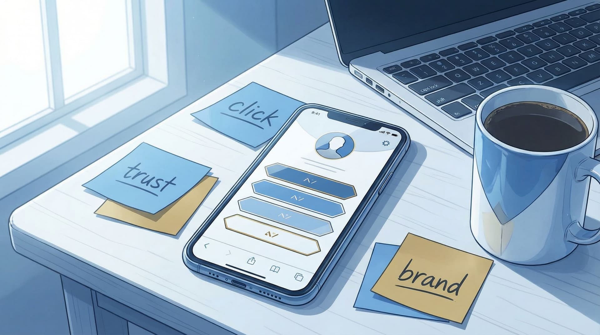
Micro-Branding On the Page: What Your Layout Says at a Glance
Now let’s assume they’ve clicked. Your page loads. You have about 3 seconds to make them feel one of two things:
- “Oh wow, this is exactly what I needed.”
- “Nope, too much, bye.”
Your actual layout is doing most of the talking here.
1. Above-the-Fold Story: Clarity vs Chaos
On a well-structured Liinks page, the top section should:
- Reassure them they’re in the right place
- Clarify who you are (again)
- Offer one obvious next step
Try this simple structure:
- Profile block: Name, short one-line descriptor matching your social bio.
- One-sentence promise:
Book a spot, grab a free resource, or binge my best trainings—start below.
- Primary button or section:
Start here: 3 steps to work with meNew? Watch this firstLocal? Book your visit
If you want help shaping that one-screen story, pair this with the ideas in The ‘One Scroll’ Strategy.
What this layout says:
“I know why you’re here, and I’ve made the next step obvious.”
2. Button Order: Your Priorities, Exposed
Your link order is a live, visual list of your priorities.
If the top of your page is:
- Your YouTube
- Your TikTok
- Your freebie
- Your actual paid offer
…you’re telling people: “Consuming my content is more important than working with me.”
There’s nothing wrong with that if it’s intentional. But if you’re trying to sell offers, book clients, or fill a calendar, your page should say that clearly.
Simple re-ordering framework:
- Primary money-maker (service, product, main offer)
- Primary trust-builder (case studies, portfolio, testimonials)
- Primary list-builder (freebie, newsletter, low-friction opt-in)
- Content hubs (YouTube, podcast, blog)
- Everything else (socials, random experiments, fun extras)
If you’re deep into analytics, you can go even further with the ideas in The Aesthetic Data Nerd—using your click data to design a better-looking and better-performing Liinks layout.
3. Visual Style: “I Care” vs “I Tried Once”
Your visual choices send a strong micro-branding signal:
- Consistent colors + typography → “I’m intentional and detail-oriented.”
- Random gradients + 7 font styles → “I get excited and then lose the plot.”
With Liinks, you can quickly:
- Match your brand colors to your social profile and content graphics
- Use consistent button styles (primary vs secondary)
- Add section headers to group related links (Offers, Free Stuff, For Brands, etc.)
Quick visual audit:
- Are my brand colors consistent from social posts → profile → Liinks page?
- Do my buttons feel like part of one system, or a ransom note?
- Is there enough white space, or does everything feel crammed?
The story you want: “This person runs a real brand, not just a collection of links.”
4. Copy Tone: Chill, But Clear
Your micro-copy (button text, section headings, tiny descriptions) tells people how serious you are.
You can be casual and clear:
- Instead of:
New video→ Try:Watch: How I plan a month of content in 60 minutes - Instead of:
Freebie→ Try:Free Notion template: plan your launch in a weekend - Instead of:
Coaching→ Try:Apply for 1:1 strategy support (limited spots)
If your copy feels like a shrug, your clicks will too.
Micro-Tweaks You Can Make in the Next 30 Minutes
Let’s turn this into a quick, practical makeover. Set a timer for 30 minutes and walk through these steps.
Step 1: Rewrite Your Bio to Match Your Page
- Clarify who you are and who you’re for.
- Add one line that previews what’s behind your link.
- Example:
Launch + content strategist for creators. Tap for offers, free trainings, and the exact tools I use.
Step 2: Upgrade Your Link Label
- Change “Website” or “My links” to something that sets expectations.
- Example:
Start here: offers, freebies, booking - If you’re using a custom domain that points to Liinks, make sure it’s something memorable and on-brand.
Step 3: Reorder Your Buttons by Priority
Inside Liinks:
- Drag your main offer / booking link to the top.
- Put one strong trust-builder (portfolio, results, testimonials) right under it.
- Add a clear, specific freebie or low-friction next step.
- Move “nice to have” links lower.
For more detailed funnel mapping, check out From Freebie Hunters to Paying Clients.
Step 4: Clean Up Visuals
- Pick 1–2 brand colors and apply them consistently.
- Choose one button style for primary CTAs, another for secondary.
- Add section headers so your page feels like a menu, not a junk drawer.
Step 5: Fix Your Micro-Copy
- Rewrite each button to answer: “What exactly happens if I click this?”
- Use verbs and outcomes:
Book,Grab,Watch,Download,See,Start.
The Big Picture: Your Link in Bio as a Character Reference
Your link in bio is doing more than routing traffic. It’s acting as a character reference.
Before anyone ever clicks, it’s telling people:
- Whether you’re serious about what you do
- Whether you’re organized and reliable
- Whether you respect their time and attention
- Whether working with you will feel clear or confusing
The good news? You don’t need a rebrand, a new website, or a 47-step funnel to change that story.
You just need a handful of small, intentional decisions on one small page—decisions that tools like Liinks make very easy to test, tweak, and refine as you grow.
TL;DR Summary
- People start judging your brand before they ever tap your bio link.
- Your handle, name field, bio, link label, and pinned content all send strong micro-branding signals.
- Your Liinks layout exposes your real priorities: whatever’s at the top is what you’re telling people matters most.
- Clean visuals, clear structure, and specific micro-copy quietly say, “I’m legit, I’m prepared, and I know what you need next.”
- A 30-minute cleanup—bio, link label, button order, visuals, and copy—can completely change what your link in bio says about you.
Ready to Change the Story Your Link in Bio Is Telling?
Don’t wait for a “big launch” or “perfect brand” moment.
Open your profile, tap your own link, and look at it like a stranger who just discovered you:
- Do I instantly understand what this person does?
- Is it obvious what I should click first?
- Does this page look like it belongs to someone I’d trust with my time or money?
If the answer is anything less than a confident yes, that’s your cue.
Spin up or log into Liinks, make those micro-tweaks, and turn your “link in bio” from a quiet liability into your sharpest first impression.
Your story is already being told. You might as well be the one writing it.


