
From Hobbyist to ‘Booked Out’: A Link-in-Bio Game Plan for Creators Turning Pro

From Hobbyist to “Booked Out”: A Link-in-Bio Game Plan for Creators Turning Pro
You know that weird in‑between stage where you’re not “just doing this for fun” anymore… but also not quite “booked out with a waitlist and a calming Google Calendar color palette” yet?
That’s the moment your link in bio quietly becomes a business asset instead of a cute afterthought.
If you’re starting to charge for your work, collaborate with brands, or take on clients, your bio link is no longer just “where the YouTube video lives.” It’s the control center for how strangers become subscribers, clients, and repeat buyers.
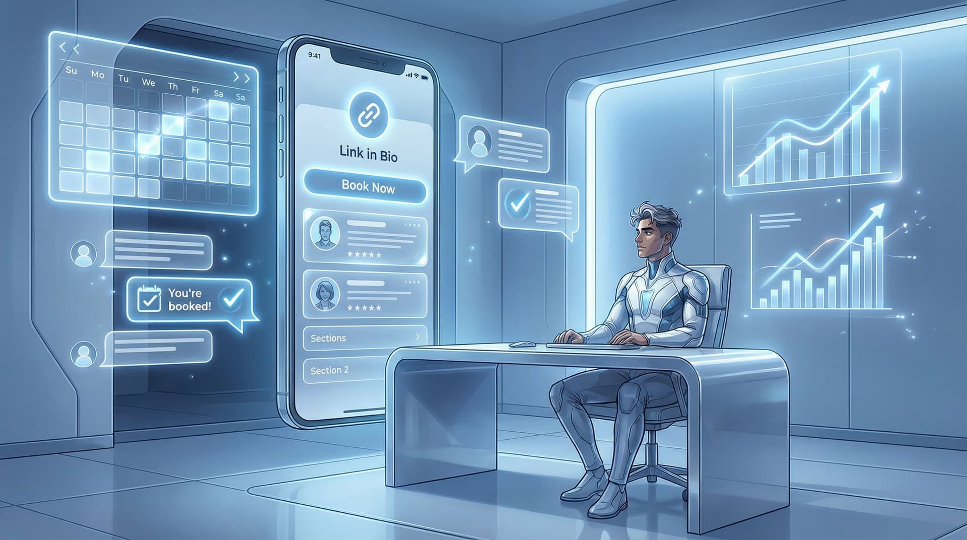
And if you’re using something like Liinks (a flexible link-in-bio tool built for creators who want their page to actually look good), you’ve got way more power than “here’s a list of random buttons.”
This post is your game plan for turning that hobby‑era link into a tiny, high‑converting booking engine.
Why Your “Hobby” Link Can’t Come With You
When you’re a hobbyist, your link in bio can be chaos:
- A YouTube playlist
- Your favorite discount code
- A random Notion template
- That one freebie you made in Canva at 2 a.m.
No one expects much. You’re experimenting. It’s fine.
But once you start charging money, people are reading your link in bio like a resume:
- Can I quickly tell what you actually offer?
- Is this person organized enough to handle my project / wedding / brand deal?
- Do other people trust them already?
If your page feels confusing, outdated, or half‑finished, you’re not “mysterious.” You’re risky.
The good news: you don’t need a full website and a 47‑step funnel to look like a pro. You need one well‑designed, well‑thought‑out link hub—something Liinks is literally built for.
Step 1: Decide What “Booked Out” Actually Means for You
Before you rearrange a single button, you need a target.
“Booked out” is not a vibe. It’s a number.
Ask yourself:
-
What are you actually trying to fill?
- 1:1 client spots
- Retainer packages
- Brand collabs
- Commissions
- Spots in a group program or membership
-
What’s your version of “full”?
- 5 clients/month?
- 3 shoots/week?
- 2 brand deals/month?
- 10 VIP days/quarter?
-
How do people officially book you?
- A Calendly or TidyCal link
- A Typeform or intake form
- A checkout page
- A “reply to this email” flow
Your link in bio exists to push people toward that booking mechanism as smoothly as possible.
If you can’t answer “What’s the main action I want people to take from my bio link?” your page will always feel like a buffet instead of a funnel.
Step 2: Give Your Page One Clear Job
Your hobby page tried to do everything. Your pro page does one thing first.
That one thing is usually:
- “Book a call” (coaches, strategists, service providers)
- “Inquire about a project” (designers, photographers, videographers)
- “Buy this offer” (templates, presets, digital products)
Everything else is supporting cast.
If you need help ruthlessly prioritizing, the “One Offer” Liinks Makeover is basically a full intervention on this.
Your new rule:
Above the fold, there should be exactly one obvious next step for someone who’s already warm and ready.
That might look like:
- A bold headline: “Brand & web designer for bold, colorful founders”
- One primary button: “Apply for a custom project”
- A secondary button: “Not ready yet? Browse my portfolio”
That’s it. Not 14 buttons. Not 6 freebies. Not “Latest Reel” at the top.
Step 3: Build a “Booked Out” Layout (Section by Section)
Let’s turn your Liinks page into a mini sales flow.
Think of it like this:
- Who you are & what you do
- Why you’re legit (proof)
- How to work with you (offers & booking)
- How to stay in your world (email list / content)
1. The 3‑Line Bio That Sells for You
You do not need a novel.
Aim for:
- Line 1 – Role & who you serve:
“Brand + web designer for bold, colorful founders.” - Line 2 – Outcome:
“I turn ‘I DIY’d this on a weekend’ vibes into ‘we raised our rates’ websites.” - Line 3 – Next step:
“Start with a free 15‑minute fit check call.”
Now your top button has context. You’re not “another creative person.” You’re a solution.
2. A Primary CTA That’s Obnoxiously Clear
Your top button should answer the question: “If I’m ready to work with you, where do I click?”
Examples:
- “Apply for a 1:1 coaching spot”
- “Book a brand shoot in NYC”
- “Hire me for UGC content (rates + portfolio)”
Skip vague labels like “Work with me” unless the button text or subcopy makes it painfully obvious what happens next.
If you haven’t cleaned up your button copy yet, bookmark From ‘Check Out My Stuff’ to ‘Book Me Now’ for a full micro‑CTA makeover.
3. Proof Section: Show, Don’t Just Tell
This is where you move from “looks cool” to “okay, I trust them.”
Create a section on your Liinks page labeled something like:
- “Client Results & Receipts”
- “Before/After & Wins”
- “What Clients Are Saying”
Inside that section, link to:
- A portfolio or highlight reel
- A case study or Google Doc with screenshots
- A carousel post that shows a transformation
- A page where you’ve stacked social proof (screenshots, testimonials, numbers)
If you want to go deeper on this, Screenshots Sell walks you through how to turn proof into a whole strategic section that quietly closes clients.
4. Offers & “Choose Your Own Adventure”
Under your proof section, give people 2–3 clear paths, max.
For example:
- “Done‑for‑you brand & web design (2 spots/month)”
- “Day rate: 1‑day design sprint for quick fixes”
- “DIY templates shop (for early‑stage founders)”
Each link should go to a page that answers three questions:
- What is this?
- Who is it for?
- What happens after I pay / book?
If you’re not ready for fancy sales pages, a clean Google Doc or Notion page is totally fine—as long as it’s clear and not giving “group project.”
5. “Not Ready Yet” Paths (Future Clients Live Here)
Not everyone is ready to book today. That doesn’t mean they’re a lost cause.
Give them:
- One main nurture link (newsletter, waitlist, or “Start here” content hub)
- One or two best‑of resources (your strongest tutorial, podcast episode, or guide)
If you’re between launches or offers, this is where a post like What to Link When You’re Launching Nothing comes in handy—your link in bio can still warm people up even when you’re not actively selling.
Step 4: Make Your Page Look Like Someone Worth Paying
You do not have to be a designer. You do have to stop looking like a default template.
When you’re turning pro, visuals are not “just vibes”—they’re trust signals.
On a tool like Liinks, you can:
- Match your brand colors and use them intentionally (one main accent, one neutral)
- Use consistent button styles (not a new experiment every row)
- Add section headers to group related links (Offers, Proof, Learn, etc.)
- Use spacing so your page feels calm, not crammed
Tiny upgrades that scream “I’m legit”:
- One strong brand color: Use it for primary CTAs only. Everything else more muted.
- Readable fonts: Save the swirly script for your logo, not your main buttons.
- Contrast: Dark text on light backgrounds or vice versa—no squinting required.
If you want a checklist of visual tweaks that instantly make you look more pro, run through The 10-Minute Link-in-Bio Audit after you set things up.
Step 5: Turn Your Page into a Simple Funnel (Not a Maze)
A lot of creators accidentally build a museum: “Here is everything I have ever made.”
You’re going to build a funnel: “Here’s the next right step for you.”
A simple “turning pro” funnel from your Liinks page might look like this:
- Warm followers click your bio link from a piece of content about your main offer.
- They land on your page and see:
- Clear positioning line
- One main CTA (book/apply)
- If they’re ready → they click, fill out the form, and land on a confirmation page that sets expectations.
- If they’re not ready → they scroll once and see:
- Proof section
- “Start here” resource
- Email list or waitlist
Over time, you can get fancier (freebie → nurture sequence → offer), especially with help from From Freebie Hunters to Paying Clients. But even a basic flow will put you ahead of 90% of “link in bio = chaos” creators.
Step 6: Make Booking You Frictionless
If someone is ready to pay you and they still have to:
- DM you
- Wait for you to see it
- Go back and forth on times
- Ask for the link again because it got buried
…you’re voluntarily losing money.
Your bio link should make booking feel like:
Click → skim → decide → book → done.
You can do this by:
- Using scheduling tools like Calendly, TidyCal, or SavvyCal for calls and sessions.
- Embedding payment links from Stripe, ThriveCart, Lemon Squeezy, or Gumroad for digital offers.
- Creating one “Work With Me” hub that explains your process once, then linking that from your Liinks page.
On your booking page, answer preemptive questions:
- What’s included?
- Who is this for / not for?
- What’s the timeline?
- What happens after I pay / book?
The clearer you are here, the fewer “just checking” DMs you’ll get—and the more likely people are to actually complete the booking.
Step 7: Keep It Updated Without Making It a Whole Thing
Hobby‑you could ignore your link in bio for months. Pro‑you cannot.
But updating it doesn’t have to be dramatic. Set a recurring 15‑minute CEO date once a week to:
- Move your current promo or priority offer to the top
- Swap in your latest high‑intent content (not every post—your best ones)
- Remove anything that’s expired, sold out, or irrelevant
- Skim your analytics (if your tool has them) to see what people are actually clicking
If your content is feeling stale, you don’t need more posts—you need smarter routing. The 5-Minute Content Refresh is great if you want your existing content to work harder through your Liinks page.
Quick Checklist: Does Your Page Look “Booked Out” Ready?
Run through this and be brutally honest:
- I can describe my main offer in one sentence.
- My top button is the exact action I want ready‑to‑buy people to take.
- I have at least one clear proof section (screenshots, testimonials, portfolio).
- My page has 3–7 links total, not 19.
- My design looks intentional (colors, fonts, spacing), not default.
- There’s an obvious path for “not ready yet” people (email list or starter content).
- It takes 3–4 taps max to go from my profile to “booked.”
If you’re missing more than two of these, you’re still in hobby‑link territory. The good news: everything on this list is fixable in an afternoon.
The Short Version (Because You’re Busy Actually Creating)
Turning pro isn’t just raising your rates. It’s removing friction between “I like your content” and “Here’s my card.”
Your link in bio is where that shift becomes real.
When you:
- Define what “booked out” actually means for you
- Give your page one clear job
- Layer in proof and clear offers
- Make booking you ridiculously simple
- Keep things visually tight and on‑brand
…you stop hoping people will “figure it out” and start guiding them there on purpose.
One tiny page. Big energy shift.
Your Next Move (Yes, This Is the Nudge)
Don’t bookmark this and wander off.
Here’s your first step:
- Open your current link in bio in one tab.
- Open your link builder (or start fresh with Liinks) in another.
- In the next 30 minutes, do just these three things:
- Rewrite your top 3 lines of copy so they actually say what you do and for whom.
- Choose one primary CTA and move it to the top.
- Add one proof link (testimonials, portfolio, or case study).
That’s it. No rebrand. No dramatic announcement. Just a quiet shift from “here are my links” to “here’s how to work with me.”
The difference between a hobbyist and a booked‑out creator isn’t talent. It’s clarity, access, and how easy you make it for people to say yes.
Your link in bio is where that yes starts. Make it count.


