
From ‘Check Out My Stuff’ to ‘Book Me Now’: Rewriting Boring Link-in-Bio Copy into Clickable Micro-CTAs

From ‘Check Out My Stuff’ to ‘Book Me Now’: Rewriting Boring Link-in-Bio Copy into Clickable Micro-CTAs
Your link in bio is not a museum. People are not there to quietly observe your work and leave. They’re there because they want to do something next.
The problem? Most link-in-bio copy sounds like a shrug.
“New video.”
“Latest blog post.”
“Check out my shop.”
That’s not a call to action. That’s a field trip announcement.
This is where micro-CTAs come in—tiny, specific lines of copy that turn vague buttons into irresistible, “oh fine, I’ll click it” prompts.
If you’re using a flexible tool like Liinks, you already have the design side handled. Now we’re going to make your words work as hard as your visuals.
Why Your Current Link-in-Bio Copy Isn’t Getting Clicks
People don’t click because they’re bored, confused, or unconvinced. Boring link labels are guilty of all three.
Most link pages are full of:
- Generic labels – “YouTube,” “Podcast,” “Shop,” “Portfolio”
- Vague invitations – “Learn more,” “Click here,” “Check this out”
- Zero context – no hint of what they’ll get or why they should care now
Meanwhile, attention spans are short:
- A widely cited Microsoft study found that average attention spans online hover around 8 seconds—shorter than a goldfish. That’s not a lot of time to win someone over.
- Eye-tracking research on web pages shows people scan in an F-shaped pattern, looking at headings and the first few words of text before deciding whether to keep going.
On a link page, that means your first 2–4 words on each button matter way more than you think.
Micro-CTAs fix this by:
- Making each link specific (“Steal my content calendar template” beats “Free resource”)
- Adding urgency or relevance (“Book your March brand shoot” beats “Work with me”)
- Clarifying outcomes (“Grow your list with my newsletter welcome sequence” beats “Newsletter”)
If your design is already solid but your click-through rate feels meh, your copy is probably the bottleneck. (If your design isn’t solid, bookmark this and go read The ‘Link in Bio’ Glow-Up: Tiny Visual Tweaks That Make People Actually Want to Click next.)
What Micro-CTAs Actually Are (and Aren’t)
A micro-CTA is a short, specific, action-focused line that tells people exactly what they’ll get when they click.
It is not:
- A full sentence paragraph
- A mysterious one-word label
- A passive description of the thing behind the link
Think of it as:
Action verb + specific outcome or benefit (+ optional time frame or audience)
Examples:
- “Book your Q2 strategy call” (action + timeframe)
- “Download the Notion client portal template” (action + specific asset)
- “Watch my 10-min pricing workshop” (action + time commitment)
- “Apply for 1:1 coaching (2 spots left)” (action + scarcity)
- “Get my weekly creator income report” (action + benefit)
Compare that to:
- “Coaching”
- “YouTube”
- “Freebie”
- “New video”
One of these sounds like a thing that exists. The other sounds like a thing you might actually want.
Step 1: Decide What You Want People to Do (Not Just See)
Before you rewrite a single word, you need to answer one unsexy but crucial question:
What are the top 1–3 actions I want people to take from my link in bio?
Not “what do I have.” Not “what do I feel guilty not linking.”
Actual actions, like:
- Book a call
- Buy a product
- Join a list
- Apply for a program
- Watch a specific piece of content that moves them toward buying
If your current page is a buffet of everything you’ve ever made, you’ll want to narrow it down. If you need help with that, The ‘One Offer’ Liinks Makeover: How Simplifying Your Page Can Actually Boost Sales is your tough-love companion.
Once you’ve picked your top actions, you can:
- Prioritize those links visually at the top of your Liinks page.
- Write your strongest micro-CTAs for those first.
Everything else gets supporting-actor energy.
Step 2: Audit Your Existing Links (The Brutally Honest Way)
Open your current link page. For each link, ask:
- If someone saw only this button, would they know what happens when they click?
- Is this phrased like a label, or like an action?
- Does it tell them what they get, or just what I made?
Now, categorize each link into one of these buckets:
- Keep, but rewrite – The destination is important, the copy is weak.
- Combine – You have three links doing the same job (e.g., multiple freebies).
- Archive – Old launches, dead offers, or content no one needs front-and-center.
On Liinks, this takes a few minutes: drag things around, toggle visibility, and rename links without touching the actual URLs.
Your goal after this pass: fewer links, clearer actions, less mental load.
Step 3: Use These Plug-and-Play Micro-CTA Formulas
Let’s get to the fun part: actually rewriting the boring stuff.
Below are formulas you can steal, plus before/after examples for different types of creators.
For Service Providers & Freelancers
Formulas:
- Book your [timeframe] [service]
→ “Book your April brand shoot” - Apply for [offer] (X spots left)
→ “Apply for 1:1 coaching (3 spots left)” - See results from [client type] like you
→ “See results from SaaS founders like you”
Before vs After:
- “Work with me” → “Book a 30-min discovery call”
- “Portfolio” → “Browse my top 10 client projects”
- “Services” → “Compare social media management packages”
If bookings are your main goal, pair this post with From Followers to Freelance Clients: Turn Your Liinks Page into a Booking Machine (Without a Full Website) and go full “tiny scheduling system” mode.
For Coaches & Educators
Formulas:
- Start the [timeframe] challenge
→ “Start the 7-day content clarity challenge” - Watch the [length] training on [result]
→ “Watch the 20-min training on charging premium rates” - Join [name] and get [core benefit]
→ “Join Creator Lab and get weekly content prompts”
Before vs After:
- “Free webinar replay” → “Watch my 45-min pricing workshop replay”
- “Group program” → “Apply for the next 12-week cohort (starts March 3)”
- “Newsletter” → “Get my weekly ‘No-Fluff Marketing’ newsletter”
For Creators Selling Products (Digital or Physical)
Formulas:
- Shop [product type] for [audience]
→ “Shop Lightroom presets for travel photographers” - Grab the [outcome] bundle
→ “Grab the Client Onboarding Bundle” - Start with the best-seller: [product name]
Before vs After:
- “Shop” → “Shop my printable budget planners”
- “Ebook” → “Download my ‘Quit Undercharging’ pricing ebook”
- “Templates” → “Steal my plug-and-play proposal templates”
For Content Creators (YouTube, Podcasts, Blogs)
Formulas:
- Binge the [topic] playlist
→ “Binge the ‘Start Your Studio’ playlist” - Listen to the episode on [specific pain point]
→ “Listen: How to get clients with 1,000 followers” - Read the guide to [clear outcome]
→ “Read: How I batch 30 Reels in 3 hours”
Before vs After:
- “New video” → “Watch: My $5k/month content system breakdown”
- “Podcast” → “Listen: 3 money mistakes new creators make”
- “Blog” → “Read: My full guide to quitting your 9–5”
Step 4: Add Tiny Details That Dramatically Boost Clicks
Once your links are action-focused, you can layer in micro-details that nudge people over the edge.
Here are small tweaks with outsized impact:
1. Time Commitment
People love knowing how long something will take.
- “Watch my 10-min Reels tutorial”
- “Take the 3-min niche quiz”
- “Skim my 5-step client onboarding checklist”
2. Specific Audience Callouts
When people feel seen, they feel compelled.
- “Download my launch checklist for course creators”
- “Shop my presets for moody food photography”
- “Join my newsletter for multi-hyphenate creatives”
If your audience is juggling multiple niches or identities, you’ll love The Multi-Passionate Creator’s Map: Structuring One Liinks Page When You Do… Everything.
3. Scarcity or Timeliness (Ethically)
Use this when it’s actually true:
- “Apply for March coaching (2 spots left)”
- “Enroll before Feb 28 for the bonus Q&A”
- “Grab the launch bundle (closing Sunday)”
4. Clear Outcomes, Not Features
Translate your offer into the result it delivers.
- “Grow your list with my welcome email templates”
- “Land better brand deals with my pitch scripts”
- “Raise your rates using my plug-and-play calculator”
Step 5: Match Your Micro-CTAs to the Rest of Your Page
Your CTAs don’t live in a vacuum—they’re part of the whole experience.
A few alignment checks:
-
Design vs. Copy
If your page looks luxe but your CTAs sound like default template text, there’s a trust gap. Conversely, if your page looks like a group project but your CTAs are fire, you’re still losing people. For a full visual tune-up, pair this with The Aesthetic Advantage: Why Good Design on Your Link in Bio Quietly Boosts Your Conversion Rate. -
Hierarchy vs. Goals
Your most important action should:- Sit at the top
- Have the most compelling micro-CTA
- Possibly get a different style (highlight color, icon, or size) in Liinks
-
Consistency vs. Chaos
Use a consistent voice across all your micro-CTAs:- If you’re playful, stay playful: “Steal my launch checklist”
- If you’re direct, stay direct: “Download the launch checklist”
-
Mobile First
Most people will see your Liinks page on their phone. Read each micro-CTA as if you can only see the first 3–4 words on a small screen. Do they still make sense? Do they still sell the click?
Step 6: Test, Tweak, Repeat (Without Overthinking It)
You do not need a PhD in conversion rate optimization to improve your micro-CTAs. You just need to be a little curious.
Try this simple 30-day experiment:
- Pick one primary link to optimize – e.g., your main offer.
- Run Version A for 2 weeks, Version B for 2 weeks.
- Change just one thing in the micro-CTA: the verb, the time frame, or the outcome.
- Track clicks inside Liinks or your analytics.
Example test:
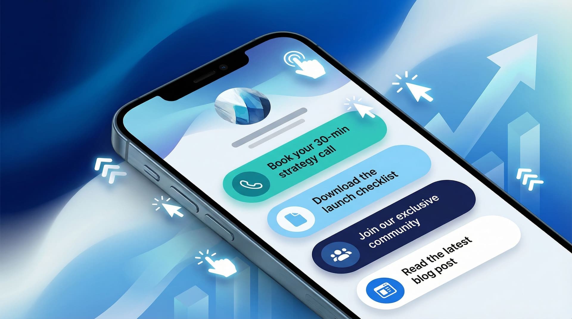
- Version A: “Book your 30-min strategy call”
- Version B: “Plan your Q2 content in 30 minutes”
Same destination, different angle. See which one earns more taps.
Keep a tiny note somewhere (Notion, Google Doc, the back of a receipt—no judgment) with:
- Date range
- Micro-CTA version
- Clicks
- Any context (big launch, viral post, dead week)
Over a few months, you’ll build your own private swipe file of what your specific audience responds to.
Quick Before-and-After Makeover: 5 Common Links
Let’s rapid-fire some glow-ups you can steal right now.
-
“New video”
→ “Watch: How I plan a month of content in 60 minutes” -
“Newsletter”
→ “Get my weekly behind-the-scenes income breakdowns” -
“Freebie”
→ “Download the 5-email launch sequence I still use” -
“Coaching”
→ “Apply for 1:1 coaching (next spots in April)” -
“Shop”
→ “Shop my plug-and-play creator templates”
Copy, paste, tweak for your niche, publish. Do not spend three weeks wordsmithing “download.”
Bringing It All Together
Let’s recap what we just did:
- You stopped treating your link in bio like a filing cabinet and started treating it like a tiny sales page.
- You identified the top 1–3 actions you actually want people to take.
- You audited your current links and demoted or archived anything that isn’t pulling its weight.
- You rewrote vague labels into specific, benefit-driven micro-CTAs.
- You layered in tiny but mighty details: time commitment, audience callouts, outcomes, and ethical urgency.
- You aligned your copy with your design, hierarchy, and voice, then set up simple experiments to keep improving.
The result? Your link in bio goes from “check out my stuff” energy to “oh, this is exactly what I needed” energy.
Your Next Tiny Step (Meta CTA Time)
You don’t need to rebuild your entire page tonight. Here’s your first move:
- Open your Liinks page.
- Rewrite just your top three links using the formulas in this post.
- Add one tiny detail to each (time frame, audience, or outcome).
- Leave everything else alone for now.
That’s it. Four micro-CTAs, max.
Once you’ve done that, your link in bio is officially doing more than pointing at your stuff—it’s guiding people toward their next step with you.
And if you’re ready to give those new micro-CTAs a home that actually looks good, you can set up or refresh your page on Liinks in a few minutes and let your words—and your work—do the clicking.


