Link-in-Bio Red Flags: Design and Copy Mistakes That Make You Look Less Credible (and How to Fix Them)

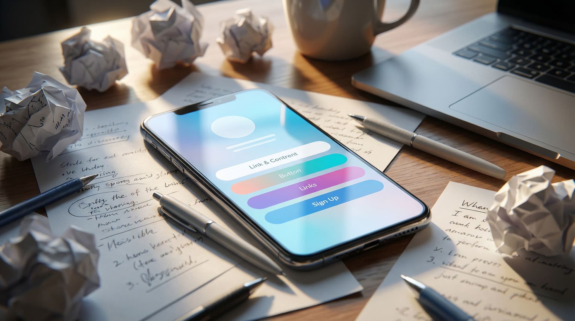
Your link in bio is where the lurkers turn into leads, buyers, or brand partners.
They’ve already done the hard part:
- They noticed you.
- They liked you enough to tap your profile.
- They were curious enough to click your link.
And then… they land on a page that looks like a group project from freshman year.
That’s the moment you either look like a real, trustworthy brand—or someone who just discovered fonts yesterday.
This matters because people are making snap judgments about you in seconds. Design and copy are doing most of the talking. If your page feels messy, outdated, or confusing, you’re not just “being casual”—you’re quietly losing money, subscribers, and opportunities.
The good news? Most credibility-killing mistakes are fixable in under an hour, especially if you’re using something flexible like Liinks, which is built specifically so your link-in-bio page can actually look good and be easy to update.
Let’s walk through the biggest red flags—and how to fix each one without needing a designer, copywriter, or personality transplant.
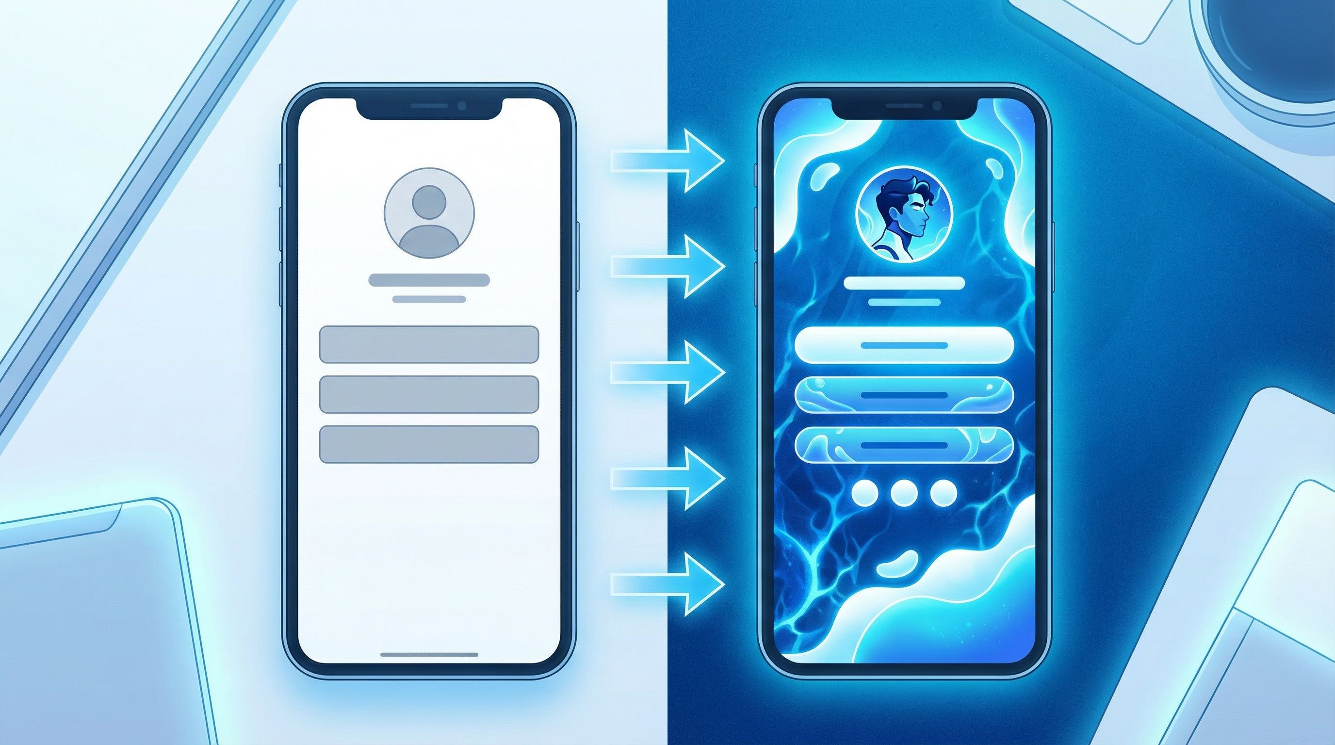
Red Flag #1: The Default Template That Looks Like Everyone Else
If your page still looks exactly like it did the day you signed up—same default colors, same generic buttons, same “this could belong to literally anyone” vibe—that’s a credibility leak.
Why it hurts you:
- You blend into every other creator using the same starter layout.
- Brands and potential clients can’t tell if you’re serious or just dabbling.
- It creates a tiny but real trust gap: if you haven’t customized this, what else are you not paying attention to?
Quick fixes:
-
Choose a clear visual direction.
- Pick one of these vibes and commit:
- Clean & minimal (neutrals, simple fonts)
- Bold & playful (bright colors, rounded buttons)
- Soft & warm (muted tones, softer typography)
- Match it loosely to what people see on your feed so the experience feels continuous.
- Pick one of these vibes and commit:
-
Customize at least three elements:
- Background color or gradient
- Button style (shape, color, hover state)
- Fonts (headings vs. body)
-
Add one on-brand detail.
- A simple logo at the top
- A small profile photo
- A short tagline that matches your bio
If you want more help on making your page feel like a real brand moment, check out “Link in Bio, But Make It a Brand: How to Turn Your Liinks Page into a Mini Style Guide” for deeper visual and verbal alignment ideas: read it here.
Red Flag #2: A Button Buffet With No Main Dish
If your page has 15+ links and no clear priority, you’re not being generous—you’re being confusing.
Typical symptoms:
- Every link feels equally important.
- You’ve got old freebies, dead launches, and random experiments still hanging around.
- People have to scroll more than once to find anything that matters.
Why it hurts you:
- Confused visitors default to doing nothing.
- Your main offer gets buried under “nice-to-have” extras.
- It feels more like a junk drawer than a curated hub.
Fix it with ruthless hierarchy:
-
Decide your primary goal for the next 30–90 days.
- Grow your list?
- Book more clients?
- Sell one main product?
-
Make that goal impossible to miss.
- Put the main link first.
- Use a slightly different button style or color.
- Add a short label above it like: Start here → or New:
-
Limit your total links.
- Ideal range: 4–8 links.
- Anything below the fold should still feel intentional, not like a graveyard.
-
Archive or hide what’s not current.
- Old launch pages
- Closed programs
- Offers you don’t actually want to sell anymore
If you’re ready to go all-in on one main offer, “The ‘One Offer’ Liinks Makeover: How Simplifying Your Page Can Actually Boost Sales” walks through this in detail: dive into it here.
Red Flag #3: Vague, Vibes-Only Button Copy
“Check this out.”
“New!!”
“Click here.”
Your buttons are tiny billboards. If they’re vague or cryptic, people will scroll right past.
Why it hurts you:
- People don’t know what they’re clicking into.
- It feels slightly risky (especially if it sounds salesy with no context).
- You miss the chance to pre-sell the click.
What to do instead:
Use specific, benefit-driven labels that answer: What is this, and why should I care?
Upgrade examples:
Newsletter→ Get my weekly email on [topic]Shop→ Shop presets + templatesFree guide→ Download the free [result] guideCoaching→ Apply for 1:1 coaching (waitlist)YouTube→ Watch my deep-dive tutorials on [topic]
A simple formula:
[Action verb] + [specific thing] + [hint of benefit]
e.g., Book a strategy call to plan your next launch
Do a quick audit: if someone who’s never met you landed on your page, could they understand each button without knowing anything about your brand? If not, rewrite.
Red Flag #4: Walls of Text No One Will Read
Yes, you’re a nuanced human with a rich story. No, your link page is not the place for a memoir.
Signs you’ve gone too far:
- Long paragraphs under your name
- Multi-line descriptions under every button
- A full “About me” section before any links appear
Why it hurts you:
- People came to click, not study.
- Too much text makes the page feel heavy and unpolished.
- It ironically makes you seem less professional, not more.
How to keep it tight and clear:
-
Limit your hero text.
- One line for what you are: Brand + email strategist
- One line for who you help and how: Helping creators turn followers into subscribers and sales.
-
Use short, scannable descriptions only where needed.
- 1–2 lines max under your most important links.
- Make them concrete: Includes templates, scripts, and a 20-minute video walkthrough.
-
Move long-form storytelling elsewhere.
- Your About page
- A dedicated sales page
- A pinned post
If you want to see how a lean, focused page can still act like a legit portfolio or client hub, read “From ‘Link in Bio’ to Legit Portfolio: A No-Code Client Hub You Can Build on Liinks in an Afternoon”: see the breakdown here.
Red Flag #5: Inconsistent or Hard-to-Read Design
If your page is rocking neon text on a patterned background, six different fonts, and buttons that blend into the background… your conversion rate is quietly screaming.
Common design sins:
- Low contrast (light gray text on a beige background)
- Too many colors fighting for attention
- Overly decorative fonts used for body text
Why it hurts you:
- Accessibility suffers (people literally can’t read your page).
- It feels amateur, which makes people hesitate before buying or booking.
- Your main actions get lost in the noise.
Make it instantly more trustworthy:
-
Stick to a simple color system.
- 1 background color
- 1 primary accent color (for main buttons)
- 1 neutral for text (dark gray or near-black)
-
Use font roles.
- One font for headings
- One font for body text
- Avoid script fonts for anything important or small.
-
Check contrast on mobile.
- Open your page on your phone in bright light.
- If you have to squint, your audience will too.
If you want to go deeper on high-end-feeling design choices (without hiring a designer), “Broke but Branded: A No-Designer Guide to Making Your Liinks Page Look Shockingly High-End” is your next stop: read it here.
Red Flag #6: Outdated, Broken, or Mismatched Links
Nothing kills trust faster than clicking a link that goes nowhere—or to something clearly abandoned.
Red flags your audience notices immediately:
- 404 errors
- “Doors closed” pages still front and center
- Old branding or messaging that doesn’t match your current content
Why it hurts you:
- People feel like they’ve walked into an empty store.
- Brands and collaborators question how organized you are behind the scenes.
- You lose warm traffic on autopilot.
Create a simple maintenance ritual:
-
Do a monthly link check.
- Click every button.
- Update or remove anything that feels outdated.
-
Use seasonal priorities.
- Rotate your top 1–3 links based on what you’re promoting this month.
-
Redirect gracefully.
- If something’s closed, send people to a waitlist or related resource instead of a dead end.
If you’re in a pivot or rebrand season and terrified of breaking everything, “One Link, Many Niches: How to Use Liinks When You’re Rebranding, Pivoting, or Still Figuring It Out” will help you transition without chaos: read it here.
Red Flag #7: Zero Sense of Priority or Flow
Even if your links are good individually, your page can still feel chaotic if there’s no clear path.
Symptoms:
- Freebies, paid offers, and random content all jumbled together.
- No logical order from “cold visitor” to “ready to buy.”
- Important steps (like email signup) buried at the bottom.
Why it hurts you:
- People don’t know what to do first.
- You miss chances to nurture visitors before pitching.
- It feels like you haven’t thought through the experience.
Design a simple journey:
Think of your Liinks page like a tiny funnel on one screen:
-
Top of page: Trust + context
- Your name or brand
- One-line positioning
- Optional: social proof link ("Start with my most popular video" or "Join 2,000+ subscribers")
-
Next: Your main action
- The #1 thing you want people to do (book, buy, subscribe)
-
Then: Nurture + explore
- Free resources
- Content hubs
- Playlists or case studies
-
Bottom: Everything else
- Secondary platforms
- Contact
- Misc links
If you want to turn that “explore” section into a powerful resource library instead of a random pile, “From Chaos to Clicks: How to Turn Your Content Dump into a Curated Liinks Resource Hub” is full of practical examples: check it out here.
Red Flag #8: Copy That Sounds Nothing Like You (or Everything Like Everyone Else)
If your page reads like a corporate brochure or a copy-paste from someone else’s bio, people feel the disconnect.
Why it hurts you:
- Your content has a voice; your page does not.
- It’s harder for people to remember you.
- It feels generic, which makes your offers feel generic.
How to sound like a real human:
-
Borrow from your own content.
- Use phrases you already say in captions, stories, or newsletters.
- If you’re funny in your videos, let a bit of that humor show up in your button labels.
-
Write like you’d text a friend.
- Instead of: Join my newsletter
Try: Get my weekly “here’s what actually works” email
- Instead of: Join my newsletter
-
Add one line of personality.
- A short tagline under your name
- A playful note above your main link: If you only click one thing, make it this.
Remember: clarity first, personality second. People should understand what they’re clicking before they appreciate how clever you are.
Red Flag #9: Treating Your Link as a Static Afterthought
If you only remember your bio link exists when you launch something, you’re leaving a lot on the table.
Why it hurts you:
- Your page lags behind your current priorities.
- You miss chances to test what people actually want.
- It never gets the small, compounding improvements that make it quietly powerful.
Shift into “always working for me” mode:
-
Use it as a test lab.
- Add a new offer or resource as a temporary top link.
- Watch what gets clicks.
- Keep what works, retire what doesn’t.
-
Align it with your current content.
- If you’re posting a series on a topic this month, feature the related resource or offer at the top.
-
Schedule mini refreshes.
- 10–15 minutes every few weeks to:
- Reorder links
- Update copy
- Swap in new resources
- 10–15 minutes every few weeks to:
If you want a low-effort, high-impact way to build or refresh your page without burning out, “The Lazy Creator’s Guide to a High-Converting Liinks Page (Built in One Weekend)” is a perfect companion: read it here.
Quick Credibility Checklist for Your Link Page
Open your Liinks page and run through this list:
- [ ] My page doesn’t look like the default template.
- [ ] There’s one clearly highlighted primary action near the top.
- [ ] I have 4–8 links, not a scroll marathon.
- [ ] Every button label is specific and benefit-focused.
- [ ] Text is short, scannable, and easy to read on mobile.
- [ ] Colors and fonts feel intentional and on-brand.
- [ ] All links work and lead to current, relevant destinations.
- [ ] The order of links reflects a logical journey.
- [ ] The tone of my copy sounds like me.
- [ ] I’ve updated this page in the last 30 days.
If you can’t honestly check most of these, you don’t need a new platform—you need a 30–60 minute clean-up session.
Bringing It All Together
Your link in bio is not just a utility. It’s:
- A mini homepage
- A tiny sales funnel
- A first impression machine
Design and copy mistakes don’t just look “a bit off”—they quietly signal whether you’re someone worth trusting with time, inbox space, or money.
The flipside: when you fix the red flags—default templates, button buffets, vague labels, walls of text, unreadable design, broken links, chaotic flow, off-brand tone, and neglect—you instantly:
- Look more professional and trustworthy
- Make it easier for people to buy, book, or subscribe
- Get more out of every single profile visit
And you can do all of that without a full website, a rebrand, or a meltdown. A flexible tool like Liinks gives you enough customization to look polished, without turning setup into a second job.
Your Next Step (Yes, Right Now)
Don’t add this post to your mental “I’ll fix it later” folder.
Here’s a simple, realistic plan:
- Open your current link-in-bio page in one tab.
- Open your Liinks editor in another.
- Pick three red flags from this list that hit a nerve.
- Give yourself 30 minutes to fix just those three.
- Rewrite your top 3 button labels.
- Remove or archive anything outdated.
- Adjust your colors and fonts for clarity and consistency.
Small, intentional tweaks compound. By this time tomorrow, your link in bio can go from “kind of embarrassing” to “quietly impressive” without you needing to become a designer or copywriter.
Your audience is already tapping that tiny URL. Make sure what they find on the other side makes you look as credible—and as good—as you actually are.

