
Algorithm-Proof Offers: How to Use Liinks to Sell Directly to Your Warmest Fans (Even When Reach Tanks)

Your reach fell off a cliff. Again.
One week you’re getting saves, shares, and DMs from strangers named “✨Soulful Marketing Coach✨” and the next week your posts are quietly performing like a high school group project: a handful of views and one pity like from your cousin.
Here’s the thing no platform wants to admit:
You do not own your reach. But you can own how you sell.
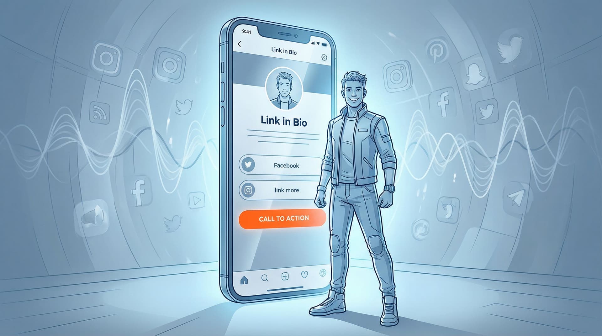
That’s what this article is about—building algorithm-proof offers and using your Liinks page as the permanent, always-on storefront where your warmest fans can buy from you, even when your content is having an identity crisis.
We’re going to turn that “link in bio” from a polite suggestion into a direct revenue channel.
Why Selling Through Your Bio Matters More Than Ever
If you’re relying on “post goes viral → people DM you → you send links manually” as your sales system… you don’t have a system. You have vibes.
When your offers are clearly laid out on a page you control—like your Liinks hub—three powerful things happen:
-
Your warmest fans always know where to buy.
Even if the algorithm shows them one post this month, your bio link is the constant. -
You stop rewriting the same sales pitch in the DMs.
Your page does the explaining. You do the delivering. -
You can test and tweak offers quickly.
No waiting on a developer, no rebuilding a full website. Just rearrange blocks, update copy, and keep it moving.
If you want a deeper dive on why a single, well-designed hub can replace a full site (at least for now), bookmark this for later: From Followers to Freelance Clients: Turn Your Liinks Page into a Booking Machine (Without a Full Website).
Step 1: Define an Offer That Survives Any Algorithm Mood Swing
You can’t “algorithm-proof” something that’s vague.
“Coaching,” “content,” and “templates” don’t sell. Specific outcomes do.
Before you touch your Liinks layout, get brutally clear on:
- Who it’s for (your warmest fans, not everyone)
- What they get (deliverables, access, or transformation)
- How they buy (button → checkout, form, or DM with a keyword)
Try this simple formula for a warm-offer headline:
I help [specific person] go from [current pain] to [desired outcome] in [timeframe or format].
Examples:
- “I help busy creators turn one month of posts into an evergreen content bank in 90 minutes.”
- “I help small business owners launch their first email list without needing a full website.”
Once you’ve got that line, you’re ready to build a home for it.
Step 2: Turn Your Liinks Page into a Tiny Sales Floor (Not a Junk Drawer)
Most bio pages look like this:
- My website
- My shop
- My YouTube
- My freebie
- My other freebie
- The thing I launched 2 years ago that I swear I’ll revive
That’s not a sales floor. That’s a clearance bin.
Instead, think of your Liinks page as a single-scroll storefront with three zones:
- Hero zone – “Here’s the main way to work with me / buy from me.”
- Support zone – “Here’s proof and context that I’m legit.”
- Exploration zone – “Here’s the rest, if you’re curious.”
1. Hero Zone: One Offer, Zero Confusion
This is the first thing people see—above the fold, no scrolling required.
Add a featured block on your Liinks page that includes:
- A bold title focused on the outcome, not the format.
- Bad: “1:1 Strategy Call”
- Better: “90-Min Strategy Call to Fix Your Content Funnel”
- 1–2 benefit bullets that answer “What do I walk away with?”
- One clear button that says exactly what happens next:
- “Book Your Spot”
- “Get Instant Access”
- “Apply for a Spot”
If you’re tempted to feature three offers at the top, go read The ‘One Offer’ Liinks Makeover: How Simplifying Your Page Can Actually Boost Sales and then come back.
2. Support Zone: Warm Up, Then Sell
Right under your hero offer, stack elements that build trust and reduce hesitation:
- A short “How it works” block (3–4 steps max)
- Screenshots or testimonials (you can link to a carousel, Google Drive folder, or dedicated proof page)
- A “Start here if you’re new” link to a free resource or intro video
You’re not trying to drown people in information. You’re answering the quiet questions:
- “Is this for someone like me?”
- “Has this worked for anyone before?”
- “What exactly happens after I pay?”
3. Exploration Zone: Let the Curious Click Around
Finally, below the trust-building stuff, add:
- Links to your content library, if you’ve turned it into a resource hub
- A newsletter signup for people not ready to buy
- Any secondary offers that matter, clearly labeled as such (e.g., “More ways to work together”)
This is where posts like From Chaos to Clicks: How to Turn Your Content Dump into a Curated Liinks Resource Hub come in handy. Your old content can quietly warm people up while your main offer sits at the top doing its job.
Step 3: Make Your Offer Button “Algorithm-Proof”
If your reach tanks, you still have:
- Your existing followers
- Your profile views
- Your bio link
Your job is to make sure every profile visit has a clear next step, even if they never see your latest post.
Nail the Button Text
On your Liinks page, avoid vague labels like “Learn More.” Your warmest fans don’t want homework; they want clarity.
Try:
- “Get the Content Bank System” instead of “Content Offer”
- “Book a Strategy Call” instead of “1:1 Coaching”
- “Grab the Template Pack” instead of “Shop”
If a stranger screenshotted your page and showed a friend, they should be able to guess what happens when they tap.
Use Visual Hierarchy to Point at the Money
This is where the design flexibility of Liinks quietly makes you more money:
- Make your primary offer button bigger or styled differently (e.g., filled button vs. outline).
- Use color contrast: your main CTA should stand out from secondary links.
- Group “money links” together and “nice-to-have links” together.
If you want more detail on subtle design tweaks that impact sales, read The Aesthetic Advantage: Why Good Design on Your Link in Bio Quietly Boosts Your Conversion Rate next.
Step 4: Connect the Dots from Content → Bio → Checkout
An algorithm-proof offer isn’t just about the page—it’s about the path.
Think of it like this:
- Content sparks interest.
- Bio gives direction.
- Liinks page closes the loop.
If any of those three are fuzzy, sales leak.
Map One Clear Path Per Offer
For each main offer, answer:
- What type of content points to this? (e.g., “behind-the-scenes of my process,” “client wins,” “before/after transformations”)
- What do I literally say in my CTA? (e.g., “Tap my link and hit the first button to book your spot.”)
- What’s the exact label of the button they’ll see when they land?
Then, make sure your Liinks page matches your content language. If your story says, “Tap my bio to grab the Content Bank System,” your top button should say “Get the Content Bank System”, not “Digital Product #1.”
Reduce Friction at Every Step
Ask yourself:
- How many taps from story → booked? (Try to keep it to 3 or fewer.)
- Is there any step that feels like “homework” (too much text, confusing options)?
- Is the same offer always in the same place on your Liinks page?
When reach is inconsistent, consistency in your pathway becomes your safety net.
Step 5: Add “Always-On” Warmth: Email, DMs, and Micro-Offers
Algorithms come and go. Email lists and relationships stick around.
Your Liinks page can quietly support both.
Add an Email Magnet That Feeds Your Offers
Under your main offer, add a simple email signup that’s directly related to what you sell.
Examples:
- Selling a content system? Offer a “7 Prompts to Fill Your Next Week of Posts” freebie.
- Selling coaching? Offer a “Mini Audit Checklist” people can use before they book.
Make the button text outcome-based:
- “Send Me the Content Prompts”
- “Get the Audit Checklist”
Now, even if someone isn’t ready to buy yet, they’re in your world—and you can follow up without begging the algorithm for attention.
Use Micro-Offers as Low-Pressure Entry Points
Not everyone will jump straight into your flagship offer. That’s fine.
You can:
- Add a low-ticket mini product (template, workshop replay, swipe file) as a secondary offer.
- Label it clearly as a “Start Here” option for people who are curious but cautious.
Your Liinks layout might look like:
- Main offer (hero)
- Start-here micro-offer
- Email freebie
- Content hub / resources
This ladder gives people multiple ways to warm up—without you posting more often.
Step 6: Treat Your Liinks Page Like a Tiny Test Lab
When reach dips, guessing gets expensive. Testing gets profitable.
The beauty of Liinks is that you can tweak and iterate without rebuilding anything.
Things to Experiment With (One at a Time):
- Button order: Swap your main offer and your freebie. Does revenue drop or rise?
- Button copy: “Book a Call” vs. “Plan Your Content Strategy” — which gets more taps?
- Hero layout: Add a short description under your main offer vs. just the button.
You don’t need fancy analytics to see patterns. Track for 1–2 weeks at a time:
- How many inquiries or sales came in?
- Which link got the most clicks?
- Did people say “I found you through your bio link” or “from your newsletter” more often?
For more ideas on using your Liinks page as a low-pressure testing ground, check out Mini Shops, Major Receipts: Turning Your Liinks Page into a Test Lab for New Offers.
Step 7: Make Your Offer Visible Everywhere (Not Just on One Platform)
If your bio link only lives on one social platform, you’re leaving money on the table.
Your Liinks URL can:
- Sit in your newsletter footer as “Work with me” or “Shop my resources”
- Live in your podcast show notes as the one place listeners go to see all your offers
- Show up on slides, PDFs, and print materials as a short, memorable URL
The more places your link exists, the less any single platform’s mood swings matter.
If you want ideas for using your Liinks URL beyond social profiles, you’ll like: Beyond “Link in Bio”: Smart Ways to Use Your Liinks URL in Newsletters, Podcasts, and Offline Marketing.
Quick Recap: Your Algorithm-Proof Offer Checklist
Before you go rearrange your entire online universe, here’s a condensed checklist you can run through in 10 minutes:
- I have one clear primary offer with a specific outcome.
- My Liinks page has a hero section where that offer is the star.
- My main button text tells people exactly what happens when they click.
- I’ve added supporting proof (testimonials, “how it works,” or a quick explainer).
- I have at least one warm-up option (micro-offer or email freebie) directly related to my main offer.
- My content CTAs match the wording on my Liinks buttons.
- I’m willing to test one small change at a time instead of nuking everything when reach dips.
If you can tick those boxes, you’re already way ahead of most creators still hoping the algorithm will “come back.”
Your Next Move (Yes, This Is Your Nudge)
Here’s your first, simple step to making your offers algorithm-proof:
- Open your Liinks page.
- Decide on one primary offer you want to sell for the next 30 days.
- Make that offer the first thing people see—clear title, benefit bullets, bold button.
- Update your next 3–5 posts or stories to point directly to that button by name.
No new platform. No 47-step funnel. Just a smarter, clearer path from “I like this creator” to “I’m ready to buy.”
The algorithm will keep changing. Your link in bio doesn’t have to.
If you’re ready to stop waiting for reach to magically fix itself, start by turning your Liinks page into the place where your warmest fans always know what to do next.


