
Beyond Aesthetics: Micro UX Tweaks on Your Liinks Page That Quietly Double Click-Through Rate

You’ve picked your colors. You’ve chosen your fonts. Your link in bio looks cute.
…and yet your click-through rate is giving “polite shrug” instead of “take my money.”
That’s because good design gets people to stay—but good UX gets them to click.
If visuals are the outfit, micro UX is the tailoring: tiny adjustments that make everything sit just right so people move effortlessly from “huh, nice page” to “oh, I’m clicking this.”
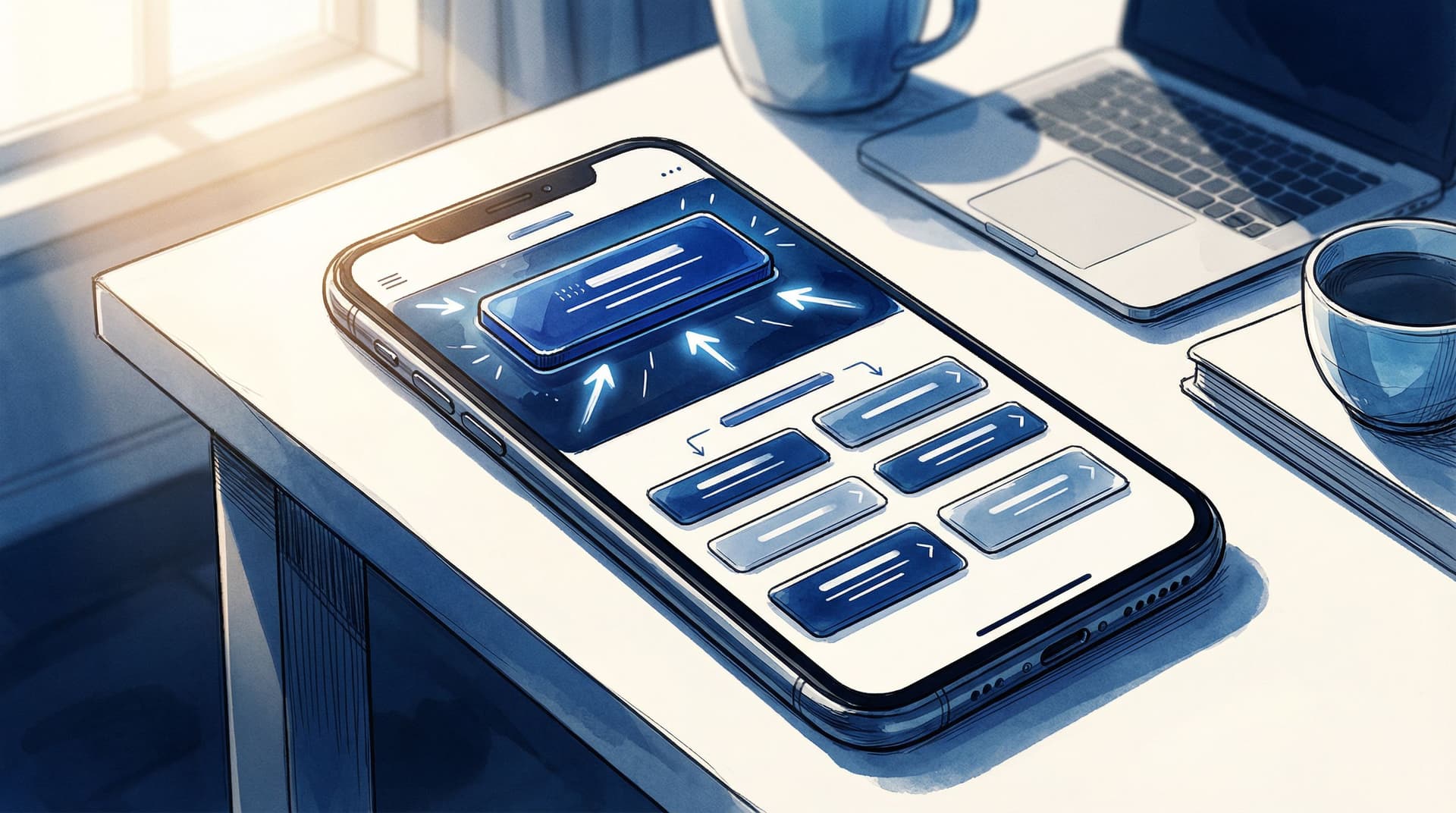
And when you’re using a flexible tool like Liinks (built for creators who actually care what their page looks like), those tweaks are weirdly easy to pull off.
This post is your guide to the small, almost invisible decisions on your Liinks page that can quietly double your click-through rate (CTR)—without you needing to redesign your entire brand.
Why Micro UX Matters More Than You Think
Let’s start with some context:
- The average website bounce rate hovers somewhere between 41–55% for most industries. People leave fast.
- On social, you’re often working with seconds of attention before someone backs out of your link in bio and goes back to scrolling.
- Tiny UX improvements—like clearer labels, better hierarchy, or fewer choices—have been shown in multiple UX case studies to increase conversions by 20–100% (yes, double) with no extra traffic.
Translation: you don’t necessarily need more followers. You need to make it easier for the people already tapping your bio link to do the right thing next.
If you’ve already tackled the visual side of things (or want help there, bookmark The Aesthetic Advantage: Why Good Design on Your Link in Bio Quietly Boosts Your Conversion Rate), micro UX is the next level.
Step 1: Ruthlessly Clarify “What’s the Point?”
Most link pages fail before anyone even looks at the buttons—because the purpose of the page is fuzzy.
Your visitor is silently asking: “Why am I here, and what should I do first?”
If your Liinks page doesn’t answer that in one glance, your CTR is leaking.
Make One Thing Obvious
You can have multiple links, but you need one primary outcome per page. Examples:
- “Join my newsletter”
- “Shop my presets”
- “Book a discovery call”
- “Listen to the latest episode”
Micro UX tweak: Add a single, clear line of copy at the top that sets the agenda.
Examples:
- “Start here: Grab my free Notion template (then binge the rest).”
- “New here? Watch this 5-minute intro, then pick your path below.”
- “Creators: want brand deals in 2026? Do this first.”
On Liinks, this can live in your bio text or as a short heading-style block right above your main button.
Put Your Primary Action in the Power Position
Eye-tracking studies show people focus most on the top of the screen and the first few items in a list.
So:
- Your #1 action should be the first button, not buried in the middle.
- Use a distinct style (filled button vs. outline, accent color, or slightly larger size) for that one key link.
If you want more help deciding what that primary link should be, check out The ‘One Offer’ Liinks Makeover: How Simplifying Your Page Can Actually Boost Sales.
Step 2: Turn Your Link Labels into Micro-Copy That Sells
Design gets the click opportunity. Copy gets the actual click.
Most creators waste their link labels on vague or internal language:
- “Blog”
- “Resources”
- “My Program”
Your visitor is thinking: “Okay, but… why should I care?”
Make Each Link Pass the “So What?” Test
For every link, ask: If someone only reads this label, do they know what’s in it for them?
Transform your labels like this:
- Instead of “Newsletter” → “Get 1 weekly email with creator money tips”
- Instead of “Coaching” → “Apply for 1:1 coaching (3 spots left)”
- Instead of “Podcast” → “Listen: How I hit $5k months with 800 followers”
- Instead of “Shop” → “Shop my Lightroom presets (before/after inside)”
On Liinks, you can:
- Use the title for the benefit (“Land brand deals in 2026”).
- Use the description/subtext for context (“Free 15-minute training—no email required”).
Add Gentle Urgency (Without Being Annoying)
Micro UX is also about helping people prioritize. A tiny time cue can nudge action:
- “Enrollment closes Feb 15”
- “New: launched this week”
- “Limited to 20 seats”
- “Most downloaded resource”
These small signals tell the brain: “Click this first.”
Step 3: Reduce Cognitive Load with Smart Grouping
Your problem may not be “too many links.” It might be “too many unorganized links.”
When everything looks equally important, people do the easiest thing: leave.
Create Sections That Match How People Think
Instead of a random stack of 12 buttons, group your links into 2–4 clear clusters.
Examples:
- “Start Here” – for new followers
- “Work With Me” – services, coaching, consulting
- “Free Resources” – lead magnets, guides, templates
- “For Brands” – media kit, past collaborations
On Liinks, you can:
- Use section headers or dividers with short, clear titles.
- Add spacing between groups so the page feels scannable.
This is especially crucial if you’re multi-passionate. For a deeper dive on structuring chaos, peek at The Multi-Passionate Creator’s Map: Structuring One Liinks Page When You Do… Everything.
Limit Choices at the Top
Hick’s Law (a UX classic) basically says: more choices = slower decisions.
So:
- Keep 3–5 links max above the fold (what’s visible without scrolling).
- Push the “nice to have” links—old freebies, one-off collabs, random experiments—below your main actions.
Micro tweak: if you feel weird hiding things, rename a section to something like “More Good Stuff” or “Deep Dive Zone” and park the extras there.
Step 4: Use Visual Hierarchy Like a Highlighter, Not a Paint Bucket
You don’t need fireworks. You need a clear visual path.
Visual hierarchy is how you tell someone’s eyes where to go first, second, third.
Make One Thing the Star, Not Twelve
On your Liinks page:
- Use one primary button style (e.g., filled, bold color) for your main CTA.
- Use a secondary style (outline, neutral color) for supporting links.
- Keep font sizes consistent—only bump size for section titles or your #1 link.
If everything is big, bold, and bright, nothing stands out.
Align for Speed
Alignment is a tiny UX detail that makes a big difference in how “professional” and easy-to-skim your page feels.
- Left-align text for easier scanning (especially descriptions).
- Keep icons, thumbnails, and buttons aligned in a clean column.
- Avoid random center-aligned paragraphs stacked on left-aligned buttons.
These are the kind of details we unpack more in Beyond Blue Links: Unexpected Design Tweaks that Make Your Liinks Page Feel Premium (Not Template-y). Pair that with the UX tweaks here and your page stops feeling like a template and starts feeling intentional.
Step 5: Make Your Page Feel Fast (Even If Your Wi-Fi Isn’t)
Perception of speed is a huge UX lever.
If your page feels slow or heavy, people won’t wait around to click—even if the actual load time isn’t terrible.
Keep It Lightweight
A few easy wins:
- Avoid stacking too many large images or GIFs at the top.
- Use thumbnails strategically—only where they truly add clarity (e.g., YouTube video preview, product image).
- Keep your color choices clean and avoid heavy background patterns that can make things feel visually “slow.”
Liinks is already optimized to be quick to load, but your content choices still matter.
Front-Load the Value
Even if the page takes a beat to fully load, people should see something useful immediately:
- Put your top CTA and a short line of copy as high as possible.
- Skip long intros. Nobody needs a paragraph about your life story before they find your shop link.
Think of it like this: your hero section isn’t a billboard; it’s a launchpad.
Step 6: Add Tiny Trust Signals Right Where People Decide
Trust is UX.
A few small cues near your key links can dramatically increase the odds someone actually clicks.
Show Social Proof in Micro Doses
Instead of a giant “Testimonials” link nobody taps, sprinkle trust right next to your CTAs.
Examples:
- Under a newsletter link: “Join 3,200+ creators who get this every Sunday.”
- Under a course link: “Over 500 students enrolled; updated for 2026.”
- Under a free guide: “Most downloaded resource on my page.”
These are quick, scannable signals that say: “Other people like you did this and didn’t regret it.”
Reduce Risk with Tiny Reassurances
Right under the button is prime real estate for calming nervous brains.
- “No spam, unsubscribe anytime.”
- “Takes 2 minutes to complete.”
- “Replay available if you can’t make it live.”
On Liinks, this lives perfectly in the description field under each link. It’s small, but mighty.
Step 7: Use Micro Experiments Instead of Big Overhauls
Micro UX tweaks are easiest to dial in when you test one small change at a time.
You don’t need a full-blown analytics department. You just need a simple habit.
Pick One Metric That Matters
Decide what “success” means for your Liinks page right now:
- Email signups
- Shop clicks
- Discovery call bookings
- Podcast plays
Then:
- Make one micro change (e.g., rewrite the label for your main CTA).
- Let it run for 3–7 days.
- Compare clicks before vs. after.
Repeat.
Micro Tweaks Worth Testing
Here are easy experiments that often move the needle:
- Change the order of your top 3 links.
- Rewrite the main CTA to be more specific and benefit-driven.
- Add a tiny urgency cue (“closes Friday,” “new this week”).
- Group scattered links into a “Start Here” section.
- Trim your page down by 2–3 low-performing links.
Over a month, five tiny experiments can add up to a page that behaves completely differently—without ever feeling like a huge project.
If you want to pair this with content tweaks, read The 5-Minute Content Refresh: Tiny Liinks Tweaks That Make Your Old Posts Feel Brand New and use your page as the control center for what you’re resurfacing.
Step 8: Don’t Forget Your UX
One last thing: UX isn’t just for your audience. It’s also for you.
If updating your link in bio feels like a chore, you won’t keep it optimized—and a neglected page is a low-converting page.
A few ways to make your own life easier on Liinks:
- Create a “parking lot” section for links you’re testing so you can drag them in and out without rebuilding.
- Duplicate structures that work (e.g., a “launch layout” you reuse every time you open a new cohort).
- Schedule 10-minute check-ins once a month to prune, reorder, and refresh labels.
Good UX for you = more consistent micro UX improvements for your audience.
Quick Recap: The Micro UX Checklist
Here’s your rapid-fire list to quietly boost CTR on your Liinks page:
- One clear purpose for the page (not five competing ones)
- Primary CTA at the top, visually distinct
- Benefit-driven labels that answer “What’s in it for me?”
- Sections and grouping that match how people think
- Limited options above the fold (3–5 max)
- Clean visual hierarchy: one star, supporting cast, consistent alignment
- Lightweight content near the top so the page feels fast
- Micro trust signals (social proof + reassurance) near key links
- Ongoing micro experiments instead of giant redesigns
- A simple maintenance habit so your page never goes stale
You don’t need a total overhaul. You need a handful of 1% tweaks.
Ready to Quietly Double Your CTR?
If your link in bio already looks good, you’re halfway there. The rest is about how it behaves when someone taps.
Here’s your next move:
- Open your Liinks page on your phone.
- Pretend you’re a brand-new follower who just discovered you from a reel.
- Ask yourself: “What should I click first—and is that actually obvious?”
- Make one micro UX tweak from this post in the next 10 minutes.
Then, over the next week, keep nudging: a clearer label here, a better section title there, one less distraction above the fold.
Your page doesn’t have to scream to perform. With the right micro UX tweaks, it can quietly double your click-through rate—while still looking like the polished, on-brand home base you built it to be.
If you haven’t set up your page yet (or your current one feels like a group project), you can start fresh with Liinks and build a page that looks good and converts—right from day one.


