From Freebie Hunters to Paying Clients: Mapping a Simple Conversion Funnel from Your Liinks Page

Some hard truth to start us off: not everyone who grabs your freebie is a “future client.”
A lot of them are just very organized hoarders of PDFs.
But hidden inside that crowd of freebie hunters are the people who will buy from you—if you give them a clear, simple path from “I’ll take the free thing” to “Here’s my card.”
That path is your funnel.
And your funnel can absolutely live on your Liinks page.
This post walks you through how to turn that cute, on-brand link hub into a straightforward conversion funnel—so that every tap on your bio link has a better chance of turning into a booking, a sale, or a long-term client.
Why Your Funnel Should Start on Your Liinks Page
You’re already sending people there.
From Instagram, TikTok, YouTube, your email signature, podcast show notes—everything points to that one tiny URL. If that URL just leads to a random list of buttons, you’re wasting the warmest traffic you’ll ever get.
When your funnel starts on your Liinks page, you:
- Control the journey. Instead of tossing people to a generic homepage, you decide exactly what they see first, second, and third.
- Reduce friction. Fewer clicks, fewer decisions, fewer “I’ll do this later” moments.
- Make your offers feel intentional. A curated layout feels like, “I planned this for you,” not “Here’s everything I’ve ever made, good luck.”
If you want more ideas on how your Liinks setup can replace or support a full website, bookmark this for later: Your Homepage Is Overrated: When a Liinks Page Should (and Shouldn’t) Replace a Full Website.
Step 1: Decide What “Conversion” Actually Means
You can’t build a funnel if you don’t know where it’s supposed to end.
For your current season, pick one primary conversion goal:
- Book a 1:1 call
- Sell a low-ticket product (template, preset, mini-course)
- Sell a main offer (program, service, retainer)
- Get people onto your email list (so you can nurture and sell later)
Yes, you probably want all of those. No, your link in bio should not try to do all of them equally.
Choose one “win” that matters most right now. That’s the end of your funnel. Everything else is either:
- A step toward that win (freebie → nurture → offer), or
- A supporting link that can live lower on the page.
If you’re a service provider (coach, stylist, photographer, designer, etc.), your main conversion is probably “book a call” or “submit an inquiry form.” You’ll find more specific examples in “Link in Bio” for Service Businesses: How Coaches, Stylists, and Photographers Can Turn Clicks into Booked Calendars.
Step 2: Map the Simple Funnel (No Fancy Software Required)
Let’s keep this as low-tech as possible. Your funnel can be as simple as:
Content → Liinks page → Freebie → Nurture → Paid offer
Here’s what that looks like broken down:
- Content: Reels, TikToks, posts, stories, YouTube videos, podcast episodes.
- Liinks page: The hub where people choose what to do next.
- Freebie: A lead magnet that solves a specific, bite-sized problem for your ideal client.
- Nurture: A short email sequence, or even a few well-timed broadcasts, that deepen trust.
- Paid offer: The thing that actually makes you money.
Your job is to make each step:
- Obvious
- Easy
- Consistent with the last step
We’re not building a 47-step marketing machine. We’re building a neat little path that feels like, “Oh, of course this is the next thing I should do.”
Step 3: Design Your Liinks Page Like a Funnel, Not a Junk Drawer
Most creators treat their link page like a catch‑all. You’re going to treat yours like a guided tour.
Think in sections, not random buttons.
Your Funnel-Friendly Layout
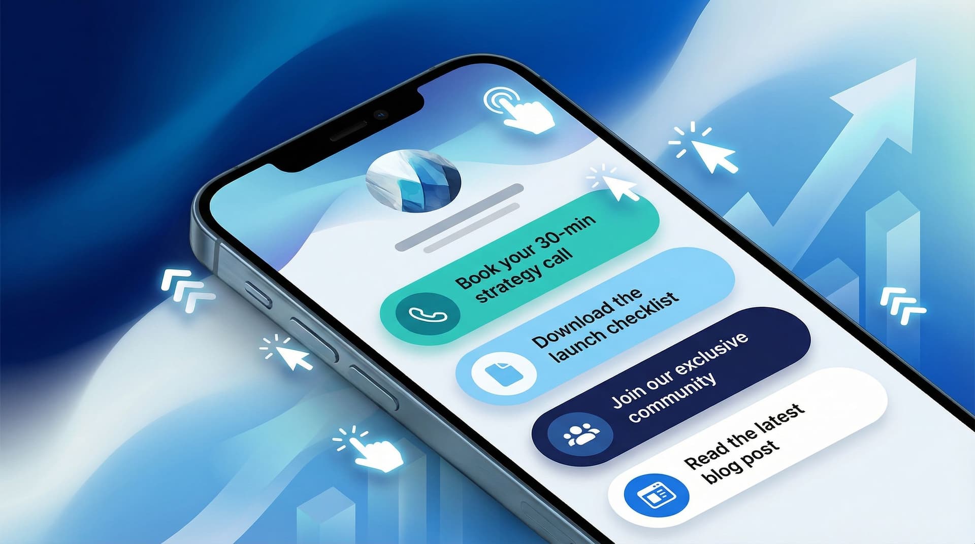
Here’s a simple structure you can build on Liinks:
-
Top Section: One Primary Action
This is for people who are already warm. They’ve seen your content, they’re ready to move.- Button example: “Ready to work together? Start here →”
- Destination: your application form, booking link (e.g., Calendly), or main sales page.
-
Middle Section: Freebie On-Ramp
This is where your freebie hunters live. Instead of judging them, we’re going to convert them.- Button example: “Get the Free Client-Attracting Content Planner”
- Destination: an email opt‑in page (from tools like ConvertKit, Flodesk, or MailerLite).
-
Lower Section: Credibility + Context
These links build trust and help people binge you.- Portfolio / case study hub
- Most popular content
- Social proof (testimonials, features)
You’ll find more layout ideas in The ‘One Offer’ Liinks Makeover: How Simplifying Your Page Can Actually Boost Sales.
Step 4: Turn Freebie Hunters into Real Leads
Not all freebies are created equal. If your freebie doesn’t naturally lead to your paid offer, you’re just building a very enthusiastic library card system.
Choose a Freebie That Points to Your Offer
Ask yourself: What tiny win would make someone more likely to hire me or buy from me?
Examples:
-
Social media manager
- Freebie: “7 Plug-and-Play Reels Hooks for Coaches”
- Paid offer: monthly content management for coaches.
-
Brand designer
- Freebie: “Brand Moodboard Starter Kit for New Businesses”
- Paid offer: full brand identity package.
-
Fitness coach
- Freebie: “5-Day Strength Starter Plan for Desk Workers”
- Paid offer: 12-week 1:1 coaching.
Your freebie should:
- Attract the same person your paid offer is for
- Solve a small, specific problem
- Naturally make them think, “I’d love more help with this”
Make the Freebie the Star (But Not the Boss)
On your Liinks page, your freebie should be:
-
Prominent, but below your main offer
People ready to buy shouldn’t have to scroll past 18 free things. -
Framed as a step toward the result they want
- Instead of: “Free download”
- Use: “Start getting consistent clients with this free content planner”
If you want help writing better button copy, check out From ‘Check Out My Stuff’ to ‘Book Me Now’: Rewriting Boring Link-in-Bio Copy into Clickable Micro-CTAs.
Step 5: Add a Simple Nurture Layer (Without Becoming an Email Machine)
Once someone opts in for your freebie, they are officially more than a random follower.
You do not need a 30‑email saga. Start with a 3–5 email sequence that:
-
Delivers the freebie + sets expectations
- “Here’s your [freebie name]. Over the next few days, I’ll send a few quick tips to help you actually use it.”
-
Shows them how to get a quick win
- Walk them through one part of the freebie.
- Share a small case study or example.
-
Connects the freebie to your paid offer
- “If you want help doing this faster / with support / with a custom plan, here’s how we can work together.”
-
(Optional) Handles an objection
- “Don’t think you’re ‘ready’ yet? Here’s what my beginner clients have achieved.”
-
(Optional) Clear invitation
- “Reply to this email with ‘PLAN’ and I’ll send you my honest recommendation,” or
- “Tap here to book your starter session.”
The point is not to become an email marketer. The point is to make sure your freebie hunters don’t just grab and ghost.
Step 6: Make Your Liinks Page Copy Do the Heavy Lifting
Design gets attention. Words get clicks.
Your funnel lives or dies on the micro-copy on your Liinks page. That means:
1. Label Links by Outcome, Not Format
Nobody wakes up wanting “a PDF” or “a webinar replay.” They want a result.
-
Instead of: “Free Guide”
Use: “Free Guide: Book Your First 5 Clients in 30 Days” -
Instead of: “Newsletter”
Use: “Weekly Client-Getting Tips (No Algorithms Required)” -
Instead of: “Work With Me”
Use: “Done-For-You Content That Books Clients While You Sleep”
2. Use Micro-CTAs on Your Buttons
Add a tiny phrase that hints at what happens next:
- “Get the free planner →”
- “Book your intro call →”
- “See client results →”
- “Start the 5-day challenge →”
That arrow? It’s doing more work than you think.
3. Match the Promise Across Every Step
If your button says “Book more clients with this free checklist,” your opt‑in page and emails should also talk about booking more clients. Keep the promise consistent from Liinks → landing page → inbox → offer.
Step 7: Add a “Direct to Paid” Path for the Ready-to-Buy Crowd
Not everyone needs a freebie.
Some people land on your Liinks page already convinced. Maybe they’ve been following you for months. Maybe a friend sent them. Maybe they’re just decisive (unicorns do exist).
Give those people a no‑nonsense, straight‑to‑paid path:
- Put your main offer link at the very top of your Liinks page.
- Make the button big, clear, and slightly more visually prominent.
- Use copy that assumes they’re ready:
- “Apply for 1:1 Coaching”
- “Book Your Brand Intensive”
- “Grab the Client Onboarding Kit”
Your funnel now has two entry points:
- Warm but not ready → Freebie → Nurture → Offer
- Hot and ready → Direct to Offer
Both routes start from the same Liinks hub. That’s the beauty of building your funnel there: you can serve different levels of readiness without building three different websites.
Step 8: Track, Tweak, and Stop Guessing
You don’t have to become a data analyst, but a little tracking goes a long way.
Here’s what to keep an eye on:
-
Click priority
- Which Liinks buttons are actually getting tapped?
- If your freebie is buried and barely clicked, move it up. If a low‑value link is stealing clicks from your main offer, demote it.
-
Opt‑in rate
- Of the people who land on your freebie page, how many actually sign up?
- If it’s low, your promise might be vague—or your landing page is confusing.
-
Conversion from list to paid
- From everyone who downloaded the freebie in the last 30–60 days, how many bought or booked?
- If the answer is “approximately zero,” your nurture sequence needs love—or your offer doesn’t feel like the natural next step.
Tiny changes on your Liinks page—like button order, wording, or grouping—can quietly double your click‑through rate. For more nerdy-but-fun tweaks, see Beyond Aesthetics: Micro UX Tweaks on Your Liinks Page That Quietly Double Click-Through Rate.
Putting It All Together: A Sample Funnel Layout
Let’s say you’re a social media strategist for coaches.
Here’s how your Liinks funnel might look:
Top of Page
- Button 1: “Done-For-You Content for Coaches (Apply Here)” → application form
- Button 2: “Strategy Intensive: One 90-Minute Call to Fix Your Content Plan” → booking link
Middle of Page
- Button 3: “Free: 30 Days of Reels Prompts That Attract Coaching Clients” → email opt‑in
- Button 4: “Watch: How I Turn 1 Reel into 5 Client Inquiries” → YouTube video or webinar replay
Lower on Page
- Button 5: “Client Results & Case Studies” → portfolio or testimonial hub
- Button 6: “About Me (Why I Only Work with Coaches)” → intro page or mini bio
From there:
- The freebie opt‑in triggers a 4‑email sequence that ends with an invite to the Strategy Intensive.
- The Strategy Intensive call is where you pitch the full done‑for‑you service.
- Your top buttons catch the people who are ready to skip straight to working with you.
That’s it. No labyrinth. Just a clean, simple funnel that lives on one good‑looking page.
Quick Recap
You just built a funnel. Let’s zoom out:
- Your Liinks page is the hub, not a random list of stuff.
- Pick one main conversion goal for this season (book, buy, or join your list).
- Design your layout like a guided tour: top = main offer, middle = freebie, bottom = credibility.
- Choose a strategic freebie that naturally points to your paid offer.
- Add a short nurture sequence so freebie hunters don’t disappear.
- Upgrade your micro-copy so buttons sell outcomes, not formats.
- Give ready buyers a direct path straight to your paid offer.
- Track and tweak instead of guessing what’s working.
None of this requires a full website rebuild, a funnel tech stack, or a marketing degree. It just requires treating your Liinks page like the tiny conversion engine it can be.
Your Next Move
Don’t try to overhaul everything at once.
Here’s a simple first step you can take in the next 30 minutes:
- Log into Liinks.
- Move your main paid offer link to the very top.
- Rewrite that button to be outcome-focused (what they get, not what it is).
- Add one clearly labeled freebie link right under it.
Once that’s live, you’ve officially started your funnel.
From there, you can layer on a better freebie, a simple email sequence, and those tiny UX tweaks that make people actually click.
Your freebie hunters are already coming through the door. Time to give them a clear path to becoming your next paying clients.


