“Link in Bio” for Service Businesses: How Coaches, Stylists, and Photographers Can Turn Clicks into Booked Calendars

You worked hard for that tiny tap.
Someone saw your content, liked your vibe, and actually clicked your link.
If they land on a random list of buttons and bounce? That’s not “oh well.” That’s a missed consult, an empty chair, or an unbooked shoot.
For service businesses—coaches, stylists, photographers, designers, therapists, you name it—your link in bio is not a nice-to-have. It’s the bridge between “I like your content” and “I’m on your calendar.”
This post is your blueprint for turning that little link into a booking engine—using flexible tools like Liinks to make it look good and work hard.
Why Your Link in Bio Is Secretly Your Most Important Booking Tool
If you’re a service provider, your income depends on one thing: people actually booking you.
Where do almost all of those potential bookings pass through? That one URL in your bio.
Here’s what’s usually happening instead:
- People tap your link.
- They land on a cluttered menu of random stuff.
- They can’t tell what you do, what’s available, or how to book.
- They close the tab and go back to scrolling.
Meanwhile, the service pros who are quietly booked out? They treat their link in bio like:
- A mini homepage that explains who they are and what they offer.
- A booking funnel that routes visitors to one clear next step.
- A trust builder that makes people think, “This looks professional. I feel safe booking.”
If you’ve ever wondered whether your link page could replace a full site (or at least carry more weight), you’ll love Your Homepage Is Overrated: When a Liinks Page Should (and Shouldn’t) Replace a Full Website.
The punchline: for a lot of coaches, stylists, and photographers, that’s not hypothetical. It’s the whole strategy.
Step 1: Decide the One Action Your Page Is Built Around
Most service providers make the same mistake: they build a menu, not a path.
You don’t need 14 equal-priority buttons. You need one obvious “this is what you’re here to do” action.
For most service businesses, that primary action is:
- Book a call (for coaches, consultants, strategists)
- Book an appointment (for stylists, beauty pros, wellness providers)
- Inquire or request a quote (for photographers, videographers, designers)
Everything else—your freebies, your podcast, your latest reel—is supporting cast.
Ask yourself:
If someone could only do one thing on my link in bio, what would make me money or move them meaningfully closer to becoming a client?
That answer is your primary call to action.
On a well-structured Liinks page, that primary action should be:
- At the very top of the page
- Visually different (button color, size, or style)
- Labeled with clear, outcome-focused copy (more on that in a second)
If your page currently looks like a buffet, you might also want to skim The ‘One Offer’ Liinks Makeover: How Simplifying Your Page Can Actually Boost Sales for a deep dive on ruthless prioritization.
Step 2: Make Your Top Button Impossible to Misunderstand
“Book now” is fine.
But “Book now” doesn’t answer the question your visitor is actually asking: What exactly am I booking, and is it for me?
This is where your micro‑copy does the heavy lifting.
Instead of vague labels like:
- “Work with me”
- “Services”
- “Book now”
Try specific, benefit-focused micro‑CTAs like:
- Coaches
- “Book a free 20‑min clarity call”
- “Apply for 1:1 mindset coaching (limited spots)”
- “Join the next group coaching cohort”
- Stylists & beauty pros
- “See pricing & book a color appointment”
- “New clients: request a consultation”
- “Book a bridal hair trial”
- Photographers
- “Check availability & inquire for wedding photography”
- “Book a 30‑min brand shoot”
- “Mini sessions: see dates & secure your spot”
Each button should answer three things in one glance:
- What is this? (clarity call, color appointment, mini session)
- Who is it for? (new clients, brides, business owners)
- What happens next? (book, inquire, apply)
If you want to go deeper on this, bookmark From ‘Check Out My Stuff’ to ‘Book Me Now’: Rewriting Boring Link-in-Bio Copy into Clickable Micro-CTAs. It’s basically a copy bootcamp for your buttons.
Step 3: Build a Simple, Friction-Free Booking Flow
Clicks don’t pay the bills. Completed bookings do.
Your job: make the path from “tap” to “confirmed” as short and painless as possible.
1. Choose your booking tool
Pair your Liinks page with a scheduling or inquiry tool that fits your business:
- Calendly – Great for coaches and consultants who want automated calendar booking.
- Acuity Scheduling – Nice for service providers who need intake forms and multiple appointment types.
- Fresha, Vagaro, or GlossGenius – Popular with stylists and beauty pros for managing appointments and payments.
- HoneyBook or Dubsado – Solid for photographers and creatives who need proposals, contracts, and invoices in one place.
- Google Forms or Typeform – Simple inquiry forms if you’re not ready for a full booking platform.
Whatever you choose, the rule is: no dead ends and no detective work.
2. Remove unnecessary steps
Every extra click is an opportunity for someone to bail.
Try to avoid:
- “DM me to book” as your primary CTA
- Sending people to a homepage where they have to hunt for your booking link
- Making people scroll through your full website just to find your availability
Instead:
- Link directly to your booking page or inquiry form
- Use one clear booking option for your main offer (e.g., “New client consultation”) instead of 12 confusing variations
- Make sure your booking page is mobile‑friendly (because that’s where almost all bio clicks come from)
3. Set expectations clearly on the booking page
Your booking or inquiry page should answer:
- What happens in this session?
- How long does it last?
- Who is it best for?
- What happens after they book or submit?
Example for a coach:
“This free 20‑minute clarity call is for business owners who are stuck at their current income level and want help creating a simple growth plan. We’ll review where you’re at, identify 1–2 bottlenecks, and see if my 1:1 program is a fit. No pressure, no pitch deck.”
Example for a photographer:
“Fill out this inquiry form to check availability and get a custom quote for your wedding. I’ll respond within 48 hours with pricing, next steps, and a link to book a consultation call.”
The clearer you are, the more confident people feel hitting “submit.”
Step 4: Design Your Page Like a Professional, Not a Hobbyist
You can be the best coach, stylist, or photographer in town—but if your link page looks like it was thrown together in five minutes, people will quietly question your professionalism.
Design is doing more selling than you think.
Make it visually consistent with your brand
On Liinks, you can customize:
- Colors that match your brand palette
- Fonts that feel like your vibe (clean, luxe, playful, etc.)
- Button styles that look intentional, not default
Aim for:
- One background color (or a subtle gradient)
- One primary accent color (for your main CTA)
- One secondary color (for supporting links)
- Two fonts max (headline + body)
If your page currently screams “group project from 2013,” you’ll get a lot out of The “Link in Bio” Glow-Up: Tiny Visual Tweaks That Make People Actually Want to Click.
Use hierarchy to guide the eye
Think of your page like a tiny sales page:
- Hero section
- A short, clear line about what you do and for whom
- Example: “Brand photographer for bold, colorful online businesses.”
- Primary CTA button
- The main booking or inquiry action
- Social proof & essentials
- A link to testimonials, portfolio, or “About” if relevant
- Secondary links
- Freebies, content, newsletter, resources
People should not have to scroll to understand what you do and how to book you.
Step 5: Customize Your Setup by Service Type
Let’s get specific. Here’s how this all plays out for different kinds of service businesses.
For Coaches & Consultants
Your biggest asset is clarity. People need to quickly understand:
- What you help with
- Who you help
- How to start working with you
Suggested layout:
- Short intro line: “Business coach helping creatives hit consistent $5k months.”
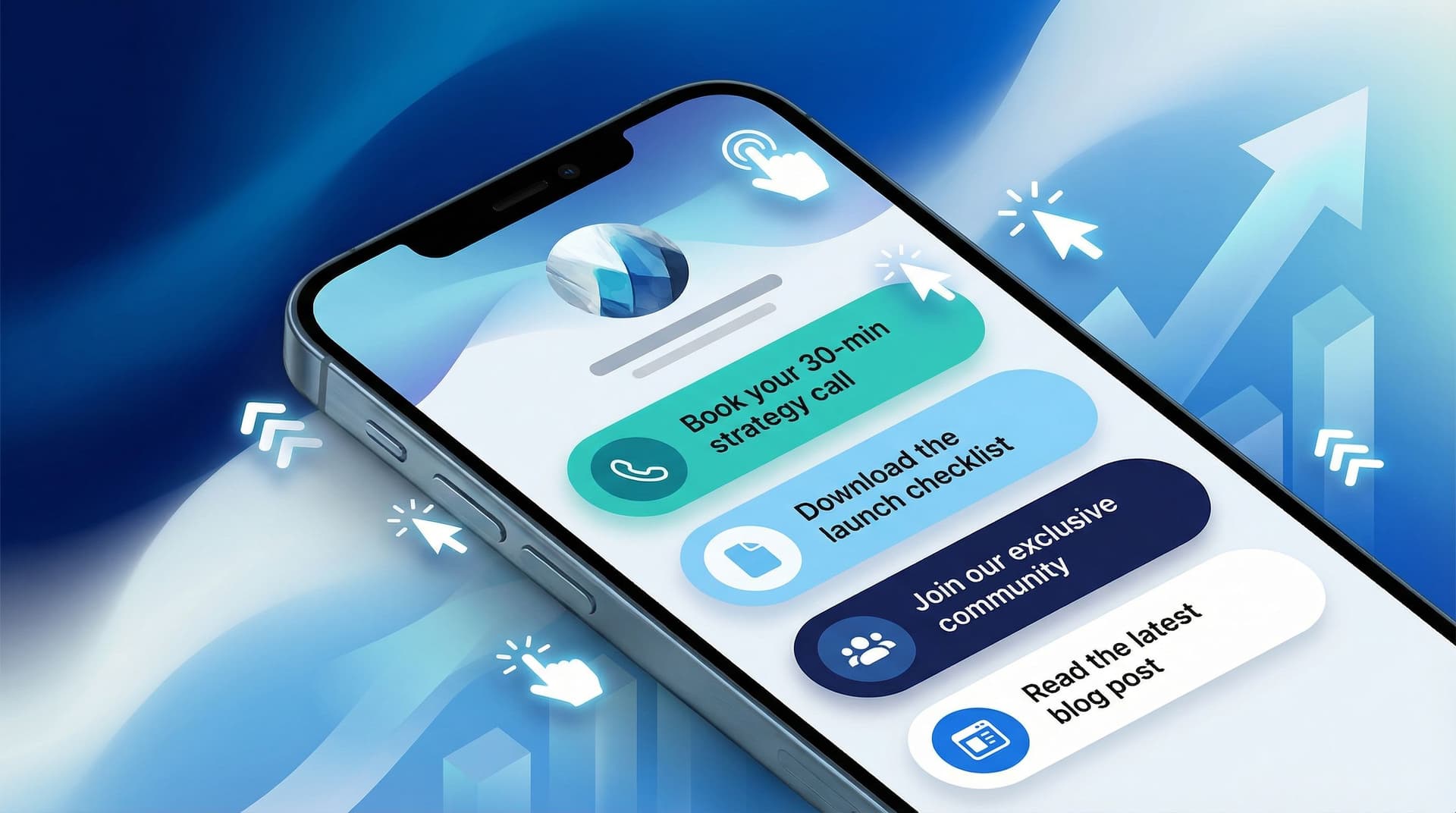
- Primary button: “Book a free 20‑min strategy call” (link to Calendly/Acuity)
- Secondary buttons:
- “See 1:1 coaching details” (link to a simple sales page or PDF)
- “Apply for group program”
- “Join my email list for weekly business tips”
- Tertiary links (lower on the page):
- “Listen to the podcast”
- “Watch my YouTube channel”
Pro tip: Use your scheduler’s intake form to pre‑qualify leads (ask about their current situation, goals, and budget), so your calendar fills with people who are actually ready.
For Stylists, Beauty Pros, and Wellness Providers
Your clients care about convenience and trust. They want to know:
- What services you offer
- Your pricing (or at least a range)
- How to get on your calendar without calling the front desk
Suggested layout:
- Short intro line: “Balayage + lived‑in color specialist in Austin.”
- Primary button: “See services & book an appointment” (link to Fresha/Vagaro/GlossGenius)
- Secondary buttons:
- “New clients: start here” (with a consultation form or special booking link)
- “View portfolio on Instagram” (link to a highlight or dedicated feed)
- “Read policies & FAQs”
- Optional:
- “Gift cards”
- “Join the waitlist”
Pro tip: Create a specific booking option for new clients so they don’t accidentally book the wrong service or not leave enough time.
For Photographers & Videographers
Your work sells you, but your process keeps people from ghosting.
Clients want to know:
- What kind of shoots you offer
- Whether you’re available on their date
- Rough pricing and next steps
Suggested layout:
- Short intro line: “Wedding & elopement photographer for couples who hate stiff photos.”
- Primary button: “Check availability & inquire for weddings” (link to HoneyBook/Dubsado/Typeform)
- Secondary buttons:
- “Mini sessions: see dates & book”
- “Brand shoots: see packages & pricing”
- “View portfolio”
- Optional:
- “Client gallery login”
- “FAQ: what to expect”
Pro tip: On your inquiry form, ask how they found you—and add “Instagram,” “TikTok,” etc. That data tells you exactly how hard your link in bio is working.
Step 6: Add Trust Builders Without Overloading the Page
People don’t book services from strangers. They book from people they feel they can trust.
Your link in bio can quietly build that trust with:
- Testimonials – Link to a short “Client Results” page or highlight.
- Portfolio – A curated gallery, not every photo you’ve ever taken.
- About you – A quick “Who I am and why I do this” page or section.
- Policies & expectations – Clear, kind boundaries around cancellations, rescheduling, and payment.
On Liinks, you can:
- Use sections or dividers to group “Work with me” vs. “Learn more about me.”
- Add small descriptions under links for extra context (e.g., “Client results & transformations”).
Remember: your main booking button should still be the star. Everything else is supporting evidence.
Step 7: Track, Tweak, and Test Like a Real Business
You don’t have to guess whether your link in bio is working. You can measure it.
Start with simple metrics
At minimum, check monthly:
- Total views on your link in bio page
- Clicks on your primary booking/inquiry button
- Bookings or inquiries that came from social (ask “How did you hear about me?”)
If 500 people tap your link, 200 people tap your booking button, and 10 people actually book, you’ve got:
- A solid page and button (good click‑through rate)
- A potential issue with your booking form, pricing, or offer clarity
If barely anyone taps the booking button at all, your page layout or button copy needs love.
Run tiny experiments
Try testing:
- A new headline (e.g., “Book a call” → “Get a custom plan for your next launch”)
- Different button copy (e.g., “Inquire” → “Check my availability”)
- Moving your primary CTA higher, or making it visually louder
Make one change at a time and give it at least 1–2 weeks of traffic before judging.
For more nerdy-but-fun tweaks, check out Beyond Aesthetics: Micro UX Tweaks on Your Liinks Page That Quietly Double Click-Through Rate.
Quick Recap: Turning Clicks into Booked Calendars
Let’s boil this down:
- Pick one primary action. Usually: book, inquire, or apply.
- Write specific, benefit‑driven button copy. No more “check out my services.”
- Link directly to your booking or inquiry tool. No scavenger hunts.
- Design your page like a mini homepage. Clear intro, strong CTA, then supporting links.
- Customize by service type. Coaches, stylists, and photographers have different needs—set your page up accordingly.
- Add trust builders. Testimonials, portfolio, FAQs, and policies.
- Measure and tweak. Use views, clicks, and bookings to guide your experiments.
Do those things, and your link in bio stops being a polite suggestion and starts behaving like a real booking system.
Ready to Turn Your Link in Bio into a Booking Engine?
You don’t need a full rebrand, a new website, or three months of “working on your backend” to start booking more clients.
You need:
- One clean, on‑brand, easy‑to‑update hub
- Clear, specific calls to action
- A simple path from tap → booking
That’s exactly what a flexible tool like Liinks is built for.
If your current setup is a random list of links and a prayer, here’s your next move:
- Log into your link in bio tool (or set up your first Liinks page).
- Choose your one primary booking action and move it to the top.
- Rewrite that button using clear, outcome‑focused copy.
- Link it directly to a friction‑free booking or inquiry flow.
- Remove or demote anything that doesn’t support that main action.
Give yourself one focused hour to do this.
By the time you’re done, every new click on your link in bio won’t just be “traffic.” It’ll be one step closer to a booked calendar.
And that’s the whole point, isn’t it?
