
UGC, But Make It Clickable: Turning Fan Content into a High-Converting Liinks Showcase

User-generated content (UGC) is the marketing equivalent of someone else bragging about you so you don’t have to.
People trust other people way more than they trust brands. Recent reports show that over 80% of consumers say they trust brands more when they use UGC, and pages that weave in real customer content can see conversion lifts of 20–50% or more.
Cool stat. But here’s the problem:
Most creators let their best UGC vanish into the feed.
It lives in Story highlights, random reposts, or a dusty “Tagged” tab. Meanwhile, the one place people are actively trying to go deeper with you—your bio link—is a UGC-free zone.
Let’s fix that.
This guide is all about turning your fan content into a clickable, conversion-ready showcase using Liinks. Not just a cute collage of screenshots, but a page that quietly says:
“People like this. People buy this. You’re probably next.”
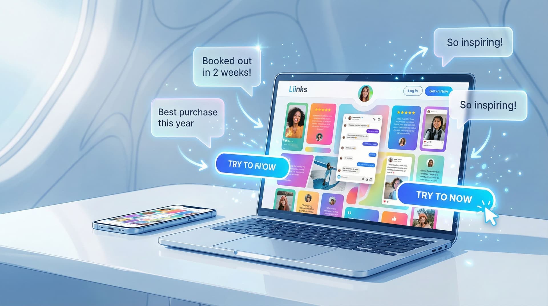
Why UGC Belongs on Your Liinks Page (Not Just Your Stories)
If your social feed is the trailer, your link in bio is the theater.
When someone taps your bio link, they’re not casually scrolling anymore. They’re:
- Actively curious
- Low-key evaluating you
- Closer to buying, booking, or subscribing than anyone else
UGC on your Liinks page does three big jobs at once:
-
Builds instant trust
People see real faces, real results, real reactions. That “Is this legit?” voice chills out. -
Shortens the decision process
Instead of hunting through your feed for proof, they see it right where the next step button lives. -
Boosts clicks that matter
UGC doesn’t just make things pretty; it makes your booking, shop, or subscribe CTAs feel safer to click.
If you’ve read our post on Screenshots Sell: How to Turn Social Proof into Strategic Liinks Sections That Quietly Close Clients, this is the UGC-powered sequel.
Step 1: Decide What You Want UGC to Do (Not Just How It Looks)
Before you start dragging screenshots into a folder like a proud parent, answer one question:
“What decision am I trying to help people make on my Liinks page?”
Some options:
- Buy a product (course, template, physical item)
- Book a service (coaching, design, photography, consulting)
- Join something (newsletter, membership, Patreon, waitlist)
Your UGC strategy should support that one main outcome.
Match UGC to the job:
- Selling a product? → Feature before/after, “unboxing,” or “this solved X problem” content.
- Booking a service? → Feature results, transformations, and specific praise about the experience.
- Growing a list or community? → Feature “I’m so glad I joined” style messages and “I wish I’d found this sooner” DMs.
You’re not building a UGC museum. You’re building a UGC sales assistant.
Step 2: Collect UGC Like a System, Not a Surprise
Yes, random tags are nice. No, they are not a strategy.
You want a steady stream of fan content that’s actually usable. That means:
1. Make it ridiculously easy to create
Give people a simple prompt or hashtag:
- “Share your setup with #deskwith[YourName]”
- “Tag me when you implement this tip so I can feature you”
- “Post your before/after with #[YourBrand]Results”
You can even rotate prompts weekly and pin them in your Stories or captions.
2. Ask for the right format
UGC is not just aesthetic selfies. For a high-converting Liinks page, prioritize:
- Short testimonial screenshots (DMs, comments, emails)
- Quick vertical videos (unboxings, reactions, “here’s how I use it”)
- Photos that clearly show the product/result in context
When you run a mini UGC push, be specific:
“If you’ve used the Notion template, reply to this with one sentence about what changed for you. I’m building a testimonial wall and would love to feature you.”
3. Get permission once, use forever
A simple, clear approach:
- Reply: “This is amazing—can I feature this on my site and marketing? 💌”
- When they say yes, screenshot that too and save it in the same folder.
Create a tiny internal system:
- Folder:
UGC – Approved - Subfolders:
Screenshots,Video,Photos - Optional: a simple spreadsheet or Notion table with:
- Name/handle
- Type of UGC
- What it’s about (offer/result)
- Where you’ve used it (Liinks, email, sales page)
Future you will be very grateful.
Step 3: Turn UGC into Clickable Sections on Your Liinks Page
Now the fun part: arranging your fan content so it doesn’t just sit there—it funnels people.
Layout idea #1: The “Proof First” Hero Row
Top of your Liinks page, right under your name and one-liner:
- A short line of copy:
“Trusted by 500+ creators who were ‘winging it’ yesterday.” - Right below it, a row of 3–4 clickable cards:
- “See client wins” → goes to a page/section with testimonials
- “Watch real results” → links to a UGC highlight reel or playlist
- “Before & afters” → links to an image gallery or carousel
The goal: your very first impression is proof, not just options.
For more on structuring that first scroll, pair this with the ideas in The ‘One Scroll’ Strategy: Designing a Liinks Page That Sells Before Anyone Ever Clicks.
Layout idea #2: UGC next to every important CTA
Anywhere you’re asking for a meaningful action, pair it with fan content.
Examples:
-
Offer button: “Book a Brand Strategy Intensive”
Right under it: a small text block or image tile:
“‘I made back my investment in 10 days.’ – @clientname” -
Product link: “Shop the Notion Content System”
Underneath: a grid of 3 tiny screenshots of DMs:
“Posted consistently for the first time in 2 years.”
“Doubled my Reels output without burning out.” -
Newsletter signup: “Join 2,300+ creators getting weekly growth experiments”
Underneath: a screenshot of someone replying to your email:
“I literally implement something from every newsletter.”
Think of it as: CTA + proof = less hesitation.
Layout idea #3: The UGC gallery as a clickable hub
Instead of a flat “testimonials” button, make a whole section that feels like a mini gallery.
Structure:
- Section title: “Real people. Real results.”
- Grid of 6–9 tiles:
- Mix of DM screenshots, photos, quick quotes
- Each tile can link to something deeper:
- Case study
- Offer page
- Blog post
- Portfolio
Example:
-
Tile: screenshot of someone saying, “Your presets finally made my photos look how I imagine them in my head.”
→ Click goes to your preset shop. -
Tile: photo of a client shoot with a caption: “Booked out for the first time in 6 months.”
→ Click goes to your “Work with me” section.
Your UGC becomes a visual navigation system, not just a brag wall.
Step 4: Make the UGC Itself Conversion-Ready
Not all fan content is created equal. The cute “OMG love this” comment is nice for your ego, but it doesn’t necessarily move wallets.
You want UGC that answers the questions people have right before they click.
Look for UGC that speaks to:
-
Objections
- “I was skeptical because X, but…”
- “I’ve tried similar things and they didn’t work, until…”
-
Specific outcomes
- “Booked 3 new clients in a week”
- “Cut my editing time in half”
- “Finally posted daily without burning out”
-
Relatability
- “I’m a busy mom / student / 9–5er and this still worked”
- “I’m not techy and I could follow it”
When you add UGC to your Liinks page, give it context:
-
Add a short headline above:
“Worried this will be too advanced?” -
Then show a DM where someone says:
“I’m a total beginner and still got through the whole course in a weekend.” -
Below that, place your “Join the course” button.
You’ve just built a mini objection-busting funnel in three blocks.
Step 5: Use Sections to Tell a Story (Not Dump a Folder)
Your UGC should walk someone through a journey:
-
“People like me use this.”
- Diverse faces, contexts, industries.
-
“It actually works.”
- Results, transformations, tangible wins.
-
“This is what happens after I buy/join/book.”
- Behind-the-scenes, process snapshots, “day in the life with X.”
You can mirror that journey in your Liinks layout:
-
Top section – Social proof snapshot
- Quick stat or line: “Over 300 creators have implemented this system.”
- A couple of powerful quotes.
-
Middle section – Deep-dive proof
- UGC gallery with results-focused captions.
- Link some tiles to longer case studies or highlight Reels.
-
Bottom section – Next step with reassurance
- CTA buttons for your main offers.
- Right next to them, 1–2 of the strongest, clearest testimonials.
If you want more ideas on how to structure your page so every click leads somewhere useful, check out The Creator’s Offer Menu: Structuring Your Liinks Page So No Click Is a Dead End.
Step 6: Track What Your UGC Is Actually Doing
You are not decorating. You are experimenting.
Inside Liinks, you can see which links and sections get the most clicks. Use that to treat your UGC like testable creative, not sacred art.
Try:
-
A/B-ish testing tiles
- Week 1: lead with income/result-focused UGC above your main offer.
- Week 2: lead with emotional/relief-focused UGC ("I finally feel organized").
- Watch which week drives more clicks on that offer.
-
Reordering sections
- Move your UGC gallery higher on the page for two weeks.
- If clicks on your main CTA go up, keep it there.
-
Comparing formats
- Try a section with only screenshots vs. one with short video thumbnails.
- See which gets more engagement.
If you want to go deeper on reading those numbers, pair this with CTR in Real Life: What Your Liinks Click-Through Rate Is Actually Telling You (and What to Fix First).
Pro tip: Don’t just ask, “Is my page getting clicks?” Ask, “Which UGC tile gets clicked before people take the action I care about?” That’s your MVP testimonial.
Step 7: Keep Your UGC Fresh Without Burning Out
The only thing worse than no social proof is social proof that looks like it’s from a past life.
Here’s how to keep your UGC showcase current without turning it into a part-time job.
1. Set a recurring 15-minute “UGC tidy”
Once every week or two:
- Add 1–3 new pieces of UGC to your page
- Retire anything that mentions old pricing, outdated offers, or past branding
- Rotate in UGC that highlights different aspects of the same offer (results, ease, experience)
2. Create a “UGC highlight” ritual in your content
Once a week:
- Share a win in Stories or a post
- Mention that it’s also featured on your Liinks page
- Invite more people to share their results for a chance to be featured
You’re training your audience that:
- People do get results
- You actually notice and celebrate them
- They can join that story too
3. Repurpose across platforms
Your Liinks page can become the central library for your best proof.
- Grab tiles from your Liinks UGC section for email “win roundups”
- Use the same screenshots in sales pages or pitch decks
- Link directly to your UGC section when pitching brand partnerships
One good piece of UGC should work for you in at least three places.
Quick Example Layouts You Can Steal
Here are three plug-and-play structures you can adapt to your own Liinks page.
For product creators (courses, templates, digital goods)
-
Hero:
- One-liner: “Tools that help creators stop winging it.”
- Button: “Shop my templates”
- Line of proof: “Used by 700+ creators.”
-
UGC Row:
- 3 tiles of DM screenshots: “Just landed my first client,” “Posted daily for a month,” etc.
-
Offer section:
- Each product link + 1–2 relevant UGC tiles underneath.
-
Deeper proof:
- “See more wins” section linking to a gallery or highlight playlist.
For service providers (designers, coaches, photographers, strategists)
-
Hero:
- One-liner: “Strategy and visuals that make you look as good as you actually are.”
- Button: “View services”
-
Results strip:
- Before/after images, client revenue or booking wins, short quotes.
-
Service list:
- Each service + 1 client quote or screenshot directly underneath.
-
“Client stories” section:
- Tiles linking to case studies, galleries, or testimonial Reels.
For community builders (memberships, newsletters, paid groups)
-
Hero:
- One-liner: “A cozy corner for creators who are done doing this alone.”
- Button: “Join the membership”
-
Social proof strip:
- Screenshots of people saying “This is the only community I check daily,” “I finally feel understood,” etc.
-
What’s inside:
- Links to call replays, resource libraries, or welcome guides.
-
More love:
- “Why members stay” UGC gallery.
Bringing It All Together
Let’s recap the game plan:
- Stop letting your best UGC live only in Stories and tagged posts.
- Collect it intentionally with prompts, clear asks, and simple organization.
- Design your Liinks page so UGC sits right next to your most important CTAs, not in a lonely testimonial corner.
- Choose proof that answers objections and shows outcomes, not just “love this!” comments.
- Treat your UGC sections as experiments—track clicks, rotate tiles, and see what actually nudges people to take action.
When you do this, your link in bio stops being a menu and starts feeling like a highlight reel of what happens when people say yes to you.
Your Next Move: Make One Link More Trustworthy
You do not need to rebuild your entire page tonight.
Here’s a low-lift way to start:
- Open your DMs, comments, or email. Grab 3 pieces of UGC that:
- Mention a specific result, and/or
- Address a fear or objection.
- Add a new section on your Liinks page:
- Title: “What happens after you say yes”
- Drop those 3 screenshots in as image tiles.
- Place this section right above your main offer button.
- Check your clicks in a week.
If that one tiny change makes your main CTA feel safer to tap, you’ve just proven the whole concept.
Ready to turn your fans into your best sales team? Head over to Liinks, give your page a quick UGC makeover, and let your audience do what they do best:
talk you up—while your links quietly collect the clicks.


