
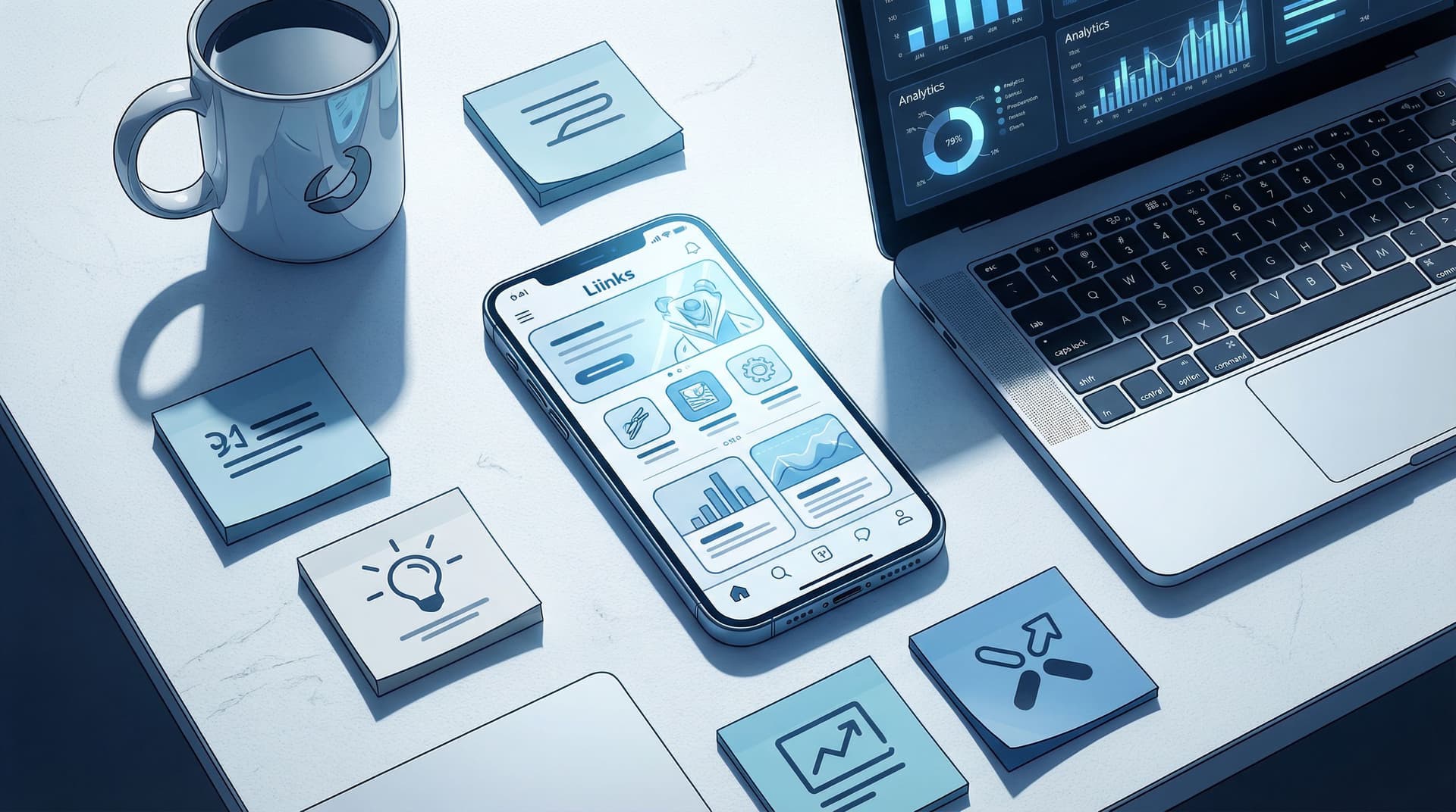
The Creator’s Offer Menu: Structuring Your Liinks Page So No Click Is a Dead End

If your current link-in-bio strategy is “throw everything on there and hope for the best,” this one’s for you.
Every tap on your bio link is a tiny miracle. Someone saw your content, liked you enough to leave the scroll, and chose to go deeper. The last thing you want is for that curiosity to slam into a wall—a dead link, a confusing layout, or a page that doesn’t make it clear what to do next.
This is where your offer menu comes in.
Think of your Liinks page as the menu at a great restaurant: everything is clear, organized, and designed to guide people toward something they’ll actually love. No mystery meat. No abandoned specials from 2022. No dead ends.
In this post, we’ll turn your link in bio into a living, breathing offer menu—so every click leads somewhere useful, profitable, or relationship-building.
Why “No Dead Ends” Is the Rule
A dead end is any click that leads to:
- A broken or expired link
- A generic homepage with no clear next step
- A vague offer that doesn’t explain what happens next
- A piece of content with nowhere to go after (no email opt-in, no related offer, no binge path)
Dead ends hurt you because they:
- Waste warm attention. People who tap your bio are already more interested than your average viewer.
- Lower your perceived professionalism. Messy or broken flows scream, “I don’t really have this set up yet.”
- Kill momentum. Every time someone has to think too hard, they bounce.
Meanwhile, a page structured like an offer menu:
- Meets people at different stages: curious lurkers, ready-to-buy fans, brand partners, binge-watchers
- Gives everyone something to do next
- Quietly increases conversions without you posting more or shouting louder
If you want to go deeper on making those first few seconds count, pair this with the One Scroll layout ideas in The ‘One Scroll’ Strategy: Designing a Liinks Page That Sells Before Anyone Ever Clicks.
Step 1: Decide What’s Actually On Your Menu
Your offer menu is not every single thing you’ve ever made.
It’s the short, intentional list of actions you’d love someone to take when they land on your Liinks page.
Start by listing all the things you could link to:
- Social channels
- Freebies and lead magnets
- Low-ticket products
- Signature offers / services
- Calendly or booking links
- Portfolio or case studies
- Newsletter sign-up
- Latest content (YouTube, podcast, blog)
- Brand / media info
Now ask three questions:
- What makes me money (directly or indirectly)?
- Services, products, affiliate links, high-intent content.
- What builds long-term relationship or authority?
- Email list, newsletter, pillar content, portfolio.
- What’s just there because I feel bad deleting it?
- Old freebies you don’t promote, random blog posts, forgotten landing pages.
Be ruthless. Your main menu should focus on the first two.
Your goal: 5–9 core actions. Everything else is either:
- Nested under those actions (e.g., a “Free Resources” section)
- Temporarily featured for a launch
- Removed entirely because it doesn’t serve your current goals
Step 2: Build a Tiered Offer Menu (for Every Stage of Readiness)
Not everyone landing on your page is ready to buy. But almost everyone is ready for something.
Structure your Liinks page like a tiered menu:
- Starter (Low-commitment actions)
- Main Course (Core offers)
- Dessert (Deeper or higher-ticket options)
Starters: For the “Just Curious” Crowd
These are low-friction, low-risk actions that warm people up:
- “Binge my best content” playlists or YouTube series
- A simple, specific freebie
- A newsletter sign-up with a clear promise
- A quiz or interactive tool
Examples of starter-style link labels:
- “Start here: my 3-part intro playlist”
- “Take the 2-minute quiz: Which offer is right for you?”
- “Grab the free Notion template I use with clients”
If you want more ideas for these “warm up” steps, check out From Lurkers to Superfans: Using Micro-Offers on Your Liinks Page to Warm Up a Cold Audience.
Main Course: Your Core Offers
This is where money is made.
Your main course links should:
- Be obvious about what they are
- Lead to focused pages with one clear action (buy, book, apply)
- Be limited—usually 1–3 core offers
Examples:
- “Book a 1:1 strategy session (limited spots)”
- “Apply for my 8-week group program”
- “Shop my presets & templates”
Each of these links should go to a page that continues the menu—more on that in a second.
Dessert: Deep Dives & Premium Things
These are for people who are already sold on you:
- VIP days
- Retainers
- High-ticket offers
- Media kit / brand partnership info
Examples:
- “Done-for-you content system (VIP Day)”
- “Brand partnerships & sponsor info”
You can tuck these a bit lower on the page. People who are ready will scroll.
Step 3: Make Sure Every Click Has a Next Step
This is the part most people skip.
They set up a nice Liinks page… and then send people to random destinations that don’t continue the journey.
Your rule: if someone clicks, they should always see a clear “what’s next.”
For Freebies
If a link goes to a free download, the landing page should:
- Explain briefly what they get
- Ask for an email (if that’s the goal)
- Tell them what happens after they sign up
- Suggest a next step once they download
Example flow:
- Liinks button: “Free content calendar (Google Sheets template)”
- Landing page: Opt-in + short description
- Thank-you page:
- Direct link to the file
- Next step: “Want help customizing this? Book a 30-minute power session.”
No dead end. They got value and a relevant next step.
For Content (YouTube, Podcast, Blog)
If you’re sending people to content, that content should:
- Link to your offers or email list
- Suggest related content to binge next
Example:
- YouTube description includes:
- Link back to your Liinks page
- Direct link to your main offer
- Playlist of related videos
You’re not just chasing views—you’re building a path.
For Services & Products
Service and product pages should:
- Make it clear who it’s for
- Show what’s included
- Explain how to get started (book, apply, buy)
- Offer an alternative if they’re not ready yet
Example “not ready yet” options:
- “Not sure if this is right for you? Take the 2-minute quiz.”
- “Want to see this in action? Watch the case study here.”
Again: no dead ends.
Step 4: Use Sections Like a Restaurant Menu, Not a Junk Drawer
One long, flat list of buttons is how you end up with overwhelm and random clicking.
Instead, use sections on your Liinks page like menu headings:
- Start Here – for new people
- Work With Me – your main offers
- Free Resources – lead magnets, guides, and tools
- For Brands & Press – media kit, stats, partnership info
Within each section, order links by importance, not chronology. Your best or most relevant offer goes first.
If you’re not sure how to structure these sections, the post The Creator’s Anti-Overwhelm Stack: Using Liinks to Simplify 5 Different Platforms into One Calm Hub walks through turning chaos into a clean, calm hub.
Naming Sections So People Instantly Get It
Skip clever for clever’s sake. Use labels that answer, “What do I find here?”
-
Instead of: “The Vault”
-
Try: “Free Resources & Templates”
-
Instead of: “Let’s Jam”
-
Try: “Book a 1:1 Strategy Call”
You can show personality in the subcopy, not at the cost of clarity.
Step 5: Turn Every Button into a Mini Salesperson
Your buttons are not just labels. They’re micro-CTAs.
A vague button:
- “New video”
- “My course”
- “Newsletter”
A micro-CTA button:
- “Watch: How I plan a month of content in 60 minutes”
- “Join the 8-week content bootcamp (payment plan available)”
- “Get 1 weekly email with plug-and-play hooks”
Each button should answer at least one of these:
- What is this?
- Who is it for?
- What outcome will I get?
If you want a full makeover for your button copy, you’ll love From ‘Check Out My Stuff’ to ‘Book Me Now’: Rewriting Boring Link-in-Bio Copy into Clickable Micro-CTAs.
Step 6: Map Simple “If They Click This, Then What?” Paths
You don’t need a complicated funnel diagram. You just need a few clear paths.
Grab a notebook or whiteboard and write:
- If they click [Starter X], then what?
- If they click [Main Offer Y], then what?
- If they click [Brand / Press], then what?
For each key link, define:
- Primary goal (join list, book, buy, binge)
- Backup goal (if they’re not ready yet)
Example for a service-based creator:
-
If they click “Free 15-minute audit”
- Primary: They book the audit.
- Backup: If they don’t book, page invites them to join the list for tips or download a related free guide.
-
If they click “Done-for-you content package”
- Primary: They apply or book a call.
- Backup: They can watch a case study or see pricing for a smaller starter package.
By the time you’re done, there is no scenario where someone clicks once and then has nowhere useful to go.
Step 7: Audit for Dead Ends (10 Minutes, Brutally Honest)
Set a timer for 10 minutes and do a quick “no dead ends” audit of your Liinks page.
Go link by link and ask:
- Does this link still work?
- Is the destination still relevant?
- Is there a clear next step on that page?
- Would a stranger understand what to do?
Delete or update anything that fails the test.
Then, once a month, repeat. You can pair this with a quick glow-up using the checklist in The 10-Minute Link-in-Bio Audit: Quick Fixes That Make Your Page Look Instantly More ‘Pro’.
Step 8: Let Data Tell You What Stays on the Menu
The cool thing about using a tool like Liinks is that you don’t have to guess which offers are pulling their weight.
Watch your click data over a few weeks:
- Which links get the most clicks?
- Which links get almost none?
- Are people favoring starters, main offers, or deep dives?
Use that info to:
- Promote high-performing links higher on the page
- Rewrite or retire underperforming offers
- Test different micro-CTAs or section labels
You can go deeper into reading those numbers in CTR in Real Life: What Your Liinks Click-Through Rate Is Actually Telling You (and What to Fix First).
Quick Example Layout: A Creator Offer Menu in Action
Here’s how this might look for a content strategist using Liinks as their main hub.
Section: Start Here
- “New? Watch this 3-minute intro video” → Short welcome video with links under it
- “Take the quiz: What content offer do you actually need?” → Quiz result pages point to relevant offers
- “Get my free 30-day content calendar (Google Sheet)” → Opt-in → thank-you page invites to book a power session
Section: Work With Me
- “Book a 60-minute content power session” → Booking page with FAQ + link to lower-ticket DIY guide
- “Done-for-you monthly content (limited spots)” → Application page + case study link
- “VIP Day: Plan 90 days of content in 1 day” → Sales page with clear schedule & next steps
Section: Free Resources & Deep Dives
- “Binge my best YouTube tutorials” → Playlist with links back to offers in description
- “Join my weekly email: 1 content prompt every Monday” → Simple opt-in
Section: For Brands & Collabs
- “Brand partnerships & media kit” → Page with stats, previous collabs, and a clear inquiry form
Every single click leads to:
- A clear explanation
- A primary action
- A backup action if they’re not ready
No dead ends. No wasted curiosity.
Bringing It All Together
Your Liinks page is not just a list of links. It’s the front-of-house for your entire creator business.
When you treat it like an offer menu:
- People instantly understand what you do
- Every type of visitor has something to click that makes sense for them
- No one hits a dead end—they always have a next step
And the best part? You don’t need a giant website, a fancy funnel builder, or a 47-step automation. You just need:
- A short list of what actually belongs on your menu
- Clear sections that match how people think
- Micro-CTAs that act like tiny salespeople
- Simple “if they click this, then what?” paths
- A monthly 10-minute audit to keep everything alive and relevant
Your Next Step (Because This Post Will Not Be a Dead End Either)
Since we’re practicing what we preach, here are your non-dead-end options:
- Option 1 – The quick win: Open your current Liinks page and remove 2–3 links that no longer serve your goals.
- Option 2 – The glow-up: Rebuild your sections using the “Start Here / Work With Me / Free Resources / For Brands” structure.
- Option 3 – The full menu makeover: Grab a notebook and map 3 key paths: what happens after someone clicks a starter, a main offer, and a brand link.
Then log into Liinks, make the changes, and watch what happens when every click actually leads somewhere worth going.
Your audience is already tapping that link. It’s time to make sure not a single one of those taps is wasted.

