
Niche, But Make It Clickable: Liinks Page Ideas for Hyper-Specific Creators (BookTok, Plantfluencers, and Beyond)

There has never been a better time to be extremely, gloriously specific online.
Not “I talk about books.”
More like: “I rate morally gray fantasy villains by how likely they are to ruin your sleep schedule.”
Or: “I help millennials keep one (1) houseplant alive long enough to experience character development.”
Hyper-specific creators are winning. BookTok alone has turned into a publishing powerhouse, with the #BookTok hashtag racking up hundreds of billions of views and driving tens of millions of book sales in a single year. Readers aren’t just scrolling; they’re buying, joining, and obsessing.
But there’s a catch:
Those super-engaged people eventually tap your bio link.
If they land on a generic, one-size-fits-no-one page? You just took niche magic and poured it into a leaky bucket.
This is where a focused, good‑looking link hub like Liinks quietly becomes your secret weapon. When your content is niche, your Liinks page should be, too.
Let’s build a link in bio that feels as specific—and as bingeable—as your content.
Why Hyper-Specific Creators Need Hyper-Specific Liinks Pages
Being niche is your superpower. Your link in bio is where you turn that superpower into subscribers, buyers, and brand deals.
Here’s why it matters:
1. Your audience expects a tailored experience
If someone follows you because you only review cozy fantasy with queer leads or only talk about low-light tropical plants, they’re expecting that same focus when they click through.
A generic page that says “YouTube | Newsletter | Shop | Blog” feels like a bait-and-switch. A niche page that says “Spicy dragon-rider recs,” “Monthly rep spreadsheet,” or “Pet-safe plant list” feels like, “Oh, they get me.”
2. Niche content = high intent clicks
Hyper-specific followers aren’t casual. They’re:
- Actively hunting for recommendations
- Ready to buy the book / plant / tool you mentioned
- Looking for community with people who share their oddly precise obsession
A well-structured Liinks page catches that intent and directs it somewhere useful instead of dropping them into a random button pile. If you want help structuring those offers, bookmark The Creator’s Offer Menu: Structuring Your Liinks Page So No Click Is a Dead End for later.
3. Niche pages make brand deals easier
Brands love clarity. When a publisher, plant shop, or skincare company clicks your bio, they’re asking: “Who exactly follows this person, and what do they care about?”
A niche Liinks page answers that in one scroll—no media kit required.
Step Zero: Give Your Niche Its Own Micro-Brand
Before we go into specific creator types, you need one thing: a tiny, recognizable “universe” your Liinks page can live inside.
Think of it as your niche’s mini brand kit:
- One core color palette that matches your content vibe (dark academia browns vs. neon romance pinks vs. earthy greens)
- A short, specific tagline that finishes the sentence: “I’m the creator who…”
- One primary outcome you want from your Liinks page (email signups, book sales, bookings, Discord members, etc.)
On Liinks, you can customize colors, fonts, and layout so your page doesn’t look like a generic template graveyard. Use that.
Your Liinks tagline can go right at the top:
- “Book recs for readers who like their fantasy morally gray and their romances slow-burn.”
- “Plant care for people who kill succulents but mean well.”
- “Spicy romance recs, annotated TBRs, and zero judgment.”
Once that’s set, you can design the rest of the page like a tiny, one-scroll experience. If you want a deeper dive on that, check out The ‘One Scroll’ Strategy: Designing a Liinks Page That Sells Before Anyone Ever Clicks.
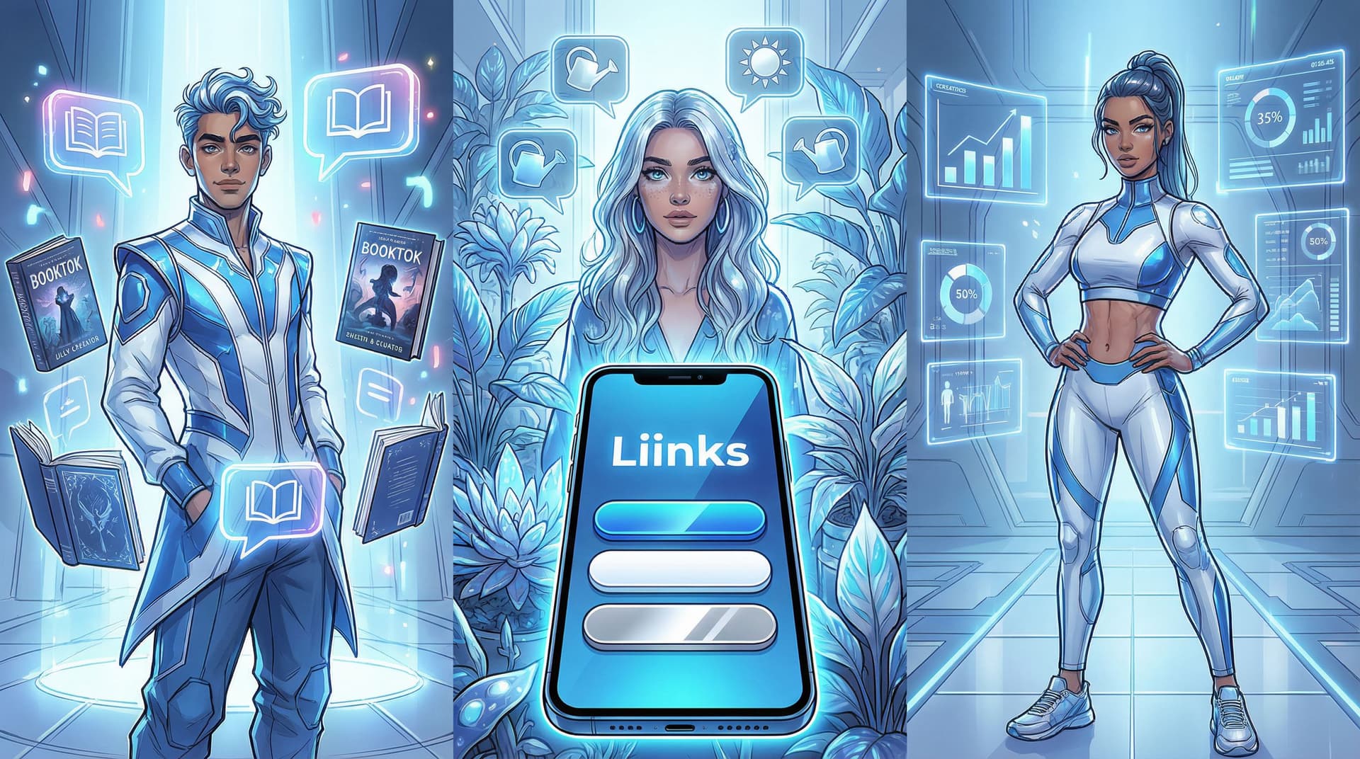
BookTok Creators: Turn Recs into Repeat Clicks
BookTok is massive, but your corner of it is specific: genre, tropes, vibes, spice level, age category, representation. Your Liinks page should mirror that.
Sections to Steal for Your BookTok Liinks Page
1. “Start Here” TBR Paths
Instead of one giant “My Book Recs” button, create curated paths:
- “New here? Start with these 5 comfort reads”
- “If you liked Fourth Wing, read these next”
- “Low-angst sapphic romances for cozy nights”
Each button can link to:
- A public Notion or Airtable list
- A StoryGraph or Goodreads shelf
- A blog post or Google Doc with links to your affiliate storefront
2. “As Seen in This Video” Rotating Feature
Pin 1–3 links that match your most recent or most viral videos:
- “Enemies-to-lovers recs from my viral ‘cry with me’ video”
- “The annotated reading order I mentioned in yesterday’s live”
Update this weekly. (If you’re worried about maintenance, set a reminder and use Liinks’ simple editor to swap URLs in under two minutes.) To keep that viral traffic working longer, pair this with the ideas in From Trend Chasing to Timeless: Turning Viral Content into Evergreen Clicks with a Smarter Link in Bio.
3. Reading Guides & Checklists
BookTok loves structure:
- “Printable dark academia reading checklist (free)”
- “Beginner’s guide to romantasy: 10-book roadmap”
- “Spice-level key + content warnings database”
These can live as:
- A PDF hosted on Google Drive
- A simple website page
- An email opt-in delivery (hello, newsletter growth)
4. Creator-Focused Section (for brands & authors)
You can be niche and sponsor-ready. Add a small section:
- “For authors & publishers” → media kit, rates, collaboration form
- “Book club & event bookings” → Calendly, Typeform, or email link
Micro-CTA Ideas for BookTok Buttons
Skip the boring “Shop my links” copy. Try:
- “Steal my cozy fantasy starter pack”
- “Browse my ‘sad girls in big coats’ shelf”
- “See every book I rated 5 stars in 2025”
- “Check trigger warnings before you dive in”
Plantfluencers: Make Your Liinks Page a Living Care Guide
Plant creators are already niche by nature (sorry):
- Low-light apartment jungle people
- Rare aroid collectors
- “I only grow herbs on my fire escape” folks
Your followers don’t just want to see your plants; they want to replicate your setup without killing everything.
Sections That Work Beautifully for Plant Niches
1. “Shop My Exact Setup”
Instead of a generic “Amazon storefront” button, split it by use case:
- “Beginner-safe plants I actually trust”
- “Grow lights that won’t make your living room look like a lab”
- “Tools I use weekly (and the ones I regret buying)”
Each button can go to:
- An affiliate shop (Amazon, ShareASale, etc.)
- A curated list on your favorite nursery’s site
2. Care Guides by Environment
Your niche probably centers on a very specific environment. Build sections like:
- “North-facing window? Start here.”
- “Pet-safe plants that won’t ruin your vet bill.”
- “High-humidity drama queens (and how to keep them alive).”
Each link can lead to:
- Short blog posts or Instagram guides
- Canva PDFs hosted in the cloud
- YouTube videos embedded on a simple page
3. Troubleshooting Hub
People click your link when something is dying. Make that obvious:
- “What’s wrong with my leaves?” → a simple quiz or flowchart
- “Yellow leaf emergency kit”
- “Soil & repotting basics in 10 minutes”
You can host a quiz with tools like Typeform or Tally, then link it through Liinks.
4. Services & Community
If you offer paid help:
- “Book a virtual plant consult” → Calendly
- “Join my monthly repotting club” → Patreon, Circle, Discord
- “Request a custom plant plan for your apartment” → form or email
Micro-CTAs for Plantfluencer Buttons
- “Show me plants that survive office lighting”
- “Fix my sad fiddle leaf (step-by-step)”
- “Copy my humidifier + grow light combo”
- “Get my ‘don’t buy these plants as a beginner’ list”
Other Hyper-Specific Creators: Steal These Layout Patterns
Not BookTok or plants? The same principles apply. The more specific your content, the more your Liinks page should feel like a tailored control panel for that obsession.
Here are layout patterns you can adapt to basically any niche.
1. The “Choose Your Adventure” Layout
Perfect for:
- Fanfic rec creators
- Niche fashion stylists (e.g., cottagecore workwear)
- Fitness creators with a specific audience (e.g., postpartum lifting, chronic illness movement)
Structure:
At the top of your Liinks page, add 3–5 big buttons that reflect the main “paths” someone might be on:
- “I’m brand new, start me slow”
- “I’m here for recs, not small talk”
- “I want your paid stuff”
- “I’m a brand / PR person”
Under each, you can stack more specific links:
- Under “brand new”: intro video, starter guide, FAQ
- Under “recs”: playlists, lists, spreadsheets
- Under “paid stuff”: offers, shop, membership
This keeps the page from feeling cluttered while still being comprehensive.
2. The “Seasonal Spotlight” Layout
Great for:
- Seasonal decor creators
- Study-with-me / exam prep accounts
- Creators who run launches or cohorts
Structure:
Top of your page = what’s relevant right now.
- “Spring capsule wardrobe checklist”
- “Exam season survival kit”
- “Enrollment open: July accountability group”
Below that, keep your evergreen sections:
- “About me + start here”
- “Free resources”
- “Work with me”
When you’re not launching anything, this layout still works—swap the seasonal spotlight for a timely freebie or challenge. For more ideas when you’re “not selling anything,” peek at What to Link When You’re Launching Nothing: Low-Lift Liinks Ideas That Still Grow Your Brand Between Big Drops.
3. The “Funnel Without a Website” Layout
Ideal for:
- Service providers who live on social (coaches, editors, designers)
- Creators testing a new offer before building a full site
Structure:
Use your Liinks page as the entire funnel:
- Hook section – “Here’s who I help and how”
- Proof section – screenshots, before/afters, client wins
- Offer section – 1–2 clear offers with short descriptions
- Next step – booking link, application form, or waitlist
If this is you, you’ll love From Clicks to Clients: Mapping a Simple Service-Based Funnel Using Only Your Liinks Page.
Making Your Niche Page Actually Clickable (Not Just Pretty)
Hyper-specific doesn’t mean complicated. A few small choices make your Liinks page wildly more clickable.
1. Name Links Like You Talk
Your followers know your in-jokes and phrasing. Use that.
Instead of:
- “Newsletter”
- “YouTube”
- “Shop”
Try:
- “Weekly recs + unhinged reading rants (newsletter)”
- “Long-form chaos (YouTube)”
- “Buy the exact thing I screamed about in that video”
If you need help rewriting boring button copy, pair this article with From ‘Check Out My Stuff’ to ‘Book Me Now’: Rewriting Boring Link-in-Bio Copy into Clickable Micro-CTAs.
2. Limit Choices, Not Personality
When someone lands on your page, they’re deciding in seconds whether to:
- Take the next step
- Hit the back button
- Get overwhelmed and close the tab
Aim for:
- 1–2 primary actions above the fold (e.g., “Start here guide” + “Shop this video”)
- 5–8 total key links on the page
You can absolutely have more, but group them into sections so it doesn’t feel like a wall of buttons.
3. Match Your Content Funnel
Ask yourself: “What did they just see before they clicked?”
- If your latest posts are all about one series, prioritize links about that series.
- If you’re mid-launch, put that offer front and center.
- If you’re in a chill season, highlight low-pressure next steps: free guides, playlists, communities.
This is where a flexible tool like Liinks shines. You can quickly reorder sections, test different layouts, and keep your page synced with whatever your niche brain is currently obsessed with.
4. Track What Your Niche Actually Clicks
You don’t have to guess which links your audience cares about. Use your Liinks analytics to:
- See which sections get the most clicks
- Compare “vibe” links (playlists, moodboards) vs. “action” links (shop, book, join)
- Test different micro-CTAs on the same link
Then, adjust. If your “pet-safe plant list” gets 5x more clicks than your generic “Shop my supplies,” that’s a clear signal: lean into that.
For more nerdy-but-pretty analytics ideas, you might like The Aesthetic Data Nerd: Using Analytics to Design a Better-Looking (and Better-Performing) Liinks Page.
Quick Build Checklist for Hyper-Specific Creators
Open your current link in bio and run through this:
- Does my page clearly say who I’m for in one line at the top?
If not, add a niche tagline. - Are my top 1–2 buttons the most relevant things for my current content?
If not, reorder. - Can a new follower figure out their “path” in under 5 seconds?
If not, create a “Start here” or “Choose your adventure” section. - Do my buttons sound like me—or like a settings menu?
Rewrite at least three with micro-CTAs. - Is there a clear next step for people who want more from me?
Newsletter, shop, booking link, Patreon—pick one primary. - Is there a tiny section for brands/collabs if that’s a goal?
Make it obvious you’re open for business.
If you can tick off most of these, you’re already ahead of 90% of creators in your niche.
TL;DR: Your Niche Deserves a Niche Liinks Page
Hyper-specific creators—BookTokers, plantfluencers, fandom essayists, micro-niche fitness coaches—aren’t “too niche.” You’re just specific enough that your audience expects the same clarity everywhere they meet you.
A well-designed Liinks page helps you:
- Turn high-intent niche clicks into the right next steps
- Make brands instantly understand who you serve
- Give overwhelmed followers an easy, “Oh, this is for me” path
- Keep viral moments working longer than 48 hours
Your content already feels like a tiny universe. Your link in bio should feel like the map.
Your Next Step (Yes, Right Now)
You don’t need a full rebrand or a weekend-long planning session.
Here’s a simple 15-minute challenge:
- Open your current link in bio in one tab.
- Open Liinks in another.
- Create or tweak your page so it has:
- One clear niche tagline at the top
- A “Start here” button tailored to your specific audience
- One high-intent link that matches your latest or best-performing content
- Rewrite three button labels so they sound like how you talk on camera.
Hit save. Drop the new link in your bio. Mention it in your next video with a specific CTA (“Link in bio for the exact plant list I used” / “Bio link has the full reading order”).
Your niche is already doing the hard part—attracting the right people. Let your Liinks page finish the job.


