From Clicks to Clients: Mapping a Simple Service-Based Funnel Using Only Your Liinks Page

From Clicks to Clients: Mapping a Simple Service-Based Funnel Using Only Your Liinks Page
If you run a service-based business, you don’t actually want “more clicks.” You want:
- More qualified inquiries
- Fewer back-and-forth DMs
- Clients who already understand what you do and what it costs
In other words: you want a funnel.
And yes, you can absolutely build that funnel using nothing but your Liinks page.
This isn’t a theory post. We’re going to walk through a simple, repeatable structure you can use whether you’re a coach, designer, stylist, photographer, VA, strategist, or any other “I sell my brain and/or skills” human.
Why Your Funnel Can Live on One Liinks Page
A funnel is just the path someone takes from “Who are you?” to “Here’s my card.” For service providers, that path usually looks like:
- Discover you via content or referrals
- Click your bio link
- Skim your offers
- Decide if you’re the right fit
- Take a next step (book, apply, or join your list)
Most people overcomplicate this with:
- A homepage
- A services page
- A separate booking page
- A random form hidden in a Google Drive folder
Meanwhile, the majority of your traffic is coming from one tiny URL in your bio… which can be a single, well-structured Liinks page.
If you’ve ever wondered whether you need a full website for this, you’ll like our breakdown in Link in Bio vs. Full Website: The SEO Tradeoffs No One’s Talking About. Spoiler: for a lot of service businesses, a strong link-in-bio setup is enough to start turning clicks into clients.
Benefits of building your funnel on Liinks:
- Speed – You can spin up or tweak your funnel in minutes, not weeks.
- Clarity – One page, one scroll, one clear path.
- Control – You can test headlines, CTAs, and layouts without calling a developer.
- Consistency – Your audience always knows where to go: that one link in your bio.
The Simple Service Funnel: 4 Stages, One Page
We’re going to map your funnel into four stages, all living comfortably on your Liinks page:
- Stop the scroll (on your Liinks page itself)
- Filter for the right people
- Build enough trust to justify a click
- Make the next step painfully obvious
Think of each section on your page as a stage in that journey.
Step 1: Turn Your Liinks Page into a “Yes, I’m in the Right Place” Moment
When someone taps your bio link, they’re asking one question:
“Is this for me?”
Your job is to answer that question above the fold.
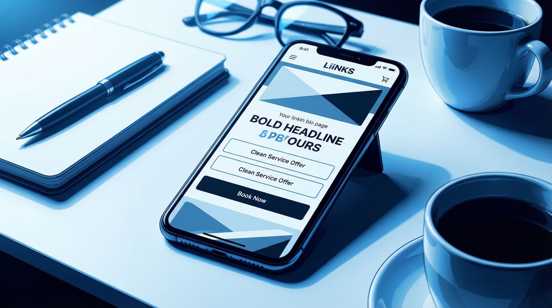
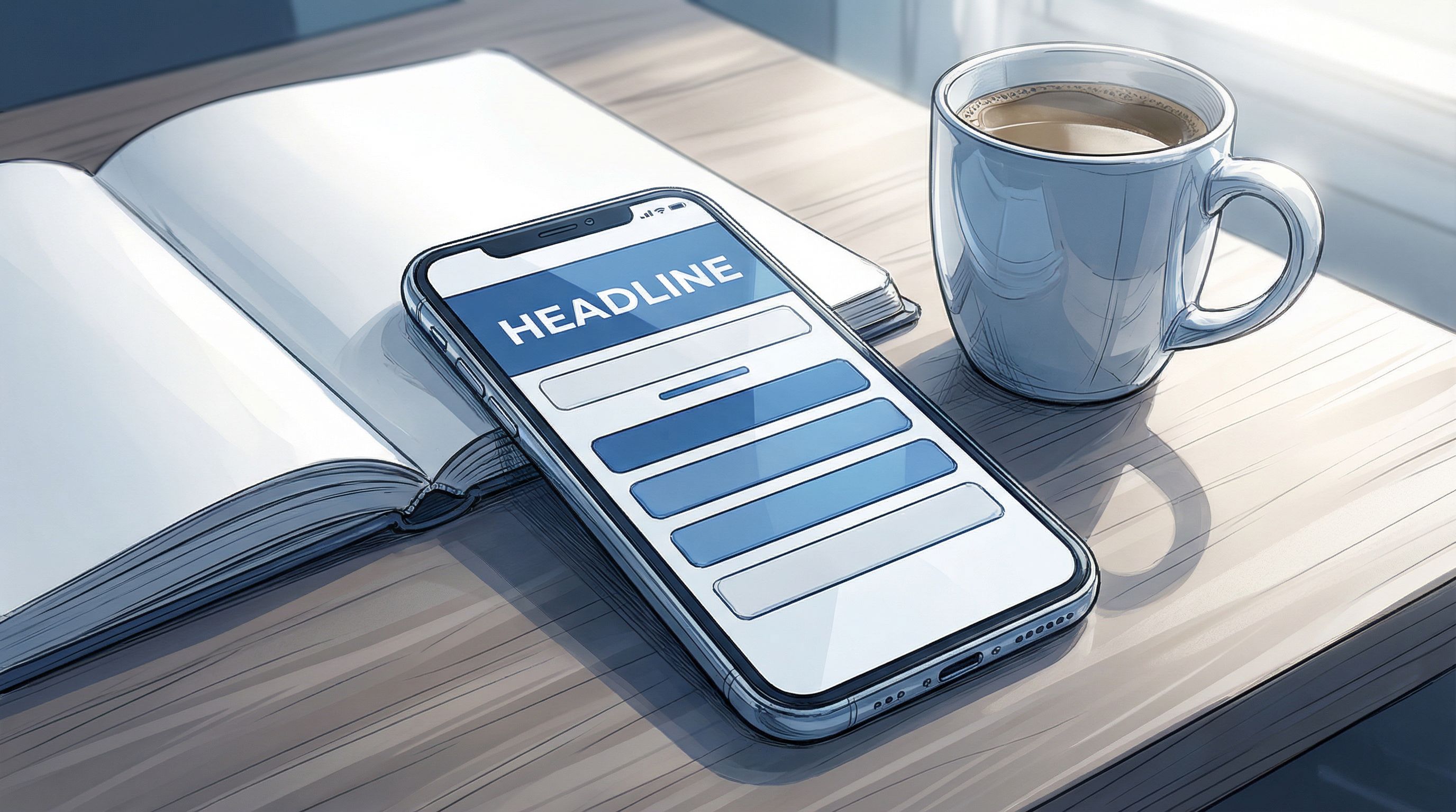
Add a clear, client-focused headline
Instead of: “Brand & Web Designer | Coffee Addict | Dog Mom”
Try something like:
- “Brand & web design for coaches who are ready to raise their rates.”
- “Photography for couples who want more candids than posed shots.”
- “Retention-focused email strategy for ecom brands making 5–50k/month.”
Make it obvious:
- Who you serve
- What you help them do
If you’re juggling multiple offers, you’ll find more structure ideas in The Multi-Passionate Creator’s Map: Structuring One Liinks Page When You Do… Everything.
Use visuals that match your services
On your Liinks page, lean on:
- A clean profile image or logo
- A simple, on-brand color palette
- Section headers that feel like mini billboards, not labels
You want someone to think, within 3 seconds: “This feels professional and relevant to me.”
Step 2: Build a Mini “Services Snapshot” Above Everything Else
Your funnel should not start with your podcast, your blog, or your latest Reel.
It should start with how someone can pay you.
On your Liinks page, create a Services Snapshot section that sits right near the top. Think of it as your “menu, but make it skimmable.”
Structure your Services Snapshot like this
Use 2–4 key links for your main offers. For example:
- “Book a Brand Strategy Intensive – 90 Minutes” → Calendly/booking link
- “Done-For-You Brand & Web Design – Start Here” → Services or application page
- “Ongoing Design Support – Retainer Inquiry” → Simple form
Each link should have:
- A clear outcome (what they get)
- A format (call, project, retainer, VIP day)
- A hint of who it’s for (coaches, local businesses, creatives, etc.)
Use micro-CTAs that sound like instructions, not labels:
- “Apply for 1:1 Coaching (2 Spots Open)”
- “See Wedding Photography Packages & Pricing”
- “Get a Social Media Strategy Day Quote”
If you want help rewriting vague buttons into clickable ones, bookmark From ‘Check Out My Stuff’ to ‘Book Me Now’: Rewriting Boring Link-in-Bio Copy into Clickable Micro-CTAs.
What if you have a lot of offers?
You don’t need to cram every single thing you do into the top section.
Instead:
- Feature 1–3 flagship services
- Group the rest under a single link like “All Services & Packages”
Your Liinks page is not your entire brain. It’s the front door.
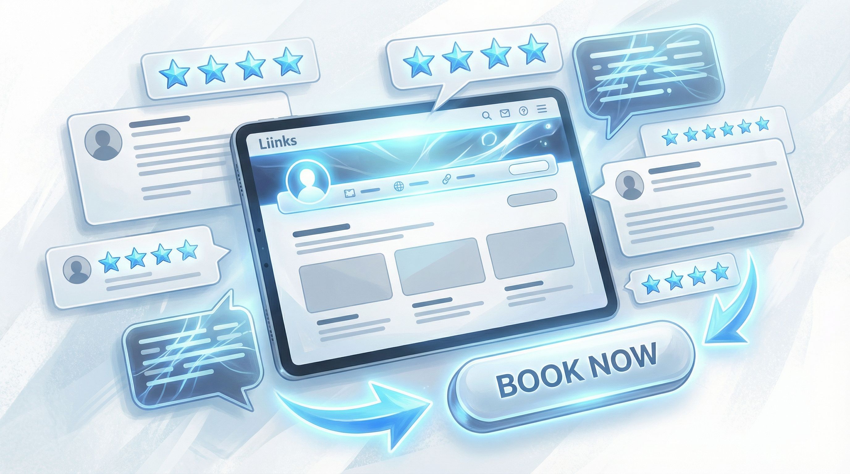
Step 3: Add a Trust Layer That Does the Selling for You
Most people don’t book a service based on one cute button.
They book because they see proof:
- Testimonials
- Before/after transformations
- Case studies
- Screenshots of real results
You can build this “trust layer” right on your Liinks page.
Turn social proof into a dedicated section
Add a section titled something like:
- “Client Wins & Receipts”
- “Proof This Actually Works”
- “What Clients Say”
Inside that section, link to:
- A gallery of screenshots (Dropbox, Google Drive, Notion, or a hidden page)
- A simple case study page
- A highlight reel of testimonials
Micro-CTA ideas:
- “See How Jenna 3x’d Her Client Inquiries in 60 Days”
- “Read 10 Client Reviews (With Screenshots)”
- “Watch a 3-Minute Before/After Brand Walkthrough”
If you want to go deeper on this, we broke it down step-by-step in Screenshots Sell: How to Turn Social Proof into Strategic Liinks Sections That Quietly Close Clients.
Sprinkle proof near your money links
Don’t bury your proof in one lonely section. On your Liinks page, use layout and ordering to create a story:
- Services Snapshot
- Social Proof / Case Studies
- Then: booking / inquiry links
You’re essentially saying: Here’s what I do → Here’s proof it works → Here’s how to get it.
Step 4: Make the Conversion Step Frictionless
This is where most funnels fall apart. People are interested… and then:
- They have to hunt for how to contact you
- They’re asked to fill out a 37-question form
- The booking link is broken or confusing
Let’s not.
Decide on one primary next step
For most service-based businesses, your main conversion action will be one of these:
- Book a discovery call
- Fill out an application form
- Request a quote
- Book a paid intro session or audit
Pick one as your primary CTA and treat it like the star of your Liinks page.
Place it:
- Near the top (under your Services Snapshot)
- Again after your proof section
- Optionally as a final “P.S.” at the bottom
Example CTAs:
- “Book a Free 20-Minute Fit Call”
- “Apply for 1:1 Coaching (2 Spots This Month)”
- “Get a Custom Brand & Web Quote in 24 Hours”
Use simple, reliable tools for the “back end”
Your Liinks page is the front door; behind each button you can plug in tools you already use:
- Booking: Calendly, Acuity, TidyCal
- Forms & applications: Tally, Typeform, Google Forms
- Payment links: Stripe Payment Links, ThriveCart, Lemon Squeezy, PayPal
A simple flow might look like:
“Book a Strategy Intensive” → Calendly link with built-in intake questions → Payment collected on booking
Or:
“Apply for Brand & Web” → Tally form → You review → You send proposal & invoice manually
Either way, your Liinks page is just the router that sends people to the right place.
Step 5: Add a “Warm-Up” Path for Not-Quite-Ready Leads
Not everyone is ready to book a call the first time they tap your link.
If your only option is “Apply Now,” a lot of warm-but-nervous people will quietly close the tab.
Enter: your warm-up path.
This is where you add one or two low-commitment options that keep people in your orbit:
- Email list: “Get My Weekly Client-Attracting Content Prompts”
- Free resource: “Download My 5-Step Brand Prep Checklist”
- Low-ticket offer: “Book a 30-Minute Audit for $49”
Connect those to:
- An email platform like ConvertKit, Flodesk, or Beehiiv
- A simple PDF hosted on Google Drive or Notion
- A mini paid offer via Stripe link
We go deeper on this kind of path in From Freebie Hunters to Paying Clients: Mapping a Simple Conversion Funnel from Your Liinks Page, but the short version is:
Your warm-up path catches the “not yet” people so they don’t disappear.
Place this section after your main services and booking CTAs. People who are ready to buy shouldn’t have to wade through a sea of freebies.
Step 6: Make Your Funnel Obvious with Layout, Not Just Links
You can have all the right buttons and still confuse people if the layout is chaotic.
Here’s a simple layout you can copy onto your Liinks page:
-
Brand headline + 1-sentence explainer
“Brand and web design for coaches who are ready to raise their rates without redoing their entire business.” -
Primary CTA
- “Book a Free Fit Call”
-
Services Snapshot
- “Brand Strategy Intensive – 90 Minutes”
- “Full Brand & Web Design – Start Here”
- “Ongoing Design Support – Retainer Inquiry”
-
Proof Section
- “Client Wins & Screenshots”
- “Case Study: From DIY Brand to 5-Figure Launch”
-
Warm-Up Path
- “Download the Brand Prep Checklist”
- “Join My Weekly Behind-the-Scenes Email”
-
Final CTA (Repeat)
- “Ready to Talk? Book Your Free Fit Call”
You’ve just created a funnel that looks like a single, calm page.
Step 7: Track What’s Working (Without Becoming a Data Scientist)
Even a simple funnel deserves a little data.
You don’t need a full analytics dashboard to make smart decisions. Start with:
-
Which links are people actually clicking?
Tools like Liinks give you per-link click data so you can see what’s getting attention. -
Which links lead to real inquiries or bookings?
Add a “How did you find me?” question to your intake forms and booking pages. Include options like:- “Instagram bio link”
- “TikTok bio link”
- “Referred by a friend”
-
What happens when you move things around?
Test small changes:- Swap the order of two services
- Change a vague CTA to a specific one
- Move your proof section higher
Watch your clicks and inquiries for 1–2 weeks after each change. Keep what works; quietly retire what doesn’t.
For more tiny, high-impact tweaks, you might like Beyond Aesthetics: Micro UX Tweaks on Your Liinks Page That Quietly Double Click-Through Rate.
Putting It All Together: Your One-Page Service Funnel Checklist
Open your Liinks page and run through this checklist:
Above the fold:
- [ ] Clear, client-focused headline
- [ ] One primary CTA (book, apply, or request a quote)
Services Snapshot:
- [ ] 2–4 main offers, each with a specific outcome
- [ ] Micro-CTAs that sound like instructions
- [ ] Optional “All Services & Packages” link if you have a lot
Trust Layer:
- [ ] Dedicated section for testimonials, screenshots, or case studies
- [ ] At least one link to a proof-heavy page or gallery
Conversion Step:
- [ ] One main booking or application link repeated in key spots
- [ ] Simple, reliable tools on the back end (Calendly, forms, payment links)
Warm-Up Path:
- [ ] 1–2 low-commitment options (email list, freebie, low-ticket offer)
- [ ] Placed after your main services, not before
Layout & Testing:
- [ ] Logical top-to-bottom flow: Who you are → What you offer → Proof → Next step
- [ ] You’re tracking which links people click and which ones lead to real clients
If you can check most of these boxes, congratulations: you’ve got a functioning funnel that lives on one good-looking page.
Quick Recap
We just turned your link in bio from “random list of buttons” into a simple, service-based funnel that:
- Welcomes the right people with a clear, client-focused headline
- Shows your core services in a skimmable, action-oriented snapshot
- Builds trust with testimonials, screenshots, and case studies
- Makes booking or applying the obvious, frictionless next step
- Catches the “not yet” crowd with smart warm-up paths
- Uses layout and light analytics to keep improving over time
All of that can live entirely on your Liinks page—no 12-page website required.
Your Next Move (Yes, This Is Your Nudge)
Don’t turn this into a three-week project.
Here’s your low-lift, high-impact first step:
- Open your current Liinks page in one tab.
- Open this post in another.
- In 30 minutes, do just these three things:
- Add or rewrite your headline so it clearly says who you help and how.
- Create a Services Snapshot with 2–4 clear, outcome-focused links.
- Add one primary CTA for booking or applying, and move it near the top.
That’s it.
Once that’s live, you’ll already have a basic funnel from clicks to clients. You can layer on proof, warm-up paths, and micro-UX tweaks over the next week—but you don’t have to wait to start.
Your future clients are already tapping your bio link. Make sure that one little page is ready to meet them where they are—and guide them exactly where you want them to go.
