
Link-in-Bio for Tiny Teams: How Solo Founders and Small Shops Can Run ‘Big Brand’ Funnels with Liinks

Big brands don’t win because they’re smarter.
They win because they have:
- A marketing team
- A tech team
- A “let’s spend three weeks debating this CTA button” team
If you’re a solo founder, creator, or small shop, you probably have… you. Maybe a part-time VA. And yet you’re competing for the same clicks, the same attention, and the same customers.
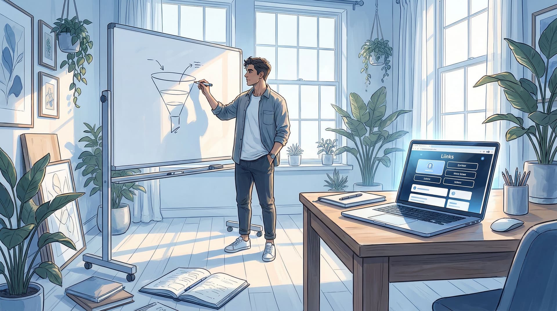
That’s where your link in bio stops being a cute utility and starts acting like your tiny-but-mighty funnel engine.
Tools like Liinks let you build a mini version of those “big brand” journeys—without needing a full website, a dev, or a 47-step funnel map.
This guide will show you how to turn that one little link into a lean, high-converting funnel that makes your tiny team feel suspiciously well-staffed.
Why This Matters So Much for Tiny Teams
When you don’t have a big team, you can’t afford:
- Confusing paths
- Dead links
- “Click around and see what happens” experiences
Every tap on your bio link is:
- A warm lead who’s already interested
- A potential buyer, client, or repeat customer
- A brand partner quietly checking if you’re legit
You don’t need a complicated funnel. You need a clear path from:
"I like this person / business" → "I know what they do" → "I know what to do next" → "I just did it."
Liinks gives you the structure to do that on one page:
- Design that actually looks on-brand (so you pass the “are they legit?” test in seconds)
- Fast editing (so your funnel evolves with your offers, not six months later)
- Sections and layouts that behave more like a tiny homepage than a random list of links
If you want to go deeper on turning your link hub into a real funnel, you’ll love our post on mapping a full journey from freebie hunters to buyers: From Freebie Hunters to Paying Clients: Mapping a Simple Conversion Funnel from Your Liinks Page.
Step 1: Decide What “Big Brand Funnel” Means for You
Big brands obsess over funnel stages. You don’t need a 60-slide deck—but you do need a simple version.
For tiny teams, think in three stages:
- Warm curious people – they just discovered you, want to know what you do.
- Interested but unsure – they’re considering buying/booking, but need clarity or proof.
- Ready to act – they just need an easy, obvious next step.
Your Liinks page can mirror this in one smooth scroll:
- Top: Who you are & what you do (clarity)
- Middle: Proof & pathways (social proof, content, context)
- Bottom: Clear, specific next steps (book, buy, join, visit)
That’s your “big brand” funnel, just without the committee meetings.
Step 2: Turn Your Liinks Page Into a Tiny Funnel Map
Instead of starting with buttons, start with questions:
- What’s the #1 thing I want people to do from my bio link?
- What’s the #2 thing (if they’re not ready for #1 yet)?
- What do they need to see or understand before they’ll do either?
Then translate that into a simple structure on Liinks.
A simple “big brand” layout for tiny teams
Section 1 – Instant clarity (top of page)
- A short, clear headline: who you are + what you do
- One primary CTA button
- One secondary CTA button (optional)
Examples:
-
Brand designer for bold, colorful e-commerce shops
Primary: “Book a Brand Intensive”
Secondary: “View Portfolio” -
Local coffee shop in Austin, TX – specialty drinks & cozy coworking
Primary: “View Menu & Hours”
Secondary: “Order Ahead for Pickup”
If you want help shaping that top-of-page story, pair this with the ideas in The ‘One Scroll’ Strategy: Designing a Liinks Page That Sells Before Anyone Ever Clicks.
Section 2 – The “big brand” proof zone
This is where you add the stuff big brands sprinkle everywhere:
- Logos of brands you’ve worked with
- Short testimonials or review snippets
- Screenshots of DMs, emails, or comments
- “As seen in” features
You can group these into a clean, visual section on your Liinks page so it feels intentional—not like a collage.
Section 3 – Choose-your-own-adventure offers
Now you give people 2–4 clear paths, not 17 random links:
- Ready to buy? → Shop, booking page, or main offer
- Need more context? → About page, portfolio, or case studies
- Just browsing? → Free resource, playlist, or newsletter
This is where the thinking from The Creator’s Offer Menu: Structuring Your Liinks Page So No Click Is a Dead End really shines. You’re not just listing links—you’re designing a menu.
Step 3: Build “Big Brand” Journeys with Micro-CTAs
Big brands don’t rely on “Learn more” and “Click here.” Their CTAs are specific.
You can steal that playbook on a tiny scale using micro-CTAs on your Liinks buttons.
Instead of:
- “New video”
- “My shop”
- “Newsletter”
Try:
- “Watch the 5-minute tutorial brands keep DMing me about”
- “Shop the presets I use in every client project”
- “Get my weekly 2-minute marketing checklist”
Micro-CTAs:
- Set expectations (what exactly happens if I click?)
- Filter the right people (the ones who want that specific thing)
- Make your page feel like a funnel, not a filing cabinet
If you want a deeper dive into writing these, bookmark From ‘Check Out My Stuff’ to ‘Book Me Now’: Rewriting Boring Link-in-Bio Copy into Clickable Micro-CTAs.
A quick formula you can steal
Use this to rewrite any button on your Liinks page:
Verb + specific outcome + who it’s for
Examples:
- “Book a 30-minute brand audit for early-stage founders”
- “Download the pricing template my coaching clients use”
- “Reserve a table for brunch this weekend”
Run every button through this filter and your page will instantly feel more like a guided journey and less like a random list.
Step 4: Make Your Liinks Page Do the Work of a Whole Team
Big brands have:
- A CRO person obsessing over conversions
- A design person polishing layouts
- A data person watching behavior
You have: your Liinks dashboard and a little bit of intention.
Here’s how to fake a whole team with a few smart habits.
1. Let your analytics tell you where the funnel is leaking
Check your Liinks analytics regularly (weekly or bi-weekly is plenty for most tiny teams):
-
High taps on your bio link, low clicks on page?
Your page isn’t clear enough. Rework your top section and micro-CTAs. -
Lots of clicks on a freebie, almost none on paid offers?
Time to bridge that gap—add a follow-up offer under the freebie, or tweak the copy so your paid offer feels like the natural next step. -
Everyone clicks one button, ignores the rest?
Promote that path more. Maybe it becomes your primary CTA.
If you want more ideas on reading those numbers like a human, not a robot, check out CTR in Real Life: What Your Liinks Click-Through Rate Is Actually Telling You (and What to Fix First).
2. Run tiny experiments instead of massive overhauls
You don’t need a full rebrand every time you want better conversions. Treat your Liinks page like a lab:
Try small tests like:
- Swapping the order of two buttons for a week
- Testing two different micro-CTAs for the same offer
- Moving a testimonial section higher on the page
- Changing one hero headline, not the whole layout
Document what you changed and what happened. Over time, you’ll quietly build your own “playbook” of what works for your audience—no complex A/B testing tools required.
For more low-lift experiments, see Beyond A/B Testing: Tiny Liinks Experiments That Reveal What Your Audience Really Wants.
3. Use design as a trust shortcut
You don’t need fancy branding, but you do need consistency. Big brands look trustworthy because everything feels intentional.
On your Liinks page:
- Use one primary brand color and one accent color
- Stick to one font pairing (no font soup)
- Group related links into sections with clear headings
- Avoid long walls of text—keep things scannable
If you haven’t done a quick clean-up in a while, run through The 10-Minute Link-in-Bio Audit: Quick Fixes That Make Your Page Look Instantly More ‘Pro’ after you read this.
Step 5: Funnel Examples for Different Tiny Teams
Let’s make this concrete. Here are a few plug-and-play structures you can build on Liinks, depending on what you do.
1. Solo service provider (coach, designer, strategist, photographer)
Goal: More qualified inquiries, fewer “so what do you charge?” DMs.
Liinks funnel layout:
-
Hero section
- Headline: Brand & web design for colorful creative businesses
- Primary CTA: “Apply for a Brand Intensive”
- Secondary CTA: “View Recent Projects”
-
Proof section
- 2–3 short testimonials
- Before/after visuals or client logos
-
Offer menu
- “Brand Intensive – 2-week done-for-you sprint”
- “Ongoing Design Support – monthly retainer”
- “DIY Template Shop – start here if you’re on a budget”
-
Warm-up content
- “Watch my 10-minute brand audit breakdown”
- “Join my weekly email for behind-the-scenes breakdowns”
Tie this together with the deeper blueprint in From Clicks to Clients: Mapping a Simple Service-Based Funnel Using Only Your Liinks Page.
2. Local brick-and-mortar shop (café, salon, studio)
Goal: More visits, bookings, and repeat customers.
Liinks funnel layout:
-
Hero section
- Headline: Neighborhood coffee & coworking in downtown Denver
- Primary CTA: “View Menu & Hours”
- Secondary CTA: “Order Ahead for Pickup”
-
Location & logistics
- Map link
- Parking info
- “Save to Apple/Google Wallet” pass if you use one
-
Offers & events
- “Happy Hour Specials – 3–6 PM weekdays”
- “Book the Back Room for Events”
- “Join the Monthly Coffee Club”
-
Social proof
- Screenshot carousel of reviews
- “Tag us on Instagram for a chance to be featured”
You’ll find more ideas tailored to local businesses in From ‘Link in Bio’ to Local Hotspot: Smart Bio Link Ideas for Brick-and-Mortar Businesses.
3. Creator selling digital products & low-ticket offers
Goal: Turn casual followers into repeat buyers.
Liinks funnel layout:
-
Hero section
- Headline: Notion templates & swipe files for busy creators
- Primary CTA: “Shop My Bestselling Templates”
- Secondary CTA: “Start with the Free Content Planner”
-
Micro-offers
- “$9 Story Prompt Pack – 30 days of content ideas”
- “$19 Launch Checklist – use this for your next drop”
-
Warm-up + nurture
- “Watch: How I plan a month of content in 45 minutes”
- “Get my weekly Creator Systems email”
-
Social proof & urgency
- Screenshots of results from customers
- “Over 500 creators use these templates”
Add a simple follow-up sequence from your email tool and you’ve essentially built a “big brand” funnel on top of your Liinks page.
Step 6: Keep It Simple Enough That You’ll Actually Maintain It
A big brand can afford a clunky funnel because they have people to babysit it.
You don’t.
Your Liinks funnel should be simple enough that you can:
- Update it in 10–15 minutes when your offer changes
- Swap a hero CTA without breaking anything else
- Add a new micro-offer without redoing the whole layout
A few guardrails:
- Cap yourself at 3–5 primary actions on the page
- Review and tidy once a month (set a recurring reminder)
- Remove outdated links ruthlessly—no “Summer 2023 sale” buttons still hanging around
Think of your Liinks page as a tiny storefront window. If it looks fresh, clear, and intentional, people will trust what’s inside.
Quick Recap
Let’s zoom out.
To run “big brand” funnels as a solo founder or tiny team, you don’t need more tools—you need a smarter bio link.
With Liinks, you can:
- Map a simple 3-stage funnel (curious → considering → ready) onto one clean page
- Use micro-CTAs so every button feels like a specific next step, not a vague suggestion
- Layer in proof and structure so your page feels like a mini homepage, not a dumping ground
- Read your analytics like a story, then run tiny experiments instead of massive overhauls
- Keep it simple enough to maintain, so your funnel stays current without becoming a part-time job
Do that, and your “tiny” operation suddenly starts feeling a lot more like those big brands—with a fraction of the overhead.
Your Next Step (Yes, an Actual One)
Don’t go build a 12-part funnel. Do this instead:
- Open your current Liinks page.
- Ask: If a stranger lands here, is it crystal clear what I do and what I want them to do next?
- If the answer is anything less than “obviously yes,” pick one change from this post:
- Rewrite your hero headline and primary CTA
- Add a tiny proof section (2–3 screenshots or testimonials)
- Rewrite your top three buttons using the micro-CTA formula
Give yourself 20 minutes. Ship the update. Check your analytics in a week.
You don’t need a bigger team to run a better funnel.
You just need one well-structured, good-looking link in bio—and that’s exactly what Liinks is built for.

