
Beyond A/B Testing: Tiny Liinks Experiments That Reveal What Your Audience Really Wants

You do not need a PhD in data science to understand your audience.
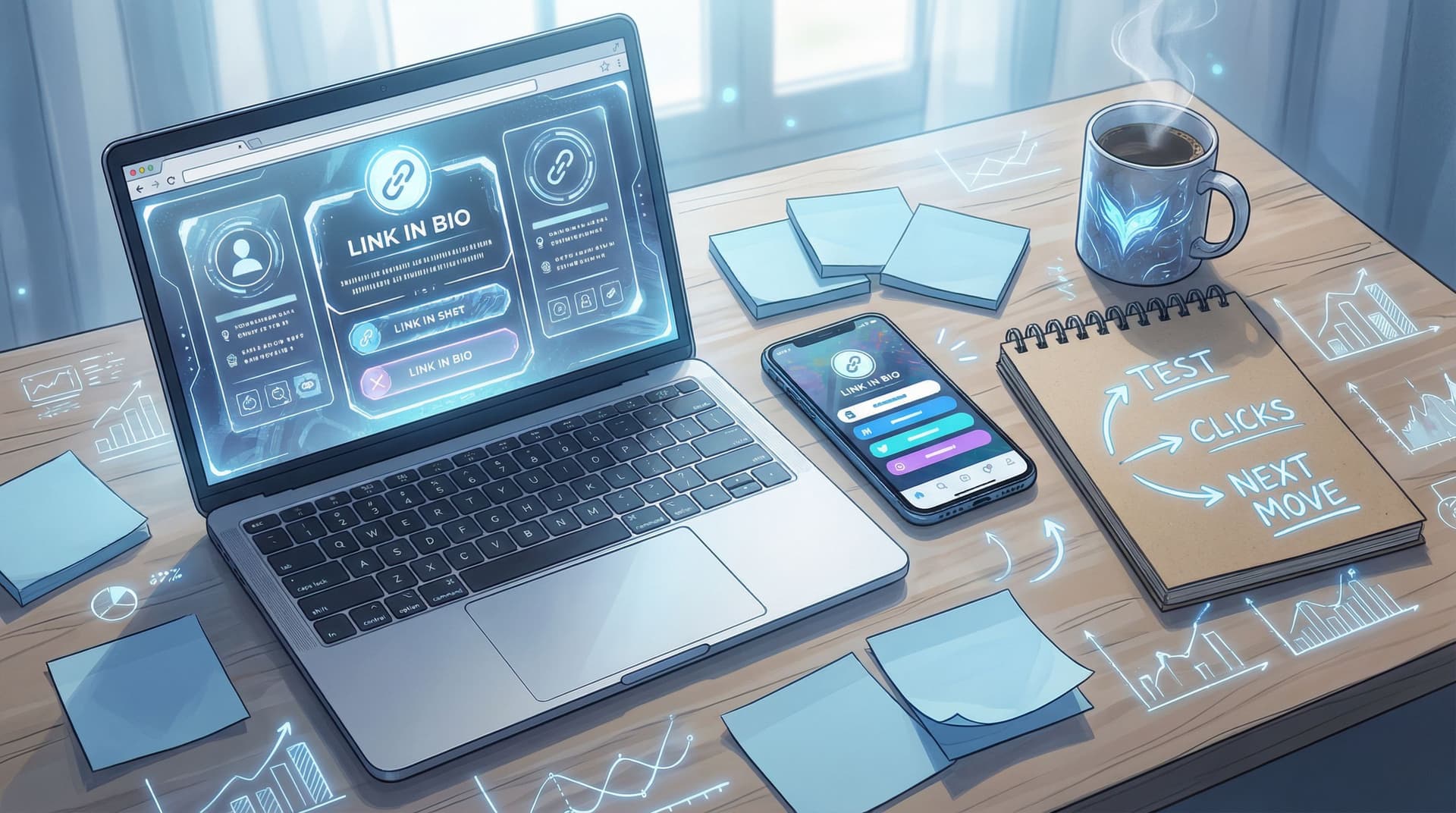
You need curiosity, a link in bio, and the willingness to run tiny experiments that feel almost too small to matter.
Spoiler: they matter.
Most creators hear “testing” and immediately picture complicated split tests, heatmaps, and graphs that look like they belong in a quarterly earnings report. Meanwhile, your real power lives in something much simpler:
Small, low-risk tweaks on your Liinks page that tell you what people actually want from you.
Let’s talk about those.
Why Tiny Experiments Beat Big Fancy A/B Tests
Traditional A/B testing is great if you have:
- A huge audience
- A dedicated analytics person
- Time to wait for “statistical significance”
If you have… none of those? Welcome, you’re in the right place.
Micro-experiments on your Liinks page are better for creators and small businesses because they’re:
- Fast – You can test something this afternoon and see directional results by tonight.
- Low-stress – No complex setup, no tech spiral, no “what even is a control group?” meltdown.
- Closer to the money – You’re testing right where high-intent people land, not on random passive scrollers.
Your bio link clicks are not casual. People who tap that link are already asking:
- “What should I do next with this person?”
- “How do I work with them / learn from them / buy from them?”
This is why we’re going beyond formal A/B testing and into something much more creator-friendly: tiny, repeatable experiments on your Liinks page that quietly reveal what your audience is craving.
If you want more context on why this page is such a power move, you might like to read The 10-Minute Link-in-Bio Audit: Quick Fixes That Make Your Page Look Instantly More ‘Pro’ after this.
Step 1: Decide What You’re Actually Trying to Learn
“Let’s test stuff” is not a strategy. Before you touch your Liinks layout, answer one question:
What decision do I want this experiment to help me make?
Some examples:
- Offer clarity – “Do people care more about 1:1 services or my group program?”
- Content direction – “Are they more interested in tutorials or behind-the-scenes?”
- Revenue focus – “Do they prefer low-ticket templates or my signature offer?”
- Audience segment – “Are more people here for my creator tips or my fitness coaching?”
Turn that big question into a simple experiment goal:
- “I want to know which offer should be my main CTA.”
- “I want to know what new visitors are most curious about.”
- “I want to know which freebie is worth turning into a paid product later.”
Write your goal somewhere you can see it. If you’re not sure what you’re testing for, you’ll end up changing things at random and learning… nothing.
Step 2: Set Up Your “Before” Screenshot (a.k.a. Your Baseline)
Before you start tinkering, capture where you’re starting from.
- Screenshot your current Liinks page (mobile view especially).
- Note what’s currently happening:
- What’s in your hero section?
- What are the first 3–5 links?
- Do you have any featured sections (testimonials, portfolio, services)?
- Write down your current metrics (even if they’re rough):
- Typical daily clicks on your top link(s)
- Overall click-through rate from social profile → Liinks page (if you’re tracking)
If you’ve never looked at your page this critically, this alone can be a mini audit. For a deeper clean-up pass, pair this with Link-in-Bio Red Flags: Design and Copy Mistakes That Make You Look Less Credible (and How to Fix Them).
Step 3: Pick One Tiny Variable (Seriously, Just One)
Micro-experiments work because they’re focused. Change ten things at once and you’ll have no idea what made the difference.
Here are creator-friendly variables you can test on Liinks:
1. The Very First Button
Your top button is prime real estate. Try:
- Swapping “Free Guide” and “Work With Me” to see which gets more love.
- Making your money link (#1 offer, shop, booking) the first button for a week.
What it tells you: Are people coming to buy/book… or to browse and learn?
2. Micro-CTA Copy
Same link, different words. For example:
- “Book a Consultation” → “Get 1:1 Strategy Help”
- “Free Training” → “Watch the 20-Minute Training Everyone Asks For”
What it tells you: Which framing or promise makes people actually tap.
If you want more inspiration here, bookmark From ‘Check Out My Stuff’ to ‘Book Me Now’: Rewriting Boring Link-in-Bio Copy into Clickable Micro-CTAs for later.
3. Section Order
Move entire sections up or down:
- Put social proof (testimonials, screenshots) above your main offer.
- Move your “Start Here” or “New? Watch this first” section to the top.
What it tells you: Do people need proof first, or are they ready to click straight into offers?
4. Format of the Same Thing
Test how you package the same idea:
- “Services” as a single button vs. a mini menu of specific services
- One “Free Resources” link vs. individual freebies listed out
What it tells you: Does your audience prefer a clear, singular path or a mini buffet of options?
5. Visual Emphasis
Without touching your overall brand, you can test:
- Turning one key button into an accent color.
- Adding a small emoji or icon to your main CTA.
- Using a short, bold subheading above your primary offer.
What it tells you: What actually catches their eye on a small screen.
Pick one of these. Write it down. That’s your variable.
Step 4: Design a 7-Day Liinks Experiment (That Won’t Break Your Brain)
Let’s keep this simple: you’re going to run one tiny experiment for roughly a week.
The 7-Day Micro-Test Plan
Day 0 – Prep
- Note your current average daily clicks for the link or section you’re testing.
- Screenshot your page.
- Write down your experiment goal and variable.
Days 1–7 – Run the test
- Make your one change inside Liinks.
- Don’t touch anything else major for the week.
- Post on social as you normally would (no need to announce anything).
Day 7 – Review
Ask:
- Did total clicks on that link/section go up, down, or stay about the same?
- Did people scroll further (if you see more clicks on lower links, your top change might be pulling them through)?
- Did you notice more DMs, replies, or questions about the thing you highlighted?
You are not writing a scientific paper here. You’re looking for clear directional signals.
If you want to be extra nerdy, you can:
- Compare weekdays to weekdays (don’t pit a Monday against a Sunday).
- Run the same test again later to confirm the pattern.
But most of the time, especially for solo creators, “Whoa, clicks doubled on that offer” is all the evidence you need.
5 Tiny Liinks Experiments You Can Steal (and Run This Month)
Let’s get specific. Here are plug-and-play experiments you can try, depending on your goals.
Experiment #1: “What Do New People Want First?”
Goal: Understand what fresh followers care about most.
Variable: Top hero section.
How to run it:
Week 1:
- Hero title: “New here? Start with my free [X].”
- Button: “Start Here → Free [X].”
Week 2:
- Hero title: “Ready to [desired outcome]? Work with me 1:1.”
- Button: “See Services & Pricing.”
What to look for:
- Which week saw more total clicks on the hero button?
- Did you notice more consult calls vs. more freebie downloads?
What it reveals:
- Are people primarily curious and warming up?
- Or are they already problem-aware and ready to invest?
Experiment #2: “Is My Audience More DIY or Done-For-You?”
Goal: Figure out whether to create more templates/courses or more services.
Variable: Side-by-side offers.
How to run it:
Create a mini two-column style section (or two stacked links clearly labeled):
- Link A: “DIY: Grab My Templates & Courses”
- Link B: “Done-For-You: Hire Me to Do It For You”
Run this for 7–14 days.
What to look for:
- Which link gets more clicks?
- Do clicks on one link lead to more inquiries or sales?
What it reveals:
- Where your next offer should probably live.
- Whether that big course idea or that retainer service deserves priority.
Experiment #3: “Which Freebie Is Worth Turning Into a Paid Offer?”
Goal: Identify your highest-demand topic.
Variable: Freebie theme.
How to run it:
List 2–3 freebies in a dedicated section:
- “30 Reels Hooks for Creators”
- “Client Onboarding Checklist”
- “Weekly Content Planning Template”
Keep their design consistent. Only the titles and descriptions differ.
What to look for:
- Which one gets the most clicks and sign-ups?
- Are people replying to your welcome email about a particular topic?
What it reveals:
- Where you should build a deeper product (course, workshop, or service) because people have already voted with their clicks.
Experiment #4: “Does Social Proof Actually Move the Needle?”
Goal: See how much testimonials matter for your specific audience.
Variable: Position of proof.
How to run it:
Week 1:
- Services section at the top.
- Testimonials/screenshot section lower on the page.
Week 2:
- Swap them: social proof above services.
If you’ve already collected proof, this pairs beautifully with the ideas in Screenshots Sell: How to Turn Social Proof into Strategic Liinks Sections That Quietly Close Clients.
What to look for:
- Any change in clicks on your main service/offer.
- Any change in inquiries or booking quality.
What it reveals:
- Whether your audience needs more “show me this works” before they click.
Experiment #5: “What Should I Feature for Brand Partners?”
Goal: Make your page more attractive to sponsors without building a full media kit.
Variable: Brand-facing section.
How to run it:
Add a small section just for brands:
- “For Brands & Collabs”
- Buttons: “See Past Partnerships” and “Request My Media Kit.”
Run for a month and track:
- Clicks on that section.
- Brand inquiries that mention finding you via your bio link.
What it reveals:
- Whether it’s worth building out a more robust sponsor section, like the ones we walk through in Brand Partnerships on Easy Mode: The Exact Liinks Sections That Make You Look ‘Sponsor-Ready’.
Step 6: Turn “Huh, Interesting” into Real Decisions
Data is only useful if it changes what you do next.
After each experiment, ask three questions:
-
What surprised me?
- “Wow, people clicked ‘Done-For-You’ way more than DIY.”
- “No one cared about that freebie I thought was genius.”
-
What will I do differently for the next 30 days?
- Move your winning offer to the top permanently.
- Retire underperforming links or demote them lower on the page.
- Create more content that points to what’s clearly resonating.
-
What’s the next tiny question I want to answer?
- “Okay, they like 1:1. Do they prefer audits or ongoing support?”
- “They love this freebie. What’s the natural paid next step?”
Then you design your next tiny experiment.
Over a quarter or two, this compounds into:
- A Liinks page that feels eerily aligned with what your audience wants.
- A set of offers and freebies that are proven by behavior, not vibes.
- Way less guesswork every time you launch or tweak your services.
Tools & Habits That Make Experiments Stick
You don’t need a massive tech stack, but a few simple habits help:
- Calendar reminders – Set a weekly reminder: “Review Liinks test results.”
- One notes doc – Keep a running log: date, variable, result, decision.
- Consistent posting – Try not to change your posting volume drastically during a test; you want the clicks to reflect the page changes, not a posting blackout.
- Quarterly review – Every 3 months, skim your experiment log. You’ll see patterns you’d never notice week-to-week.
If you want help planning your offers and layouts before you even start testing, AI-Assisted Link in Bio: Using ChatGPT and Liinks Together to Plan Offers, CTAs, and Layouts is a great next read.
Quick Recap: What You Learned (Without a Single Scary Graph)
We covered a lot, so here’s the short version:
- Your Liinks page is where your most serious people land. That’s why it’s the perfect place to run tiny experiments.
- You don’t need full A/B testing setups. You need one clear question, one variable, and 7–14 days of patience.
- Great experiment ideas include:
- Swapping your top button
- Testing micro-CTA copy
- Moving social proof above or below offers
- Comparing DIY vs. done-for-you clicks
- Highlighting brand-facing sections
- The goal is directional clarity, not perfection. If clicks clearly move in one direction, act on it.
- Over time, these micro-tests shape a page that sells more and confuses less.
Your Next Move: Run One Tiny Test This Week
Let’s make this practical.
Within the next 24 hours:
- Open your Liinks page.
- Pick one experiment from this post (or invent your own).
- Write down your goal and the one thing you’re changing.
- Set a reminder for 7 days from now to review what happened.
That’s it. No dashboards. No “when I have more followers.” Just one small, intentional tweak that teaches you something real about your audience.
Your followers are already voting with their clicks.
Use your Liinks experiments to finally listen.


