Beyond “Link in Bio” Lists: Turning Your Liinks Page into an Interactive Content Experience (Without Code)

Most people treat their bio link like a junk drawer: everything technically fits, nothing is easy to find, and no one enjoys opening it.
But that tiny tap from Instagram, TikTok, or X? That’s not casual traffic. Those are your most curious, most primed-to-take-action people.
So instead of dropping them onto a flat list of buttons, let’s do something more interesting:
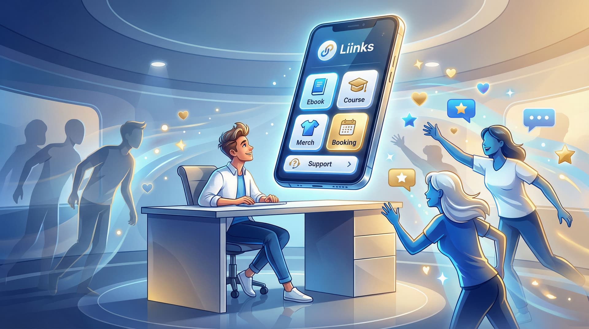
Turn your Liinks page into a mini interactive experience.
No code. No dev. No 57-tab tech stack. Just smart structure, a few no-code tools, and the customization superpowers you already have inside Liinks.
Why “Interactive” Beats “Here’s a Bunch of Links”
Think about the last time you tapped someone’s bio link.
You weren’t thinking, “Wow, I really hope I see a long, unstyled list of random URLs.”
You were thinking:
- “Where’s that thing they mentioned?”
- “How do I buy / book / sign up?”
- “What should I do next?”
An interactive Liinks page does three big things better than a static list:
1. It guides instead of overwhelms.
Quizzes, quick-choice menus, and segmented sections help people self-select where to go, instead of dumping every offer you’ve ever created in their lap.
2. It keeps people on the page longer.
When there are things to tap, scroll, expand, swipe, and explore, visitors stick around. That extra attention is pure gold for conversions, especially if you’re mapping a funnel from your page (which we break down more in From Clicks to Clients: Mapping a Simple Service-Based Funnel Using Only Your Liinks Page).
3. It quietly qualifies and warms your audience.
Interactive elements—like “choose your path” buttons or micro-offers—turn cold lurkers into warm leads before they ever hit your inbox. If you want to go deep on that, bookmark From Lurkers to Superfans: Using Micro-Offers on Your Liinks Page to Warm Up a Cold Audience.
Static lists tell people, “Here’s everything.”
Interactive pages say, “Here’s what’s right for you.”
Guess which one converts better.
Step 1: Decide What Kind of “Mini Experience” You’re Building
Before you start adding widgets, get clear on the job your Liinks page should do.
Ask yourself:
- Do I want more email subscribers?
- Do I want more booked calls or clients?
- Do I want more product sales?
- Do I want people to binge my content and get obsessed with me?
Pick one main goal (two max). Then choose your “experience style” to match.
A. The Quiz-First Experience (Lead Gen + Segmentation)
Best for: creators, coaches, and educators who want to grow an email list and point people to the right offer.
Your Liinks page becomes:
A “Start Here” hub that routes people into the right path via a quiz.
You can use no-code quiz tools like:
- Interact – popular for creator quizzes and email integrations
- EmbedQuiz – AI-assisted quiz builder with embeddable components
- Qzzr – simple quiz maker with branding and embed options
You don’t need to embed the whole quiz inside Liinks; you can:
- Build the quiz on one of those tools.
- Grab the share URL.
- Make your top button on Liinks something like: “Take the 60-Second Quiz to Find Your Best Next Step” and link out.
B. The Choose-Your-Path Experience (Navigation Without Overwhelm)
Best for: multi-passionate creators, service providers, and anyone with more than one audience type.
Your Liinks page becomes:
A clean menu where people sort themselves into the right lane.
Example structure:
- “I’m here to book a service” → section with your core services, pricing, and booking link
- “I’m here to learn / binge free content” → section with your top 3–5 pieces
- “I’m here to buy a product or template” → section with your bestsellers
This is especially good if you’re juggling multiple offers. For more on that, see The Multi-Passionate Creator’s Map: Structuring One Liinks Page When You Do… Everything.
C. The Micro-Offer Playground (Warm-Up + Low-Lift Sales)
Best for: creators with small, low-ticket offers, templates, or intro sessions.
Your Liinks page becomes:
A snack bar of tiny yeses—$9 products, 15-minute audits, mini-workshops—that warm people up before they buy the bigger thing.
You can:
- Stack 2–4 micro-offers near the top.
- Add clear, specific CTAs like “Get the $9 content calendar I use daily”.
- Sprinkle in proof (screenshots, testimonials) near those links.
Step 2: Design Your Page Like a Tiny App, Not a Flyer
If you want your Liinks page to feel like an experience, it has to look like one.
Inside Liinks, you already have control over layout, colors, fonts, spacing, and sections—so use them like a product designer, not a person panic-adding buttons.
Start with a Clear Above-the-Fold Moment
What someone sees without scrolling should:
- Tell them who you are
- Tell them what you do
- Give them one obvious next action
Try this simple stack:
- Profile area – your name, one-line positioning, and a strong visual (photo or logo).
- One hero CTA – e.g. “Start Here: Take the 60-Second Quiz” or “New? Watch This 3-Minute Intro.”
- Social proof hint – a short line like “Trusted by 1,200+ students” or “Seen in [Brand] / [Brand].”
Everything else can wait until they scroll.
Group Links into Intent-Based Sections
Instead of a single column of chaos, break your page into clear sections with headings.
Examples:
- Work with Me – your services, offers, booking links
- Start Here – intro video, quiz, or best beginner resource
- For Returning Clients – client portal, resource library, support links
- Free Stuff – your best freebies, guides, or workshops
This mirrors what we talk about in The 10-Minute Link-in-Bio Audit: Quick Fixes That Make Your Page Look Instantly More ‘Pro’, but with an extra layer of interactivity on top.
Make Buttons Feel Click-Worthy, Not Generic
You don’t need animations for your page to feel interactive. Micro-copy and visual hierarchy do a lot of the work.
Try:
- Specific labels – “Book a 20-Min Strategy Call” beats “Coaching.”
- Micro-promises – “Get my Notion content system (free)” or “See real client results.”
- Urgency without drama – “Next cohort starts March 4” or “Only 3 spots left this month.”
Use color intentionally:
- One primary color for your main CTA(s).
- One secondary color for supporting links.
- Neutral or minimal styling for “nice-to-have” links.
If everything screams, nothing speaks.
Step 3: Add No-Code Interactivity (Without Breaking Anything)
Let’s talk about ways to make your Liinks page feel interactive, even if everything is technically “just links.”
1. Quiz as a Guided Path
We touched on this earlier, but let’s make it concrete.
Your goal: segment people and guide them to the right offer or content.
What you’ll need:
- A quiz builder (e.g. Interact, EmbedQuiz, or Qzzr)
- An email service if you want to collect leads (ConvertKit, MailerLite, Flodesk, etc.)
Your flow:
- Create a short quiz (5–7 questions max) that answers something your audience actually cares about. Example:
- “What’s your content consistency type?”
- “Which offer should you launch next?”
- “What’s your skin-care routine personality?”
- Set quiz results to point to different next steps (e.g. a specific offer, playlist, or resource).
- Put your quiz link as the top CTA on your Liinks page.
- Underneath, add result-specific sections people can explore after they finish the quiz.
Even if the quiz itself lives off-site, the experience of starting there and coming back to a clearly-mapped Liinks page feels cohesive and intentional.
2. Micro-Offer Stack with Proof
If you sell anything, this one’s for you.
Your goal: turn curiosity into low-friction, low-ticket sales.
What you’ll need:
- A payment link or checkout tool (Stripe payment links, ThriveCart, Lemon Squeezy, Gumroad, etc.)
- 2–4 tiny offers ($7–$49) that solve very specific problems
Your flow:
- Create a section on your Liinks page titled something like “Tiny Offers, Big Wins”.
- Add 2–4 micro-offers with:
- A bold title
- One-line benefit
- Price in the button label (e.g. “Get the $12 Story Prompt Vault”).
- Direct each button to its checkout page.
- Directly below this section, add screenshots, testimonials, or quick stats about results (you can host a simple image gallery or link to a proof highlight).
This turns your page into a tiny, interactive storefront where people can browse, click, and buy without hunting through your whole internet footprint.
3. Content Playlists Instead of Random Links
Creators love linking every new piece of content individually. Your visitors do not love scrolling through that chaos.
Instead, think in playlists:
- “Binge the 5-Part Series on Building a Client Funnel”
- “Watch My Top 3 Reels on Pricing Your Services”
- “Start Here if You’re New to My World”
Your flow:
- Group your best content into 2–4 themed playlists.
- For each playlist, create a single landing page (this can be a YouTube playlist, a podcast page, a blog tag page, or a simple Notion/typed list).
- Add each playlist as its own link block on Liinks, with a fun, descriptive label.
Now your Liinks page feels like a curated content hub, not a never-ending archive.
Step 4: Add Light-Touch “Feedback Loops”
Interactivity isn’t just what people click. It’s how you listen and adapt.
You can add simple, no-code feedback loops right on or around your Liinks page.
Quick Polls & Surveys
Use tools like:
Create a one-question poll or a very short survey and link it from your Liinks page as:
- “Tell me what you want next (10 seconds)”
- “Vote on my next workshop topic”
This does two things:
- Makes visitors feel involved.
- Gives you actual data on what to create, launch, or promote.
DM or Voice Note Prompts
If your brand leans personal, add a link or CTA like:
- “Send me a 30-second voice note with your biggest question” (linking to something like Voxer or a simple DM)
- “Reply to this with your niche and I’ll send one content idea”
Is this technically “interactive content”? Not in the widget sense. But it turns your Liinks page into the starting point for real conversations.
Step 5: Make the Experience Flow Like a Funnel (Not a Maze)
A lot of creators accidentally build mazes: people click around, get lost, and leave.
You want a funnel: a clear, intentional path from curiosity to commitment.
Use this simple three-step structure on your Liinks page:
- Attention → Orientation
- Top-of-page hero section: who you are, what you do, one main CTA.
- Orientation → Exploration
- Choose-your-path or quiz link: let people self-sort based on their goals or stage.
- Content playlists and free resources to build trust.
- Exploration → Conversion
- Micro-offers, main offers, or booking links with clear, specific CTAs.
- Social proof and results near the conversion links.
If you’re a service provider, pair this with the structure in “Link in Bio” for Service Businesses: How Coaches, Stylists, and Photographers Can Turn Clicks into Booked Calendars so your interactive bits still lead to actual bookings.
Quick gut-check:
- Can a brand-new person land on your page and know what to do first in under 5 seconds?
- Can a warm follower land on your page and find how to buy or book in under 3 clicks?
- Is there at least one “low-commitment” action (quiz, freebie, poll) and one “high-commitment” action (buy, book, apply)?
If yes, your Liinks page is doing its job.
Step 6: Keep It Alive with Tiny, Regular Tweaks
The fun part about using Liinks as your interactive hub? You can update it in minutes.
Instead of rebuilding your page every quarter, make tiny weekly or biweekly tweaks:
- Swap your hero CTA based on what you’re currently promoting.
- Rotate which micro-offer is featured at the top of the stack.
- Add a temporary “This Week Only” section for pop-up offers or live events.
- Retire dead links and stale freebies that no longer reflect your best work.
If you have a big archive, use the ideas in The 5-Minute Content Refresh: Tiny Liinks Tweaks That Make Your Old Posts Feel Brand New to keep your best content in circulation without burning out.
The goal isn’t to make your page busier. It’s to make it feel current, intentional, and alive.
Quick Recap
We covered a lot, so here’s the highlight reel:
- Your bio link traffic is high-intent, so don’t waste it on a flat list of links.
- Decide your main goal first (subscribers, clients, sales, binge time) and build your Liinks page as a mini experience around that.
- Design your Liinks page like a tiny app: clear above-the-fold, intent-based sections, and buttons that say more than “click here.”
- Add no-code interactivity through quizzes, micro-offers, content playlists, and feedback loops.
- Make the whole thing flow like a funnel: orient → let them explore → give them obvious ways to commit.
- Keep it alive with small, regular tweaks instead of giant, once-a-year overhauls.
Your Liinks page doesn’t need to be bigger. It needs to be smarter.
Your Next Move (Yes, an Actual Action Step)
You knew this was coming.
Here’s what to do in the next 20–30 minutes:
- Open your current Liinks page in one tab and your social profile in another.
- Ask: “If someone taps this link right now, what’s the one thing I most want them to do?”
- Make that action your hero CTA at the top of your Liinks page.
- Add one interactive element from this post:
- A simple quiz link
- A micro-offer stack
- A content playlist
- A one-question feedback poll
- Remove or demote any link that doesn’t support that main goal.
You don’t have to build the perfect interactive experience today. You just have to move your page one step beyond “here’s a list of stuff.”
Open Liinks, pick your first interactive upgrade, and give your followers something worth tapping into.


