
Brand Partnerships on Easy Mode: The Exact Liinks Sections That Make You Look ‘Sponsor-Ready’

Brands are not stalking your follower count as hard as you think.
They are stalking something else: your link in bio.
When a brand is even mildly interested in working with you, they do exactly what your followers do:
- Tap your profile
- Skim your vibes
- Smash that bio link to see if you’re legit
If they land on a messy, half-updated page with random links and a 2022 freebie? That’s not “quirky creator energy.” That’s, “Cool, we’ll circle back… never.”
This is where a polished, intentional Liinks page quietly becomes your sponsorship magnet. You don’t need a media kit PDF, a 12-page website, and a brand manager. You need one tiny, well-structured page that screams:
“I know my audience, I know my offers, and I’m ready to make you money.”
Let’s build that.
Why Your Link in Bio Is Your Silent Pitch Deck
Brands are busy. They’re scanning creators at scale. Your Liinks page is often the first and only deep dive they’ll do before deciding whether to:
- Reach out with a collab opportunity
- Toss you onto a shortlist for a campaign
- Or quietly close the tab and move on
A sponsor-ready page does three things instantly:
- Shows what you do – niche, content style, and topics
- Shows who you influence – who your people are and what they care about
- Shows how you work with brands – clear offers, proof, and next steps
If you’ve already done some of the work from posts like “From Hobbyist to ‘Booked Out’: A Link-in-Bio Game Plan for Creators Turning Pro”, you’re halfway there. Now we’re just tuning that same page for brand partners, not just followers.
The Sponsor-Ready Blueprint: Sections to Add to Your Liinks Page
We’re going to walk through the exact sections that make a brand say, “Oh, they’ve done this before.” Even if you haven’t. Yet.
You don’t need to use every section name verbatim; think of these as blocks you can stack in your Liinks layout.
1. A One-Liner That Sounds Like a Campaign Tagline
The first thing on your page should not be a random “Hey, I’m Jess ✨.”
It should read like the headline of a pitch deck.
Your goal: one line that tells a brand who you are, who you reach, and what you’re known for.
Examples:
- Helping busy millennials romanticize their 9–5 with easy fashion & desk-life content.
- Plant-based food creator turning “I could never be vegan” into “Wait, this slaps.”
- Budget travel creator helping young professionals see the world without quitting their jobs.
How to implement on Liinks:
- Use a text block at the top as a mini “hero line.”
- Keep it short enough to read in one breath.
- Mirror the tone of your content (funny, warm, bold—just not vague).
This is the line a brand manager screenshots and drops in Slack with: “This is the vibe.”
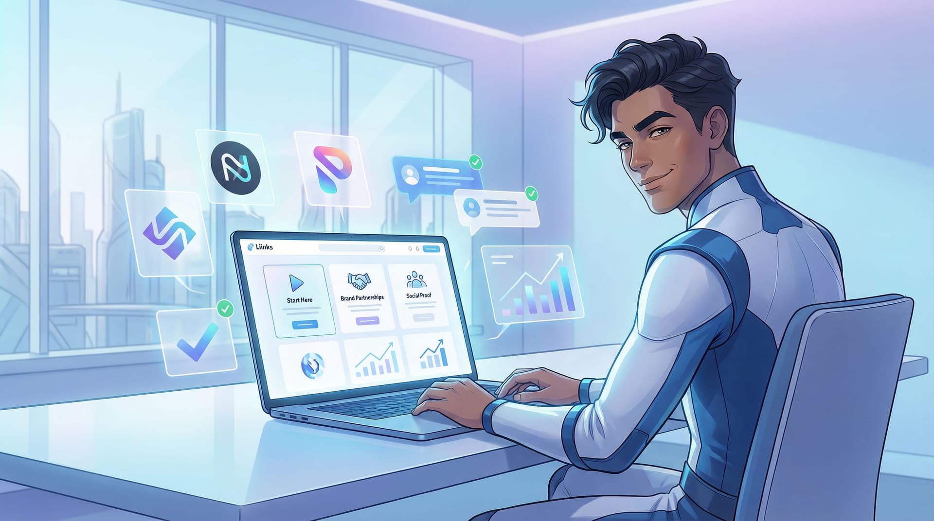
2. A “Start Here” Section for Curious Brands and Followers
Next, you want a small cluster of links that answer: “What should I look at first?”
This helps:
- New followers who just want your best stuff
- Brand reps who want a quick sense of your content range and performance
Create a section titled something like:
- Start Here
- New? Watch These First
- My Greatest Hits
Inside, add 3–5 links:
- Your top-performing YouTube video / Reel / TikTok
- A post that perfectly represents your brand (tone, visuals, niche)
- A piece of content that already features a brand integration (even if it was gifted)
- A link to your main offer or shop, if relevant
Pro tip: If you’ve already turned your page into a more interactive experience using the ideas in “Beyond ‘Link in Bio’ Lists: Turning Your Liinks Page into an Interactive Content Experience (Without Code)”, this is where you curate that experience specifically for brand scouts.
3. A Dedicated “Work With Me” / Brand Partnerships Section
If you want brand money, you need a section that literally says so.
Think of this as a mini landing page for sponsors, right inside your Liinks page.
Use a heading like:
- Brand Partnerships & Collabs
- Work with Me (for Brands)
- Creator + Brand Collabs
Then include 3–6 links that cover:
-
Overview of ways to work with you
Link to a simple Notion page, Google Doc, or hidden page where you outline options like:- Sponsored posts (Reels, TikToks, Shorts)
- Story integrations
- UGC content packages
- Affiliate partnerships
- Long-term ambassadorships
-
Simple contact or inquiry form
Use tools like Tally, Typeform, or Google Forms and link it as:- Brand & Collab Inquiries
- Request My Media Kit / Rates
-
Optional: media kit link
If you already have one, great. If not, don’t stress. A clean Liinks page plus a clear overview doc can absolutely do the job while you build one. -
Rate-free option
Some brands just want to start a conversation. Include a link that says something like:- Not sure what you need? Start here → (goes to your contact form)
Design tips inside Liinks:
- Use a different background color or accent to visually separate this section.
- Use short, punchy micro-CTAs on your buttons (you can borrow ideas from “From ‘Check Out My Stuff’ to ‘Book Me Now’: Rewriting Boring Link-in-Bio Copy into Clickable Micro-CTAs”).
4. Social Proof That Feels Like a Case Study, Not a Flex
Brands want to know: “Can this creator move the needle?”
You don’t need a 12-slide case study deck. You need a social proof section that quietly says, “Yes, I can.”
Create a section titled:
- Results & Receipts
- What My Audience Actually Does
- Proof It Works
Inside, you can mix and match:
- Screenshots of high-performing posts (views, saves, shares)
- Story replies like “Bought this because of you!” or “Just ordered!”
- Short testimonials from past brand partners or clients
- Screenshots of affiliate dashboards (blur out sensitive numbers if needed)
Upload these as images hosted somewhere (Drive, Dropbox, etc.) and link them, or link to a simple gallery page.
If you want to go deeper on structuring this, “Screenshots Sell: How to Turn Social Proof into Strategic Liinks Sections That Quietly Close Clients” walks through exactly how to format these so they feel persuasive, not chaotic.
Bonus move: Add 1–2 quick text blurbs like:
- “My audience loves practical, budget-friendly skincare—my last GRWM sold out a cleanser in 48 hours.”
- “Typical content: tutorials, ‘come shopping with me,’ and realistic day-in-the-life vlogs.”
Brands don’t just want numbers; they want context.
5. Audience Snapshot in 30 Seconds or Less
You do not need a full demographics report on your Liinks page. But a tiny audience snapshot is a power move.
Add a short text block or link titled something like Who I Create For and include:
- Age range (rough): “Mostly 22–34”
- Location: “Primarily US, UK, and Canada” (or wherever is true for you)
- Interests: “Skincare, wellness, realistic routines, affordable style”
- Platform behavior: “They love tutorials, GRWMs, and ‘shop with me’ content.”
You can pull this from your platform analytics and your own observations.
Why this matters: brands are matching their target customers with your audience. Make that match obvious.
6. Offers and Products That Show You Can Sell
If you’ve sold anything—your own product, an affiliate rec, a digital download—this is great news for brands. It shows you’re not just “vibes,” you’re conversion-friendly.
Create a section like:
- Shop My Stuff
- Offers & Resources
- Things My Audience Buys
Inside, link to:
- Your own products (courses, templates, presets, guides)
- Your main affiliate storefront (e.g., Amazon Storefront, ShopMy, LTK)
- Any bundles or collections that already perform well
This does double duty:
- Helps followers buy from you
- Shows brands you already know how to drive purchase behavior
If you’re a service provider (coach, designer, photographer, etc.), this section is also where you can feature services that complement brand work—like UGC packages or content creation services. Posts like “From Followers to Freelance Clients: Turn Your Liinks Page into a Booking Machine (Without a Full Website)” can help you structure that side.
7. A Clear, Low-Friction Way for Brands to Reach You
Do not make a brand dig through DMs and comment sections to figure out how to contact you.
You want one obvious, low-friction path for brand outreach.
Options:
- A dedicated Brand Inquiry Form (Tally, Typeform, etc.)
- A mailto link to your collab email
- A Calendly link for “Brand Discovery Calls” (if you’re at that stage)
Label the link clearly:
- Brand & Partnership Inquiries →
- Book a Brand Collab Chat →
- Request My Media Kit & Rates →
Place this link:
- Near the top of your Brand Partnerships section, and
- Once more near the bottom of your page as a final nudge
Remember: the more steps someone has to take to reach you, the more likely they are to bail.
How to Arrange These Sections So Brands Actually Scroll
You’ve got the ingredients. Now let’s plate them.
A simple sponsor-ready layout on Liinks might look like this:
-
Hero one-liner
One sentence that nails who you are + who you serve. -
Start Here / Greatest Hits
3–5 links to your best, most representative content. -
Brand Partnerships Section
Ways to work with you + brand inquiry form. -
Social Proof / Results
Screenshots, testimonials, performance highlights. -
Audience Snapshot
Short text block with who follows you and what they care about. -
Offers & Products
Your shop, services, or affiliate hubs. -
Final Nudge
A repeated “Brand Inquiries” link at the bottom.
Think of the scroll like a story:
“Here’s who I am → here’s proof I’m good at this → here’s who I influence → here’s how we can work together.”
Quick Copy Tweaks That Make You Look 10x More Professional
You don’t need corporate jargon, but you do need clarity.
Swap vague labels for specific, sponsor-friendly copy:
- Instead of “New video” → “Watch: 30-day skin reset routine (50k+ views)”
- Instead of “My Amazon” → “Shop the exact products I use in my GRWM videos”
- Instead of “Work with me” → “See how brands partner with me (+ examples)”
A few guidelines:
- Lead with outcomes, not platforms. Brands care what your content does.
- Mention metrics sparingly (only where they’re impressive and relevant).
- Avoid underselling language like “just,” “little,” “random,” “maybe.”
If writing this stuff makes your brain melt, steal frameworks from that micro-CTA post I mentioned earlier: “From ‘Check Out My Stuff’ to ‘Book Me Now’: Rewriting Boring Link-in-Bio Copy into Clickable Micro-CTAs”.
Make It Look Like You Didn’t Throw It Together in One Night
Is design the only thing that matters? No.
Does it matter a lot? Yes.
Brands are scanning for signal vs. chaos. A polished Liinks page gives “organized, reliable, understands brand standards.”
A few low-lift design moves:
- Pick 1–2 brand colors and use them consistently for buttons and accents.
- Use hierarchy: bigger text for section titles, smaller for descriptions.
- Limit yourself to 6–10 primary links; tuck everything else into secondary sections.
- Use spacing—don’t cram everything into one endless, unbroken column.
If this feels overwhelming, do a quick pass using ideas from “The 10-Minute Link-in-Bio Audit: Quick Fixes That Make Your Page Look Instantly More ‘Pro’” and then come back to add sponsor-specific sections.
A 30-Minute Build Plan (So This Actually Gets Done)
Let’s be honest: you are one scroll away from saying “I’ll do this later” and forgetting.
Here’s a simple 30-minute plan to make your Liinks page sponsor-ready today:
Minute 0–5: Draft your one-liner
- Open a notes app.
- Write 5 messy versions of your “I help X do Y” sentence.
- Pick the least cringe one and paste it into a text block at the top of your Liinks page.
Minute 5–15: Build your three core sections
-
Start Here / Greatest Hits
- Add 3–5 links to your best content.
-
Brand Partnerships
- Create a quick Notion or Google Doc outlining ways to work with you.
- Spin up a simple inquiry form.
- Add both as links.
-
Brand Contact
- Add a clearly labeled link to your collab email or form.
Minute 15–25: Add proof + audience snapshot
- Grab 3–5 screenshots of DMs, comments, or high-performing posts.
- Upload them somewhere and link as a mini gallery.
- Add a short text block summarizing who your audience is.
Minute 25–30: Clean up the visuals
- Choose consistent button styles and colors.
- Nudge your Brand Partnerships section higher on the page.
- Remove or demote any random, outdated links that don’t serve brands or buyers.
Done. Is it perfect? No. Is it miles more sponsor-ready than “here’s a random list of stuff”? Absolutely.
TL;DR: What Makes a Liinks Page Look Sponsor-Ready
If you skimmed (it’s okay, brands skim too), here’s the core checklist:
- One clear, confident one-liner at the top
- A curated “Start Here” cluster of your best content
- A dedicated Brand Partnerships section with:
- Ways to work with you
- A simple inquiry form or email
- Social proof: screenshots, testimonials, performance highlights
- Audience snapshot: who follows you, where they are, what they care about
- Offers / products section to show you can sell
- Polished design: consistent colors, spacing, and intentional link order
If a brand can answer, in under 60 seconds:
“Who is this creator? Who do they influence? How do we work with them?”
…you’re in a very good spot.
Your Next Step (Yes, Right Now)
Open your current link in bio on your phone.
If it doesn’t:
- Greet brands with a clear one-liner
- Show them your best content first
- Make it painfully easy to see how to work with you
…then your next move is simple:
- Head to Liinks.
- Add a Brand Partnerships section using the blueprint above.
- Give yourself 30 minutes to ship a “good enough” sponsor-ready version.
Brands are already clicking your bio. The question is whether what they see says, “Cute content!” or “Let’s send a contract.”
Let’s aim for the second one.


