
The “One Niche, Many Offers” Blueprint: Using Liinks to Sell Digital Products, Services, and Memberships from a Single Page

You know that moment when someone taps your bio link and gets hit with:
“My ebook! My course! My 1:1 calls! My group program! My newsletter! My dog’s Instagram!”
…and then they quietly close the tab?
You’re not the problem. Your offer sprawl is.
If you’re serious about your niche, you probably don’t just have one thing to sell. You’ve got:
- A low-ticket digital product
- A signature service or 1:1 offer
- A membership or community
- Maybe a workshop replay, template pack, or mini-course on the side
The question isn’t “Should I sell multiple things?” It’s:
How do I sell multiple offers from one niche without confusing everyone (including myself)?
That’s where the “One Niche, Many Offers” blueprint comes in—and why a flexible, design-forward link-in-bio tool like Liinks is basically your control center.
We’re going to turn your bio link into a tiny, beautiful storefront where:
- Every offer has a clear place and purpose
- Your best buyers know exactly where to click
- You can add, test, and retire offers without rebuilding your entire business
Let’s build it.
Why “One Niche, Many Offers” Beats “One Offer, Forever”
A lot of advice online sounds like: “Just pick one offer and scale it to the moon.”
Cute. Also: unrealistic for most creators and small businesses.
Your audience doesn’t all want the same thing. Inside your niche, you’ve got:
- Beginners who want quick wins and low-commitment offers
- Serious-but-busy people who want you to shortcut the process for them
- Superfans who want to go all-in, hang out with you in a membership, and buy everything you make
A single offer can’t do all of that well.
A smarter approach is:
One clear niche → multiple offers at different price points and depths → one simple place to find them all.
That “one simple place” is your Liinks page.
If you like this kind of systems thinking, you’ll probably also love using your bio as a quiet testing lab—see how creators are doing that in The “Quiet Launch” Playbook.
Step 1: Get Ruthlessly Clear on Your One Niche
Before we touch layouts or buttons, you need one sentence:
“I help [who] do/achieve [what] with/through [how].”
Examples:
- “I help freelance designers book better clients with better portfolios.”
- “I help busy moms build strength at home with 30-minute workouts.”
- “I help beginner creators land their first 5 paid brand deals without a manager.”
Everything on your Liinks page should be able to answer: Does this directly serve that sentence?
If not, it’s not an offer. It’s clutter.
Quick exercise (do this in your Notes app):
- Write your one-sentence niche.
- List every offer you currently have.
- For each, answer: “How does this help that specific person get that specific result?”
- If you can’t answer in one line, it doesn’t belong on your main page (yet).
Step 2: Map Your “Many Offers” Like a Menu, Not a Pile
Your goal is not “list everything I sell.”
Your goal is “guide the right person to the right offer in under 5 seconds.”
Think like a restaurant menu:
- Clear sections
- Logical order
- Obvious “house specials”
The 3 Core Offer Types
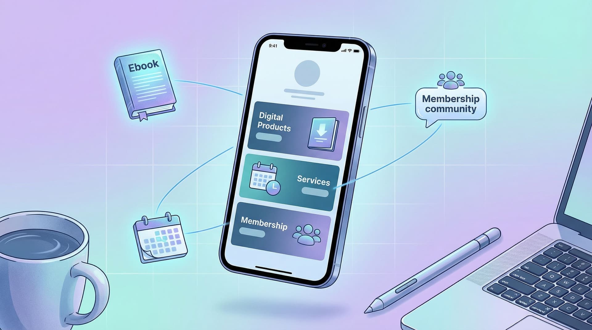
Most creators and small businesses can fit their offers into three buckets:
- Digital Products
- Ebooks, templates, presets, Notion dashboards, workshop replays, mini-courses.
- Services
- 1:1 calls, done-for-you packages, audits, retainers.
- Memberships / Communities
- Patreon, private Discord, subscription programs, content libraries.
You do not need a separate website section for each of these. You just need a smart layout on your Liinks page.
If organization is not your love language, bookmark Stop Guessing, Start Grouping for a deeper dive on using content buckets to make your page actually findable.
Step 3: Design Your “One Niche, Many Offers” Liinks Layout
Let’s turn this into an actual page.
The Basic Structure
Here’s a simple, high-converting layout you can build in Liinks in under an hour:
-
Hero section: who you are + what you do
- Short headline that matches your niche sentence.
- One subheading clarifying who you’re for.
Example:
- Headline: “Systems & strategy for freelance designers.”
- Subhead: “Templates, trainings, and 1:1 support to help you raise your rates and stop ghosty clients.”
-
Primary CTA (your main money-maker)
- One standout button (different color, bigger, or with an icon).
- This is your core offer: usually your main service or flagship digital product.
-
Offer sections by type
Use section headers and group links:- Digital Products
- Services
- Membership / Community
-
Soft offers + nurture
- Newsletter sign-up
- Free lead magnet
- Social links
-
Proof
- A few testimonials, logos, or “as seen in” mentions.
Layout Tips That Quietly Boost Sales
-
One star of the show.
Don’t make people guess what you want them to buy. Use size, color, or placement to make one offer obviously “the main thing.” -
Group by outcome, not format (optional pro move).
Instead of “Digital Products / Services / Membership,” you could group by what people want:- “Start here (quick wins)”
- “Work with me (done-with-you / done-for-you)”
- “Go all-in (membership & community)”
-
Cut the zombie links.
If you haven’t mentioned an offer in months and it hasn’t sold itself? Archive the link. You can always bring it back.
For more layout nerdiness (and how to keep skimmers from bouncing), check out SEO for Attention Spans Under 8 Seconds.
Step 4: Give Each Offer a Mini Sales Page… in One Line
On a Liinks page, your link title + description are your sales copy.
Each offer should answer three questions at a glance:
- Who is this for?
- What result does it help them get?
- How “big” is the commitment? (price, time, energy)
A Simple Formula for Offer Links
Title: result-focused name
Description: “For [who] who want [result] in [timeframe] without [annoying thing].”
Examples:
-
Client-Ready Portfolio Kit
For freelance designers who want a polished portfolio in a weekend without rebuilding their whole website. -
90-Min Strategy Call
For creators who want a custom content + offer plan without signing up for a long-term program. -
Design Business Membership
For designers who want monthly trainings, templates, and support to grow to $5k+ months without burning out.
This makes it easy for someone to scan your Liinks page and instantly know:
- “Oh, that’s for me.”
- “That’s where I should start.”
Use Visual Hierarchy Like a Grown-Up Brand
On your page:
- Make your main offer button visually distinct (accent color, icon, or slight size bump).
- Use consistent emojis or icons per category:
- 📘 for digital products
- 🤝 for services
- 🌐 or 💬 for memberships/communities
- Keep titles short and punchy; let descriptions do the clarifying.
If you want your page to look like your Instagram, TikTok, and website had a very attractive baby, you’ll love The ‘Link in Bio’ Style Guide.
Step 5: Connect the Back-End: Payments, Delivery, and Access
Your Liinks page doesn’t process payments itself; it’s the hub that sends people to the right checkouts and access points.
For each offer type, you’ll connect:
1. Digital Products
Common tools:
- Gumroad – simple for ebooks, templates, and small products.
- Lemon Squeezy – great for digital products, especially if you care about VAT handling.
- SendOwl – solid for file delivery and license keys.
What to link from Liinks:
- Direct product checkout page
- Or a simple product landing page if you need more copy
2. Services
Common tools:
- Calendly or SavvyCal – for booking calls with payment.
- TidyCal – budget-friendly alternative.
- Dubsado or HoneyBook – for more complex service workflows.
What to link:
- A booking page that includes: description, price, FAQs, and intake form.
3. Memberships / Communities
Common tools:
- Patreon – creator-focused memberships.
- Circle or Skool – community + course hub.
- Discord (with Gumroad or Memberful for paid access).
What to link:
- Membership sales page or direct checkout.
Rule of thumb: every button on your Liinks page should send people to one of three things:
- A checkout page
- A booking page
- An email capture / waitlist
If it doesn’t move them closer to buying, booking, or joining? It’s optional.
Step 6: Stack Your Offers Without Overwhelming People
You can sell multiple things from one page… if you respect people’s attention and decision-making.
Use an “Offer Ladder”
Think of your offers as steps:
- Free / Low-Friction – lead magnets, free guides, low-ticket products.
- Core Paid – your main product or service.
- Deep-Dive / Ongoing – memberships, retainers, high-ticket programs.
On your Liinks page, signal this ladder clearly:
- Add small labels in your descriptions: “Best place to start”, “For existing clients”, “Advanced”.
- Put your core paid offer near the top, with your freebie just below or above it.
Limit Choices per Category
Analysis paralysis is real. Instead of listing 14 digital products, try:
- 1–3 “featured” products on your main Liinks page
- A link that says “Browse all templates” or “Full product library” that goes to a separate hub
This way, your main page sells your best stuff, not all stuff.
Step 7: Make Your Page Work Harder Than Your Content
Once your “One Niche, Many Offers” layout is live, the fun part starts: you don’t have to constantly re-link everything.
Every time you mention an offer in content, you can:
- Point to one link in bio
- Use specific CTAs like: “Tap my link in bio and hit ‘Client-Ready Portfolio Kit’ at the top.”
To make that even smoother, pair this setup with a high-intent strategy like the one in The High-Intent Link in Bio. It’ll help you attract people who are actually ready to buy, not just browse.
Track What’s Actually Working
Even a simple system can give you useful data:
- Rotate which offer is in the primary CTA spot for a week at a time.
- Watch which links get the most clicks.
- Retire or rework offers that consistently get ignored.
Your Liinks page becomes a live dashboard of what your audience actually wants—not just what you think they want.
Quick Recap
You don’t have a “too many offers” problem. You have a “no one can tell what to do next” problem.
The “One Niche, Many Offers” blueprint fixes that:
- One clear niche – Know exactly who you help and how.
- Many aligned offers – Digital products, services, memberships that all serve that same person.
- One simple hub – A clean, on-brand Liinks page that:
- Highlights your main offer
- Groups the rest logically
- Connects straight to payment, booking, or sign-up
- Smart hierarchy – Offer ladder, limited choices, clear labels.
- Ongoing tweaks – Use your page as a tiny experiment lab to see what people actually click.
When you nail this, your bio link stops being a random list of stuff and starts feeling like a tiny, confident storefront for your entire business.
Your Next Move (Yes, This Is Your Nudge)
If your current setup is “a pile of links and a prayer,” here’s a simple first step:
- Open your existing bio link (or your notes).
- Write your one-sentence niche.
- Pick one core offer you want to sell the most this month.
- Create or refresh your Liinks page so that:
- Your hero text matches your niche
- That core offer is the most obvious button on the page
- Your other offers are grouped and clearly labeled
You can add the fancy stuff later. For now, give your audience one niche, many offers, and one clear path to buy.
Your content is already doing the hard work of getting people curious.
Let your Liinks page finish the job.


