
Aesthetic Meets Algorithm: How Design Choices on Your Liinks Page Quietly Boost SEO

You know that friend who’s effortlessly good-looking and somehow also aces every exam? That’s what we’re going for with your link-in-bio.
Your page shouldn’t just be pretty; it should be suspiciously effective.
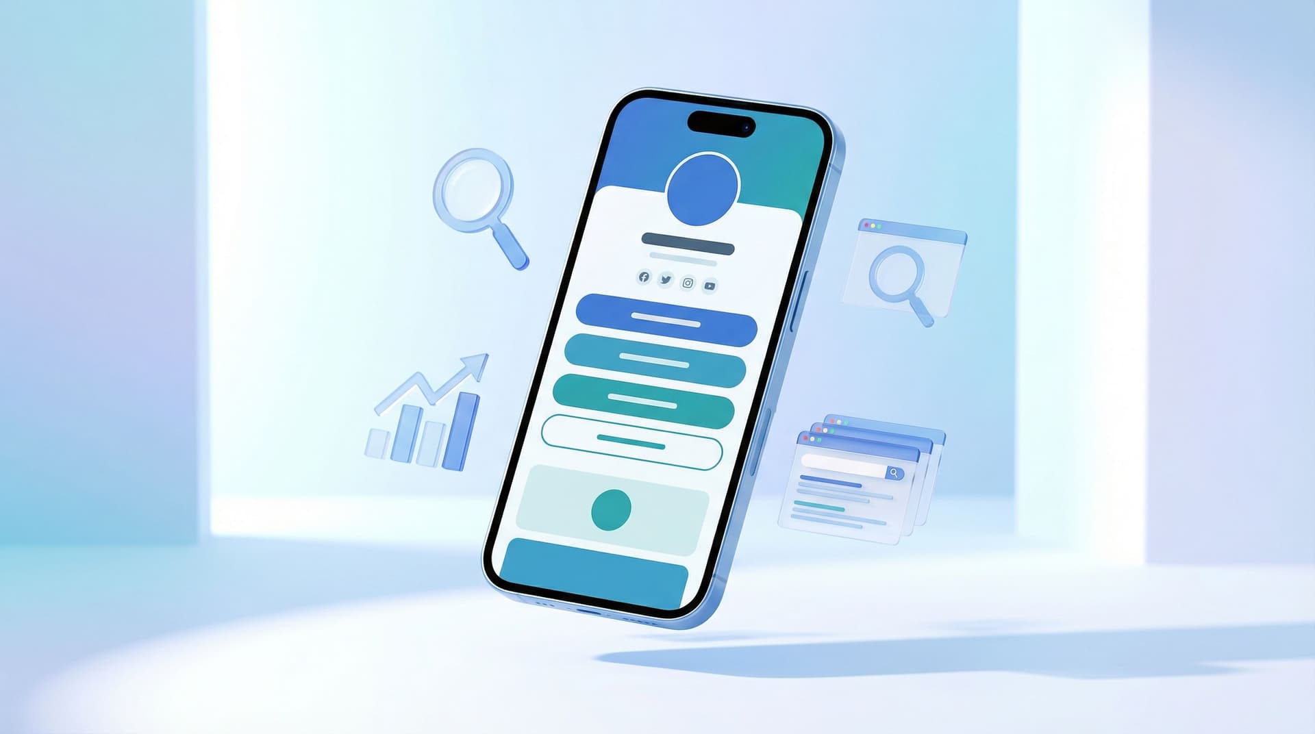
When you’re using Liinks, you already care about aesthetics. Clean layouts, on-brand colors, cute buttons—vibes are handled. But here’s the part most creators and small businesses miss:
The same design decisions that make your Liinks page look good are also sending quiet signals to Google.
Layout, colors, fonts, button labels, even how far people have to scroll—these all affect:
- How long people stay on your page (dwell time)
- Whether they bounce immediately
- How many links they click
- Whether search engines see your page as helpful and trustworthy
And yes, that rolls up into SEO.
This isn’t about stuffing keywords into tiny buttons. It’s about designing a page that humans love using—because search engines are increasingly using that as a ranking clue.
Let’s break down how to make your Liinks page do double duty: gorgeous and quietly algorithm-friendly.
Why Your “Cute” Liinks Page Is Secretly an SEO Asset
Your Liinks page can show up when people Google:
- Your name or brand
- Your handle (e.g.
@yourusername) - Your niche plus your name (e.g.
“Taylor social media templates”)
If you’ve read SEO for People Who Don’t Want a Website: How to Make Your Liinks Page Actually Rank, you already know this is possible.
Here’s the twist: once someone actually lands on that page, design takes over.
Well-designed pages tend to:
- Load faster and feel smoother to use
- Keep people around longer
- Make it obvious what to click next
Those behaviors—longer dwell time, lower bounce rate, more interaction—are strong hints to search engines that your page is worth showing to more people.
So no, your color palette alone won’t get you to page one. But the way you use design absolutely nudges the algorithm.
The Three Overlooked Design Signals That Matter for SEO
Think of this as your “SEO, but make it aesthetic” checklist.
1. Visual Clarity = People Staying Longer
If someone lands on your Liinks page and instantly understands:
- Who you are
- What you offer
- Where to click next
…they’re going to hang out longer and actually explore.
That extra time on page is a quiet SEO win.
To get there, design for clarity:
- Use a strong, readable heading at the top.
- Bad:
Welcome ✨ - Better:
Templates, Courses & Coaching for Busy Creators
- Bad:
- Keep contrast high. Cute low-contrast text (light gray on beige) is great for screenshots, terrible for real humans.
- Limit chaos. A hundred buttons, all the same visual weight, screams “I don’t know what matters here.”
If you need help deciding what does matter, hop over to The Creator’s Offer Menu: Structuring Your Liinks Page So No Click Is a Dead End for a deep dive.
2. Layout & Scannability = More Clicks (and Better Signals)
Search engines can’t see your design… but they can see what people do with it.
A scannable layout encourages:
- More link clicks
- More time spent exploring
- Fewer “nope” back-button exits
Design for scanning by:
- Using clear sections. Group related links together instead of one endless button stack.
- Adding micro-headings. Little labels like
Start Here,Popular Resources, orWork With Meguide the eye. - Keeping “one scroll” in mind. The most important stuff should be discoverable in a single, calm scroll—not a wrist workout.
If you want to turn that scroll into a tiny sales page, bookmark The ‘One Scroll’ Strategy: Designing a Liinks Page That Sells Before Anyone Ever Clicks.
3. Speed & Stability = Core Web Vitals Without the Headache
Google cares about whether your page:
- Loads quickly
- Responds fast when people tap
- Doesn’t jump around while loading (layout shift)
You don’t have to memorize acronyms like LCP and CLS, but you do need to avoid design choices that slow things down or make the page feel janky.
On your Liinks page, that means:
- Not overloading with heavy GIFs and giant images
- Avoiding weird, slow-loading embeds above your main content
- Keeping fonts and colors consistent instead of loading 6 different font families
Good news: Liinks is already lightweight and fast by default. Your job is mostly “don’t sabotage it.”
Turning Design Choices into SEO Power Moves
Let’s get practical. Here’s how to design your Liinks page so it quietly charms both humans and algorithms.
1. Start With One Clear Purpose (Per Page)
If your page is trying to:
- Get newsletter signups
- Sell products
- Book calls
- Promote events
- Showcase your portfolio
…all at once, no one (including Google) can tell what it’s for.
Pick a primary goal, then design around it.
Ask yourself:
“If someone only spends 10 seconds on this page, what’s the one thing I want them to do?”
Then:
- Make that link visually louder (color, size, position)
- Put it near the top
- Support it with a short line of copy that explains the benefit
Everything else? Still there, just visually quieter.
2. Use Hierarchy Like a Designer, Think Like a Search Engine
Visual hierarchy is how you signal importance with:
- Size
- Color
- Placement
- Spacing
On your Liinks page, hierarchy helps both humans and algorithms understand what matters.
Try this structure:
- Top area: Identity & promise
- Profile image or logo
- Name / brand
- One-line positioning statement
- 1–2 primary CTAs
- Middle: Organized resource sections
Free ResourcesShop My ProductsWork With Me
- Bottom: Deep cuts & socials
- Secondary links
- Social profiles
This layout keeps your main goal above the fold while still giving Google and visitors a sense of depth and relevance.
3. Write Button Text That Humans (and Google) Understand
Design isn’t just color and layout—it’s also language.
Button labels like Click here or More are a missed opportunity. They don’t help visitors, and they don’t tell search engines anything about what’s behind the link.
Instead, use descriptive, benefit-driven text:
Get my free content calendarShop Lightroom presetsBook a 30-minute strategy callRead my latest tutorials
This does three things:
- Sets clear expectations (fewer bounces)
- Encourages the right people to click
- Gives search engines more context about your content
If you’re stuck, use AI as your tiny copy chief—AI as Your Tiny Creative Director: Using ChatGPT to Draft On-Brand Copy, CTAs, and Layouts for Your Liinks Page walks you through exactly how.
4. Keep Your Design Consistent With Your Other Profiles
Search engines look at your whole presence: social profiles, Liinks page, mentions on other sites. When everything feels like the same brand, you’re building trust.
Design consistency looks like:
- Using the same profile photo on Liinks and social
- Matching your main brand colors
- Re-using the same tagline or short bio
For humans, this creates that “oh yep, I’m in the right place” feeling.
For search engines, it’s one more signal that this page is the real hub for your name and niche.
5. Use Sections to Reduce Choice Paralysis (and Boost Clicks)
One long list of 27 links is a great way to get… no clicks.
People don’t want to scroll through a mystery stack. They want a menu.
Use Liinks’ layout options and grouping to:
- Separate links into content buckets (
Learn,Shop,Work With Me) - Put 3–7 links in your most important section—enough choice, not overwhelming
- Move old or seasonal links into a clearly labeled
ArchiveorPast Launchessection
If you want a system for this, Stop Guessing, Start Grouping: How to Use Content Buckets to Organize Your Liinks Page (So People Actually Find Stuff) is your new best friend.
6. Avoid Design Decisions That Quietly Hurt SEO
Some aesthetic choices are harmless. Some are sneaky little conversion killers.
Watch out for:
- Low contrast text. If people have to squint, they’ll leave.
- Tiny tap targets. Buttons that are hard to tap on mobile = frustration.
- Overusing animations. A subtle hover? Fine. A page full of bouncing elements? Distracting and sometimes slow.
- Image-only buttons with no text. Cute, but inaccessible and less clear for search.
A good rule: if a design choice makes the page harder to read or use, assume it’s bad for SEO too.
A Simple 20-Minute “Aesthetic + SEO” Tune-Up for Your Liinks Page
Ready to actually do this? Here’s a quick workflow you can run this week.
Step 1: Open Your Page on Mobile
Most of your visitors are coming from social, which means they’re on their phones. So:
- Open your Liinks page on your actual device
- Scroll through like a brand-new visitor
Ask yourself:
- Do I know who this person is within 3 seconds?
- Is there one obvious next step?
- Do I feel overwhelmed by options?
Step 2: Fix the Top 20% That Drives 80% of Results
Tackle the top of the page first:
- Rewrite your main heading to clearly state who you are and what people can get.
- Choose one primary CTA and make that button visually dominant.
- Move any “just in case” links lower down the page.
Step 3: Group and Label Your Links
- Create 2–3 sections with clear labels.
- Drag links into the section where they logically belong.
- Trim anything outdated or irrelevant.
You don’t have to delete old links—just move them into a lower-priority section.
Step 4: Clean Up Your Visuals
- Switch any low-contrast combinations to something more readable.
- Standardize fonts (one main font, maybe one accent).
- Remove any heavy, slow-loading images that aren’t doing real work.
Step 5: Refresh Copy for Clarity and Keywords
Without turning your page into a keyword salad, lightly weave in:
- Your niche (
fitness coach,brand designer,copywriter) - Your offers (
templates,courses,coaching,shop)
Examples:
Brand Designer for Creators | Templates, Courses & 1:1 IntensivesEmail Copywriter | Weekly Newsletter, Services & Free Resources
Then:
- Make sure button text clearly says what’s behind the click.
Step 6: Check Analytics After 1–2 Weeks
Once your new design has been live for a bit, peek at your Liinks analytics:
- Did overall clicks go up?
- Is one section or button clearly outperforming the rest?
- Are people scrolling further than before?
Use that data to keep iterating—The Aesthetic Data Nerd: Using Analytics to Design a Better-Looking (and Better-Performing) Liinks Page is a great next read if you want to nerd out here.
Quick Recap: How Design Quietly Boosts Your SEO
Let’s tie this together:
- Clarity keeps people on the page. Clean hierarchy and readable text increase dwell time and reduce bounces.
- Scannable layouts drive more clicks. Grouped links and clear sections make it easier for people (and algorithms) to understand what your page is about.
- Speed and stability matter. Lightweight visuals and simple design help your Liinks page feel snappy, which search engines like.
- Consistent branding builds trust. Matching your Liinks page to your socials helps both humans and search engines connect the dots.
- Smart copy does double duty. Descriptive button text and headings guide people and give search engines context.
Your Liinks page doesn’t need to be a full website to pull its SEO weight. It just needs to be intentional.
Your Next Move: Make One Design Upgrade That Also Helps SEO
You don’t have to rebuild your entire page today.
Pick one of these to do in the next 15–20 minutes:
- Rewrite your main heading to clearly say who you are and what you offer.
- Choose a single primary CTA and make that button visually louder.
- Create 2–3 labeled sections and drag your links into them.
- Fix any low-contrast text so your page is easy to read on mobile.
Then open your analytics in a week or two and see what changed.
If you’re not using Liinks yet, this is the perfect moment to set up a page that looks like your brand and behaves like your quiet little SEO assistant.
Pretty and powerful. That’s the goal.


