How to Split a Photo Into an Instagram Grid With the Liinks Instagram Grid Maker

Someone taps your profile for the first time. Before they read a single caption, before they even register your bio, they see a block of nine squares. That block is your first impression, and for most accounts it is nine unrelated thumbnails fighting each other for attention.
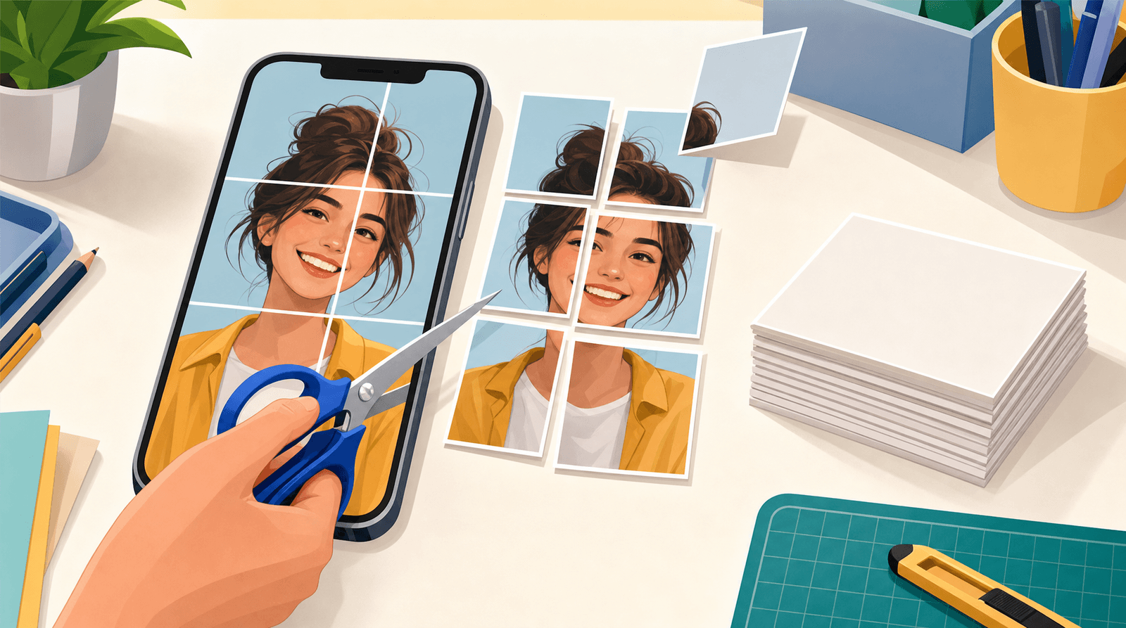
A puzzle grid changes that. One image, sliced across nine posts, so the top third of your profile reads as a single deliberate picture instead of a pile of recent uploads. It is an old trick. It also still works, because the profile grid is one of the last surfaces on Instagram that you fully control: no algorithm decides what order those tiles appear in, only you do.
The reason more people do not run one is not taste. It is logistics. Slicing an image into nine perfectly aligned tiles means cropping to the right aspect ratio, cutting on exact pixel boundaries, exporting nine files, and then posting them backwards, because Instagram puts the newest post in the top-left slot. Miss one step and you have a broken mural sitting permanently on your profile.
The free Liinks Instagram Grid Maker handles all of it. Upload one image, pick a grid, download numbered tiles, post them in order. No account, no watermark, no upload to anyone's server.
The thing most grid tools still get wrong
Start here, because it is the part that silently ruins murals made with older tools.
Instagram's profile grid used to be square. Every guide, template, and splitter tool written before the change assumes 1:1 tiles. But the profile grid is 4:5 portrait now. When you post a square image, Instagram crops its left and right edges to fill that taller cell.
For a normal photo that crop is a minor annoyance. For a mural it is fatal. Every tile loses a strip from each side, which means every seam in your nine-piece image is missing a slice of picture. The waves do not meet. The horizon jumps. Your carefully aligned mural looks like it was assembled by someone who was not paying attention, and there is no fixing it short of deleting nine posts.
So the Grid Maker leads with 4:5 and defaults to it. Square is still there, because people slice images for things other than Instagram profiles, but switching to it puts a warning right under the button:
If you take one thing from this post: use 4:5. Whatever tool you use, whatever template you downloaded in 2022, check the aspect ratio before you cut.
Meet the Liinks Instagram Grid Maker
The Instagram Grid Maker is one of the free tools Liinks builds for creators and small businesses. Open the page, drop in an image, and the grid appears on the right.
A few things worth knowing before you start:
- Your image never leaves your browser. The slicing runs on a canvas on the page. Nothing is uploaded, so there is no queue, no processing wait, and no copy of your unreleased artwork sitting on a stranger's server.
- Tiles export at full resolution. 1080 by 1350 pixels each in portrait, 1080 by 1080 in square. That is Instagram's native size, so nothing gets resampled on upload.
- Filenames carry the posting order. Each downloaded tile starts with its post number, which is the whole reason a puzzle feed is survivable.
- There is no sign-up. You do not need a Liinks account to use it.
The walkthrough, step by step
1. Pick an image that can survive being cut
Not every photo makes a good mural. Before you upload anything, run it past three questions:
- Does it read at a glance? Your grid will be viewed at about 120 pixels per tile on a phone. Fine detail disappears. Bold shapes, strong colour blocks, and clear silhouettes survive; a busy crowd photo does not.
- Is anything important sitting on a seam? Your face, your logo, your product. Grid lines will cut straight through them. Compose so the focal point lands inside a tile, not across the join.
- Is it big enough? A 3 by 3 portrait grid needs 3240 by 4050 pixels to export at full quality. The tool tells you if your image is smaller and warns that the tiles will look soft. Take that warning seriously: soft tiles are the second most common way murals go wrong.
2. Upload it
Drag the file onto the drop zone or click to browse. PNG, JPG, WebP, and GIF all work. Once it loads you will see the filename and the source dimensions, so you can immediately tell whether you cleared the resolution bar.
3. Choose a grid size
Seven presets, and the three-column ones are what you want for a profile:
| Preset | Posts | What it is for |
|---|---|---|
| 3 × 1 | 3 | A single banner strip across the top row |
| 3 × 2 | 6 | A short mural, quicker to fill and quicker to retire |
| 3 × 3 | 9 | The classic. One screen of profile, fully controlled |
| 3 × 4 | 12 | A taller feature, for a launch or a full campaign |
| 3 × 5 | 15 | A long-form mural. Commit before you start |
| 2 × 2, 4 × 4 | 4, 16 | For slicing images for something other than Instagram |
Be honest about the commitment. A 3 by 5 grid is fifteen posts you cannot delete individually without leaving a hole, and every new post you make afterwards pushes the whole thing down. 3 × 2 and 3 × 3 are the sweet spot for most accounts: enough impact to be noticed, few enough posts that you are not locked into one image for a month.
4. Confirm the tile shape
Portrait 4:5, unless you have a specific reason not to. See above.
5. Use the preview toggles
Two switches sit under Preview, and both are worth flipping before you download anything.
Post numbers overlays each tile with the order to post it in. Look closely at the numbering and you will see it runs backwards: the bottom-right tile is 1, the top-left tile is 9. That is not a bug, it is the whole trick, and we will come back to it in a second.
Grid gaps adds thin gutters between tiles so you can see roughly how the mural will look on a real profile, where tiles do not quite touch. If your design depends on a line running perfectly across a seam, this is where you find out whether it reads.
Neither toggle affects the export. Downloaded tiles are always clean, full-bleed images with no numbers and no gaps.
6. Download
Download all saves every tile in one go, staggered slightly so your browser does not block the batch. Or click any single tile to download just that one, which is handy when you fumble a post and need to redo one piece.
Every filename starts with its post number, so your downloads folder sorts itself into posting order. Do not rename them.
Posting it without breaking it
This is where most puzzle feeds die, so read this bit twice.
Instagram stacks the newest post in the top-left slot and pushes everything else right and down. Which means the finished mural is assembled in reverse: the piece that ends up in the bottom-right corner has to be posted first, and the piece that ends up top-left has to be posted last.
The Grid Maker has already done that maths for you. The numbers on the preview and the numbers on the filenames are posting order, not reading order. So:
- Post tile 1 first. It will land top-left and look meaningless on its own.
- Post tile 2. The first tile slides right.
- Keep going in order, one at a time, until tile 9.
- When the last tile lands, the mural snaps into place.
Three practical rules while you do it:
- Post them in one sitting. A half-finished mural is confusing at best and looks broken at worst. If you cannot do all nine in one go, use a 3 × 1 or 3 × 2 grid instead.
- Do not post anything else in between. One unrelated photo dropped into the middle shifts every tile by one slot and destroys the alignment permanently.
- Write captions that stand on their own. Each tile is a real post that appears in real feeds. Someone scrolling their timeline sees a slice of an abstract shape with no context. Give each one something to say, or at minimum a consistent line that signals it is part of a set.
What to actually put in the grid
The tool is the easy part. Deciding what deserves nine posts is the real work. Four formats that consistently earn their space:
The banner. A 3 × 1 strip across the top of your profile with your name, your offer, or your tagline built into the artwork. It is a header for an account that does not have one, and at three posts it is cheap to run and cheap to replace.
The launch. Your product, your album cover, your book jacket, spread across nine tiles the week it drops. The grid works as an announcement that lives on your profile instead of vanishing from feeds in six hours.
The portfolio wall. For photographers, illustrators, and designers: one hero piece cut into nine, so the profile itself is the portfolio. This is the version people screenshot.
The countdown. A mural that only resolves when the last tile lands, posted over a few hours on launch day. Slightly risky, since an unresolved grid looks odd mid-build, but the payoff when it completes is genuinely good.
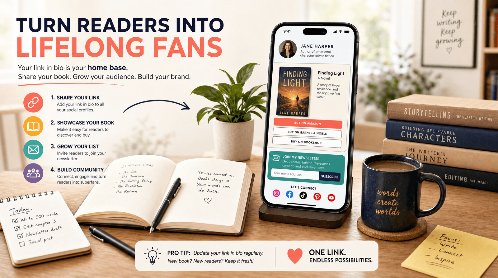
Whichever you pick, the same rule from Stop Designing Your Link-in-Bio for Strangers applies here: you are not designing for the person who has never heard of you, you are designing for the person who just tapped your name because something you made caught their eye. They are already curious. The grid's job is to confirm they are in the right place.
Give the grid somewhere to send people
Here is the trap with a puzzle feed: it is very good at making people stop, and completely incapable of making them do anything.
A mural earns you attention and a profile visit. What converts that visit is the one clickable line on the whole page, your link in bio. If it points at a homepage, or at whatever you were promoting three weeks ago, you have spent nine posts on a beautiful dead end.
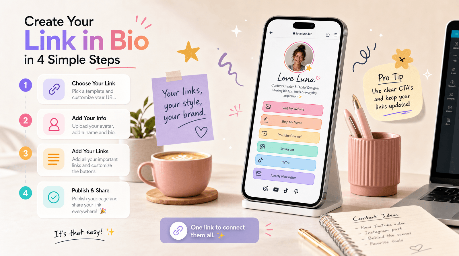
A Liinks page fixes the mismatch. Put the thing the mural is about at the top: the album, the launch, the shop, the booking form. Add your other links underneath in the order people actually want them. Then check the analytics to see which one they tapped, so the next mural points at something you know works.
Two things worth setting up before you post tile 1:
- Match the page to the grid. If the mural is a product launch, the first block on your Liinks page should be that product. The visual continuity from grid to page is what makes the click feel obvious rather than optional.
- Have it ready before the last tile lands. The traffic spike from a completed mural happens in the hours right after, not the week after. This is the same argument as Going Viral Is the Easy Part. Being Ready Is the Hard Part., and a puzzle feed is a spike you can actually schedule.
While you are in the free tools, the Social Media Image Resizer pairs well with this one: use the Grid Maker for the profile mural, then resize the same artwork for stories, X, and your newsletter header without recropping it four times.
TL;DR
- Instagram's profile grid is 4:5 portrait, not square. Square tiles get cropped on the sides and your mural will not line up. Use 4:5.
- The free Liinks Instagram Grid Maker slices one image into 3 to 15 numbered tiles, in your browser, with no account and no upload.
- A 3 × 3 grid needs a source image of at least 3240 by 4050 pixels. The tool warns you if yours is smaller.
- Tiles export at Instagram's native 1080 by 1350, and each filename starts with its posting number.
- Post in reverse. Instagram puts the newest post top-left, so tile 1 goes up first and tile 9 goes up last. The tool has already worked out the order.
- Post the whole set in one sitting, with nothing in between, and write captions that make sense on their own.
- Point the grid at something. Get your link in bio matched to the mural before the last tile lands.
Try it
The Instagram Grid Maker is free, needs no sign-up, and runs entirely in your browser. Drop in an image and see what your profile could look like.
Then give it somewhere to go. A Liinks page collects your shop, your latest drop, and every link you share into one place, with analytics that tell you which one people actually tap. Build yours in a few minutes at liinks.co.