How to Create a Free Open Graph Image With the Liinks Open Graph Image Generator

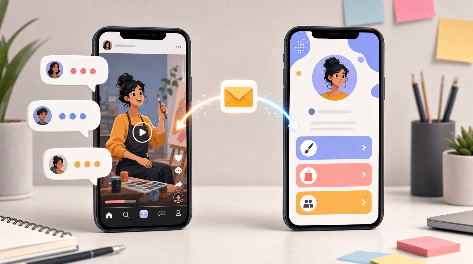
You spent an hour writing the post. You picked the right hook, trimmed the caption, and finally dropped your link in. Then the preview loads: a gray box, a broken thumbnail, and a URL that reads like a receipt.
That preview is the first thing most people see before they decide whether to click. Not your caption. Not your bio. The card. And when it looks like a placeholder, people scroll past a link they might have loved, because the wrapper told them it wasn't worth the tap.
The card has a name: it's your Open Graph image, the picture that platforms pull in whenever your link gets shared. Most creators never touch it, because designing one used to mean opening Photoshop, guessing the right dimensions, and exporting a file you hoped would fit. The new Liinks Open Graph Image Generator removes all of that. It's free, there's no sign-up, and you can have a polished share card downloaded before your coffee gets cold.
What an Open Graph image actually is (and why it decides your click rate)
"Open Graph" is the shared standard that Facebook, X, LinkedIn, Discord, iMessage, Slack, and nearly every other platform use to build a preview when someone pastes a link. The platform reads a few hidden tags on the page and assembles a card: a title, a short description, and an image. That image is the Open Graph image, and it's almost always the biggest, loudest element in the preview.
Here's the part people miss: the link preview is a piece of visual real estate you don't control by default. If you never set an Open Graph image, the platform grabs whatever it can find, which is often nothing useful. A logo scaled to mush. A random screenshot. Blank space. And a blank card reads as low effort to the exact audience you're trying to convert.
A good Open Graph image does three quiet but important jobs:
- It takes up more space in the feed. A card with a real image is physically bigger than a bare link, so it stops the scroll.
- It sets an expectation. A clean, on-brand card signals that whatever is on the other side is also clean and worth your time.
- It carries your brand into places you'll never post directly. Every time someone shares your link in a group chat or a Slack channel, your card goes with it. That's free reach, but only if the card looks like something.
The difference between those two cards isn't design talent. It's five minutes and the right tool.
Meet the free Liinks Open Graph Image Generator
The Open Graph Image Generator is one of the free tools Liinks builds for creators and small businesses, no account required. You open the page, design your card in the browser, and download a PNG. Nothing gets uploaded to a server, nothing asks for your email, and the whole thing runs on the page in front of you.
It builds your image at exactly 1200 by 630 pixels, which is the standard Open Graph size that every major platform expects. That single detail solves the most common self-inflicted problem with share images: uploading something at the wrong ratio and watching the platform crop the important part right out of frame.
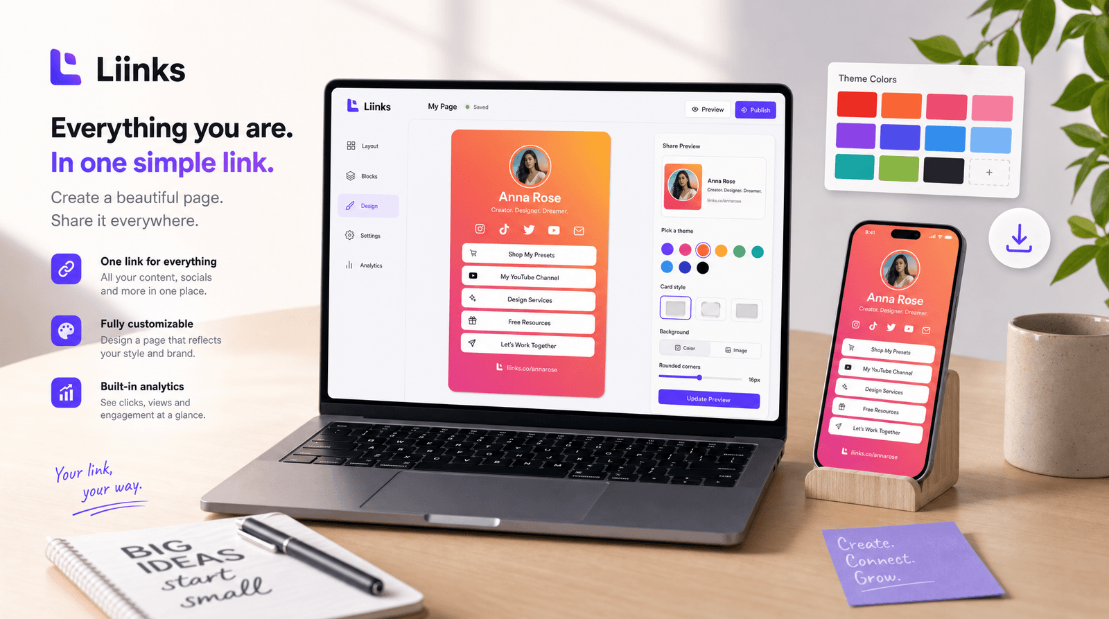
Everything on the left updates the live preview on the right in real time, so you're never guessing what the final file will look like. Here's what you're working with.
Six themes to match your brand
The generator ships with six ready-made themes: Ocean, Midnight, Sunset, Forest, Grape, and Light. Five are bold gradients and one is a clean white card with a colored accent, so you can go loud or go minimal depending on your brand. Pick the one that's closest to your vibe and the text colors adjust automatically for contrast, so nothing you type will disappear into the background.
Text fields that do the thinking for you
You get four text areas, and each one maps to how people actually read a card:
- Eyebrow (optional): a small, all-caps label above the headline, like "NEW ON THE BLOG" or "FREE WORKSHOP." It gives context in a glance.
- Title: the headline, and the thing people read first. Keep it punchy.
- Description: a sentence or two that supports the title without repeating it.
- Footer: your handle or link, like
yourname.liinks.co, with a small colored dot so it reads as a signature rather than an afterthought.
You can also switch the alignment between left and center depending on whether you want an editorial or a poster feel.
Your logo, dropped right in
There's an optional logo slot with drag-and-drop upload. Add a PNG, JPG, SVG, or WebP and it sits cleanly above your text, sized correctly so it never looks stretched. This is the single fastest way to make a card feel like yours instead of a template.
One button, one file
When the preview looks right, you hit Download PNG and you're done. You get a real 1200x630 image file, ready to attach to a page, a post, or a product. No watermark, no export settings to fumble with.
How to make your share card in under five minutes
If you want the fastest possible path from blank page to finished card, here's the workflow.
- Open the tool. Go to liinks.co/open-graph-image-generator. No login, nothing to install.
- Pick a theme first. Choose the one closest to your brand colors before you write anything. It's easier to write text against a background you can already see.
- Write the title like a headline, not a sentence. "How to Grow a Newsletter From Zero" beats "Some thoughts on my newsletter journey." Front-load the value.
- Add an eyebrow for context. A short label like "NEW EPISODE" or "LIMITED SPOTS" tells people what kind of link this is before they read a word of the title.
- Keep the description to one idea. It's supporting text, not a paragraph. One clear promise is plenty.
- Drop in your logo. This is the step most people skip and the one that makes the biggest difference. It turns a nice template into your card.
- Set the footer to your Liinks URL. Your
yourname.liinks.cohandle in the footer means anyone who sees the card knows exactly where to find everything else. - Download the PNG. That's your file. Reuse it, or make a fresh one for each launch.
The trick is to treat the card like a tiny billboard. You have about one second of attention in a busy feed, so one strong image, one strong headline, and your name. That's the whole job.
Where the OG image fits into your Liinks page
An Open Graph image isn't a one-off asset. It's part of how your whole Liinks presence shows up when it travels beyond your own feed.
Inside your Liinks profile, the social share settings let you set a Custom Image for exactly this purpose, so when someone shares your link-in-bio page, your designed card is what loads instead of a generic screenshot. The generator and your page are built to work together: design the card once, set it as your custom share image, and every share of your page carries your branding.
Once your card is live, you'll want to confirm it renders correctly across platforms. That's what the free Open Graph Debugger is for. Paste any URL and it shows you exactly how the preview will look on Facebook, X, LinkedIn, and more, so you catch a broken card before your audience does instead of after. The two tools are a natural pair: make the image with the generator, then sanity-check it with the debugger.
And if your goal is clicks, the card is only the first domino. Once someone taps through, the page they land on has to hold up. That's a design and copy problem worth its own attention: we cover the details in Stop Losing Clicks: Common Link-in-Bio Mistakes and How to Fix Them, and if you care about how your page surfaces when people search inside social apps, How to Optimize Your Link-in-Bio for Social Search is the companion read.
The Open Graph Image Generator also sits alongside the rest of the free Liinks toolkit. If you liked how fast this one was, the same no-sign-up approach powers tools like the Liinks Favicon Generator, which handles the other tiny-but-mighty piece of your online brand.
TL;DR
- Your Open Graph image is the preview card platforms show when your link gets shared. A blank or broken card quietly costs you clicks.
- The free Liinks Open Graph Image Generator builds a perfectly-sized 1200x630 card in your browser, with no sign-up and no upload.
- Pick from six themes, add an eyebrow, title, description, footer, and your logo, then download a ready-to-use PNG.
- Set that image as your Custom Image in your Liinks social share settings so every share of your page carries your branding.
- Check it renders correctly with the free Open Graph Debugger before you rely on it.
Make your links look like they're worth the click
The link preview is the one piece of your marketing that shows up in places you'll never post: group chats, DMs, Slack channels, other people's timelines. You don't get to write a caption in those places. All you get is the card. So make the card do the work.
Design yours in a couple of minutes with the free Open Graph Image Generator, set it on your profile, and give every share of your Liinks page a first impression that actually earns the tap. Your future clicks will thank you.