
Should I Use a Mobile-First Website Builder?

As smartphones and tablets continue to dominate internet usage, having a mobile-friendly website is no longer optional—it’s essential. Enter mobile-first website builders, tools specifically designed to prioritize mobile design before adapting to larger screens. But is a mobile-first builder right for you? In this post, we’ll explore what it means to be mobile-first, the advantages of using these tools, and factors to consider when making your choice.
What Does Mobile-First Mean?
A mobile-first website is a website that’s designed primarily for mobile users, with larger screen versions built out from the mobile design. Mobile-first design means that everything, from layout to images to load times, is optimized for smaller screens before being adapted to desktop.
Mobile-first website builders are tools that streamline this process, giving you design templates, tools, and features tailored to mobile users. Many builders even include elements like touch-friendly buttons, single-column layouts, and fast-loading visuals to enhance the mobile experience.
Why Mobile-First Matters
In today’s digital landscape, mobile-first design is crucial for several reasons:
- Mobile Traffic Dominates: Mobile devices account for over half of all global web traffic. A mobile-first website ensures that your audience has an optimal experience on the device they’re most likely to use.
- Improves User Experience: Mobile-first websites are designed with touch navigation, smaller screens, and faster loading times in mind, making it easier for users to navigate and interact with your site.
- SEO Benefits: Google’s algorithm favors mobile-first websites when ranking search results. Mobile-first design can give you an edge in search engine rankings, helping your site appear higher in search results.
- Higher Conversion Rates: Mobile-friendly websites tend to have better conversion rates since users can easily navigate the site and access what they need, leading to more sales or sign-ups.
Pros of Using a Mobile-First Website Builder
A mobile-first website builder offers several advantages that can benefit your brand or business:
- Optimized for Mobile from the Start: These builders prioritize mobile experience, which means less manual work to ensure your site looks good on smartphones and tablets.
- Pre-Designed Mobile Templates: Many mobile-first builders offer professionally designed templates that are optimized for mobile devices, making it easier to create a modern, functional website quickly.
- Fast Loading Times: Mobile-first builders focus on efficiency and speed, as mobile users tend to expect sites to load quickly. The streamlined design elements often lead to faster loading times, which is great for user experience and SEO.
- Better User Engagement: With mobile-optimized features like touch navigation, larger buttons, and scroll-friendly layouts, mobile-first websites encourage users to engage and explore.
- Easier Maintenance: Since mobile-first builders prioritize simplicity and functionality, they’re often easier to maintain and update, saving you time and effort.
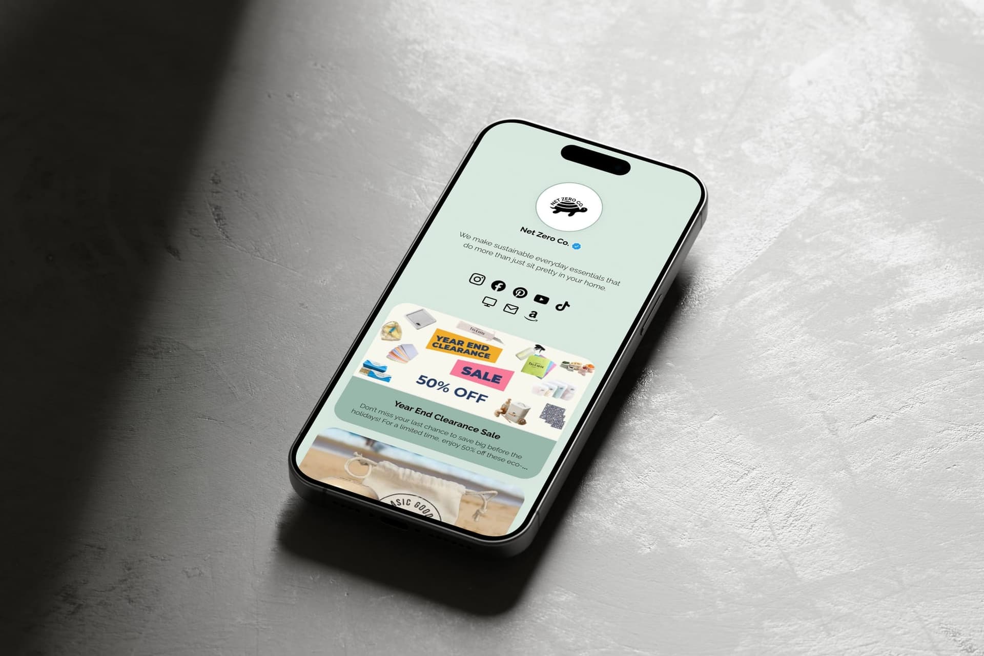
Liinks is a popular mobile-first website builder### Potential Drawbacks of Mobile-First Builders
While mobile-first builders have many benefits, there are some limitations to consider:
- Limited Desktop Customization: Because mobile-first builders prioritize mobile design, desktop versions may lack some customization options, which might be a drawback for desktop-heavy industries.
- Simplified Design Elements: Mobile-first builders are often streamlined, so they may not support complex desktop features or multi-column layouts that work well on larger screens.
- Content and Layout Restrictions: To ensure fast loading times on mobile, some mobile-first builders limit the types of content or visual elements you can add, which could restrict creativity.
Should You Use a Mobile-First Website Builder?
Deciding whether to use a mobile-first website builder depends on your goals, target audience, and the type of experience you want to deliver. Consider the following:
- Do You Have a Mobile-Centric Audience?: If a significant portion of your audience is browsing on mobile devices, a mobile-first website builder could be the perfect solution to create a seamless experience for them.
- Is Speed a Priority?: If loading times and user engagement are top priorities, a mobile-first approach can help you achieve a fast, responsive website.
- Is Desktop Functionality Essential?: If you need a highly interactive or complex desktop version, you may want a builder that offers both mobile-first and desktop options.
How Liinks Can Support Your Mobile-First Strategy
If you decide to go mobile-first, tools like Liinks can help you optimize your site’s functionality even further. With Liinks, you can create a clean, customizable link-in-bio page that’s designed with mobile users in mind. Perfect for directing traffic to multiple pages, products, or social profiles, Liinks ensures your visitors can access everything you offer from one convenient mobile-friendly page.
Ready to embrace mobile-first?
Liinks can be an excellent complement to your mobile-first website, helping you keep all your essential links in one place, optimized for mobile users.


