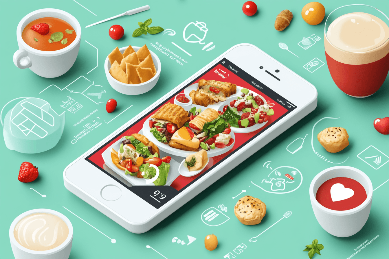
When people are searching for their next meal or drink, they’re often doing it on their phones. Whether it’s checking out a restaurant menu, finding a food truck’s location, or ordering takeout, mobile users expect a fast and seamless experience. For food and drink businesses, having a mobile-first website isn’t optional—it’s critical to attracting and retaining customers.
A mobile-first approach prioritizes usability and functionality on smartphones and tablets, ensuring your website delivers a great experience no matter where your audience is. Here are some ideas to help you create a mobile-first website that works as hard as you do.
1. Feature a Clear and Accessible Menu
Your menu is the heart of your website, and mobile users need it to be easy to read and navigate:
- Make It Interactive: Organize your menu with collapsible categories (e.g., starters, mains, drinks) to avoid overwhelming users.
- Use Images Strategically: Include high-quality photos of key items to make your offerings irresistible.
- Highlight Key Details: Add dietary information (e.g., vegan, gluten-free) and pricing for clarity.
- Focus on Readability: Use legible fonts and ensure text isn’t too small for mobile screens.
2. Simplify Online Ordering and Reservations
Convenience drives customer loyalty. Make sure your mobile site offers:
- Easy Ordering: Integrate with delivery platforms or build your own ordering system for pickup or delivery.
- Streamlined Reservations: Include a mobile-friendly reservation tool for booking tables.
- Real-Time Updates: Display availability for tables or estimated delivery times to manage customer expectations.
3. Optimize for Local Searches
Many customers are searching for businesses nearby. To capture their attention:
- Embed a Map: Include an interactive map showing your location with tap-to-navigate directions.
- SEO for Local Keywords: Optimize your site for phrases like “best tacos near me” or “coffee shop downtown.”
- Click-to-Call Buttons: Allow customers to call your business directly with a single tap.
4. Showcase Social Proof
Building trust is key for food and drink businesses. Add social proof to your site by:
- Featuring Reviews: Display Google or Yelp reviews prominently.
- Highlighting User-Generated Content: Include photos or videos shared by happy customers.
- Integrating Social Feeds: Embed your Instagram or TikTok posts to add a dynamic, real-time feel.
5. Prioritize Visual Appeal
Food and drink businesses thrive on the visual appeal of their offerings. Make your website visually engaging with:
- Full-Screen Images: Feature stunning visuals of your signature dishes, drinks, or ambiance.
- Videos: Add short clips of chefs at work, drinks being prepared, or the atmosphere of your location.
- Dynamic Design: Use smooth animations or transitions for an interactive experience.
6. Simplify Navigation
Mobile users need quick access to information. Make navigation effortless by:
- Using Sticky Menus: Keep navigation options like “Menu,” “Order Now,” or “Contact” fixed at the top or bottom of the screen.
- Adding Clear CTAs: Use bold buttons with action-oriented text like “Order Online” or “View Specials.”
- Reducing Clicks: Ensure users can find key information with minimal effort, such as placing your menu link prominently on the homepage.
7. Highlight Promotions and Seasonal Offers
Promotions and special offers can drive traffic and conversions. Make them stand out by:
- Adding Banners: Use mobile-friendly pop-ups or banners for limited-time deals or happy hour specials.
- Including Countdown Timers: Create urgency by showing how long an offer will last.
- Promoting Loyalty Programs: Let users easily sign up for rewards or discounts directly from your site.
8. Focus on Speed and Performance
A fast website keeps customers engaged and prevents drop-offs. Optimize performance by:
- Compressing Images: Use tools to reduce file sizes while maintaining quality.
- Lazy Loading Content: Load images or videos as users scroll for faster initial page loads.
- Testing Regularly: Check your site on various devices to ensure a smooth experience.
How Liinks Can Complement Your Mobile-First Website
A mobile-first website is essential, but sometimes you need to simplify even further. That’s where Liinks comes in:
- Centralized Links: Direct customers to your menu, ordering page, or social media from a single, easy-to-navigate link-in-bio page.
- Highlight Promotions: Use Liinks to feature seasonal offers or new menu items at the top of your page.
- Track Engagement: Liinks’ analytics help you see which links are driving the most traffic and adjust your strategy accordingly.
By combining a mobile-first website with Liinks, you can provide a streamlined and engaging experience for your customers.
Conclusion: Delight Customers with a Mobile-First Approach
A mobile-first website is a must for food and drink businesses that want to connect with customers wherever they are. By prioritizing usability, aesthetics, and convenience, you can create a site that drives traffic, boosts engagement, and keeps customers coming back for more.
Ready to take your online presence to the next level? Start optimizing your website for mobile today, and pair it with Liinks for a seamless, customer-friendly experience.


