
Why Mobile-First Design Matters for E-commerce
- Mobile Shopping Dominates: Over 50% of online shopping happens on mobile devices, and that number continues to grow.
- Higher Conversions: A seamless mobile experience reduces friction and encourages purchases.
- Improved SEO: Search engines prioritize mobile-friendly websites, helping you reach more customers.
- Customer Expectations: Shoppers expect fast load times, easy navigation, and intuitive checkout processes on mobile.
1. Showcase Products with a Stunning Mobile Gallery
First impressions matter, especially for e-commerce. Your website should make it easy for customers to explore your products visually:
- Use High-Quality Images: Include zoomable images that showcase details of your products.
- Add Product Videos: Mobile-friendly videos can help customers visualize how your products work or look in real life.
- Optimize Image Loading: Use compressed images and lazy loading to ensure your site loads quickly.
2. Simplify Navigation for Mobile Users
Clear, intuitive navigation is key to keeping mobile shoppers engaged:
- Use a Sticky Navigation Bar: Keep important links like “Shop,” “Cart,” and “Contact” accessible at all times.
- Implement Search Functionality: Add a search bar with autocomplete to help customers quickly find what they need.
- Streamline Categories: Use collapsible menus or accordions to organize product categories without cluttering the screen.
3. Make Checkout Frictionless
Cart abandonment is a common issue in e-commerce, but a smooth checkout process can significantly reduce it:
- Enable Guest Checkout: Don’t force customers to create an account to complete their purchase.
- Optimize Payment Options: Include mobile-friendly payment methods like Apple Pay, Google Pay, or PayPal.
- Use Autofill for Forms: Allow customers to autofill address and payment details to save time.
- Add Progress Indicators: Show steps like “Shipping Info,” “Payment,” and “Review Order” to keep users informed.
4. Prioritize Speed and Performance
Mobile shoppers are impatient, and a slow website can lead to lost sales:
- Use Accelerated Mobile Pages (AMP): Ensure your pages load instantly on mobile devices.
- Minimize Code: Compress CSS, JavaScript, and HTML for faster load times.
- Test on Multiple Devices: Regularly check your website’s performance on different smartphones and browsers.
5. Highlight Personalized Recommendations
Leverage customer data to provide personalized shopping experiences:
- Display Recommended Products: Use data like browsing history or purchase behavior to suggest relevant items.
- Enable Dynamic Pop-Ups: Offer targeted promotions or discounts based on user behavior.
- Use Geolocation: Show location-specific offers, like free shipping or local products.
6. Create a Seamless Mobile Storefront
Your mobile storefront should be visually appealing and functional:
- Use Card Layouts: Display products in a grid or card layout for easy browsing.
- Add Call-to-Actions (CTAs): Use bold buttons like “Add to Cart,” “Shop Now,” or “View Details.”
- Include a Quick-View Option: Let users preview product details without leaving the main page.
7. Build Trust with Social Proof
Shoppers trust peer reviews and recommendations. Build confidence with:
- Customer Reviews and Ratings: Highlight real feedback to encourage purchases.
- User-Generated Content: Feature photos or videos shared by happy customers.
- Trust Badges: Add badges for secure checkout, money-back guarantees, or free shipping.
8. Optimize for Local and Global Audiences
If you sell internationally, make your website adaptable for different regions:
- Offer Multi-Currency Support: Automatically display prices in the user’s local currency.
- Enable Language Options: Add a language toggle for multilingual customers.
- Provide Local Shipping Info: Show shipping timelines and costs based on the customer’s location.
9. Integrate Social Media
E-commerce thrives on social connections. Make it easy for users to engage with your brand on mobile:
- Add Social Sharing Buttons: Let customers share their favorite products with friends.
- Embed Social Feeds: Showcase your Instagram, TikTok, or Pinterest content to inspire purchases.
- Use Influencer Content: Highlight collaborations or testimonials from influencers.
10. Leverage Analytics for Continuous Improvement
Track and analyze how customers interact with your mobile site:
- Monitor Abandoned Carts: Identify where users drop off and optimize those steps.
- Analyze Click Behavior: See which products or CTAs get the most attention.
- Test and Iterate: Use A/B testing to refine layouts, CTAs, and product displays.
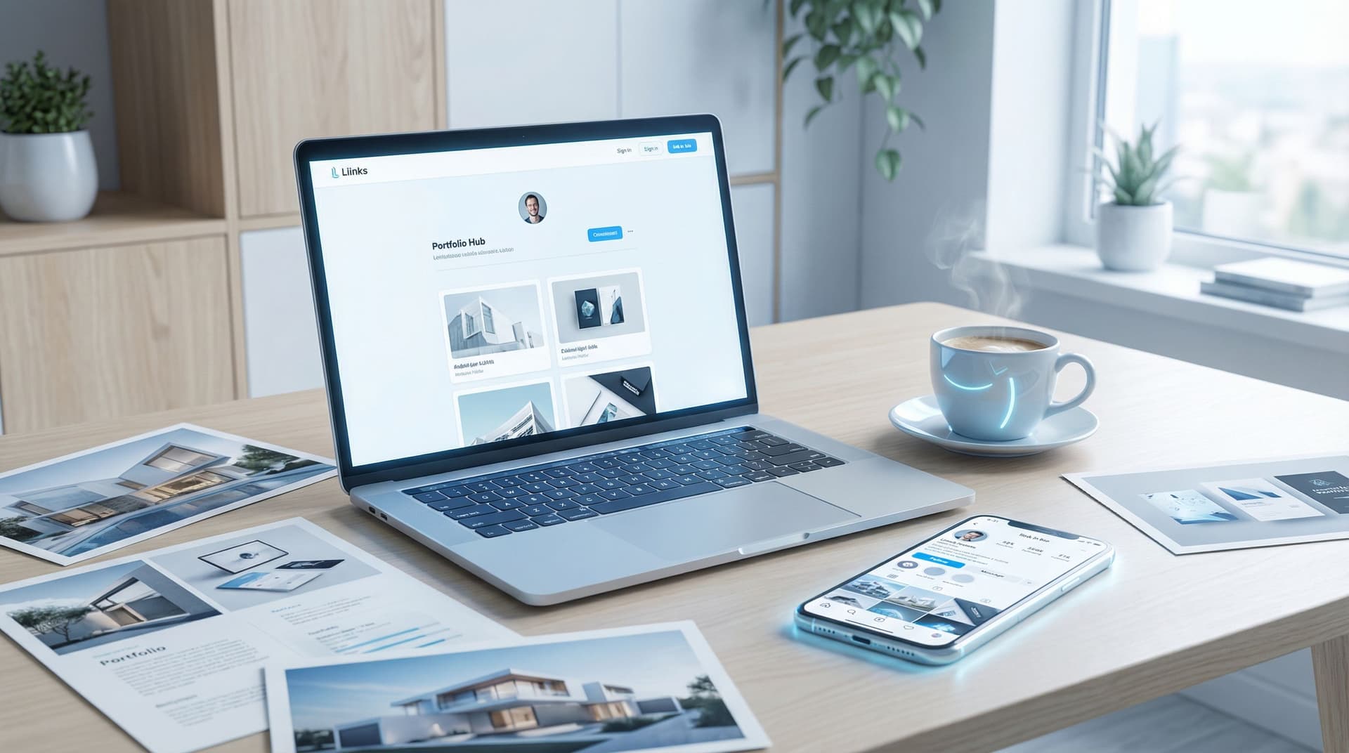
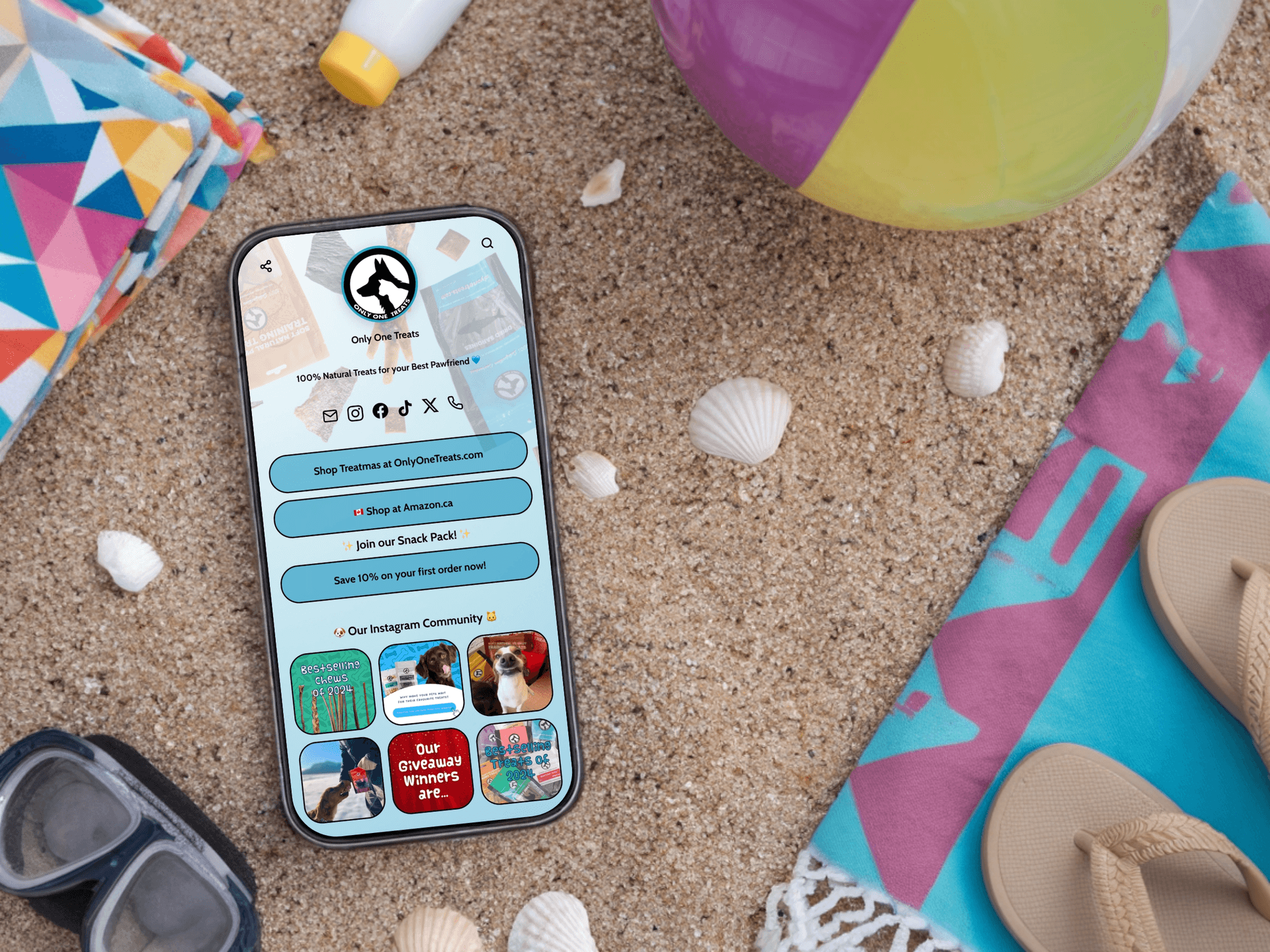
How Liinks Can Complement Your E-commerce Website
As an e-commerce brand, managing links across platforms can be challenging. Liinks provides a centralized hub for all your links, simplifying navigation for your audience.
* Promote Key Products: Use Liinks to feature your best-selling or new arrivals at the top of your link-in-bio page.
- Drive Traffic to Your Store: Add links to product pages, sales, or campaigns.
- Highlight Exclusive Deals: Showcase limited-time discounts or promotions with bold CTAs.
- Track Engagement: Use built-in analytics to monitor clicks and optimize your strategy.
With Liinks, you can extend the functionality of your mobile-first website and make it even easier for customers to shop and explore your brand.
Conclusion: Build a Mobile-First E-commerce Website That Converts
A mobile-first approach is essential for e-commerce brands looking to capture the attention of today’s smartphone shoppers. By focusing on speed, simplicity, and user experience, you can create a website that not only attracts customers but turns them into loyal fans.
Ready to streamline your e-commerce experience?
Sign up for Liinks today to complement your mobile-first website and drive more sales effortlessly.