Every New Follower Visits Your Profile Once
Here is the uncomfortable version of how a follow actually works.
Someone sees one of your posts. They like it enough to tap your name. They land on your profile, read your bio, look at your grid or your last three videos, maybe tap your link, and decide within a few seconds whether you are worth keeping around. Then they hit follow and go back to scrolling.
That is the whole relationship so far. And there is a good chance it is the only time that person will ever look at your profile on purpose. From here on, they see you when an algorithm decides to show them something, in a feed where they follow eleven hundred other accounts. They are not coming back to browse. They are not going to dig through your highlights next Tuesday to find out what you sell.
You get one visit. It already happened, or it is happening right now to someone. The question is whether the page they land on was built for that moment, or whether it was built the way most pages are built: slowly, by accretion, one link at a time, for an audience that already knows you.
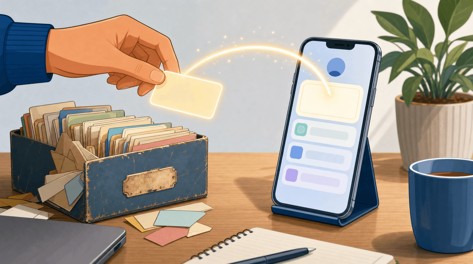
The follow is a bookmark, not a subscription
We talk about followers as if they were email subscribers. They are not. An email subscriber has given you a delivery address. A follower has given you a lottery ticket.
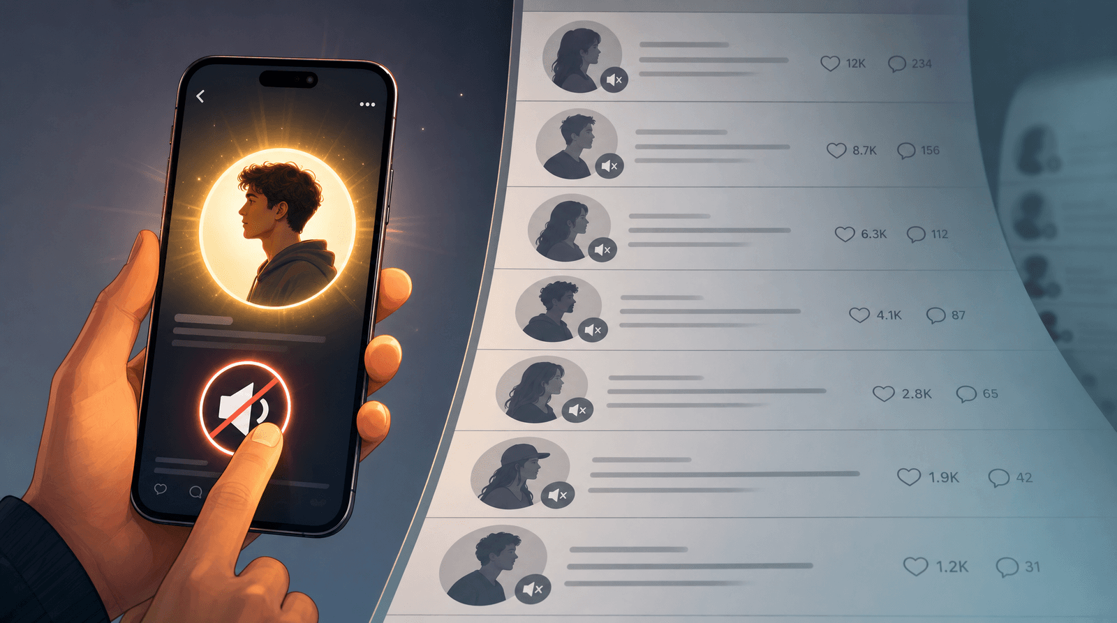
Reach on every major platform is now a fraction of follower count, and it is chosen by ranking systems optimising for watch time, not for loyalty. The practical result is that most of your followers will not see most of your posts, and a meaningful share of them will never see another one. They followed on a Tuesday, the algorithm did not surface you on Wednesday, and by Friday you are a name they half-recognise.
This is why follower count keeps drifting further from revenue, and why we keep writing that you don't need more followers, you need better clicks. The number at the top of your profile is a record of past interest. It is not a channel you control.
The profile visit is different. That is the one moment where the person is deliberately looking at you, in a quiet room, with intent. No algorithm sits between you. They chose to tap. Everything you want a new person to know about you has to fit in the space between that tap and the moment they get bored.
Most creators spend their week optimising the part they cannot control, and almost no time on the part they can.
What a stranger is actually doing in those thirty seconds
Nobody arrives on your profile thinking "let me evaluate this personal brand." They arrive with three questions, and they answer them fast, mostly without noticing they are doing it.
Question one: what is this?
They need a category before anything else. Photographer. Sourdough bakery in Leeds. Woman who reviews budget skincare. Nutrition coach for runners. If your bio makes them work for this, you have already spent most of the visit.
The bios that fail here are almost never bad writing. They are inside jokes, mission statements, or lists of adjectives. "Storyteller. Coffee. Chaos." is charming to the fifty people who already know you and useless to the person who arrived four seconds ago from a Reel.
Question two: is this for me?
Category is not enough. A wedding photographer in Seattle is irrelevant to someone planning a wedding in Dublin, and a nutrition coach who works with elite athletes is intimidating to someone who just started running. The visitor is looking for a signal that they are the intended audience: a location, a niche, a price band, a type of client, a specific problem you solve.
This is the question that decides whether a follow turns into anything. People do not buy from accounts they like. They buy from accounts they think are talking to them.
Question three: what happens if I tap?
If the first two answers land, they will tap your link. This is the highest-intent moment you will ever get from that person, and it is where most pages fall apart, because what they find on the other side is a wall of eleven blue buttons with no obvious first move.
A visitor who cannot tell what the primary action is does not carefully weigh the options. They leave. We wrote about this from the buying side in the high-intent link in bio, and the same principle applies to a brand-new visitor who is not ready to buy anything yet: the page has to make one move obvious, and everything else secondary.
Three questions. Maybe thirty seconds. That is the entire onboarding flow you get with a new human being.
Your link-in-bio page is an onboarding flow, not a filing cabinet
Here is the mental shift that changes how you build the page.
Most link-in-bio pages are built for the person who already knows you. Every link on them was added for a reason that made sense at the time: a podcast episode you were on in March, the Ko-fi you set up once, the newsletter, the shop, the discount code from a collab that ended. Nothing is wrong with any single one of them. Together they form a directory, and a directory assumes the visitor knows what they are looking for.
A first-time visitor does not know what they are looking for. They know they liked one video. Handing them a directory is like answering "what do you do?" with a filing cabinet.
Compare that to a page built for the stranger. Tracy Saunders, a bridal hair and makeup artist in Seattle, answers all three questions before you scroll: who she is, what she does, where she does it, and what you should tap if you want to hire her.
Notice what the first screen does not contain. There is no link to a podcast appearance. There is no newsletter archive. There is one photograph that shows the work, one sentence that establishes the category and the geography, and one button that is unmistakably the thing to press. The rest of the page exists below, for people who want more. It just does not compete for the opening moment.
That is the structure worth copying, and it is deliberately boring:
- Identity. Name and face, or logo, at the top. No mystery.
- Category and qualifier. What you do, and who it is for. One line. Location if location matters.
- One primary action. The single thing you most want a new person to do, styled so it is visually louder than everything else on the page.
- Proof. A photo of the work, a recent piece, a client result. Something that shows rather than claims.
- Everything else. The full menu, in order of how many people actually want it.
If you build on Liinks, that ordering is what sections and link styles are for. A featured section with an image at the top, standard links below, socials in the header rather than eating a row of prime space. The layout tools are not decoration. They are how you tell a stranger what to look at first.
Pick one primary action, and let it be a small one
The most common mistake on a page built for strangers is making the primary action too big.
A brand-new follower is not going to book a $3,000 package thirty seconds after their first video. Making "Book a consultation" the loudest button on the page means the loudest button is the one almost nobody is ready to press, and a page whose main action gets ignored feels dead to everyone who visits it.
Choose the action that matches the temperature of the visitor. For someone who has known you for four seconds, that usually means one of:
- Join the list. An email or SMS signup is the only way to convert a lottery ticket into a delivery address. If you take one thing from this post, take this.
- Watch or read the best thing you have made. A single flagship piece does more to convert a casual follow into a real one than any amount of description.
- See what it costs. For service businesses, a clear services and pricing page removes the biggest reason people quietly disappear. We are on record that nobody is going to DM you for prices.
Then let the higher-commitment actions live below the fold, where the people who are ready will find them. The visitor who is ready to book will scroll. The visitor who is not ready will still leave you with something.
Test it the way a stranger would
You cannot judge your own page, because you cannot unknow what you know. Every abbreviation makes sense to you. Every link has a story. You need a way to see it cold.
Three things that work:
The five-second test. Show your page to someone who has never heard of you, for five seconds, then take it away and ask them what you do and who it is for. If they cannot answer both, your bio is the problem, not your content.
Open it on a phone with the sound off, in daylight. That is the real viewing condition. Not your desktop, not a design mockup. Small screen, thumb, bright glare, half a second of patience.
Read your analytics as a funnel, not a scoreboard. In Liinks you can see how many people landed on the page and how many clicked each link. High visits and low clicks is not a traffic problem. It is a page problem, and it is fixable this afternoon. Which link gets tapped first also tells you what people actually want from you, which is often not what you assumed when you built the page.
If your click-through rate on the first-position link is under a quarter of visits, the opening screen is not doing its job. That is not a catastrophe. It is the single highest-leverage thing on your entire marketing to-do list, because it applies to every new person who arrives, forever, including the wave that shows up the week something of yours takes off. Being ready for that wave is its own discipline, which is why going viral is the easy part.
TL;DR
- A follow is one profile visit, not a subscription. Reach after that is decided by an algorithm you do not control, so treat the visit as the only guaranteed moment you get with a new person.
- Every stranger answers three questions in about thirty seconds: what is this, is it for me, and what happens if I tap. Your bio answers the first two. Your link-in-bio page answers the third.
- Most pages are directories built for people who already know you. Build the opening screen for the person who does not: identity, category, one obvious action, proof, then everything else.
- Match the primary action to the visitor's temperature. Email signup beats a booking link for someone who met you four seconds ago, because it converts a lottery ticket into an address you own.
- Test the page cold: five seconds with a stranger, on a phone, then read your click-through as a funnel rather than a scoreboard.
Build the page that visit deserves
You already earned the hard part. Someone watched your work, liked it, and went looking for more. The only thing left is making sure the place they land actually answers them.
Liinks gives you the pieces to do that: featured sections with images so your best work is the first thing anyone sees, link styles that make one action visibly primary, an email capture block that turns visitors into a list you own, and analytics that show you exactly where the drop-off is. It takes about twenty minutes to restructure a page around a single first-time visitor, and it works on every person who arrives after that.
Start your page for free, open it on your phone, and ask yourself the question a stranger is about to ask: what is this, is it for me, and what do I tap.